Is It Wednesday Yet?
13 September 2011 — Here we are again with another installment of your favorite comic book review series. As always, the reviews are free of spoilers, so read on without fear of having your experience ruined!
Our grading scale is simple:
Buy: An excellent comic book.
Borrow: A good comic, but save yourself some money by reading a friend's copy.
Flip Through: Give it a once-over at the comic shop.
Skip: This doesn't need to be explained.
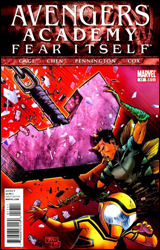 Avengers Academy #17
Publisher: Marvel
Released: 03 August 2011
Writer: Christos Gage
Penciler: Sean Chen
Inker: Andrew Hennessy
Colorist: Jeromy Cox
Letterer: VC's Joe Caramagna
Cover: Billy Tan
Cover price: $2.99
Review: Tom Hemmings
I wasn't quite sure why they felt the need to start this book when they already have the well-established youth teams of the Young Avengers and Runaways. However, the premise is distinct from those titles; it's more of a successor to Avengers: The Initiative. Then again, the closest comparison would really be New Mutants, with Hank Pym and his Avengers associates taking the place of Xavier and his X-Men. Of course, if there's one man who's less capable of creating a safe environment for kids to learn than Xavier, it's Pym.
This is a Fear Itself tie-in, which, for characters not named Captain America, Thor, and Iron Man, is all about generic team-ups to take on the biggest Marvel characters who've all been given a Thor-style makeover. Naturally, the God responsible for all of this had to take on a few B-listers to fill out his numbers. So whilst the X-Men take on Juggernaut and The Thing is fought by his FF teammates, our young heroes have to face twice the firepower and a fraction of the star power in Absorbing Man and Titania.
I've seen worse tie-ins. The World War Hulk X-Men book, for example, was literally nothing but a three-issue fight scene. Thankfully this is actually interwoven into the ongoing book. These kids are all concerned about their potential to be disasters like Speedball, or perhaps even the likelihood that they could be future villains. That's the part that underscores the more successful aspects of this issue, as the students question whether it's justified to kill, even if you're killing the pilot of a giant Nazi mech.
I'm uncomfortable with the ultra-violent shift taken by modern youth books. It works in something like X-23, but that tone has been adopted industry-wide without really engaging the consequences — both in and out of the book. This shift has led to Avengers Academy, where apparently the moral conclusion everyone is working towards is that killing is justified. Now whether or not that's actually the case, it pretty much defies the core concept of many of comic's most significant characters such as Batman and Spider-Man. Real-world value of this idea aside, it's disheartening to see a teen superhero book come to such a radically different conclusion.
Having said that, at least the issue is explored and not tossed away as being unworthy of reflection. The actual interactions of the team are solid, if occasionally a little clunky. There are interesting characters here, even if some of them are just rehashes of old ones. How Reptil differs from Beast Boy or Anole is unclear. There are some potential legacy characters in here as well, but thankfully they're individual enough that it's not the focus of the book.
The art is consistent throughout, but there's something odd about the coloring. The palette is a lot brighter and more garish than I'd like; the standard skin tones regularly vary down into that deep pink that is common in comics, but somehow never looks right to me. It's a shame, because I like the pencils. They're strong, allowing for the odd wobble such as faces that don't quite fit.
To be honest, this issue has a lot going on, but somehow it still feels like a placeholder for something more significant. I'm not inspired to check out the next issue since the generic evil characters were by far the weakest aspect, and it looks like we're going to get more of them. As a teen book it's competent, but there's nothing to recommend it above similar books; I'd rather you went and looked at Teen Titans, Young Avengers, New X-Men, or The Legion of Super-Heroes. Flip through it.
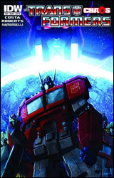 Transformers #24
Publisher: IDW
Released: 24 August 2011
Story: Mike Costa and James Roberts
Script: Mike Costa
Artist: Livio Ramondelli
Letterer: Chris Mowry
Cover: Livio Ramondelli
Cover price: $3.99
Review: Tom Hemmings
To provide a little background to my insight on this, I've been collecting Transformers comics since I started reading. I've owned or at least read every single issue of the old Marvel UK run, which was so strong it was accepted as canon by the US version of the comic. I love Transformers, and consider the comics, not the cartoons, to be the true place where this franchise lives and breathes.
That said, there are a lot of little continuity issues that prevent me from placing where this takes place in the Transformers universe. Rodimus Prime and Optimus Prime are working alongside each other, Megatron and Galvatron are in the same universe, and there's the presence of latter-day Decepticon leaders like Thunderwing. These things raise questions that the first-page recap box doesn't actually manage to answer. That doesn't mean they're hard to accept, indeed, they echo some of the finest stories in the Transformers canon. This whole book draws heavily on classic stories like "Target: 2006," "All Fall Down," and, most significantly, the original 1986 animated feature. A great many ideas and moments in this are culled directly from the golden age of the franchise. Clearly story architects Mike Costa and James Roberts have affection for the classic lore.
However, you're in trouble if someone as familiar as myself with the universe doesn't understand the current state of affairs. Forget the idea that every comic should be someone's first; this is around my 500th Transformers comic, and I shouldn't be lost when I pick it up — especially in the G1 universe. Clearly the recap page didn't do a good enough job when it leaves me with more questions than answers. It's a shame, because on a character level they've really done some nice stuff here. It has epic grandstanding and brutal fights, but it's not just all about the lead players. There's some downtime development of the soldiers in this war, just like classic Transformers scribe Simon Furman liked to do. The use of this style does clash with the direct movie references they throw in, but this still feels like a comic of the franchise — and that's not as simple as it might sound.
The art for this book is a prime example of a love / hate relationship. Structurally, in places, it's wonderful; faces look like Geoff Senior drew them, and some bodies have the same lean (slightly proportionally challenged) look of Jeff Anderson. I question a few things, such as Optimus having massive ear antennae that stick out at angles — that's not a look that I ever thought worked for him. I also have questions over the designs of Galvatron, Megatron, and Rodimus. All these characters are prone to redesigns, but those usually do a great deal to help me place them in an era, and, as a result, the variable period they appear to be from is one of the things that left me confused.
However, the biggest problem I had with this comic was in the coloring and use of light. There are so many bright lights on panel that JJ Abrams would step back and say, "Hold on a minute!" The deep, dark shadows strewn throughout make it look like Hellboy. I get what they were going for — in space, darkness is more prevalent than light. Though it's technically impressive and, in places, beautifully detailed work, it completely overpowers the book. I realize that it was all the work of a single artist, yet I can't help but feel it would have been stronger if someone else took over after the pencils were done.
It's tough to grade this, but in the end I'm going with a flip through. If you see it on a shelf, take a look just to see what I mean about the art. However, if you're a classic G1 fan, then there's a little more for you here.


