Is It Wednesday Yet?
16 August 2011 � Here we are again with another installment of your favorite comic book review series. As always, the reviews are free of spoilers, so read on without fear of having your experience ruined!
Our grading scale is simple:
Buy: An excellent comic book.
Borrow: A good comic, but save yourself some money by reading a friend's copy.
Flip Through: Give it a once-over at the comic shop.
Skip: This doesn't need to be explained.
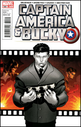 Captain America and Bucky #620
Publisher: Marvel
Released: 27 July 2011
Writers: Ed Brubaker and Marc Andreyko
Artist: Chris Samnee
Colorist: Bettie Breitweiser
Letterer: VC's Joe Caramagna
Cover: Ed McGuinness
Cover price: $2.99
Review: Tom Hemmings
Captain America had been Bucky's book since 2007, and with his tenure as Captain America at an end, you can understand my fear that one of the standout characters in modern Marvel was about to be moved off the playing field for good. This is why the announcement of Captain America and Bucky was such great news for fans of Brubaker's work. Not only do we get a timely retelling of Cap and Bucky's origin, but we also get to see it through the eyes of the kid sidekick.
It's strange, but for a character I've been reading for a while now, this book suddenly made me realize how little I knew about Bucky. He's always been the scrappy, idealistic kid, retroactively trained by the SAS, then sent out as a poster boy for recruitment and as an assassin. You don't tend to think much is important about the childhood of a comic book character, but clearly that was wrong. Bucky's past is at least as interesting as that of his more famous partner, and in this issue we get the whole thing: troubled youth, military training, and meeting Steve Rogers.
I've probably said this elsewhere, but Brubaker is one of the best writers going today. In particular, his grip on the Cap universe has been rock-solid, especially the stuff relating to WWII. In other collections, Bru has explored the home front during wartime and some of the original mystery men, but what I've always wanted to see is a fully fledged Invaders book: Cap, Bucky, Namor, Human Torch, Toro, the whole lot. We've had glimpses before, but a proper book has always had great appeal. From what I can tell, this is that book, and I'm utterly thrilled by the idea. Throw in the quality of this issue and it's probably my most anticipated monthly book not named Ultimate Spider-Man.
The artwork here is perfect. Chris Samnee brings to the table the classic look of Darwyn Cooke (Catwoman), the detail of Steve Epting (Captain America), and the inky styling of Michael Lark (Daredevil), evoking memories of Brubaker's best comics. Chris Samnee's work is no stranger to praise on Earth-2.net, he recently worked on the critically popular Thor: The Mighty Avenger. With his move into Brubaker's stable of go-to artists, he leaps firmly into my own list of talents to watch. He has a firm grasp of individuals, expressions, spaces, and shading that is so wonderful to see that I can't imagine anyone having anything more than the most nitpicky complaints about the art. Bettie Breitweiser supports him admirably; the colors make this feel like a part of the past and yet somehow still very modern.
I haven't mooned over a book like this in a long while. It's brilliant! It's exactly what I've been asking for these last few years, and it somehow lived up to the hype I'd created in my mind. Buy it now. This is a series you're not going to want to miss, and this is the point to jump on.
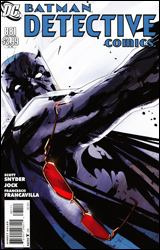 Detective Comics #881
Publisher: DC Comics
Released: 10 August 2011
Writer: Scott Snyder
Artists: Jock and Francesco Francavilla
Colorists: David Baron and Francesco Francavilla
Letterer: Jared K. Fletcher
Cover: Jock
Cover price: $3.99
Review: Sean Lemberg
An interesting thing about children: sometimes they don't fall far from the tree, as the old adage says, but sometimes that fruit lands on a slope and rolls into dark, unfamiliar territory. Such is the case with Commissioner James Gordon, whose biological son and adopted daughter are the figureheads of this month's drama. While Barbara has always embraced the path of the righteous, fighting crime as both Batgirl and Oracle, James Junior has traveled an entirely different route that's culminated in stays at Arkham Asylum and fraternizations with many of Gotham's most colorful enemies.
Gordon's son is different from the rogues Batman has traditionally stared down without a flinch. He doesn't believe in cronies, mindless brawls, or elaborate costumes; truly his father's offspring, he relies on cool logic and calculated moves to solve the problems he perceives before him. With a few inherent personal feelings of abandonment and jealousy as they relate to his father and sister adding fuel to the fire, this makes him a nice change of pace from the usual business. The man is crazy, criminally so, but he's not stupid and that's the kind of enemy that's often the most dangerous.
It's that same careful balance that writer Scott Snyder hopes to capitalize on, but I found the accompanying plot to be a bit too heavy on the build-up and shockingly light on the climax. More than half the issue is dedicated to James Junior's overly verbose explanation of his master plans, a character flaw that even poor captive Barbara can't help but point out. And his lack of an effective follow-through left me wondering how brilliant he actually was. Snyder's heart is in the right place, and on a few occasions he provides a rare, empathic peek into the mind of a psychotically disturbed individual, but the issue's dialog repeats itself fairly regularly and the story's hurried conclusion does nothing to address the deeper issues he hints at. In the end it's just another day at the office masquerading as something more substantial.
The artwork, provided by the team of Jock and Francesco Francavilla, varies from moody and unsettling to chaotic and twisted. Each artist works with a light touch; showing restraint and a solid eye for composition, they both manage to do more with less. There's a pretty clear moment about two-thirds of the way through the issue where the style shifts, but the styles compliment one another decently enough that such a shakeup isn't unsettling. There's really nothing wrong with the way this issue looks, but it doesn't exactly leap up and take control of the reader's imagination, either � it's suitable but not spectacular.
It's clear from the way he writes the character that Scott Snyder understands the need for a difference between Bruce Wayne's Batman and Dick Grayson's. It's important enough that he even grants the issue's villain a few panels on the subject. There's a rare opportunity to redefine this character at hand, but it's going to take something with a bit more daring than this month's issue to get us there. In a few select panels, Snyder scratches the surface of something with potential, but by the time he's reached the back cover, those glimpses remain just that: peeks of promise that are left unparsed. It's a perfectly decent issue, but not exactly required reading. Borrow it, but don't expect to reread it again any time soon.
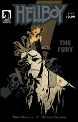 Hellboy: The Fury #3
Publisher: Dark Horse
Released: 10 August 2011
Writer: Mike Mignola
Artist: Duncan Fegredo
Colorist: Dave Stewart
Letterer: Clem Robins
Cover: Mike Mignola
Cover price: $2.99
Review: Sean Lemberg
With nearly 20 years of stories behind him, Mike Mignola's Hellboy is still moving forward with a voracious appetite, investigating the supernatural issues no one else dares to touch. On this adventure, though, he very well may have bitten off more than he can chew. That's no hyperbole either, as the scale and stakes have never been higher, both for Hellboy and the planet itself. Staring down the Queen of Witches, Hellboy's aim is nothing short of circumventing the end of civilization as we know it. An extinction event on par with the fall of the dinosaurs is nearly upon us, and the only thing standing between it and us is the little red demon with a giant, gloved right hand.
This chapter is heavy on atmosphere, but is still exceptionally easy to read. Mike Mignola's writing has come a long way since he teamed with John Byrne back in Hellboy's very first adventure, and the way he calmly lets major events play out without an excess of narration or explanation is further proof of his graduation to genuine storyteller. It's an extremely well-crafted issue that efficiently covers the full gamut of emotions, then leaves its audience wide-eyed and uncertain about where things can possibly go next. While he may not be providing the artwork any longer, Mignola's writing is still masterfully streamlined and simple, and he trusts his companion implicitly enough to leave the majority of the storytelling to the visuals.
Of course, the real question for any artist who dares to take up the mantle on Hellboy is how their work compares to Mignola's. And while no less than a dozen different artists have offered their take on his signature creation, none have stuck around nearly as long as Duncan Fegredo. Since his first run with the series in 2007's Darkness Calls, Fegredo has carved a spot for himself in the Hellboy mythos, and with good reason: his style is an extremely close approximation of Mignola's. Truth be told, aside from their differing takes on common human characters, it's difficult to distinguish the two at all, particularly when it comes to the titular character. Fegredo has lots of room to stretch his artistic legs this month; with a gigantic fight scene spanning most of the issue and macabre gothic accents enlivening the backgrounds, he responds in fantastic form. It's a genuinely gorgeous issue that takes on a wide variety of emotions, implications, and premonitions, while still maintaining that eerie sense of haunted reality that Mignola has always brought to the table. The big man himself couldn't have done it any better.
It's a rarity in the comics world, or truly in any form of entertainment, for promises of "this changes everything" to truly deliver. Either editorial interference, reluctance on the part of the creators, or poorly concocted new directions hamper such examples with very few exceptions. Not so with Hellboy: The Fury. It's a concluding chapter worth remembering, a storytelling decision born not of any perceived need to shake things up. It's the natural progression of a yarn that's been spinning for some time, and an especially effective one at that. Buy it.
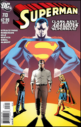 Superman #713
Publisher: DC Comics
Released: 13 July 2011
Writers: J. Michael Straczynski and Chris Roberson
Artists: Diogenes Neves, Eddy Barrows, and Jamal Igle
Inkers: Oclair Albert, JP Mayer, and Jon Sibal
Colorist: Marcelo Maiolo
Letterer: John J. Hill
Cover: John Cassaday
Cover price: $2.99
Review: Tom Hemmings
There's been a great deal of uproar about what DC's reboot is going to do with some of their classic characters, none more so than Superman. "He's going to have a collar? He's ditching the red underpants? This will ruin the character!" The question I pose is this: Is the prospect of Superman wearing jeans but being written by Grant Morrison less appealing than the classically dressed Superman written by J. Michael Straczynski? Which will better convey what Superman actually is?
In the time since the original Crisis Superman has defended the innocent, thwarted evildoers, and even defied gods. He's saved Metropolis, the world, and even reality itself many times. It's a bit late to be having second thoughts about putting on the red and blue. However, that's exactly what this issue is about, Clark deciding at the end of his walk across America that he must hang up the tights. Not only that, but every person wearing his symbol should do so, too.
You know, Spider-Man has had similar thoughts. He was one man, often hated in his home city, and far from being the most inspirational superhero on the planet. What would it matter if he stepped aside? He's even tried it a few times, when the needs of his family came first and he had a direct replacement he could trust. He can't be blamed for trying, but as Uncle Ben said, "With great power there must also come great responsibility." Inevitably he found that web-slinging was his destiny, regardless of the harm it did to his own life. Superman has power beyond measure, not just physically but symbolically. To cast it aside is a betrayal of everything that character is. I know it can be hard to write an interesting Superman story. Inheriting his titles can often seem like a poisoned chalice: they're prestigious enough for attention, yet too sacred to truly do anything with. This, however, is a complete embarrassment of a storyline.
On the art, I will say that it makes strong attempts on some pages, but is largely inconsistent. Some of the faces are downright hideous, and Clark's jawline changes so often it could be a participant on America's Next Top Model. The coloring really does a good job trying to hide these flaws, but the artists are not suited for a book of this level.
Grant Morrison can write a Superman book that will make you smile and cry and be inspired by example. Straczynski seems to have accidentally put a stranger in a suit and for some reason everyone still thinks it's the real deal. This reboot can't come fast enough. Skip this.


