Is It Wednesday Yet?
12 April 2011 — Here we are again with another installment of your favorite comic book review series. As always, the reviews are free of spoilers, so read on without fear of having your experience ruined!
Our grading scale is simple:
Buy: An excellent comic book.
Borrow: A good comic, but save yourself some money by reading a friend's copy.
Flip Through: Give it a once-over at the comic shop.
Skip: This doesn't need to be explained.
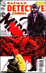 Detective Comics #875
Publisher: DC Comics
Released: 30 March 2011
Writer: Scott Snyder
Artist: Francesco Francavilla
Letterer: Jared K. Fletcher
Cover: Francesco Francavilla
Cover price: $2.99
Review: Tom Hemmings
If you like Batman: Year One by Frank Miller and David Mazzucchelli, you'll like this. If you like Commissioner Gordon and want to see more done with him, you'll want to check this out. Most importantly, if you feel the GCPD has been underrepresented in the comics ever since we said goodbye to Gotham Central, you should read this and request that this creative team get a shot at a series like that. They could even just make it this one.
This is not perfect. There's a bit with Harvey Bullock near the beginning that is a nice guide to his character, but it adds nothing to the story. However, in the wider concept of a series, it would be welcome. There's confusion and the odd convenient coincidence later on as well. I won't pretend the meat and bones of the story is perfect, either. However, as something that evokes the black mood of a cop in Gotham at winter, it's excellent. Here, equal plaudits go to writer and artist, with some gorgeous atmospheric art mingling with the overall tone and character aspects whilst Snyder tells a story that feels totally in sync with modern Gotham whilst also reaching back into the past to explore the origins of a recently returned figure.
Snyder instantly makes you understand Gordon here, his guilt over his son, and the self-doubt that plagues him. The flashback follows Gordon searching and questioning his actions and judgment at the time, perhaps realizing he was functioning more as a police officer than a father in many ways. Is his son's troubled past the result of his divorce? Could it have been prevented, or was he born that way? It's excellently explored and is a great example of why these characters deserve ongoing stories of their own, because there's no way this can all be wrapped up cleanly. I don't recall ever having read anything by Snyder before, but this has impressed me.
Now to concentrate on the art. The way that white is used to mix with Gordon's hair, glasses, and breath against a stark black background and red-shaded objects is brilliant; it fits Snyder's descriptions of the character and the season perfectly. Then you move into a summer from long ago, where everything is warm and faintly dreamlike, fitting the nature of Gordon's recollections. He also highlights Gordon's red hair, just as David Mazzucchelli did in Year One. There's artistic freshness at work here, but the references to significant works help place this within the Bat-universe, not just as another story but as a part of those original events. The use of so few colors per page actually makes this feel like a comic from the 1980s in some ways, as though the limited palette was a technical restriction that was turned into an artistic merit.
Going in, I'd only heard of Snyder's story, and by the end not only did I feel like I knew almost all that was required, I felt I had to start following this book. I honestly enjoyed it that much. Buy it.
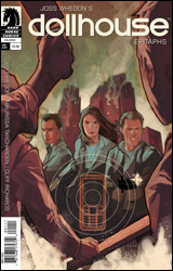 Dollhouse: Epitaphs
Publisher: Dark Horse
Released: 30 March 2011
Writers: Jed Whedon and Maurissa Tancharoen
Artist: Cliff Richards
Colorist: Michelle Masden
Letterer: Blambot's Nate Piekos
Cover: Phil Noto
Cover price: $3.99
Review: Hannah Krueger
The idea behind Dollhouse is that in every major city there exist houses of people who have had their brains and personalities wiped blank. They can be programmed with any personalities and enhanced skills to any specification. These "dolls" are then rented to wealthy clients for any variety of requests, from a mother for a nursing baby to a negotiator for a kidnapped child to a dead wife so her husband can share a final moment with her. But, now, the owners of the technology have found a way to make the technology go viral, and imprint people through their cell phones. Our comic focuses on a group of five people who were smart enough not to pick up their phones, and are now attempting to survive.
I tried following Dollhouse back when it aired, but I ended up dropping it after the first season because I couldn't bring myself to care. I'll be picking it up again for Big Damn Heroes (starting tomorrow on Earth-2.net), though, and one of the bits of the universe I was most intrigued by was the future shown in "Epitaph One," the unaired first season finale. This appears to be setup and background for all the characters we met in that episode, and for the scenario at large. It's not something that's strictly necessary for you to read to understand what's going on in the "Epitaph" episodes, because as I understand it, all of this was alluded to within the episode itself. However, if you wanted to know the stories of the characters, and to see the initial situation vaguely unfold, here's your chance.
However, where it leaves off is intriguing, as this one-shot appears to be set-up for the miniseries that starts in mid-July. Though, whether that's going to jump straight to the timeline of "Epitaph One" or cover ground in between there remains to be seen.
Dark Horse seems to be the home for the comic continuation of all of Whedon's cancelled properties right now, so I imagine that we're going to be seeing a lot more of this sort of thing in the future, maybe with some other cancelled shows (Firefly, please). As a set-up for the miniseries, though, this is pretty weak. There's one bit at the very end of the issue that's intriguing, but the rest of it feels like it's going through the motions. It also attempts to give tragic histories to characters that are already in a pretty sucky situation, which makes it feel like overkill.
Art wise, this is solid enough. It does well conveying the chaos and apocalyptic landscapes that happens as the imprinting goes viral, but most characters are drawn with oddly shadowed faces, so that eyes and mouths aren't really visible. And that's before the imprinting happens. It only gets worse when Cliff Richards is asked to draw the differences between the imprinted and the actual. This, in and of itself, doesn't make that much sense, given that one of the major points in the episode was that it was hard to tell whether or not someone had been imprinted just by looking at them.
Flip through this. If you're interested to know more about the origin of the "Epitaph One" universe and characters, you might be interested in this, but the price is too high for me to recommend it.
Also, be sure to listen to the first episode of Big Damn Heroes, covering the first four episodes of Buffy the Vampire Slayer, coming 13 April to Earth-2.net! Okay, I'm done now.
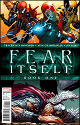 Fear Itself #1
Publisher: Marvel
Released: 06 April 2011
Writer: Matt Fraction
Artist: Stuart Immonen
Colorist: Laura Martin
Letterer: Chris Eliopoulos
Cover: Steve McNiven
Cover price: $3.99
Review: Sean Lemberg
Let's just take it for granted that things are a bit rocky in the Marvel Universe. Though the classic Avengers have finally reassembled, Norman Osborn has been removed from power, and the sun seems to be rising over the horizon, things are far from perfect both within Avengers Mansion and outside its golden gates. And as the unrelenting dust storm begins to start up yet again, the publisher's most visible heroes have a bevy of new foes to confront as well as several fresh, prickly situations to diffuse.
Matt Fraction's tale in Fear Itself is a natural progression of the "superheroes as social commentary" vein most recently tapped in Brian Michael Bendis' big crossover arcs, in which the biggest names of the Marvel U find themselves entangled not in the robotic arms of Doctor Octopus or another evil mastermind, but rather in the hot-button political issues of the day. Where Bendis and the dozens of preceding authors would skirt a direct confrontation by way of allegory and metaphor, Fraction has thus far been much more upfront. He's not using mutants as a stand-in for the Civil Rights Movement; he's actually dropping Steve Rogers in the middle of the Ground Zero mosque demonstrations. Tony Stark is using his new popular resurgence and the desperate need to rebuild Oklahoma after the events of Siege as a vehicle to create American jobs in the midst of a recession. We're not exactly dancing around the issues anymore, and whether you see that as a positive turn or a negative one will depend entirely on the level of maturity and / or escapism you expect from your mainstream comic events.
Of course, it should go without saying that such weighty issues are also counterbalanced by a healthy dose of good old-fashioned superhero mystique. With 40 pages of content, this issue has plenty of room for both, and Fraction pulls off his act with impressive poise. The topical matters thus far haven't felt shoehorned in, heavy-handed, or one-sided, and the more fantastic scenarios around every other page don't seem completely ridiculous or out of place alongside them. This doesn't feel like an opportunity to spray an unsolicited political agenda so much as it does an instinctive next step forward for the publisher's heroes. It's the battlefield on which popular opinion and ancient mythology come to blows.
Aiding Fraction with his work is Stuart Immonen, one of Marvel's most recognizable, top-notch superstar artists. Immonen has that magic touch, a knack for conveying whatever mood the writer is looking for via subtle shifts in his artwork. When Fraction is trying to invoke fear, Immonen uses a darker tone and more daunting, worm's-eye camera angles. If he's after humor, the panels grow lighter and you'll notice throwaway jokes going on behind the action. Even in the sterner, straightforward conversation-based scenes, of which there are plenty, the artwork keeps the pace moving with passion and vigor. It seems like I never have a bad thing to say about Stuart Immonen, and with good reason. The guy never takes a panel off. He's constantly one-upping himself, improving his game and impressing under the glare of a hot spotlight. This issue is no exception.
I'll admit to being a bit burnt-out by crossover events of late. Just between the two big publishers alone, it seems like nary a month has passed without some manner of major, series-spanning super-story over the last five-plus years. The gimmick is tired, but that doesn't mean it's without the capacity to bring the goods from time to time. Whether or not this storyline delivers on its promise remains to be seen — Marvel's track record on that one isn't exactly spotless — but as setups go, I found this to be thoroughly intriguing. Fraction is asking many questions without a simple answer to be found. How he chooses to answer them (or if he does at all) will determine how the series is ultimately remembered. Buy it.
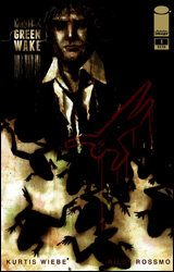 Green Wake #1
Publisher: Image
Released: 06 April 2011
Writer: Kurtis Wiebe
Artist: Riley Rossmo
Letterer: Kelly Tindall
Cover: Riley Rossmo
Cover price: $3.50
Review: Sean Lemberg
Image's latest foray into the surreal, Green Wake, provides yet another chance for the versatile publisher to showcase its flexibility. The miniseries, a murder mystery set in a Silent Hill-styled purgatory for hopeless spirits, is horror in a more subdued manner than, say, The Walking Dead or Hellblazer. Its lofty aspirations seem to be of a cloudy, atmosphere-dominated tangle in the same vein as David Lynch's Twin Peaks, but its methods of execution leave a lot to be desired.
Our writer, Kurtis Wiebe, for example, seems to delight in being vague. He'll open a doorway wide, then smugly refuse to step through. In carefully limited doses, this technique can be a powerful method to personally involve readers in the storytelling. After all, which is scarier: the monster you see in living color, or the one you'll catch a glimpse of with peripheral vision, a peek so fleeting your imagination is left to fill in the gaps? Overuse of this method, however, is a quick and dirty recipe for frustration and abandonment. If you refuse to reveal a thing, eventually the audience is going to lose interest in what's behind the curtain altogether. Wiebe's concept of a world where lost souls go to slog for eternity is fertile soil, but he's so reluctant to tell us anything at all that it leaves the impression that he hasn't quite figured it out himself. That lack of elaboration also robs the cast of any dash of personality and, consequently, approachability. We're along for a ride through the grey void with a small cluster of cold, expressionless specters.
Riley Rossmo's artwork is a different beast altogether. Rossmo, who's quickly becoming one of Image's hottest talents following prolonged runs on the kooky Proof and Cowboy Ninja Viking, works a captivating style that's equal parts old school, new school, and boarding school. His chaotic, loose linework is unbalanced and sharp-edged, like a series of quick gesture drawings freed from the confines of a favored sketchbook. An exuberant, overwhelming dose of Ben-Day dots adds depth and structure in unexpected spaces, creatively applied in a similar fashion to James O'Barr's work on The Crow decades back. For the final touch, he sprays the page with a blotchy, often bleakly monochromatic dash of rough-painted color ŕ la Ben Templesmith. It's at once stripped down, complicated, impersonal, and intensely intimate; utterly unmistakable. Like many of the best unconventional artists, his work is curious enough to inspire a much closer look regardless of the accompanying material, which is certainly the case with Green Wake.
Rossmo's work carries the book. While Wiebe is doing his best to add pseudo-suspense via a series of open-ended questions and a distinct lack of elaboration, Riley is off on his own, populating the world with shady characters, haunting landscapes, coal-spoiled skies, and leaky pipes. It even appears that, at times, the writer actually realizes the inessential nature of his presence, as he drops completely out of the picture and lets the artwork stroll around on its own for several pages. It's as close as Green Wake ever gets to any degree of enlightenment.
Wiebe and Rossmo's alcohol-soaked venture into the crusty fringes of consciousness is, ultimately, little more than a depressing picture book. It's not quite as complicated, nor as engaging, as it seems to think it is, with a distinct lack of a strong hook leaving the whole experience quite shallow. An adventurous premise and strong establishing shot may deliver readers an early taste of promise, but for the rest of the issue we're sleepwalking through the story just like the city of Green Wake's entire population. Flip through it for the artwork.
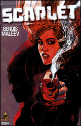 Scarlet #5
Publisher: Marvel / Icon
Released: 06 April 2011
Writer: Brian Michael Bendis
Artist: Alex Maleev
Letterer: Chris Eliopoulos
Cover: Alex Maleev
Cover price: $3.95
Review: Tom Hemmings
Personally, I've been waiting for the trade on this one, which is why I'm not up-to-date on a book created by one of my favorite teams of all time. Bendis and Maleev have worked together on critically acclaimed books such as Daredevil and Spider-Woman, and Scarlet, their latest effort, is part of the Icon label — Marvel's creator-owned line, a brand that has Kick-Ass and Powers in its roster. These books have nothing but the names of their creators to sell them, so it's usually a big deal when they're announced. Mark Millar, Ed Brubaker, Sean Phillips, Steve McNiven, and, of course, Bendis himself have all worked on Icon books before. Considering their past, the announcement of a Bendis / Maleev book generates a lot of hype. Is the hype justified, though?
Maybe.
It actually feels closest to a mixture of Powers and Vertigo's DMZ: part revolution, part detective story. I'm unfortunate to be coming in at the end of the first arc, because it's never really made clear exactly what Scarlet's deal is. What I did like was the way that Bendis took a step back and let Maleev tell the majority of the story in the first half. Whilst I like his writing, I'll admit that his style tends to clutter the page with word balloons, but here he's making short, direct statements as part of a speech, and as a result many panels are left untouched. This is a good thing, since Alex Maleev is clearly on a career high here. The level of detail on the two-page spreads is astonishing, and such a breath of fresh air in a book I expected to find dense with witty dialog.
Then, inevitably, this has to end and we're back in familiar territory, following a police detective on the other side of things. As usual, Bendis treats conversation like the sound of rival gangs exchanging gunfire, all short bursts and unpredictable rhythms; it's good but nothing really new. However, there is a fresh device at work here. Back when Mighty Avengers started, much was made of Bendis reintroducing thought balloons. Now he's brought in this odd thing where his characters break the fourth wall to speak their internal dialog directly to you in these big square word boxes. I'm not sure about it at all — show, don't tell is a big deal for me in stories — so unless you have a really good reason, I'm not much of a fan of just being told what a character thinks. Maybe it worked better in earlier issues, but as a gimmick I didn't love it here. It seems like a way of explaining the stakes and the story without any real effort.
Borrow this, preferably starting with the first issue. The art is great and the story is okay, but you may find some aspects a little less to your liking.


