Is It Wednesday Yet?
11 February 2011 — Here we are again with another installment of your favorite comic book review series. As always, the reviews are free of spoilers, so read on without fear of having your experience ruined!
Our grading scale is simple:
Buy: An excellent comic book.
Borrow: A good comic, but save yourself some money by reading a friend's copy.
Flip Through: Give it a once-over at the comic shop.
Skip: This doesn't need to be explained.
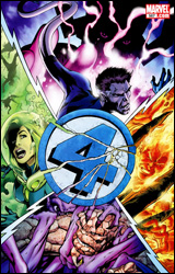 Fantastic Four #587
Publisher: Marvel
Released: 19 January 2011
Writer: Jonathan Hickman
Penciler: Steve Epting
Inkers: Rick Magyar, Mike Perkins, and Steve Epting
Colorist: Paul Mounts
Letterer: VC's Rus Wooton
Cover: Alan Davis
Cover price: $3.99
Review: Sean Lemberg
Well, this is it: the issue you've been hearing about in all the filler segments of the local news. This month the Fantastic Four lose one of their own, and (if we're listening to all the hyperbole spewed by the Marvel promotions department) nothing will ever be the same again. Frankly, I'm surprised the mainstream media still buys into these grandiose claims of heroic deaths in comic books. They've taken the bait for each dirt nap from Superman to Captain America and every single time, without fail, the original character is back below the masthead within a relatively short period of time. This shouldn't come as much of a surprise to the fanboy faithful, what with the recurring joke that only Uncle Ben and Bucky ever actually stays dead, but it constantly amazes me that the programming directors of major networks still haven't caught onto that little nugget of info and quit covering these issues like they're some kind of major, permanent event.
At any rate, that is what it is, and we've still got a few shovelfuls of dirt to deposit on a nameless character's grave before the day is done. Playing his cards close to the vest, longtime Fantastic Four scribe Jonathan Hickman has split the team's membership, dropping them each into a perilous, potentially volatile situation sans backup. Reed is on the surface of a world that's on a collision course with Galactus, Susan stands between the two armies of an impending Atlantean civil war, and Ben and Johnny defend the kids (and the Baxter Building) from a surprise Negative Zone invasion. Somebody's going home in a box, and it probably won't be HERBIE — although that would be the greatest bait-and-switch of all time.
Hickman does a nice job of filling the air with an immersive sense of tension, like storm clouds gathering on the horizon. Despite that dark premonition, he's sent the team out to very familiar territory: adventuring, exploring, and problem-solving in unfamiliar landscapes at the furthest reaches of our understanding. My favorite element of Fantastic Four has always been that sense of exploration, of looking behind the curtain into the unknown, and this month we're doing that in three different places. The feeling is that the team is stretching itself a bit too thin, over-diversifying their interests to disastrous results. I suppose it was inevitable, considering their unquenchable thirst for the mysterious, that they'd eventually get a hold of something beyond their ability to contain. It's an expected comeuppance, I guess.
Steve Epting's artwork fits the mold of the classical Marvel style: spectacular but grounded. In many panels he appears to be channeling several of the publisher's founding fathers, with the influence of John Romita, Sr. shining through most evidently, while in others his take is much more modern and streamlined. His work is best in the galactic scenery that surrounds Reed, but he handles the foreign landscapes presented by the other scenarios decently enough, as well. This issue in particular demands a lot from its artwork, and while none of his panels are really pin-up material, Epting never loses his audience with a momentary lapse of concentration. His work is strong and disciplined, sometimes at the expense of being overly adventurous.
Fantastic Four #587 does deliver on its promise of offing one of the founding members, and while the reasoning for that ultimate sacrifice isn't entirely waterproof, it's no less heroic or meaningful as a result. Jonathan Hickman tells a complicated, multifaceted story in a clean, easy-to-read style, forking up some big changes without giving in to the urge to over-dictate them. This is a good issue, albeit not an entirely fantastic one, as it never fully reaches the state of heavy emotion it was seemingly intended to. Borrow it.
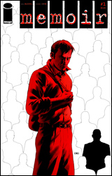 Memoir #1
Publisher: Image
Released: 19 January 2011
Writer: Ben McCool
Artist: Nikki Cook
Letterer: Tom B. Long
Cover price: $3.50
Cover: John Cassaday
Review: Tom Hemmings
One of the greatest strengths of Image is their versatility. For example, one week I can be reading the colorful adventures of MarineMan and then the next I can be reading a black and white investigative-horror about a community with a terrible secret. Whilst writers such as The Goon's Eric Powell bemoan the lack of variety in modern comic books, Image is the perfect example of a company with a wide range of books.
Memoir follows investigative reporter Trent MacGowan on his publicity-fuelled trip to the town of Lowesville. Years ago something horrible but unspecified happened to the town, and today the entire population suffers from collective amnesia. Ben McCool is a part-time Marvel writer who many comic fans won't have had the chance to read much of, but the fact that this book has a John Cassaday cover is sure to grab a lot of people's attention. Does the book justify this interest?
It's really hard to say. I honestly couldn't count the things I think are wrong with this book even if I took my socks off and used my toes. There are characters that ring completely hollow. There's the fact that a journalist is pre-publicizing a piece of journalism on TV before he's even done it. There's the fact that Trent MacGowan even feels the need to be a massive dick in his own internal monologue. That said, it also has an undeniable atmosphere. It's generated through stuff as simple as shadows in the forest and the quirky negative attitudes of the townsfolk, but its there throughout.
A great deal of this has to do with the art. Anyone familiar with the work of Toby Cypress (The Tourist) or Ryan Kelly (Local) will straight away spot the style that artist Nikki Cook is going for. Again, there is so much imperfection that many will find it hard to get past; many of the faces are woefully inconsistent including the main characters, and the physical proportioning varies so much that it looks like MacGowan has broken his neck on a couple of occasions. In fact, one of the townsfolk has a neck like a bag; he more closely resembles Admiral Ackbar than anything human. However, all this actually goes toward the creeping feeling that something just isn't right, and whilst the faces may be inconsistent they are still chock full of character. You would have a hard time confusing the people in this book with each other.
I'm not sure that the atmosphere in this book is enough to justify your money, but I remain interested because, as a mystery, it's pretty good. I'm also curious to see how the art deals with what may or may not be coming. Flip through it.
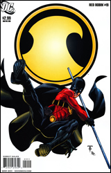 Red Robin #19
Publisher: DC Comics
Released: 12 January 2011
Writer: Fabian Nicieza
Penciler: Marcus To
Inker: Ray McCarthy
Colorist: Guy Major
Letterer: Sal Cipriano
Cover: Marcus To
Cover price: $2.99
Review: Tom Hemmings
Fabian Nicieza is an extremely experienced hand who's been working at major comic book companies for nearly 25 years, and chances are you've come across his work before. On the Marvel side, he was most notably responsible for long runs on Thunderbolts and various Deadpool books — including the excellent Cable & Deadpool. Since shifting over to DC in recent years, Nicieza has mostly been working on satellite Bat-books such as Robin, Nightwing, and Azrael. Red Robin is another in that chain, and sees Nicieza returning for a second go at the often-mishandled Tim Drake.
In this issue we join Tim on a journey through his own mind / cyberspace. On the way, he has to link up with other people who are trapped there while figuring out a way to escape. Really, the appeal here isn't the plot, but the look into Tim's mind, which reveals a hidden desire to be Nightwing plus the odd glimpse into his own imagined future that ties back nicely into the Titans of the Future reality. Unlike some people at DC, Nicieza has gone out of his way to use DC's history to his advantage, actually to some degree rewarding long time fans of the character and trying to maintain their attentions. His understanding of the continuity allows him to play with several ideas and characters that other writers might rather consign to the history books, but it's nice that he recognizes that loyal fans get a kick out of seeing even those minor players utilized once again.
The problems come when you realize that nothing of consequence is actually ever going to happen in this book. As a character, Tim tends to get yanked around. The second a writer finds a comfortable groove with him and provides a stable supporting cast, editorial orders another sudden change of circumstance and everything shifts again. Much like the events of this book, nothing has time to gain any actual emotional traction, and the result is something that doesn't actually feel like it's going anywhere.
Red Robin is somewhere to throw Tim while the rest of the Bat Family gets on with more important things. Bottom line, if Batman is recruiting people to wear his colors, then the pecking order for recruits should be Dick Grayson, Tim Drake, and everybody else way down the line. Why is he still messing around in an irrelevant costume when he should be one of the League of Batmen? All I can think is that DC's keeping him sidelined so when the dust clears post-Morrison, they'll still be able to use him for something. Until that day, Tim is doomed to an editorially mandated limbo as artificial and inconsequential as the one he's stuck in during this issue.
The art is a real plus on this book. Marcus To hasn't had the chance to do much for major companies, but on the strength of this I'd expect to see him moving onto something more prominent fairly soon. His pencils are an excellent base for this art team to work on, and the result is clean, crisp, detailed, and interesting. From recreating the classic Batman and Robin duo to a blood-drenched Joker, this is great work. I can't wait to see what else these guys get the chance to work on.
Flip through this. It's salt of the earth professional comics, but don't go expecting anything to actually happen. But look out for To in the future, the art team is firing on all cylinders.
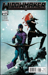 Widowmaker #1
Publisher: Marvel
Released: 15 December 2010
Writer: Jim McCann
Penciler: David Lopez
Inker: Alvaro Lopez
Colorist: Nathan Fairbairn
Letterer: VC's Cory Petit
Cover: Jae Lee
Cover price: $3.99
Review: Tom Hemmings
It's the continuing adventures of Mockingbird and Hawkeye! You know, Mockingbird and Hawkeye? The on-again, off-again husband and wife team that spends most of their time trying to figure out exactly when they were replaced by Skrulls? No? Well they're back, and Marvel felt it prudent to insert a third player into the mix. Also, they named the series after her instead. Welcome, my friends, to Widowmaker.
This book isn't just a random team-up, it's also part of our continuing Comic Books 101 course. This week: What to do with old identities.
If you're writing a comic book character that has a lot of costumes and identities, you're naturally going to want to be green and recycle them. This can result in spin-off characters, such as Captain America's supporting cast of USAgent and Nomad. On the other hand, you can go with creating a new antagonist, such as the black-costume Spider-Man leading to the villainous Venom. Clint Barton recently ditched his Ronin outfit (which was handed down from Echo, fellow avenger and Daredevil lover) for his classic Hawkeye duds (which were recently being worn by Bullseye, another avenger and Daredevil mainstay), and this has lead to someone going through his drawer, taking the Ronin outfit for a spin. Problem is, this classic story device is most effective when illustrated on the front cover. It adds mystery and sells issues. For instance, we've seen Spider-Man fighting another Spider-Man, Matt Murdock duking it out with Daredevil, and, my personal favorite, two Megatrons! It ceases to be that useful when it's not advertised up front.
But enough griping about the concept. It's still Comics 101, and, as such, should be entertaining in a traditional if predictable way, right? Well, it's your basic superhero comic pretending to be a spy story fare, really. There are clunky, expositional moments, and I have problems with a few minor points (e.g. no SHIELD agent would be so deep undercover that they wouldn't know Norman Osborne had taken over for a while). However, to pick too many holes in this would be to ignore the spirit of the comic. It's all about international hero action, and, in this case, exploring the Marvel Universe a bit. The whole thing actually feels a little less dispensable than the usual spinoff miniseries thanks to the characters it brings in, and, yes, the classic "Who is the new Ronin?" storyline.
Artistically this book does the trick for the most part, although it distresses me that when choosing an aspect of Frank Quitely's work to imitate, Lopez picked his female faces. As a result, Black Widow looks like she's been hitting the crack pretty hard, and I think Mockingbird only escaped having giant, tired circles around her eyes because of her glasses. Everything else is great, though. The artist delivers really nice work, and has a good eye for detail. It's so rare to see an accurate depiction of a real vehicle in a comic and yet here it is: a Russian Mi 24 Hind helicopter in mid-firefight. It's these sorts of touches that separate out the good artists from the rest.
Flip through this one. It's mainly for the people who've been following the adventures of Hawkeye and Mockingbird up to this point, but that's not to say that it's bad.
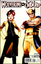 Wolverine and Jubilee #1
Publisher: Marvel
Released: 19 January 2011
Writer: Kathryn Immonen
Artist: Phil Noto
Letterer: VC's Clayton Cowles
Cover: Olivier Coipel
Cover price: $2.99
Review: Sean Lemberg
The perennial runt of the litter, Jubilee's never had a fair shake from anyone: her family, her teammates, her readers, even her life. Perhaps most distressingly for the young former Generation X'er, that trend doesn't seem to be changing course. Depowered by the Scarlet Witch along with most of the mutant race on M-Day, Jubilee felt isolated just hanging out with her former teammates, despite their assurances that she was still a part of the gang. Now infected with vampirism after a surprise attack on Utopia by Xarus, the son of Dracula, she's been completely ostracized from her closest friends, physically as well as emotionally, while they try to figure out where to go from here.
What the whole of this issue boils down to is the entire team trying to walk softly around their newly fanged teammate. Most of the island is trying to work out a way to avoid upsetting her, while at the same time coping with their own sense of innate uncertainty and learning to trust that she won't appear at the foot of their bed in the moonlight with that glint of shadowy hunger in her eye. Thus far, though, the only one who's managed to set aside their feeling of distrust is Logan, with whom she'd already developed a special student / mentor relationship. Some of her former teammates do a better job of masking their emotions than others, but there's a palpable sense of unease that presents itself the very moment she walks into a room, which Jubilee herself doesn't do much to dismiss with her frequent, angry outbursts.
There's probably a decent story in here somewhere, waiting to be unearthed, but Wolverine and Jubilee is taking the long way there. So much time is spent treading water, waiting for all the talk and time-killing to give way to genuine development, that by the time the plot actually does manage to take a step forward, the back cover is just a page turn away. Kathryn Immonen gives her characters some halfway decent dialog this month, but her story structure leaves a lot to be desired.
Phil Noto's subdued, character-focused artwork is the true star of the issue, and while he doesn't get much of a chance to stretch his legs with any particularly interesting panels, his work in the snail-paced establishing pages really shines. I think I'd have abandoned this book around page 10 without a better-than-average artistic showing, and Noto kept me reading to the final page. If he can work this kind of magic with a dull, stagnant storyline, his artwork should be a genuine spectacle when he gets something really juicy to sink his teeth into.
I kept waiting for the establishing shot of this miniseries to go somewhere, but it never delivered. Page after page, I was flooded with repetitions of the same central theme: Jubilee feels unhappy, and her friends don't trust her. Yes, that much was conveyed in the opening blurb inside the front cover — why don't we get some traction and move forward on that theme? Wolverine and Jubilee isn't awful, but it is terribly redundant and over-cautious, a running-in-place waste of good artwork. Flip through it for the visuals and skip the word balloons.
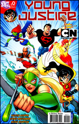 Young Justice #0
Publisher: DC Comics
Released: 19 January 2011
Writers: Kevin Hopps and Greg Weisman
Artist: Mike Norton
Colorist: Alex Sinclair
Letterer: Travis Lanham
Cover: Mike Norton
Cover price: $2.99
Review: Hannah Krueger
It's all come down to this! The young sidekicks of the Justice Leaguers are standing up to their elders, demanding they be let in on the action! They're mad, and they're sure as hell not gonna take it anymore!
And then Batman tells them to wait three days while he decides their ultimate fates. So Superboy, Robin, Aqualad, and Kid Flash spend the next three days waiting for the Bat's judgment.
So, yeah, that was a completely anticlimactic set-up for this first issue. And really, it's not about most of the team. Aqualad and Robin get two pages combined, tops, not counting the pages where the team appears, and even those two pages feel like the writers suddenly remembered that these other two characters exist.
No, this is really The Wally and Superboy Show, a la Abbott and Costello. Wally is the hyper little puppy who's bouncing off the walls and is eager to show Superboy what it's like to be a teenage boy: hanging around the house, eating pizza, going to the mall, you know, all those things the kids do nowadays. However, Superboy seems to be more intent on being a teenage girl pining after the love of her life (or the moment), and desperate to do anything for their approval. Seriously, half of his lines are about Superman taking notice of him. He puts my hormone-ridden teenage sisters to shame for sheer puppy-dogness!
However, the fight scene that takes up the main part of this issue is pretty solid, especially for a comic aimed at the younger generation. It's enough of a knock-down, drag-out fight that Superboy and Wally get to show off their abilities and strengths, but still restrained enough that kids can read it and their parents won't throw a pearl-clutching fit about the violence. I'm kind of irritated that it only showed off Wally and Superboy instead of the whole team, but I assume they'll get more attention in upcoming comics.
Also, a random thing that really bugged me about this: Why the hell is it only Batman who gets to decide if they can be a team or not? Doesn't Superman have a bit of a stake in this, what with his younger clone being involved? Or Aquaman? Or Flash? I mean, they're only their mentors and all, not like they could tell Batman anything about them. Nope, it's only Batman who will be able to decide and judge.
The art on this is very angular, and kind of reminiscent of the Teen Titans cartoon. In fact, the more I look at it, the more it feels like this is what the comic — and possibly the animated series — is trying to be: the new Teen Titans.
Borrow this. I have a feeling that this is gonna be a pretty good indicator of whether or not you like the animated series as well, so consider it a litmus test of sorts.


