Is It Wednesday Yet?
30 November 2010 � Here we are again with another installment of your favorite comic book review series. As always, the reviews are free of spoilers, so read on without fear of having your experience ruined!
Our grading scale is simple:
Buy: An excellent comic book.
Borrow: A good comic, but save yourself some money by reading a friend's copy.
Flip Through: Give it a once-over at the comic shop.
Skip: This doesn't need to be explained.
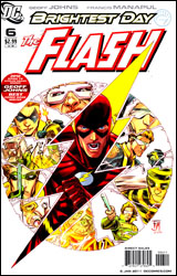 The Flash #6
Publisher: DC Comics
Released: 17 November 2010
Writer: Geoff Johns
Artist: Francis Manapul
Colorist: Brian Buccellato
Letterer: Sal Cipriano
Cover: Francis Manapul
Cover price: $2.99
Review: Tom Hemmings
First thing first: I'm a huge fan of Geoff Johns run on The Flash. His time with Wally West was the first thing that made me wake up to Johns' work, and since then he's gone on to become DC's premiere writer / storyline architect, especially when it comes to revitalizing classic characters. He's made Green Lantern one of the best superhero comics out there through his reintroduction of Hal Jordan, without disrespecting the legacy of the other Lanterns. Unfortunately, I can't say the same for what he's done here.
There is nothing in this comic individual to Barry. With the shift between Kyle Rayner and Hal Jordan you could quite clearly tell they were very different people from very different backgrounds: the military-trained thrill-seeker and the compassionate artist with the burden of being the last Green Lantern. Read this issue of The Flash and all you'd have to change is the names and it could be Wally. There was absolutely no benefit to bringing back Barry Allen as The Flash if this was all they had in mind to do with him. It's not like the whole Spider-Man selling his marriage thing; you can't play devil's advocate and say it provides a whole new range of stories to tell if this is all they're going to do with it. The sole reason to bring Barry back was because that's who the writers used to read, and so they personally prefer him, even if there is, for all intents and purposes, almost zero noticeable difference between the two characters.
I don't want to put down the story, its decent enough. I'm a big fan of how Johns uses the Rogues; they're a really cool group of villains, and it's great to see the future of their team explored a little in this arc. This is the final issue of "The Dastardly Death of the Rogues" story, and it's a solid Flash comic, though it's not up to Johns' previous work with Wally. I would say that the teaser at the end has some interesting implications, so Johns at least has a plan for how he's going to involve Flash in the wider DC Universe.
On the art, Francis Manapul wouldn't be my first choice for this book, as he does a fairly basic job of conveying the kinetic nature of the characters involved. However, he remains an extremely talented artist who produces very solid work, and I will admit there are a few very pretty pages � in particular, a wonderfully realized look into Barry's mind. I think I'd be happier if the comic didn't waver so often between a clean, fully inked style and something sketchier; it's inconsistent beyond the point being able to pin it on Speed Force effects.
Flip through it. I'm not saying you won't like it, but it's not what you might be hoping for.
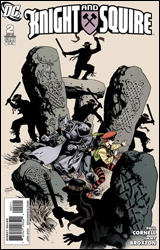 Knight and Squire #2
Publisher: DC Comics
Released: 10 November 2010
Writers: Paul Cornell
Artist: Jimmy Broxton
Colorist: Guy Major
Letterer: Steve Wands
Cover: Yanick Paquette
Cover price: $2.99
Review: Tom Hemmings
I loved this. During his run on Batman, Grant Morrison was responsible for the creation or revival of a lot of frankly very silly characters, including the Club of Heroes / Batmen of All Nations. Among this group of sorry reprobates were Knight and Squire, created in 1950 as British analogues for the Caped Crusader and Boy Wonder. Now, just to make sure you understand, Knight wears metal amour with little bat ears and a cape, and Squire is the only sidekick in the world who dresses sillier than the original Robin. When I heard they were getting a miniseries, I figured it was just another cheap cashing in on one of Morrison's ideas, but then I spotted that Paul Cornell was involved. For those of you unaware of his work, he wrote the excellent Captain Britain and MI13 series for Marvel, and the thought of him being let loose on another English hero piqued my interest. This book did not disappoint.
This is wall to wall silliness. From the utterly hilariously daft villains such as Organ Grinder (w/ monkey) and the fiendish Morris Men, to the plethora of stereotypical British supporting characters that almost steal the show, this was just brilliantly funny. Cornell has a real handle on exactly how to portray the Silver Age era in a modern comic, and has a gift for throwing in obscure gags that I'm not even sure many will get or even spot. Knight has Squire picking up his copy of Total Castle for crying out loud! That's like Batman getting House and Cave Weekly. Squire's mum puts her crime fighting gear on the washing line and no one bats an eye! Oh, and you'd be forgiven for thinking Knight takes his castle / chess motif a little far until you consider how far Bruce Wayne takes the bat thing.
Despite all the daftness, you never get the feeling that Knight and Squire are anything less than capable, experienced heroes. Thanks to her prior greater exposure in team-ups with Robin and the like, Squire is pretty much the lead character, which is interesting when she's technically supposed to be the sidekick. To be honest, I'd be happy to see this status quo maintained; seeing these adventures continue through the eyes of the junior member would be a really fun way of carrying on the series. Knight could use a little more time though. He's basically just filling a costume right now. Although he does get in some almost Adam West-worthy gags,
I'm really surprised I haven't heard of artist Jimmy Broxton before; he has these wonderfully expressive and detailed characters, although any time he wanted to depict one of the less attractive supporting characters it did look like he'd deliberately referenced Rags Morales' art. Generally he's pretty much perfect for this book; there's some really neat work and a great handle on the mix of insane costumes and expressive faces that you need to depict a completely cartoonish parody of a British superhero comic.
Buy this. It's tremendously fun, and utterly silly.
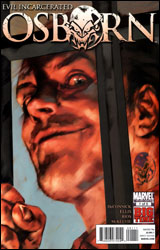 Osborn #1
Publisher: Marvel
Released: 17 November 2010
Writer: Kelly Sue Deconnick
Artist: Emma Rios
Colorists: Jose Villarrubia and Matt Wilson
Letterer: VC's Clayton Cowles
Cover: Ben Oliver
Cover price: $3.99
Review: Sean Lemberg
Norman Osborn has stagnated fairly significantly over the past year. Not that one could blame him, being confined to just 10 square feet of cell space in one of the back corners of the Raft � floating home to Marvel's criminally insane and maniacally dangerous. The ex-Green Goblin hasn't been without his share of visitors since the Avengers forcibly removed him from power in Siege, but for the most part he's been left to spend some time with his own thoughts. As it turns out, that might be all the company he needs, what with the pair of strong-willed personalities crammed in there, each vying for control of his mind and body.
I can get that considering his static locale and lack of company, Norman himself isn't the most likely candidate for a starring role in his own limited series right now. No matter how fascinating his psyche may be, readers aren't going to stream through the doors to follow the adventures of the firmly incarcerated man and his active imagination. As a means to keep this from becoming a single-perspective series of internal monologues, writer Kelly Sue Deconnick has sent us off to a small handful of locations around the globe with at least one thing in common: a subject of conversation. If you imagined the topic to be Norman himself, I'll be around to deliver a cookie shortly. Although his finger is no longer on the button, it seems the Goblin is still a popular subject of debate in various military, press, and religious circles, and for at least one day we get to play fly on the wall.
Bearing that in mind, it still feels quite odd to read a book titled Osborn in which Norman himself has only a few very brief appearances. Understandably, it's the first issue of the series and Deconnick spends most of her time setting up the pins so forthcoming issues have something to bowl over, but at the end of the day it's still the villain who has the most intriguing persona of the lot, and his regular presence is sorely missed.
Deconnick's temporary partner, artist Emma Rios, left me desiring more. Her work dances a fine line between frantic and over-composed, neglecting detail in certain circumstances and pouring it on in others. Her take on the story's few recognizable characters (namely Peter Parker, Ben Urich, and Norman himself) are foreign, a trend that continues when she moves to take on the issue's new faces. There's no sense of adventure or excitement in her work, not that the word-heavy situations she's illustrating have much call for that, but that gives her art a bland, drawn-out personality. Rios seems like a fill-in artist who's missing her opportunity to turn a few heads as a regular. Her page layouts are easy to follow and clean enough, but the artwork itself is stale, faceless, and dry.
I once thought that Osborn was the key to any issue's success. With such a deep, rich, charismatic character already defined beforehand, I was certain that any story could find new life by merely including him. And for some time, that little theory of mine held up. Different writers and different titles all tried Norman on for size, and with very little exception, each came out smelling like roses. Odd, then, that it's the Goblin's own self-titled miniseries that kills it for me. Despite its promise and the character's long string of success stories, this story just isn't a winner. It's slow-moving, witless, and predictable, three traits I never thought I'd assign to anything involving the former head of the Avengers. Skip it.
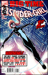 Spider-Girl #1
Publisher: Marvel
Released: 17 November 2010
Writer: Paul Tobin
Artist: Clayton Henry
Colorist: Chris Sotomayor
Letterer: VC's Joe Caramagna
Cover: Barry Kitson
Cover price: $3.99
Review: Sean Lemberg
Spider-Girl may look like a familiar marquee to Marvel regulars, but I think I can safely assure you that the new series is anything but. Casting aside the costume, numbering, identity, and timeline of the under-loved previous series that had so frequently flirted with cancellation, this new number one seems to share only a masthead and a willingness to fight crime with its long-lived predecessor. Set in the present day, Spider-Girl #1 features the debut of former Young Ally Araña in her new getup, swinging through the city on artificial webs during the intermission between classes at Milton Summers High School.
Clayton Henry's artwork is a good way to get a new series off on the right foot. His style is sleeker, smoother, and more vividly realistic than the exaggerated, overly stylized work of both Ron Frenz (on Mayday, the previous Spider-Girl) and Mark Brooks (earlier iterations of this character). The shift in artistic discipline is a nice touch, one that reinforces the differences between the new focal point and those two preceding faces. Araña has grown up a bit since the first time we met her, evidenced by her recent appearances in Amazing Spider-Man's "Grim Hunt" and the short-lived Young Allies series. Henry does a fine job of reflecting that in the character's physique, demeanor, and body language, resulting in a lead that almost feels too mature to still be in high school.
Writer Paul Tobin makes an effort to counterbalance that, interspersing a running set of internal monologues throughout the issue in the form of tweets and IMs. That's not exactly a new trick, but despite a few snags (as in, how is she carrying on a chat at the same time she's putting the boots to a generic villain in the issue's opening pages?) and a dangerous proximity to the realm of full-on gimmicks, it does serve a purpose; these little pseudo-interactive thought bubbles are a quick, informal way to introduce new readers to who this new lead character is, what she's concerned about, and where she's coming from. Presumably so the story can waste little time in diving right into the thick of its first juicy story arc.
Only the drama doesn't start up immediately, or even imminently. Having efficiently established most of the cast within the first six pages, Anya then spends the next dozen on a carefree stroll through the city, shooting the breeze with Susan Richards. When an unspecified threat to the city forces Sue to cut their lunch date a bit short, our lead finally dives into action, although it's of the generic variety. Stopping purse snatchers, halting a carjacking, that sort of thing, with hints and dashes of tweets and IMs still dropped in at appropriate intervals. It's a casually paced introduction to the character that slowly builds to ensure something bigger next month.
The new Spider-Girl has lots of promise, although it's still playing with its ultimate intentions held close to the vest. This opening volley is unusually carefree in tone, moving through the story with the same sense of urgency most folks show window-shopping at the mall on a Sunday afternoon. The artwork is gorgeous, thanks in no small part to Chris Sotomayor's brilliant colors, and the story has spent enough time laying the groundwork for a major shake-up to really have a profound effect. The big question is, will next month's story rise up and take advantage? As it stands, this debut is decidedly middle-of-the-road. Borrow it.


