Is It Wednesday Yet?
25 May 2010 — Here we are again with another installment of your favorite comic book review series. As always, the reviews are free of spoilers, so read on without fear of having your experience ruined!
Our grading scale is simple:
Buy: An excellent comic book.
Borrow: A good comic, but save yourself some money by reading a friend's copy.
Flip Through: Give it a once-over at the comic shop.
Skip: This doesn't need to be explained.
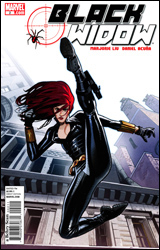 Black Widow #2
Publisher: Marvel
Released: 12 May 2010
Writer: Marjorie Liu
Artist: Daniel Acuna
Letterer: Blambot's Nate Piekos
Cover: Daniel Acuna
Cover price: $2.99
Review: Hannah Krueger
Black Widow is hallucinating and wakes up in the hospital. Something invasive has been done to her, and Wolverine knows something about it. It involves a rose, and is really vague. While Natasha escapes, the Avengers are called to a dark, intimidating room, and it is implied that Natasha has been spying on all of them (isn't that kind of what her character is supposed to do?), and is selling information to the highest bidder. Someone gets shot by someone bad, which seems to corroborate this idea. I can't tell what everyone's supposed to be feeling, because, except for Natasha, everyone's eyes appear to be permanently closed, and their mouths are just weird. Wolverine and Natasha agree that someone is out to get her. There is fanservice, and really vague narration that attempts to be mysterious. And then more people show up.
Black Widow was probably one of my favorite parts of Iron Man 2, I'll be upfront about that. And this has plenty of her being kickass. But a lot of this seems to be built on backstory that I don't know, especially the thing with the rose; it seems to be important, and is connected to her past, but that's all we know.
There are plenty of cameos from other Avengers and baddies. Wolverine (who, as always, is in more books this month than I can count on all of my fingers and toes) in particular may actually have something major to contribute in this rather than making a one-page appearance. It gets kind of annoying, because at least a third to half of this book is taken up by characters that are not Natasha. They simply talk about her, and have no significant interactions with her; give me more of Natasha doing what she does best.
The art is kind of, well, I don't know how to describe it. There are a lot of shadows, and the way that the characters are drawn sometimes — especially with regards to facial expressions — really strikes me as off. There are pages where Widow looks like a coke addict, and, at times, is the only one who appears to have eye color. Everyone else's eyes are just black blobs that are either permanently closed or contorted in some weird expression.
I'd say give this a flip through. If you went into this knowing next to nothing, you might want to find the first issue and see if it does anything more for you. But if you know what you're looking for going into this, you'll probably be able to get more out of it.
 DMZ #53
Publisher: DC Comics / Vertigo
Released: 12 May 2010
Writer: Brian Wood
Artist: Riccardo Burchielli
Colorist: Jeremy Cox
Letterer: Jared K. Fletcher
Cover: John Paul Leon
Cover price: $2.99
Review: Hannah Krueger
DMZ #53 opens with a torture scene, and there's almost an execution. Wow. Fun stuff. What follows is mostly internal monologue catching readers up to the current situation in the DMZ (which is even shittier than normal and includes lots of bombing and raids), and a conversation with the sister of America's Public Enemy Number One.
DMZ is one of the comics that got me into comics in the first place. My friend had the first few trades in her room, and I would usually end up leaving with a volume or two until I saw her next. With DMZ, I loved the concept and seeing what Wood would do next.
And then I was too broke to buy comics, and my friend ended up transferring out.
So, it's nice to be able to catch up on DMZ again. Unlike my other book this week, I at least have a pretty solid idea of what's happened in the interim of where I left off and where I picked up.
I really have to give Wood credit for this issue, because, more than any prior issue that I've seen, he takes the Iraq-DMZ parallel to its logical conclusion. The torture scene is unsettling and it makes sense in the context of the story, versus it being just for kicks. And seeing the bombing of NYC is really effective, especially considering the fact that absolutely no dialog (external or internal) is used while it's happening; there are some very effective pages of destruction, all showing what's going on with no distractions.
Matt's internal dialog, happily, isn't as whiny as it could be, especially in this sort of situation; it's simple, effective, and only helps augment what we already see going on — and in some cases, what can't be seen.
I'm not sure if DMZ is winding down its run, but this issue feels like a penultimate issue; there are recaps of stuff that happened earlier in series, and the entire thing feels like an elegy for what was lost and what's about to happen.
Riccardo Burchielli's art is absolutely astounding. There's loving detail in every bit of it, especially when looking at the graffiti and the design of the DMZ itself. The panels showcasing the bombings and their aftermath are especially effective, and they help carry the story forward without needing to use Wood's words. The colorist, Jeremy Cox, also adds a lot to this entire issue, making it feel that much more vibrant and real.
I'd say borrow this at the very least. If you haven't been following DMZ up until now, this can serve as a starting point to see if you might like it. If you have been following DMZ, well, buckle up, because whatever's coming next, it's gonna be big.
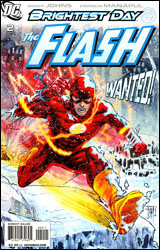 The Flash #2
Publisher: DC Comics
Released: 12 May 2010
Writer: Geoff Johns
Artists: Francis Manapul and Joel Gomez
Colorist: Brain Buccellato
Letterer: Sal Cipriano
Cover: Francis Manapul
Cover price: $2.99
Review: Guest
So two issues in and things are already sort of confusing in the world of The Flash. You see, the Mirror Master died in front of Barry Allen. Only it wasn't Mirror Master, it was Mirror Monarch, a member of a 25th century version of the Rogues working on the side of good. Meanwhile, the proper Rogues are up to, well, not much really.
Honestly, there's not a whole lot happening. There's a mystery involving someone framing Barry for the death of the Mirror Monarch, but the issue feels like it's more about displaying Barry's powers than anything else. We still don't get much of a sense of who Barry is, and I'm starting to think we never will. If Johns can't do anything with the character, I'm hard-pressed to think of someone who can. This isn't to say that Barry's written terribly, but we're just getting more of the white bread / clean slate characterization we've gotten since his return. Digger Harkness is more interesting at the moment, and he's only in this one for a few pages. Hell, this book is more proof than anything that the Rogues need their own book, and Johns should be the one to write it. If feels like he's having so much fun with Captain Cold that when he has to go back to Barry to further the plot, the wind gets sucked out of him. Main characters of ongoing books shouldn't be wind-suckers.
The plot itself has some potential, and the Captain Boomerang story is one that's clearly leading up to big things. The Renegades (as the future vigilantes are called) could be an interesting recurring threat, but I get the feeling that they only exist here so that Flash can have at least one big fight per issue in this arc. Though this may be selling Johns short, after this, I wouldn't be surprised if they're never mentioned again.
Manapul is good here. I never much liked him as an action artist, but he does what he can. He seems to enjoy having Barry do all of these crazy feats of speed, and it works most of the time. But his style can still fall apart and get a little too sketchy for my tastes. On the other hand, he can draw talking heads with the best of them, and his facial expressions are superb — with the exception of one really weird panel where Barry's lip seems to be made out of spikes. Yeah, it's strange.
I'll be generous and give it a borrow. I didn't hate it by any means, and that's more than can be said about a lot of the stuff I review. It just doesn't feel like required reading, and considering the team behind it, you would expect more than that.
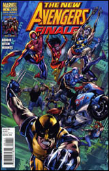 New Avengers Finale
Publisher: Marvel
Released: 12 May 2010
Writer: Brian Michael Bendis
Pencilers: Bryan Hitch and Stuart Immonen
Inkers: Butch Guice, Andrew Currie, and Karl Story
Colorists: Paul Mounts, Justin Ponsor, and Rain Beredo
Letterer: Chris Eliopoulos
Cover: Bryan Hitch
Cover price: $4.99
Review: Sean Lemberg
Those who lost track of the latest Marvel super-event, Siege, may be surprised to see the much-ballyhooed New Avengers series drawing to a close after just over five years of publication. Truth is, even those who closely followed the series have a good reason to feel surprised, since the book never really seemed to reach solid footing. This unusual pairing of solo heroes, borrowed members from other squads, and forgotten faces was always changing bases of operation, dodging proponents of the Registration Act, or cleaning up after the latest crossover event. The team rarely enjoyed self-contained adventures of its own, although the promise of that kind of establishment seemed to be constantly looming just over the horizon.
Well now the Act is in doubt, Norman Osborn has been removed from power, and it's a new day for both the Marvel Universe and the Avengers themselves. So, naturally, that occasion needs to be commemorated with a new first issue, and New Avengers was one of the titles marked for restarting. I guess those halcyon days we were all looking forward to will never arrive, at least not under this banner.
Seems like the whole purpose of this little epilogue is to mop up some lingering bits of plot grime, tie up (or snip off) a few lingering loose ends, and generally just chill with the old team one last time. If that sounds pretty close to the status quo, that's because it is. But writer Brian Michael Bendis has scattered enough little tidbits around the issue to make the whole deal feel much more like a transition and less like a continuation. Take Luke Cage's speech to the exhausted squad of confused Avengers, for example. Out of context it sounds like another chance for Bendis to work in a bit of his trademarked realistic dialog. Bear in mind the talk of Cage heading a new team of Avengers, however, and you'll take notice of both the mobilizing effect that speech has on his teammates, and the knowing grin smeared across Captain America's face.
There are also about 20 pages of pure, balls-out action. Over the course of this series, I don't think there's been a single occasion where the team met up with someone who could stand up to the sheer force of their combined powers, let alone one who could take it without disintegrating into a million tiny pieces. In their final hours together, just such an opponent falls right into their lap, and the team is all too happy to take that opportunity and have some fun.
The superstar art team of Bryan Hitch and Stuart Immonen is in charge of amplifying and electrifying this rather unconventional ride into the sunset. In the past both guys have shown off the innate ability to make relatively small moments feel like really big deals, a trait which is exploited to its fullest during the aforementioned brawl. Hitch and Immonen thoroughly enrich the issue with their usual cinematic touch, although a dark, murky color palette often confuses many of the finer points of their efforts. Standing amidst the dust of Siege's final arena, I can understand the need for a dark, cloudy look. Dancing amid exploding walls and constant gunfire in the heat of battle, however, there's a bit less of an excuse. Great colorists need to know when and how to pull back and let the artists reach their audience, and in this case the palette is constantly standing directly in between the two.
This issue marks the end of a long, emotional chapter for the Marvel U. It's the culmination and conclusion of everything that was set into motion way back in Avengers: Disassembled. And, for all the confusion and aggravation inspired by that story and the half-dozen crossovers that followed, in the end it's all come together into a single, perhaps too-neatly wrapped little package. The ride wasn't perfect, but really, what is? Buy it.
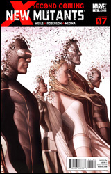 New Mutants #13
Publisher: Marvel
Released: 12 May 2010
Writer: Zeb Wells
Artists: Ibraim Roberson and Lan Medina
Colorist: Brian Reber
Letterer: VC's Joe Caramagna
Cover: Adi Granov
Cover price: $2.99
Review: Guest
When the first word in a comic is "Cable," you're off to a bad start, and I'm willing to admit that I had the score for this one already figured out. But that's the funny thing about expectations, rarely do things pan out the way you think they should. Hell, I know this as well as anyone. I wasted six years of my life watching Lost.
Oh yeah, I went there.
While I'm pleased to say that this issue was better than I thought, there are still some problems here. For starters, when your book is titled New Mutants, don't you think the team as a whole should show up for more than one page? It's also the middle issue of a 14-part X-Men crossover, and it's the most disjointed X-event ever. Well, at least since the last one.
So Cable and Jean Hope have returned to the present and have arrived on Utopia. Bastion (a name I never thought I'd type in 2010) is up to some bad stuff, and some people have died along the way. That's really all that's going on here, and if you don't read this stuff on a regular basis, don't even bother. They're going to throw about 20 characters at you that you've never seen or heard of before, and you'll still have to buy seven more issues to get the whole story — not counting the other tie-ins. Despite all of this, it manages to squeeze in a few good character beats and a fun, albeit brief fight.
The art is good when people aren't moving. Characters are pretty, yet completely without grace. And Hope seems to have a different face in every panel. The coloring doesn't help, making everyone look like a shiny wax statue. Since I'm pretty much at the stage where I could never read another X-book again for the rest of my life, I'm not really the target audience. It was better than I expected, but it still doesn't deserve anything more than a flip through.
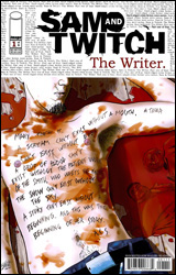 Sam and Twitch: The Writer #1
Publisher: Image
Released: 12 May 2010
Writer: Luca Blengino
Penciler: Luca Erbetta
Inker: Fabio Bono
Colorist: Filippo Rizzu
Letterer: Ben Timmreck
Cover: Luca Erbetta
Cover price: $2.99
Review: Desmond Reddick
In this story, a serial killer obsessed with writing all over his crime scenes and victims is loose, and the two detectives from Spawn have to team with a profiler whose specialty is the written word to catch him.
Despite an opening that is very cinematic and extremely impressive in its storytelling, this is a completely aggravating reading experience. Right off the bat we are given the face and lair of the killer, so there's no mystery there. So then the conflict and plot is driven by the characters as they try to get along while trying to find the killer. Which is fine. In fact, it's how I prefer my murder mysteries. When they're done well, that is. But then the fractured storyline of something that will happen to Sam in two weeks is introduced in a failed attempt to create intrigue. It's almost enjoyable to see such a shitheel go through something horrific.
The problem with this story is that there are no characters. Sam is portrayed as an overweight brute without a brain whose form of characterization is that he's rarely seen without a chocolate bar or a cigarette in his hand. His voice would be right at home on shock jock radio, which is free, so you don't need to waste your money to read it here. Twitch is just a nonentity; he has zero charisma or voice. Both of these characters are black holes of entertainment. They ensure that no fun can happen on behalf of the reader, and they do it well.
In fact, the very idea of a forensic profiler whose specialty is the written word intrigues me. But the writer of this story, Luca Blengino, goes out of his way to keep her out of the story completely. The need to introduce every principle character in a four-issue series in the first issue is paramount, but at least give her something to do other than be annoying for three panels and disappear completely.
The art, by Luca Erbetta, is the only saving grace. It, along with the coloring, makes this a palatable experience in a small sense. The visual style is distinct and the storytelling is very good, especially in the opening scene. I've been trying to think of an artist to compare Erbetta with, but I simply can't.
The one thing worse than the story is the lettering. I understand the need to spice things up in the lettering department, but when it's done to the detriment of the book's readability, it's a problem. The letterer made a decision to put the text right over the art with a chalk underline. It's an interesting choice, but ultimately rules out being able to read half of the book. If it's not set against a dark background, it's a lost cause. Word balloons are a little clunky and old school, but there's a reason for them: they're functional. They've worked for three quarters of a century. When you refuse to use them, you take the risk of alienating your reader and that is what this book has done.
Reading Sam and Twitch: The Writer is frustrating, boring, and disappointing. The art is superb but is failed in every way by the rest of the creative team. Skip it, but keep your eye out for Luca Erbetta.
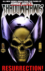 Shadowhawk #1
Publisher: Image
Released: 12 May 2010
Writer: Dan Wickline
Artist: Tone Rodriguez
Inker: Frank Bravo
Colorist: Frank Bravo
Letterer: Ed Dukeshire
Cover: Tone Rodriguez
Cover price: $3.50
Review: Desmond Reddick
Good morning, class.
Remember where we left off yesterday?
Shadowhawk is back. Not the young kid that replaced him for a cup of coffee. I mean the original guy who died of AIDS after a wicked spree of breaking purse-snatchers' backs. He fights people. Other people like him because they still think he's the heroic kid who was just a regular vigilante of the non-crippling kind.
Great, we're all caught up. Yes, Jessica?
No, you can't get AIDS by punching someone in the back.
So, where was I? Ah yes, historically speaking, before all of you were born, a bunch of hotshot artists broke away from the company that makes Spider-Man comics and started their own company called Image. And they brought along a guy named Jim Valentino.
I'm not sure why, either, Travis. Some things in history are not explained by the benefit of hindsight. It's a good lesson to learn.
While Shadowhawk was by far the lowest seller of the initial Image line, it still had what the others did not: a story. And you could argue that the evolution the brand went through was most significant from then 'til a few weeks ago — before this book came out. He got AIDS, hunted for a cure through time and space, died, passed on his legacy to another character, and revealed the Shadowhawk persona to be something prevalent through time since at least the ancient Egyptian era. Quite a journey over 20 years, wouldn't you agree?
Well, another important lesson to learn about history is that it repeats itself. Because after all of that evolution, it's still the same old guy under the costume who's ready to break some backs again, am I right?
Good question, Lindsay. I honestly can't say. I would guess that he has perhaps found the cure for AIDS but isn't sharing it with the world. I wouldn't know because it isn't even glossed over in this issue. Any ideas?
Sam? Good idea, but no. Retcons aren't being covered until second term.
Luke? Seriously. Read the book next time; punching reality was last week.
Timmy, get your finger out of your nose!
Okay. Here it is. What this is is an example of a well-worn property being trotted out for another spin around the bend even though there's absolutely no call for it. Valentino is trying to make a hero that was barely relevant 20 years ago relevant in our modern era. He's done two very interesting things:
01. He's stepped aside to let another creative team run Shadowhawk, ensuring it has a chance of popularity.
02. He's hired Steve Niles to write the backup (also featuring Shadowhawk) that he himself is drawing.
Why won't it work, Jennifer? The book still has all the failings it had in its original run. If the Image artists were the Swedish Bikini Team, then Valentino was their ugly, hunchbacked laundry girl. Nothing has changed. Even the new creative team has crafted a story that both looks and reads like the original run of Shadowhawk stories.
This will ensure its mediocre placement as a footnote in the grand history of the great Image Comics movement. And one more thing...
[bell rings]
[chairs scuff floor and students stand to leave]
I WAS GOING TO ASSIGN THIS AS FURTHER STUDY THIS WEEKEND, BUT SKIP IT AND REMEMBER: NEXT FRIDAY YOUR DISSERTATIONS ON COUNTDOWN ARE DUE!
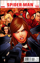 Ultimate Comics Spider-Man #10
Publisher: Marvel
Released: 12 May 2010
Writer: Brian Michael Bendis
Artist: David Lafuente
Colorist: Justin Ponsor
Letterer: VC's Cory Petit
Cover: David Lafuente
Cover price: $3.99
Review: Sean Lemberg
Aunt May's home has turned into a boarding house for homeless superheroes in hiding. After taking in Johnny Storm and introducing him to Peter's high school as a distant cousin, they turned the exact same trick again, this time with Bobby Drake. Sounds a bit conspicuous, right? Well, don't forget to factor in the rising public distrust of mutants, Kitty Pryde's public life as just such an individual, and the arrival of a large group of federal agents who would like to share a few words with her. Suddenly a pair of vaguely familiar new students with dyed hair doesn't seem like such a big deal.
Make no question about it: this series has changed decidedly since Ultimatum. Not just in terms of its cast, which has shifted noticeably from a solo book with irregular guest spots into a full-fledged monthly team-up series. Not just in subject, flip-flopping from a superhero book with a side of relationship drama into an after-school special with a dash of superheroics thrown in for flavor. It's also completely changed its tone. What used to be a genuinely exciting series with a good sense of humor, tight drama, and great action — appropriate and enjoyable for all ages — now feels more like a girl's manga digest. Brian Michael Bendis still shows flashes of what made him one of my favorite writers when this series was running under its original title, but he pairs that with the willingness to linger and lost maturity that's turned me off to him lately. This is a series that I used to identify with, one that I think universally connected with anyone who had trouble communicating with their peers in high school. Lately, it's only served to remind me why I don't hang out with kids that age today.
David Lafuente's artwork is horribly frustrating to cope with, particularly after Mark Bagley and Stuart Immonen's long, sustained preceding runs. Lafuente's layouts — far and away his greatest strength — improve every month. He tells a fantastic story in between the panels and shows top-notch pacing throughout this issue. It's incredibly easy to read, and a quick scan tells the whole story without sacrificing any emotion. His actual renderings, on the other hand, have faded just as quickly as his storytelling has improved. As Lafuente streamlines and simplifies his already-bare pencils, the artwork itself begins to feel incomplete and terribly, excruciatingly rushed. His grip on the characters, which was extremely loose to begin with, has all but come undone at this point. After 10 issues, you'd think he'd have a pretty good idea of who the cast is and what they look like, but I still found myself citing the word balloons to see which face in the crowd belonged to Peter Parker. Lafuente's foundation is solid, but his execution gets worse with each issue.
It's a shame what this series has become. Where previously it stood apart from the pack, an example of what made comics great in their heyday, today it merely reinforces some of the most glaring flaws about the modern mainstream; it's meekly written and amateurishly illustrated, but it absolutely meets its deadline every single month. Skip it. Apart from a brief moment provided by the school principal, of all people, this series is going nowhere I'm interested in visiting.


