Is It Wednesday Yet?
04 May 2010 — Here we are again with another installment of your favorite comic book review series. As always, the reviews are free of spoilers, so read on without fear of having your experience ruined!
Our grading scale is simple:
Buy: An excellent comic book.
Borrow: A good comic, but save yourself some money by reading a friend's copy.
Flip Through: Give it a once-over at the comic shop.
Skip: This doesn't need to be explained.
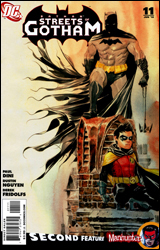 Batman: Streets of Gotham #11
Publisher: DC Comics
Released: 21 April 2010
Writer: Paul Dini
Penciler: Dustin Nguyen
Inker: Derek Fridolfs
Colorist: John Kalisz
Letterer: Steve Wands
Cover: Dustin Nguyen
Cover price: $3.99
Review: Desmond Reddick
In this one, Damian is trapped in some weird performance and Zsasz is on a killing rampage. Oh yeah, and there's a redheaded kid with bizarre superpowers who fights Damian before they come together to take on Zsasz. This, all while Batman talks to a couple of goons outside. That's pretty much it.
I love Zsasz. I really do. But can someone tell me how a trained ninja with a katana and a ginger Incredible Hulk have trouble taking on a maniac with a kitchen knife? Seriously. Not once do we get the name of the kid with superpowers. Is he supposed to be Blockbuster? Well, this could be a Robin / Prime team-up. But seeing as the Milestone Universe and the Red Circle Universe have been co-opted by DC, I don't see them doing an Ultraverse crossover anytime soon.
On top of that, Damian (dressed in civvies) feels the need to paint a tuxedo mask over his eyes in blood. Despite the fact that he just told Zsasz he was Robin by doing this, thus forcing him to up his game and be less reckless, doesn't he know that's how you get Hepatitis C? Really, that's how I got it.
After the bloody brouhaha, Damian ends the battle in a way that he could have ended it in panel one. We learn nothing new about any of the characters, not even Red Ginger Hulk. The exercise in mediocrity ends with an attempted piece of moral weight, but it falls flat because nowhere in the preceding pages are we made to care about the outcome.
Bravo, Paul Dini. You have officially crafted the most inconsequential Batman story I've ever read. And I've read some doozies in my day.
Not even Dustin Nguyen can save this heap of "I don't care." But he tries, I'll give him that. The action is given a very frenetic feel and it really sets the quiet moments apart. Zsasz is made to look like a real threat even though he shouldn't be, and Ginger Hulk is an interesting presence. Damian is a little impish in appearance, but Nguyen isn't the only one who draws him that way. In fact, when he isn't drawn that way he looks too old, so I can't really count that against him.
The backup — yes, it's a backup — featuring Manhunter is so incessantly dull that I can't bring myself to care about it even though it is about Dr. Arkham and is drawn by Jeremy Haun. It should be right up my alley.
This is just another example of the non-essential extended Bat-universe. This is the second issue I've read of this series and it feels exactly the same as the first. Dini is treading water and no superstar artist can make it palatable. I think it's time for DC to trim some Bat-books, starting with this one. Skip it.
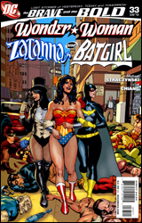 The Brave and the Bold #33
Publisher: DC Comics
Released: 21 April 2010
Writer: J. Michael Straczynski
Artist: Cliff Chiang
Colorist: Trish Mulvihill
Letterer: Rob Leigh
Cover: Jesus Saiz
Cover price: $2.99
Review: Sean Lemberg
Since its relaunch a couple of years back, The Brave and the Bold has gone through a series of subtle shifts in concept. Always a team-up book at heart, the permanence, length, and importance of each story has changed shape somewhat routinely with the introduction of each successive writer. In its latest incarnation, the book serves as an addendum, expanding upon and rounding out characters and relationships that don't get a lot of time under the spotlight in DC's regular ongoing books. While the tone is generally playful and light, sometimes it will surprise us with an unexpected dash of emotion, revisiting chapters in certain characters' lives that aren't entirely rosy.
As you've probably gathered, this would be one of those issues. The majority of the tale is optimistic enough, a rare night on the town for the intimidating trio of Wonder Woman, Zatanna, and Barbara Gordon — while the latter was still donning a cape and cowl. The three hit the clubs and enjoy a little personal interaction, nothing too weighty or profound at first glance. In fact, as the page count began to swell, I wondered if this chapter would offer anything of consequence or if it was just here to provide a month's worth of filler. As with many of my own late nights out, the conversation suddenly takes a turn for the serious.
J. Michael Straczynski doesn't quite spell it out for you right away, but when Diana starts talking about the inevitability of fate and the power of overcoming its challenges, the ultimate direction of this month's story quickly becomes obvious. It transforms a formerly fluffy tale without much weight into something that's a little bit deeper, more insightful, and meaningful.
Cliff Chiang isn't the permanent artist for Brave and the Bold (regular penciler Jesus Saiz still provides the cover), but he makes a good enough showing that I don't think it'll be long before DC fits him into an ongoing gig somewhere. His restrained style — a mix of the Kubert brothers and Frank Cho — was a good choice for an issue that's focused on three strong female leads. Chiang gives them each a willful, confident air without neglecting their looks. The trio may be gorgeous, but they're also not ditzy or meek — which is something that's often much easier said than done in this industry. My one main complaint was in how difficult it was to tell Zatanna from Diana in their civvies, but that's a mystery that's fairly easily solved once they open up with a little dialog. Chiang's work is smooth, efficient, and appropriate, a great fit for Straczynski's plans.
This isn't an issue that's going to radically alter anyone's perceptions of the characters. At best it's a companion piece, and a fleeting one at that. Its connection to one of DC's most shocking moments is sparse, but I think I prefer it that way. Straczynski isn't meddling with a story we already admire, he's just showing it from another angle. It's not essential reading by any means, but fans of any of these characters will want to give it a long look. A bite-sized success, short but sweet. Borrow it.
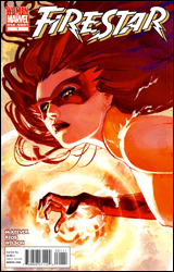 Firestar
Publisher: Marvel
Released: 21 April 2010
Writer: Sean McKeever
Artist: Emma Rios
Colorist: Matthew Wilson
Letterer: Kristyn Ferretti
Cover: Stephanie Hans
Cover price: $3.99
Review: Sean Lemberg
It's been some time since Firestar enjoyed a taste of the limelight. Whether she's been running with the Hellfire Club, the New Warriors, Spider-Man and Iceman, or the Avengers, it seems like she's always been an extra: seen but not heard. That's something of a shame, because her personal story is surprisingly deep and fleshed out.
Under writer Sean McKeever's hand, Firestar's tough luck takes center stage, shifting her from an also-ran that most readers remember as one of Spidey's amazing friends into a sympathetic figure who stares down terrible personal adversity every day. Like most heroes with a secret identity, she juggles an active private life with regular costumed patrols — but her powers, for all the good they're doing, are also slowly killing her. Having never developed immunity to the microwaves that drive her abilities, she's been stricken with a cancer that saps her strength and willpower. It's a tragic turn for a character that's usually so cheery and upbeat.
Despite being handed such a complicated, multifaceted situation, McKeever never takes it anywhere. Cassie's struggle with her identity and the effect it's having on her health are the focal point of the story, but she finds no solutions or personal breakthroughs this month. Really, we're just watching her deal with the situation day-to-day and eavesdropping on her depressing social life. She feels uncertain about her place in the world, and despite the assurances of her friends and family the readers don't get any reason to believe she's wrong for doubting herself. Is it worth literally killing yourself to stop a couple joyriding teens, or pull a few cats out of trees for old ladies? Most one-shots don't waste a lot of time in getting right to the meat of the subject, but Firestar seems content standing perfectly still and mumbling to itself.
Artist Emma Rios brings an extremely minimal style to the table, one that had me immediately comparing her work to that of the Luna brothers. Each renders their characters with smooth, uninterrupted lines and very little elaboration. The method isn't without its fans, but I can't say I'm among them. It feels awkward, like there's a certain invariable that's been stripped away, crucial to finalizing a good composition. There's no texture to be found in Rios's ultra sleek, simple-to-a-fault artwork, and depth of any kind is a realm that's left to the colorist to explore. That results in a page that feels very unbalanced and faint, like it's constantly in danger of floating off into space.
This may be the least consequential single-issue story ever. It goes absolutely nowhere, and accomplishes little more than establishing who the lead is and what her present situation looks like, all of which had already been covered by the static blurb inside its front cover. It's a somber story by design, but not one that left me feeling any closer to its cast when I finally polished it off. This could've been a real gem, given the unheralded trials its lead has gone through of late, but instead it's maddeningly futile. Skip it.
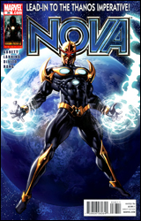 Nova #36
Publisher: Marvel
Released: 21 April 2010
Writers: Dan Abnett and Andy Lanning
Artist: Andrea Divito
Colorist: Bruno Hang
Letterer: VC's Cory Petit
Cover: Mike Deodato
Cover price: $2.99
Review: Desmond Reddick
Annihilation. Annihilation 2: Electric Boogaloo. War of Kings. Realm of Kings. Burger of Kings. For years, the cosmic arm of Marvel has been a microcosm for the publisher as a whole. Too many sea changes not allowing for new readers to jump in and get acquainted with any sort of status quo before the whole world is turned upside down again. This one is no exception.
In this issue, Hal and Kyle band together... sorry, my bad. Nova and Darkhawk band together to take on Cthulhu and evil versions of our heroes. Simple enough. And despite not knowing what the hell Nova and Quasar are talking about in the beginning of the book, why Darkhawk is there, why Namorita is alive, and who the hot scientist is, the book is relatively readable.
It's a pretty basic superhero comic, really. Especially when it employs the good ol' answer to how to confront an ancient evil god: beat him up and send him back through the portal from which he came. But it all feels like action with no consequence, and when it finally does stumble towards the end, we're told that it's all been leading to — you guessed it — The Thanos Imperative! That's right, another event.
So this story is meant to be a small bridge between events, and yet it tells us nothing about the characters, has action that really doesn't matter, and does a ramshackle job of introducing us to the world. In a sense, it is a complete and utter waste of paper.
It's like the whole thing was just leading to the full-page ad at the back. And only for $2.99!
The art is serviceable. It won't tickle your fancy either way. In fact, it's a little nice to see someone who obviously takes visual cues from Mark Bagley with Nova and Namorita in the cast of characters. The art style and storytelling are both very reminiscent of Bagley's work from the 1990s, but this book needed a wow factor on the scale of someone like Stjepan Sejic in order to make it worth taking the time to look at.
Instead, this story put a cosmic nail in the coffin for me at Marvel. They are impenetrable half the time and just plain mediocre the other half. It is imperative that Marvel stop trying to shine a light on a portion of their world that doesn't look good under scrutiny. Imperative. Get it? Skip it.
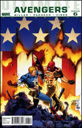 Ultimate Avengers #6
Publisher: Marvel
Released: 21 April 2010
Writer: Mark Millar
Penciler: Carlos Pacheco
Inker: Dexter Vines
Colorist: Justin Ponsor
Letterer: VC's Cory Petit
Cover: Carlos Pacheco
Cover price: $3.99
Review: Guest
If you don't care about the Ultimate Universe, then there's a lot to process here. Captain America found out that the Red Skull was his estranged son, and went rogue in an effort to find him before SHIELD did. Fury responded by forming the Avengers specifically for the purpose of retrieving Cap, which they manage to do right around the time Red Skull finds the Cosmic Cube. Cap, as expected, escapes and heads to Alaska to meet up with the whole gang.
Really, that's as coherent as this whole thing gets. We get some misplaced jokes, a lot of fighting, and not much else here. Leave it to Mark Millar to write a book in which I can't stand any of the characters, hero or villain. I'm all for shades of grey, but that doesn't mean that every hero needs to secretly be a wuss or a selfish prick, nor does it mean that a villain that just spent the past six issues in a state of puppy-crushing glee can be instantly redeemed by proclaiming that his daddy didn't love him.
Honestly, reading stuff like this makes me wonder how Millar can be heralded as one of the best in the industry, considering how often writers are taken to task for their failures as often as their successes. This is why we needed to kill the Ultimate Universe? We couldn't possibly tell a story of such a predictable caliber unless we killed half of our characters first? Makes sense to me.
On the bright side, the art is really good. Pacheco thankfully isn't drawing for the core universe, so the panels are bright enough for his work to breathe a bit. His Red Skull design as a whole is pretty vicious and he even manages to make some of the lamer outfits (like Hawkeye's) look somewhat plausible.
There's really nothing to this book. The writing is such a blatant attempt at innovation that it comes off as by-the-numbers, and there's no reason for the $3.99 price tag. Flip through it for the art and ignore the rest, as most seem to be doing with the Ultimate Universe these days.
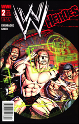 WWE Heroes #2
Publisher: Titan Comics
Writer: Keith Champagne
Artist: Andy Smith
Colorist: Hi-Fi Color Design
Letterer: Comicraft
Covers: Andy Smith
Cover price: $3.99
Review: Guest
I quit.
No, not the site. I'm quitting Earth. I refuse to exist on the same planet as the people — no, the fuckwads — that created this comic. No. It's not a comic. It's not even good enough to be a terrible comic. It's so bad that there isn't a word that exists to describe it, so I am forced to make one up: horrificent.
Before I go any further, I should point out that I indeed did request this one. I had heard so many bad things that I wanted, nay, I needed to know if they were true. I felt it was my civic duty to confirm if such a thing actually existed.
It does, and I'm going to spoil the hell out of it, so be warned.
Since the beginning of time, two immortal warriors have done battle: the Shadow King and the Firstborn. No, those aren't the liner notes to a Cradle of Filth album. That's the plot. Apparently, the Firstborn is a member of the WWE roster, and the Shadow King has hired terrorists to invade Wrestlemania.
So Triple H and Undertaker are having a match. Taker uppercuts him with a sledgehammer, and Triple H doesn't even leave his feet. Cut to a shot of the fans, who look like the lowest forms of life in existence. Wait, scratch that. Everyone this artist draws looks like an idiot.
The terrorists quickly take over the event and lead the entire roster to the ring with their guns. By my count, the WWE roster is apparently now 14 people. Chris Jericho doesn't take kindly to this foolishness and starts fighting back. The terrorists then take him behind a curtain and kill him.
I'll repeat that.
They. Kill. Him.
The lead villain then grabs the bell and mockingly suggests a 10-bell salute in Jericho's memory. As if it couldn't get any worse, Triple H reveals himself as the Firstborn (shocker, I know) and then fights the Undertaker for some reason. This then leads to Triple H somehow having a heart attack and also dying. We then cut to a shot of a bunch of wrestlers crying over the death of their friend. One of these wrestlers is Umaga.
Yeah. Funny stuff's over. This pissed me off.
For those that don't know, Eddie "Umaga" Fatu actually died late last year — of a heart attack. And the worst part is, this isn't an anomaly. There are at least one or two major deaths in wrestling every few years, and a vast majority of them are from drug-induced heart attacks. How they could have let something like that pass absolutely astounds me.
Was this book intended for children? Clearly that's the target audience of the WWE these days, but I wouldn't let a child anywhere near a book that clearly shows their wrestling heroes dying. These aren't just fictional characters being used here. These are representations of real people that truly exist, and could one day actually die this way. Was this book intended for adults? I can't imagine that being the case, considering how absurd the story is. The truth is that its intention is equal to its responsibility. There is none shown here. This is a pathetic cash in on a joke of a license written by a hack with no concept of a story, and drawn by an artist that would get laughed at by any legitimate comic publisher. This brings down the art of comics and what little dignity pro wrestling has left.
Fuck Keith Champange for writing this book and fuck WWE for letting it happen.
I refuse to grade this. It doesn't deserve one. Consider this the last time any of us review one of these books. They don't deserve our publicity.


