Is It Wednesday Yet?
23 February 2010 � Here we are again with another installment of your favorite comic book review series. As always, the reviews are free of spoilers, so read on without fear of having your experience ruined!
Our grading scale is simple:
Buy: An excellent comic book.
Borrow: A good comic, but save yourself some money by reading a friend's copy.
Flip Through: Give it a once-over at the comic shop.
Skip: This doesn't need to be explained.
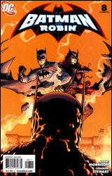 Batman and Robin #8
Publisher: DC Comics
Released: 10 February 2010
Writer: Grant Morrison
Artist: Cameron Stewart
Colorist: Tony Avina
Letterer: Jared K. Fletcher
Cover: Frank Quitely
Cover price: $2.99
Review: Sean Lemberg
After taking down his successor as Robin in a previous adventure, Dick Grayson's next challenge as the resident Dark Knight is in the same vein. In a roundabout way, you could say his new opponent even hails from the same shadowy family. It seems like the search for Bruce Wayne has come to an end, and the original caped crusader isn't pulling any punches when confronted by his most loyal prot�g�. That is if everything really is exactly as it seems.
Given that this is a Grant Morrison-written series, that last statement is no certainty, with Batman and Robin #8 proving to be a perfect case in point. The front cover teases a Batman vs. Batman throw-down, with Bruce reanimated by a Lazarus Pit and Dick spoiling for the fight of his life. And with a few caveats, the interior delivers. Thing is, that's not Bruce. Not exactly, anyway. But it also isn't a doppelganger.
This is a tricky plot, with a lot of close calls and moments of pause, but at the end of the day Morrison's narrative is able to pull off some crafty stunts while avoiding any major calamities. His explanation for the misleading premise actually makes a fair amount of sense, and at the same time answers a few nagging questions left over from several of the Bat's previous activities. Doting followers of the extended Wayne family will enjoy a few "Aha!" moments, while those with an expectation for self-contained yarns will more than likely see the issue's explanations as something of a cop out. In many ways, your enjoyment of Batman and Robin #8 will depend entirely on the breadth of knowledge you carry into it.
Of course, Morrison has his problems. In particular, I've had enough of the cutesy-speaking, theme-garbed villains that have hung around this series since its start. This month's dialog, however fleeting it may actually be, is also a shortfall. The writer is so dedicated to reminding his audience that the issue takes place in England that several of its supporting characters sound like walking, talking stereotypes.
I'm not entirely sure what to make of Cameron Stewart's artwork. He's clearly the best compliment Morrison has enjoyed since Frank Quitely left the series � which I realize isn't saying much since I didn't care at all for Philip Tan's work � but he has a few hang-ups that I've struggled to move past. His very bold, composition-centered illustrations hug the fine line between stylization and oversimplification. Everything and everyone feels extremely thick and round, with the approach working better in some situations than in others. Stewart's work in the Batman vs. Batman fight scene is panicked, crazy, and chaotic � which are both positives and negatives. I'm sure the confusion was probably what Morrison was shooting for, with readers left uncertain about which brawler was the good guy, but it also slows the action way down in what should've been a very fast-paced, competitive fight.
After taking a moment's pause in the preceding arc, Batman and Robin appears to be back on the right track with its latest turn. While this issue is much more straightforward and less eccentric than the title's first few issues, the actual storytelling has more gravity and depth to it. Cameron Stewart won't benefit from any comparisons to Frank Quitely, but he's enough to get the job done and even turns in a few panels that had me wondering if he might some day begin to rival his better-known predecessor. There's some hope for this series yet. Borrow it.
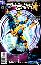 Booster Gold #29
Publisher: DC Comics
Released: 10 February 2010
Writer: Dan Jurgens
Artist: Dan Jurgens
Inker: Norm Rapmund
Colorist: Hi-Fi
Letterer: Steve Wands
Cover: Dan Jurgens
Cover price: $3.99
Review: Sean Lemberg
The first thing you're going to notice about this series is that it looks like something that should've been published 18 years ago. The writing, the artwork, even the cast, has been ripped directly from the pages of DC's early 90s Death of Superman / Rise of the Supermen storyline. The style hasn't aged particularly well, but I guess it's been MIA for long enough to be considered retro, and lord knows why, but that's a trend that always seems to be in vogue with our culture. We just can't get enough of looking, acting, and speaking like the past, and Booster Gold #29 is the comic book equivalent of that trend.
Of course, the nostalgia factor is a heavy trip for anyone who was reading back then, but the memories aren't always happy ones. The medium has evolved significantly since Dan Jurgens was in his prime, and though his Death of Superman was in some ways the grandfather of the more mature, intelligent slant the industry (and DC in particular) has adopted since then, it's also just as much a product of the sensationalist, prospector-friendly era that nearly killed the market for good. It's a dash of the good, a pinch of the bad as far as these memories go.
Thing is, upon closer inspection the throwback theme is more than just a cheap gimmick. In his latest role, Booster Gold has taken on the title of history's defender, a job description that sees him more often than not protecting a character he absolutely despises. This issue is a perfect example: shot back in time to the days when the Cyborg Superman was not only free, but genuinely considered as a replacement for the real thing, Booster has to ensure the maniac follows through on his terrifying destruction of Coast City. It's an odd thing for a hero to be working behind the scenes to see genocide through to its conclusion, but Booster's boss � and his conscience � has ensured him that the greater good of the ramifications from that moment outweigh the sacrifices made by its victims.
Adding to the ordeal is the presence of another traveler, Sondra Crain, who moves through time with the more noble, perhaps na�ve goal of averting the crisis altogether. Jurgens doesn't expressly endorse one point of view over the other, but he also doesn't explore the conundrum quite as thoroughly as he probably should have. Subtlety and nuance are not two of Jurgens' stronger suits, and his stiff, straightforward storytelling style often works to the book's detriment.
Booster Gold, in its present form, is as hot and cold as they come. Under the surface, the concept of adding depth and perspective to several of the publisher's most memorable stories is wonderful. The choice of Dan Jurgens as writer / artist works well to set the tone of the era and immediately sends more familiar readers on a quick trip down the aisles of their memory banks. Problem is, his writing can't keep pace with the high concepts and his artwork never delivers the wink or nod to the present that could tie the whole bag together. An early 90s style would've been perfectly appropriate in cases when the story was set in that period, but it's totally out of place when the scene changes to the modern day or the future. It's a fine idea that I could've really got behind, but in its current iteration I can't say it's working. Flip through it for the nostalgia, but leave it on the shelves near the back issues it's repurposing.
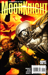 Vengeance of the Moon Knight #5
Publisher: Marvel
Released: 10 February 2010
Writer: Gregg Hurwitz
Penciler: Jerome Opena
Inker: Jay Leisten
Colorist: Paul Mounts
Letterer: VC's Joe Caramagna
Cover: Leinil Francis Yu
Cover price: $2.99
Review: Guest
I'd be hard-pressed to think of a character that's been chewed up and spit out as much as Moon Knight, both from a writing and editorial standpoint. Marvel really doesn't seem to notice he's there most of the time, and when they do, he's given writers that often try to overcomplicate an already difficult subject. While Charlie Huston's take on the character had a lot of vision, it often suffered from being too ambitious. The storytelling was as erratic and disjointed as Marc Spector himself, which made for an uneven read at times.
With this new ongoing, Gregg Hurwitz has taken everything back to basics. Moon Knight is no longer the unrestrained sadist just pretending to play hero, he's a changed man, defiant in his vow to never kill again. He still plays by his own rules, but never to the degree of unlikable prick. This isn't to say that the more insane aspects of the character are gone, but they're thankfully downplayed in favor of a more straightforward arc involving Moon Knight and his resurrected arch-nemesis, Bushman. It gives him a place in the Marvel Universe, and even lets him get one over on one of the big shots in a verbal encounter.
While the writing is strong, the art isn't to the same standard. There was no chance of it touching David Finch's previous work on Moon Knight, but it's tone-appropriate. The real issues come in some of the action scenes. It can be hard to tell exactly what's going on at times, and since we don't have a mountain of Claremontian text to walk us through every move, it's up to the visual storytelling to do the job, and it really sputters along.
That said, it's still the best Moon Knight's been written in years, and I'm genuinely excited to see where the character goes from here. It's the only Marvel book I'm buying on a monthly basis anymore, and that should count for something. Being aware that most probably don't have the same affection for the character that I do, I'd still say this is a sound borrow. The art is a problem in spots, but the writing is doing wonders for a character once thought radioactive.


