Is It Wednesday Yet?
02 February 2010 � Here we are again with another installment of your favorite comic book review series. As always, the reviews are free of spoilers, so read on without fear of having your experience ruined!
Our grading scale is simple:
Buy: An excellent comic book.
Borrow: A good comic, but save yourself some money by reading a friend's copy.
Flip Through: Give it a once-over at the comic shop.
Skip: This doesn't need to be explained.
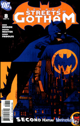 Batman: Streets of Gotham #8
Publisher: DC Comics
Released: 20 January 2010
Writer: Mike Benson
Penciler: Dustin Nguyen
Inker: Derek Fridolfs
Colorist: John Kalisz
Letterer: Sal Cipriano
Cover: Dustin Nguyen
Cover price: $3.99
Review: drqshadow
Amidst the constant superpowered distractions, the death of Bruce Wayne, the hunt for his allegedly reanimated corpse, and the revival of most of the DC Universe's dead heroes and villains in Blackest Night, it seems like ages since we were reminded that Batman is, first and foremost, a detective. That's a blemish DC aims to zap away with Batman: Streets of Gotham, a moody return to form for the Caped Crusader that concentrates more on the human element of crime in Gotham City and less on the garishly garbed creatures who inhabit Arkham Asylum.
Stepping in temporarily for Paul Dini, writer Mike Benson brings a surprisingly firm grip to this series. Benson seems to know what makes Batman tick in a classical sense. After years of elevated activities amongst the heroic elite, it's surprisingly relaxing to see Bats slumming it in the alleyways, conversing with his pedestrian sources, and trying to get to the bottom of the mystery surrounding a nameless, faceless vigilante killer. Fortunately enough, that's where Benson does his best work.
The real focal point of this issue is in the dialog Batman shares, both with Commissioner Gordon and with the stream of seedy informants outside bars and strip clubs in the unfriendly corridors that line his city's limits. Benson doesn't dance around the issue: he gets Batman in and out efficiently, but doesn't sacrifice a few shreds of character development or personal insight along the way. Dick's little chats get right to the point without feeling overly concise or bland, and remind us on more than one occasion that there's a different guy under the cowl. He's still doing an impersonation, and while the layman probably wouldn't know the difference, the character's more dedicated readers should be able to see Benson's little nods and nudges for what they are.
Dustin Nguyen's thickly shadowed, jagged-edged artwork gives Streets of Gotham an immediate identity. Throwing back to an era when noir was more a way of life, Nguyen's work is rich in character and long on atmosphere � a tight fit for the more civilian nature of the story. Like many detective films from the 1940s and 50s, Nguyen deals in sharp contrast, often leaving very little grey area in his compositions. In this instance, it works for him grandly. Not all characters would benefit from the attention of such a harsh light, but Batman absolutely thrives on it. The majority of his visual history demands a firm understanding of the importance of shadow, and in this area Nguyen is a modern master with an assist from John Kalisz's efficient, muted color palette. On one or two instances, Kalisz exhales and turns in a brightly colored page, which only serves to highlight just how critical the desaturated tones he brings to the rest of the issue really are. The artwork just doesn't look right alongside the energy that accompanies a full spectrum.
I'll be frank: this two-issue mini arc probably isn't going to be of much consequence in the long run. It's just Batman returning to the roots of his identity, doing what he does best in the shadows without throwing any punches unless they're absolutely necessary. Next to the search for Bruce Wayne or the identity of the domino mastermind, this may not seem like much, but it's absolutely necessary. Every single arc can't be an epic, and to tell you the truth I'm generally much happier with those that aren't. Streets of Gotham doesn't aspire to be more than it is, and that allows it to really hunker down and deliver a damn fine detective yarn. Borrow it and enjoy.
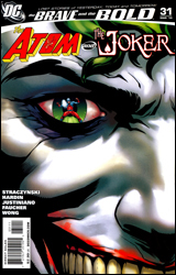 The Brave and the Bold #31
Publisher: DC Comics
Released: 20 January 2010
Writer: J. Michael Straczynski
Penciler: Chad Hardin and Justiniano
Inkers: Wayne Faucher and Walden Wong
Colorist: Trish Mulvihill
Letter: Rob Leigh
Cover: Jesus Saiz
Cover price: $2.99
Review: Desmond Reddick
In the one safe bastion in the DC Universe where you can read done-in-one stories featuring A- to Z-list characters teaming up, I never thought I'd see The Atom and Joker together. Well, together is a relative term. In this issue, the Joker appears to be suffering from a terminal brain ailment, and only a microscopic (and reluctant) Ray Palmer can save him.
This is in the clich�d realm right from the start, but the added twist is that Palmer is so small that he becomes affected by errant electrical synapse charges, giving him unedited peeks into the twisted mind of the man he's supposed to save.
I'm of two minds on this book. One: great idea to meld these previously incompatible characters into a team-up of sorts. Two: I don't want to see what makes The Joker tick unless there is a clear out.
On the positive end of the story, the set-up is quite brilliant in that Ray Palmer only takes the job because even if he does a good job, he could still end up killing the Joker. We have to remember that Palmer is a scientist and not a medical doctor, so he isn't worried about oaths and stuff. His good nature and curiosity win out as it does with any scientist, and he takes a long, strange trip inside the head of the most twisted killer in the DCU.
The negative end of the story? This book essentially gives us Joker's origin. And guess what? He's a messed up kid who killed animals. Did Rob Zombie write this? Even the greatest Joker story of all time offered a possible origin for the insane killer, but it called into question its validity at every point. Though I'm not the biggest fan of JMS, I would have thought that even he would understand the single fundamental principle driving the terror behind the Joker: he's unpredictable and mysterious. A better way to tell this story without the flashbacks is to just have Atom walking around in Joker's subconscious, which could be a lot scarier than the clich�d, easy route JMS took. He may think he's clever giving us a "cool, dark backstory," but he's only showing his hand as someone who doesn't know what makes the character work.
The art carries a good balance of Hardin's Silver Age touch in the real world, while Justiniano presents a glossy yet creepy look in the flashback sequences. Though Hardin's Silver Age look is uneven at times, he still provides us with one of my favorite panels this year: Atom climbing into the Joker's nostril while saying "Joker boogers!"
Jesus Saiz's cover is beautiful. I only wish that it was symbolic of the Atom seeing through Joker's eyes as opposed to looking back at Joker's memories, but despite my major problems with the book, I have to say flip through it.
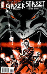 Greek Street #7
Publisher: DC Comics / Vertigo
Released: 20 January 2010
Writer: Peter Milligan
Artist: Davide Gianfelice
Colorist: Patricia Mulvihill
Letterer: Clem Robins
Cover: Davide Furno
Cover price: $2.99
Review: Desmond Reddick
I didn't read this book. Let's get that out of the way. I really didn't read it. I did, however, attempt to read it four times.
Admittedly, two out of those four times were pretty lame attempts, but the first and last were what I would call valiant efforts to put my attention on the drivel inside this book for longer than 48 seconds.
I failed, dear reader. Am I sorry about it? Nope. Not at all. In fact, this book should have been right up my alley. In elementary school I was the Greek mythology geek. It was at the age when I was still trying to hide the fact that I loved comics, but, since the library had books on Greek mythology, I found that I was able to get my comics fix during silent reading time by learning about these amoral gods, vicious monsters, and unstoppable heroes.
Why don't I like this book that takes ancient Greek tragedies and tells them in the modern era? Because I had to go on the Internet to find out that's what this book is about. I also had to go on the Internet to find a synopsis, but it's as meaningless as the first and fourth times I tried to read it � so I won't bother posting it.
I know that the second issue of the second arc of a comic is not supposed to be the entry point for new readers and that some things should be unclear, but the only things I gathered from this issue are that two people are being forced into making a porno until the chick goes all Delphic oracle on the director and that a guy named Furey is pissed off (imagine that).
What did I come away with? The sheer headache of pretentious, arthouse faux drama, and angular, inconsistent art devoid of visual storytelling. This is Vertigo at its self-important worst, and I have no problem saying that. It used to be that Vertigo was consistently incredible � save for a few minor missteps � but it seems that in the past few years the opposite is true.
Being that I cannot in good conscience rate a book I was unable to finish, I would urge you to flip through it, because that was all I was physically capable of doing.
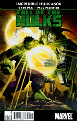 Incredible Hulk #606
Publisher: Marvel
Released: 20 January 2010
Writer: Greg Pak
Penciler: Paul Pelletier
Inker: Danny Miki
Colorist: Frank D'Armata
Letterer: Simon Bowland
Cover: John Romita, Jr.
Cover price: $3.99
Review: drqshadow
In case you haven't noticed, there seems to be an awful lot of Hulks running around the Marvel U lately. Between red versions of the regular Hulk and She-Hulk, good old regular She-Hulk, Skaar, and The Leader, the local population of rage-induced goliaths is at an all-time high. Of course, the one guy who doesn't turn into a green monstrosity when he's angry, oddly enough, is Bruce Banner. Instead, Banner's been teaching his barbaric son the nuances of heroism, and aligning with the mysterious Red Hulk in his quest to halt the advances of The Leader. Because, really, if there's one thing gamma-infused giants are known for, it's their levelheaded rationality.
If that quick glimpse at the status quo sounds confusing, you have no idea. Greg Pak's story has about a dozen plates spinning at any given moment, and this month we're compulsively checking in on the status of each one of them from start to finish. Reading this issue is like taking a peek into the imagination of a child with severe ADD. Within the first six pages, my head was whirling. When the constant leaps between locales hadn't let up two-dozen pages later, I think I was just about ready for some tranquilizers. While some of this can be blamed on my jumping into a large-scale storyline midstream, a greater part of it can be blamed on bad storytelling. Pak glosses over important details, like how certain characters make their way across the globe in the blink of an eye, and loses himself instead in the hyperbolic diss-off between Banner and Dr. Doom. It's scatterbrained at best, and not even compellingly so.
I had an equally hard time keeping up with Paul Pelletier's neurotically intricate artwork. Pelletier's layouts are strong enough, moving the story efficiently and legibly, but he rarely takes any risks or stretches a situation into something larger than life. Instead, he obsessively decorates almost every square inch of the page with linework, a mindset that's only amplified by Frank D'Armata's intrusive, constantly gleaming colors.
If the artwork was too busy to begin with, the colors only serve to magnify that problem. Every little wrinkle or dancing shadow is reinforced to the Nth degree, with even the most innocuous scenery rendered with painstaking precision and depth. I can't fault D'Armata for his skill level � the guy knows his way around the digital spectrum � but his sense of restraint needs a lot of development. Sometimes it's okay for a background character to just be a background character. If everyone's treated with the same amount of heavy depth and detail, the foreground can get crowded in a hurry � to the detriment of the issue's legibility, at that.
Strange as it may sound, returning Incredible Hulk to its original owner may have been the worst thing Marvel could have done. They'd taken an incredible (har har) risk in handing the series over to Hercules following World War Hulk, but Pak and Fred Van Lente have actually pulled an upset and made the replacements more intriguing than the original occupant. Now back in the hands of the green goliath, the series feels dated and unnecessary. It's missing the sharp, self-satirizing edge Hercules still carries in his own ongoing series, and has, instead, become precisely the kind of story that Herc's series continues to lampoon. I didn't like this one bit: skip it.
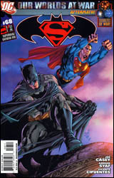 Superman / Batman #68
Publisher: DC Comics
Released: 20 January 2010
Writer: Joe Casey
Penciler: Ardian Syaf
Inkers: Vicente Cifuentes and David Enebral
Colorist: Ulises Arreola
Letterer: Rob Leigh
Cover: Ardian Syaf
Cover price: $2.99
Review: Guest
Superman / Batman has always been a weird book for me. The concept really doesn't have much in the way of focus, and you know from the outset that any of the important stuff is likely to happen in the main Superman and Batman titles � as this book has a habit of jumping in an out of continuity. I mean, Bruce is still Batman but Blackest Night is going on. It's a huge mess from all angles, though they still manage to pull out some good stories from time to time. Not much has changed in that respect.
Supes and Bats have come upon a Kryptonian warship that's been lost in time, and it appears to be housing something that isn't very nice. There's a lot to like here, and in terms of a popcorn comic, it does its job quite well. For starters, the annoying back and forth narrative volleyball that Jeph Loeb originated is completely absent here. I didn't miss it, and the story actually benefited from Bruce and Clark keeping their thoughts to themselves.
Ardian Syaf's art is quite good, though he often seems restricted by his panels. He really shines when given lots of space to work with, and outshines a lot of the artists that have previously worked on Superman / Batman. Though there is some action in the later pages, this is mostly a talkie issue, and I'm interested to see what he can do with a big fight scene to chew on.
Really, the only cons to this book are the same that have existed since its inception; all events contained within are largely irrelevant to the greater DCU, thus, there aren't a ton of surprises, but if you're in the mood for an easy read featuring recognizable characters, there are worse places you can look. Borrow it.
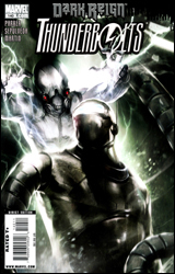 Thunderbolts #140
Publisher: Marvel
Released: 20 January 2010
Writer: Jeff Parker
Artists: Miguel Sepulveda and Sergio Arino
Colorist: Frank Martin
Letterer: Comicraft's Albert Deschesne
Cover: Francesco Mattina
Cover price: $2.99
Review: Guest
This book. My god.
I like to think of myself as a pretty patient and rational man. Sure, sometimes I go off on bad stories and crack a few jokes to make for a more interesting read, but at the end of the day I'm getting to write about something I enjoy. It's not a bad gig, and I get to read free comics in the process. At least, that's how it used to be. After reading Thunderbolts #140, I'm just about fine with the idea of never reading another comic book for the rest of my life.
If I had to describe to someone why I no longer read Marvel, but for some reason lost the use of my hands and vocal chords, I would swing a non-functioning digit in the general direction of this book. As it stands, I'm typing this review with one hand, because the other has found itself permanently affixed to my forehead whenever I'm forced to think about what I just read.
Here's the plot: the Agents of Atlas and the Thunderbolts are fighting in a swamp, and then everyone decides to discuss their mommy issues. Then they're fine again. The rest of the book is as follows:
"Let's fight."
"Fuck you!"
"Fair enough."
"Retreat!"
"Hey, did I ever tell you about that time my brother and I used to go fishin'?"
"Is this really the time to talk about this? We just utterly failed our objective on an epic level here."
"Ha! Ha! We're failures! Let's share a hearty laugh!"
"Alright, let's take a break to set up something for a book in which stuff actually happens."
"Back to the bullshit, let's fully castrate the leader of the team before we finish up here, just to make sure no one cares."
Fin.
I could go on about the roster of jobbers that make up the new Thunderbolts. I could sit here and complain about the art, which continues the "let's all turn off the lights and be Mike Deodato" trend going on at Marvel right now. I could do all of those things, but this book wore me the fuck out. I just want to lie down and forget this ever happened. Skip it.


