Is It Wednesday Yet?
26 January 2010 � Here we are again with another installment of your favorite comic book review series. As always, the reviews are free of spoilers, so read on without fear of having your experience ruined!
Our grading scale is simple:
Buy: An excellent comic book.
Borrow: A good comic, but save yourself some money by reading a friend's copy.
Flip Through: Give it a once-over at the comic shop.
Skip: This doesn't need to be explained.
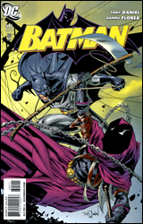 Batman #695
Publisher: DC Comics
Released: 13 January 2010
Writer: Tony Daniel
Penciler: Tony Daniel
Inkers: Sandu Florea and Norm Rapmund
Colorist: Ian Hannin
Letterer: Jared K. Fletcher
Cover: Tony Daniel
Cover price: $2.99
Review: drqshadow
In his first non-crossover arc with DC's primary Batman series, writer / artist Tony Daniel has introduced his more dedicated followers to a wide array of mysteries. Why's the Black Mask back in town, and what purpose does his bloody, unpredictable path of destruction serve in the big picture? How does the rest of the criminal underground feel about their involvement (or lack thereof) in his plans? Whose team is Kitrina Falcone playing for? Daniels gives the reader plenty to ruminate over in the pause between issues, and not all of it is explicitly spelled out in the captions and word balloons.
But even as recently as Battle for the Cowl, I found Daniel's artwork tough to appreciate. For all the potential he showed at times, his lack of restraint and focus proved too high a hurdle to clear and turned me off to him as a whole. Daniel was trying so hard to impress on the big stage that he lost sight of the fundamentals; his cast moved awkwardly, his pacing was jerky, and his paneling was complicated, making it difficult to follow at even the best of times.
What a difference a few months' worth of experience can make. The work Daniel turns in this time is striking, a far cry from those previous efforts. He's still not above the occasional stumble, as evidenced by a chaotic early fight scene between Kitrina and Catwoman, but for the majority of this month's issue the artwork is tight, disciplined, and memorable. I loved his spread of Batman silhouetted against the bright flames of a burning house, and the Caped Crusader's rooftop interrogation of a generic crook proves equally impressive.
Daniel's writing, though, hasn't taken as substantial a step forward. While his plots are deep enough to hook casual readers, his execution still leaves a lot to be desired. Tony's heavy-handed dialog weighs down the page and slows the action, elaborating unnecessarily at every opportunity. Almost every conversation could have delivered its point and moved forward in half the time, but instead it lingers and rambles on. That space could have been better put to use as a bridge between scenes, establishing a new locale or focal point. Instead, we find ourselves overstaying our welcome and then suddenly snapping to the meat of a completely different scenario, sometimes in the middle of a thought.
Tony Daniel is an artist first and a writer second, so it should come as no surprise that his professional evolution focuses on improving the former before it does the latter. Though he still struggles with consistency on a few occasions, that journey is beginning to yield some serious results. This is, for the most part, a really nice looking issue and a testament to the creator's dedication. It isn't, however, all that well written. Daniel has a few good ideas bouncing around upstairs, but he hasn't developed the capacity to effectively translate them to the page. I can see the potential looming in the background of this series, but it's being restrained by a few glaring flaws. It's worth flipping through, but Batman still has a ways to go before it reaches the promised land.
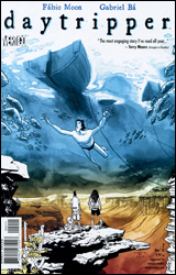 Daytripper #2
Publisher: DC Comics / Vertigo
Released: 13 January 2010
Writers: F�bio Moon and Gabriel B�
Artists: F�bio Moon and Gabriel B�
Colorist: Dave Stewart
Letterer: Sean Konot
Cover: Gabriel B�
Cover price: $2.99
Review: drqshadow
After making their mark on Matt Fraction's Casanova, twin brothers F�bio Moon and Gabriel B� have set their goal a bit higher with Daytripper, their new project for Vertigo. Assuming (and sharing) both the written and artistic responsibilities, the pair's first stab at a self-inclusive project is an ambitious affair. Through the eyes of Br�s, a foreigner traveling through the less-touristy locales of rural Brazil, and his charismatic companion Jorge, the twin creators take their readers on a tour of both their homeland and the human experience.
Daytripper's timeframe lazily moves forward and backward like the soft waves of the ocean. Last month we saw a flicker of the narrator's future, a foreboding prediction that saw Br�s struggling to swallow his last breaths in a pool of his own blood. This month's focus slides backwards by a few years, traveling to a brighter time in his life and evaluating how his past actions and encounters indirectly led him to such a gloomy apparent demise. If you're looking for an up-tempo adventure, this won't suit your needs. Its focus is deeper than that, and although none of the narration explains it outright, the goal is a complete picture of the spirit behind Br�s's physical mask. Whether or not the duo actually succeeds is up to the reader, and how much he finds in common with that central figure.
It's the issue's artwork, more than its storytelling, that's Daytripper's most captivating quality. The twins collaborate on each page, their combined efforts bringing out the best in each unique style and producing a unified vision that almost seems like it was created by a separate, third entity. Ever heard a duet that mixes the two singer's voices so expertly, their individual tones combine to produce a distinctly different voice? It's the same kind of effect here. The pair bring a flavor that's faintly reminiscent of David Lapham and Eduardo Risso; it's simplicity without the sacrifice of identity. The page is clean but detailed, easy to scan but also to get lost inside. They deliver an understanding of the architecture, population, and general attitude of Brazil that wouldn't have felt authentic in the hands of another, enhancing the dreamy, otherworldly mood the series seems to strive for.
Along the way they get a lot of help from colorist Dave Stewart, whose richly textured watercolors take the book's visuals to another level. Stewart stays out of the spotlight when the story's meant to steal the focus, but on the few instances its goal is to awe the reader with a spectacular glimpse into the local scenery, he jumps right to the forefront. Moon and B�'s compositions would do just fine on their own, but it's really Stewart's colors that make the sunset on the second page, or the underwater scene around the halfway point, so genuinely spectacular.
This issue ends just as abruptly as the first, shocking us with another dead end road that leaves an array of questions unanswered, but in so doing ensures it'll stay alive in the audience's minds much longer than if it had been upfront with its resolutions. It's an absorbing adventure in personality, motivation, and decision, not to mention a brief, authentic look at what sets Brazil apart from the rest of the world. The gorgeous artwork is the first thing you'll notice, but the story's haunting echoes will stay with you for the long run. Buy it.
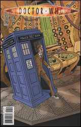 Doctor Who #7
Publisher: IDW
Released: 13 January 2010
Writer: Tony Lee
Artist: Al Davison
Colorist: Lovern Kindzierski
Letterer: Neil Uyetake
Cover: Paul Elliott
Cover price: $3.99
Review: Guest
It's time for another interactive review. Go to your local video store and rent the movie Cube 2: Hypercube. Now view said movie. Done? Alright, now imagine that with random aliens thrown about, and a Tool album cover at some point in the middle. Do you want to pay four dollars to read a comic book version of that experience? Yeah, didn't think so.
Doctor Who comics have been kind of a mixed bag as of late. The Forgotten miniseries was a great bit of fan service, but I've been struggling to get into the new ongoing. Perhaps it's the inability to truly capture the Tenth Doctor's erratic nature on the printed page, though this book tries. I mean, it really tries. It tries too much, in fact. Lee's writing doesn't dare take a second to breathe, whilst Al Davison takes the occasional break between Glenn Fabry emulations to give The Doctor the most overacted facial expressions possible. He's less an otherworldly genius than he is a blabbering neurotic here. And by the end of the issue I was pretty much tired of The Doctor and his companions.
Yes, you read correctly, he has companions. Despite having already gone through the events of Series / Season Four and parting ways with Donna Noble, he's just suddenly fine with having company again. There is zero attempt to explain this, and you come to understand pretty quickly why an ongoing may not have been the best idea for the character. After watching the events of "The End of Time" unfold, it's difficult to care about this sort of adventure. Perhaps that's why Lee seemingly quit halfway through and said, "Fuck it. Let's put them in a fever dream."
Despite my complaints, it's sort of difficult to completely fault the creative team. They're stuck in a holding pattern until the spring, but that may not be the real issue here. The bigger problem is that Doctor Who can't really work as an ongoing title, at least not the way this one is being structured. The whole appeal of secondary Who media is for the fans that love to sort out their own theories and timelines in an attempt to make it part of the larger canon. Individual, self-contained adventures are perfect for this, but to now imply that The Doctor has visited Hollywood in the 1920s, gone on trial (again), and ended up in a hypercube all in one continuous journey only serves to become more and more absurd the longer it goes. If the book was particularly well-written or entertaining, I'd probably be able to ignore this to an extent, but the sad truth is that it's a dry and quite frankly ugly book, and certainly not one that's going to impress any Whovians. I would know. Skip it.
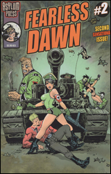 Fearless Dawn #2
Publisher: Asylum Press
Released: 13 January 2010
Writer: Steve Mannion
Artist: Steve Mannion
Colorists: Frank Forte and Steve Mannion
Cover: Steve Mannion
Cover price: $2.95
Review: Guest
As time wears on, I've come to expect a few things from comics that have largely one man handling all of the creative duties. I know that there are going to be a lot of small editing mistakes, and I know that, if nothing else, the book is going to reflect the hard work and the passion of the creator for his subject. Not surprisingly, both apply when talking about Fearless Dawn.
It's this same creator care that makes me wish I had a few more kind words for the book. It's not horrible. I wouldn't even really call it bad, as such. I just didn't care. Though there is a vaguely coherent narrative involving an antlered heroine battling Nazis, the paper-thin plot is really sort of tossed aside in favor of indie-riffic comic posturing that doesn't always hit its mark. For every subtle joke that works, there are 10 at the Hanna-Barbera level that don't.
Had I not read the credits myself, I'd have sworn there were two different artists on this one. Sometimes Mannion is more than competent, with detailed faces that still maintain a cartoonish, Eric Powell quality and bodies that carry over the cheesecake factor of his covers. Other times, often in the same panel, it's like he decided mid-page that he didn't like comics anymore, and wanted them to look as dumb as possible. I mean, it's embarrassingly bad at parts. The title character often goes from Betty Boop to blow-up doll to expressionless raccoon and then back again. I can only assume that this was a stylistic choice, but it's not a good one if that's the case.
That said, I've read worse. Clearly, Mannion is trying to go for something here, I'm just not entirely sure what that something is. The dialog has its moments, but the story isn't going to grip you and the art is a mess. Give it a flip and see what, if anything, you can get out of it.


