Is It Wednesday Yet?
15 December 2009 — Here we are again with another installment of your favorite comic book review series. As always, the reviews are free of spoilers, so read on without fear of having your experience ruined!
Our grading scale is simple:
Buy: An excellent comic book.
Borrow: A good comic, but save yourself some money by reading a friend's copy.
Flip Through: Give it a once-over at the comic shop.
Skip: This doesn't need to be explained.
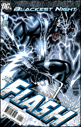 Blackest Night: The Flash #1
Publisher: DC Comics
Released: 03 December 2009
Writer: Geoff Johns
Artist: Scott Kolins
Colorist: Michel Atiyeh
Letterer: Travis Lanham
Cover: Scott Kolins
Cover price: $2.99
Review: drqshadow
If you haven't been keeping track, the dead are coming back to life across DC's landscape. That means if you're a hero and you've ever met someone who's since departed this mortal coil, chances are they'll be knocking on your door within the next few days — a brand new ring on their finger, and maybe a few basic grooming issues to think over. Although the primary story has finally reached the second act in Blackest Night — where the heroes have taken the fight to the reanimated mob — this issue takes place before any of that. After all, why move the story forward when you're doing just fine with a lengthy and repetitive introduction?
Of course, longtime Flash readers will be less interested in that than they are the return of scribe Geoff Johns to the land of the Scarlet Speedster. Johns' return, however brief it may turn out to be, helps this installation of the crossover to stand out more than the majority of its tie-in companions. For a character such as The Flash — possessor of a large, colorful gallery of rogues, both living and dead — this level of intimate knowledge is crucial. A less experienced writer would have spent the entirety of this issue just getting to know the bit players, while Johns can swoop right in and concentrate on getting their stories straight.
Rather than following the reactive storytelling embraced by the other authors of the Blackest Night comics, this installment takes a more proactive look at the dark events transpiring around the globe. Barry Allen isn't content to sit back and wait for his fallen enemies to seek him out, and Geoff Johns isn't happy to fill the story with random fists punching their way out of the grave every couple pages. Instead, he tells us a bit more about the dead themselves, be it through Barry's memories of his last encounter with the fiend, the gut reactions of the rogues still among the living (who aren't necessarily happy to see their former rivals returning from the grave), or the lost memories tied to the corpses themselves. This isn't always an action flick, and that alone is enough to make it special.
Himself no stranger to The Flash, pencil-man Scott Kolins brings a style to the issue that's often eerily similar to that of Andy and Adam Kubert. The reunion with his former collaborator is a good fit for Kolins, who also lends a sense of familiarity and comfort to the proceedings, slipping back into the scene in the same way he would an old pair of gloves. It's a good thing, too, because he reunites with every last of those acquaintances in this issue. Covering almost every corner of the Flash's cast — living and dead, friend and enemy — this tale frequently and rigorously puts Kolins' memory to the test, and he nearly always manages to use it as motivation to produce something excellent.
With so many characters vying for our attention, the issue almost runs short of elbow room. And, on a few occasions, that's the case; but for the large majority of it, Johns and Kolins manage the numbers better than I could've imagined. More importantly, they do so without handicapping the main narration along the way. While it's awfully crowded, this is a solid first issue that unleashes several intriguing new plot lines and offers new peeks behind the masks of several important characters. It's not just for Flash diehards; casual fans will find plenty to enjoy here, too. It's one of the few tie-ins to really explore the full potential of this crossover. Borrow it.
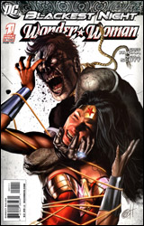 Blackest Night: Wonder Woman #1
Publisher: DC Comics
Released: 03 December 2009
Writer: Greg Rucka
Penciler: Nicola Scott
Inkers: Prentis Rollins, Jonathan Glapion, Walden Wong, and Drew Geraci
Colorist: Nei Ruffino
Letterer: Travis Lanham
Cover: Greg Horn
Cover price: $2.99
Review: Guest
Whenever someone brings up the subject of Wonder Woman, I'm forced to recall a sleepless night I had about two years ago. Whilst flipping through the channels on the television, I came upon one of those silly young adult dramas. I want to say it was One Tree Hill or maybe The OC. I don't recall. But I do know there were a lot of pretty white people with problems. What made me stop on this particular program was the fact that one of the female characters had taken it upon herself to dress up as Wonder Woman for a Halloween party. This moment is worth noting because it marks one of the few times Wonder Woman has ever had any significant impact on me.
Perhaps that's because she's a character most writers don't have the slightest idea what to do with. Gail Simone's done a pretty damn good job during her run, but few other writers have been able to get much out of the character. Greg Rucka is one of the few that's actually been able to do it better. His take on the character is more than just a generic symbol for all of womanhood, and he understands that the only way to show the strength of her gender is to ignore it. Diana's character is defined as a warrior, but she's not dictated by it. She cares about human life, and shows respect for those that honor their duty even without superpowers. It's details like this that really enhance what is otherwise your standard Blackest Night tie-in. A previously deceased character — in this case Maxwell Lord — comes back to torment Wonder Woman. Returning from the dead or otherwise to seek revenge is an old premise, but Rucka adds so much to it and the book that the title character actually feels like she belongs in DC's Holy Trinity.
Nicola Scott's art is exactly what you remember from Secret Six; it's not the most consistent, especially in terms of faces, but it's completely serviceable. The funny thing is that her faces tend to distort quickly from far away, but her close-up of Diana are often fantastic. The short bits of action are nothing to write home about, but are helped along by the now-familiar "spectrum vision" that shows the emotions of the characters through the eyes of the Black Lanterns.
For anyone that's read Blackest Night #5, you'll know that the real story is what comes after this. With Rucka at the helm, I must say I'm looking forward to how the next two issues are going to be handled. As for this one, it's a quick story that's far from essential reading, and unless you're a Blackest Night completist, you can just borrow it from a friend.
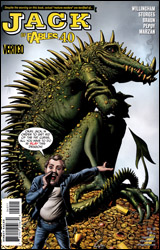 Jack of Fables #40
Publisher: DC Comics / Vertigo
Released: 03 December 2009
Writers: Matthew Sturges and Bill Willingham
Penciler: Russ Braun
Inkers: Russ Braun, Jose Marzan Jr., and Andrew Pepoy
Colorist: Daniel Vozzo
Letterer: Todd Klein
Cover: Brian Bolland
Cover price: $2.99
Review: Guest
Indulge me in a quick survey. Do you already read Jack of Fables? End of survey. Now tabulate your score. Did you answer yes? Then this is the book for you.
If you answered no, there's really nothing here to justify spending your three dollars. It's not a horrible book, but this is the 40th issue of a series that I've never cared to read until the point I was asked to review it. If you're in the same boat, allow me to do you a favor and tell you right now: you're not missing anything.
Main character Jack Horner (of Be Nimble and Giant Killer fame) has turned into a dragon. He spends his time in a cave with a hoard of money, and eating cows that a friend buys for him. This is about as exciting as it sounds. Elsewhere, Jack Frost — who is somehow a different person — is off fighting an evil wizard. Oh, and two guys are in another cave talking with an owl. That's not me being vague about the plot, either. I was trying to spoil this issue, and chances are you didn't even notice.
A wise person once said that it should be the goal of anyone to be either loved or hated, because nothing is worse than indifference. That's what I am to this book. It's not like Cable, where I can pop a blood vessel in my brain with every page. I mean, it's well-written at parts and the art is pretty, but I just don't have any reason to care.
Perhaps this is not a book looking to hook any new readers. And I can respect that. Jack of Fables has its fanbase and I'm certain that these people will love it. It's just that I don't think it would be so difficult to help everyone else along. For example, a grand total of one sentence could have been used to explain that Jack Frost is actually the son of Horner. No one should need Wikipedia to understand a comic book, but that's exactly what I had to do.
I won't give this a skip on principle. It not for me, and nothing here makes me want to catch up. It's far too mired in its own continuity to be new reader-accessible, and the characters, while amusing, give you no real reason to care about them. I tried to go in with an open mind and got nothing from the experience. I'd say flip through it to see if the same applies to you.
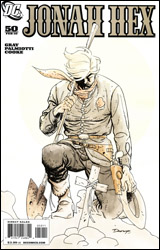 Jonah Hex #50
Publisher: DC Comics
Released: 03 December 2009
Writers: Justin Gray and Jimmy Palmiotti
Artist: Darwyn Cooke
Colorist: Dave Stewart
Letterer: Rob Leigh
Cover: Darwyn Cooke
Cover price: $3.99
Review: Desmond Reddick
To celebrate the 50th issue of the longest-running Western comic in recent memory, Jonah and his on-again, off-again lady-in-waiting, the awesomely vicious Tallulah Black, have a saloon rendezvous and part ways. This bein' Jonah Hex, it ain't right that be the plot of this here special issue. After they go their own ways, Jonah gets roped into collecting a bounty on 50 no-good law breakers, and Tallulah leaves to start fresh in a small town. Naturally, the stories collide later in the issue with violent and tragic results.
Jonah Hex #50 is dripping with sadness and irony, tempered with merciless violence, and branded with simplistic but potent imagery. I feel ashamed for being only an occasional reader of this, what may be the best book DC is publishing. While I had a few problems with this book, it's hard to complain. The story ends proper with what may just be the coolest page in comic book history, but then goes into an epilogue that is so sad and beautiful that you can only be upset for a few seconds that the story didn't end earlier.
This book is also notable for being only the second issue of this entire run that features art by Darwyn Cooke. I can think of no other artist whose style has defined the industry these last 10 years. His close ties to the Silver Age, a similarity to both the Bruce Timm and Mike Allred styles, and a storytelling eye that bests them all, Cooke may be the best artist comics has today. In this issue, the cartoonier edges of his lines are almost abandoned completely, favoring the rough and grizzled look suitable to Jonah Hex. Cooke is most definitely this era's greatest master from heroes to crime to Westerns, and this book not only supports that statement, it exemplifies it.
Adding to the best comic art around is Dave Stewart's colors that sublimely do the job that every Western comic needs its colorist to do: wash out the dusty browns, keep it sterile and bleak, and accent the action. Stewart's work does that and more.
If you at all have ever enjoyed a Western, you will enjoy this book. It combines the best of the genre into a potent and powerful tour de force. Every scene seems to begin with a panoramic shot like John Ford's films, but then dives into the violence of Sam Peckinpah. It is beautiful to behold.
Even though Cooke only draws one issue of this series every year and a half, it has shown itself to be a consistent comic both at the story arc level and as single issues like this. The stories are powerful, thought-provoking, violent, and most certainly deserving of more praise than I feel I've delivered in this review. Pull this book.
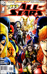 JSA All-Stars #1
Publisher: DC Comics
Released: 03 December 2009
Writer: Matt Sturges
Artist: Freddie Williams II
Colorists: Richard Horie and Tanya Horie
Letterer: Pat Brosseau
Cover: Freddie Williams II
Cover price: $3.99
Review: Michael David Sims
I know my track record with the JSA is spotty, but with a new team, a fresh start, and an artist I quite like, I had to give JSA All-Stars #1 a try.
Now that the try has been given, where do I start?
Firstly, JSA All-Stars #1 references events from Justice Society of America #33 and 34 (the latter of which won't be released until 23 December), without telling the reader exactly where to look to understand said references. I hate to be a Get Off My Lawner, but, really, what happened to the good ol' editorial caption boxes pointing readers to other comic books? Not only does it help readers know where to look to get the bigger picture, but it creates a fuller universe and generates sales. Really, it's a no-brainer!
Next, never does it explain why Magog — who's only been in DC continuity since February 2008 — is team leader, above even JSA mainstay Power Girl. Besides being an ex-Marine and an obnoxious hardass, what gives him rank over a Supergirl?
And that leads me to my next point: after reading this issue I don't know who any of these people are. All 10 members of the team — and that doesn't count the original Hourman, Sandy Hawkins, or the tiny flying monkey — are given surface level characterization at best. Here's what I know: Power Girl has big tits and seems like a compassionate leader type, Magog I've mentioned, Hourman (the young one) has parents, Stargirl might be a masochist because she cries about not being attacked, Damage is an angry dickhead who might be having marital problems, Cyclone is ginger, Wildcat (the young one) has werecat powers, Judomaster (besides having a great name) can kick people, Citizen Steel is... I don't even know, King Chimera is a smart magic guy, Hourman (the old one) is an inventor, Sandy doesn't want to sleep, and Frankie the monkey-thing is in no way to be compared to Lockheed because it's clearly a coincidence that the young girl on the team has a weird pet.
While I understand that these characters will be fleshed out over time, is it so hard to give actual depth to a handful of these people? Power Girl is the only one who comes close to having any sort of rounded-out personality — so I'll give Matt Sturges that — but it's lost in the tornado of mediocrity that is this issue. (It's also undermined by her shredded costume, the constant ass shots, and the emphasis on her best-known attributes. But more on this later.) I thought the whole point of splitting the JSA into two teams / books was to trim the fat, allowing for the writers and readers to get a better grasp on everyone. But with 10 active players in JSA All-Stars #1, and the lack of depth they receive, one has to wonder if the team couldn't have been trimmed a little more.
Then there's the page where Cyclone and King Chimera either flirt or have a heated moment. The writing seems to indicate that King is giving Cyclone the cold shoulder, but the art suggests otherwise. Also on that page is a lettering mistake; in the foreground Cyclone chases King Chimera, while in the background Judomaster berates Damage. However, the word balloons that should be assigned to Cyclone and Damage are attributed to Cyclone and King Chimera. It's quite jarring.
Okay, I have to jump back to characterization for a moment. What the fuck is wrong with Damage? I don't mean with his face or whatever, but his attitude? He calls King Chimera a loser, then freaks out and attacks the man after King Chimera calls him an "idiot" in return. Judomaster then says, "That was... not necessary," to which Damage says, "You're taking his side?" On the next page the word balloon that's attached to King Chimera but should be Damage's reads, "Oh, come on! You heard the crap he was saying — he was begging for it." Is this guy mental? I'm really asking here, because he doesn't seem right in the head. And I have to say, making one of your heroes a complete lunatic asshole is not endearing. Even if that's the point, tone it down for the sake of believability.
Enough about characterization, the lack of depth, and all of the other writing flubs; let's talk about Freddie Williams II, an artist I've loved since his debut on Robin. Besides a few minor missteps — such as a panel in which it appears Power Girl is missing a chunk of her forearm, the painfully obvious reuse / digital manipulation of a panel, boobs sometimes looking like they've been pasted on, and the fact that Citizen Steel did not fall down when Magog's dialog seemed to indicate otherwise — visually this is a strong book. (Hmm. The offset portion of the previous sentence seems to contradict my positive proclamation, doesn't it?) His characters are cartoony and colorful, yet they're expressive and grim when they need to be. Action sequences are a tad cluttered, but I blame that on there being too many heroes and a large faceless army in the fray. And though his attention is split in too many directions, his interest never seems to waver — not even when the team is sitting around chatting.
This being a JSA review, one has to mention either Nazis or Power Girl's breasts. Since the villains are communists and some guy in a mask, Nazi remarks are out. So let's talk about how Freddie Williams II handles Power Girl's boobs. (I just... I mean... let's just move on.) Most shots are fine, but there are panels where the shot has clearly been staged so we're looking directly up or down at them. Similarly, if her ass is in panel, it's in the foreground. I mean, when Power Girl clutches a bomb and doubles over to shield others from its detonation, the angle you do not want to choose is from behind. Why? 'Cause then it looks as though she's clutching her midsection in pain as a monster fart explodes in our faces.
Back to the boobs. There's no way around drawing Power Girl's mammoth chest. It's there so it must be dealt with, I understand that titillation has been a part of superhero comics since Phantom Lady (if not before), and, let's be honest, I like seeing well-drawn breasts. But there is a line and though I feel Williams didn't cross it, he came close by choosing some poor angles. Why does this disappoint me? Because he's better than that, frankly.
Despite all of the problems I had with JSA All-Stars #1, I think it can be a good book. Cut at least three members from the team, give each one a purpose and heart, limit the crossovers and references to Justice Society of America, and have them face a top-level villain or two and this will be a very solid, fun book. As it stands, even though it looks good, it's written poorly, so skip it.
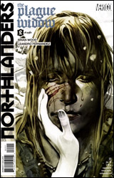 Northlanders #22
Publisher: DC Comics / Vertigo
Released: 03 December 2009
Writer: Brian Wood
Artist: Leandro Fernandez
Colorist: Dave McCaig
Letterer: Travis Lanham
Cover: Massimo Carnevale
Cover price: $2.99
Review: Desmond Reddick
Northlanders is a book that has evaded me. Perhaps it's been my propensity to dislike most of what Vertigo has released in the past decade not written by Grant Morrison. Or maybe it was just the fact that I was "Vertigoed out" in the 1990s, but somehow a drama with a revolving cast of characters set during the Viking age has not been on my "to read" pile for two years.
Well, now it is.
Granted, coming into a series at the 22nd issue in part two of eight should put any book at a disadvantage, but beyond a few things near the end, this book required no further exploration to understand what was going on.
This arc, like all Northlanders arcs, is a stand-alone story. This one, entitled "The Plague Widow," tells the story of what a Viking woman must do to ensure the survival of her daughter and herself after her husband dies of the plague. As a widow in a time of quarantine and paranoia, she is called upon to make a "donation" of a large portion of her food to the local chieftain. But, as a Viking woman, the donation won't be made before an act of defiance so cinematic and mythic that it will literally leave you bewildered as to what's going to happen next issue.
Hilda, though quiet and reserved, is a character unlike most in comics. She is a strong-willed, powerful woman. We also don't need to see spandex pressing against her tits to get the idea across either. Though much of the plot is back-loaded in this issue, the rest becomes a character study in a story light on plot but very heavy on tension, emotion, and character. In fact, a lot of this book can stand on its own as a one-shot in a short story perspective. But thankfully, there will be a fully rounded story to let us all know what happens to poor Hilda, not to mention the machinations of the corrupt Volga River powers that be.
As far as the art is concerned, if you think you know Leandro Fernandez, you're wrong. This is one of the more moving and powerful visual stories I've ever read. This book would work without words, the images are that strong. Northlanders offers him the opportunity to take his time and tell a story, and boy, does he! And McCaig's colors are harsh and stark, giving an intentionally drab atmosphere to the nasty winter that oppresses the characters in the book.
To tie it all up, this book is most certainly worth a buy, and if the rest of the storylines of this series are as good as this one, this is worth putting on your pull list.
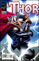 Thor #604
Publisher: Marvel
Released: 03 December 2009
Writer: Kieron Gillen
Penciler: Billy Tan
Inker: Batt
Colorist: Christina Strain
Letterer: VC's Joe Sabino
Cover: Billy Tan
Cover price: $2.99
Review: drqshadow
It's really nothing new, but life's been kind of shit for the Norse God of Thunder over the last few months. After returning from hibernation, reviving the lost city of Asgard and its population, and helping to defeat the Skrull invasion, Thor was exhausted and ripe for an attack. That's all the invitation his adopted brother needed. Acting swiftly, Loki wrested control of Asgard to a more controllable figurehead, transplanted the city limits to Latveria, and forged an uneasy alliance with Doctor Doom.
It really wasn't that long ago that this series had built a respectable head of steam. J. Michael Straczynski and Olivier Coipel had managed the relaunch in style, giving Thor a familiar mortal link, Asgard a new locale, and the Gods themselves a fresh direction. I still wasn't especially taken with the cast, which is why I merely flirted with the title around its launch and then left it behind, but things seemed to be headed in the right direction. Imagine my surprise, then, when I opened up this issue to find that things had all but returned to the stale status quo that had nearly doomed the series years ago.
In his first month at the helm, writer Kieron Gillen has inherited something of a disaster in Thor. Gone are the new directions that had effectively granted the series a facelift; Thor still employs Donald Blake as his link to the mortal realm, but he's becoming more of a bit player and less original with every passing moment; Asgard loses more of its luster in each panel, becoming less the unique floating city that left Oklahomans in awe two years ago and more the crusty, ancient tomb it had been for decades before; the gods have returned to their distant, haughty old ways; add to all that another cryptic scheme from Doctor Doom that doesn't really make any sense, and you've got a book that's running — no, sprinting — in the wrong direction.
To say I have a mild distaste for Billy Tan's artwork would rank among the understatements of the century. He's not single-handedly responsible for my dropping of New Avengers several months back, but his lumpy musculatures and nasty layouts were among my chief reasons. Since moving to Thor, his rendering has improved moderately, but his compositions remain clunky and messy, infuriating to navigate, and terribly confusing at even their finest moments. Tan routinely rides on the coattails of his writers, summoning whatever cheap gimmicks he can muster on the page that offer built-in visual excitement and adding nothing to those that don't. I don't understand what Marvel sees in this guy; he constantly turns in disappointing work and they keep rewarding him with regular, high profile gigs. I guess, as an evaluator of talent, sometimes when you swing for the fences you wind up striking nothing but air.
Simply put, this issue is a waste of time, paper, momentum, and characters. It's exactly what the first issue of the relaunch seemed to go out of its way to step away from, and it's sad to see it's returned there so swiftly. Skip it. Don't even give it so much as a second glance.


