Is It Wednesday Yet?
21 July 2009 — Here we are again with another installment of your favorite comic book review series. As always, the reviews are free of spoilers, so read on without fear of having your experience ruined!
Our grading scale is simple:
Buy: An excellent comic book.
Borrow: A good comic, but save yourself some money by reading a friend's copy.
Flip Through: Give it a once-over at the comic shop.
Skip: This doesn't need to be explained.
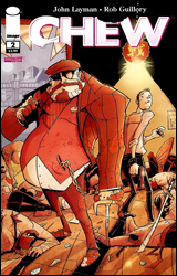 Chew #2
Publisher: Image
Released: 08 July 2009
Writer: John Layman
Artist: Rob Guillory
Letterer: John Layman
Cover: Rob Guillory
Cover Price: $2.99
Review: Dan Toland
What the hell?
Tony Chu is a Cibopath. Which is to say, Tony Chu experiences vivid psychic visions from whatever he eats; where it came from, everything around it, its final moments, its entire history all flood his mind. Naturally, these talents were going to waste in his life as a Philadelphia vice cop, so Tony now finds himself embroiled in the two-fisted, nonstop rollercoaster of a world that is the Food and Drug Administration. No, really. During his first case, Tony and Savoy, his new partner, investigate the appearance of a human finger in a McBurger and run afoul of the yakuza.
I'm not certain I get it, either. It almost doesn't matter, though, because Chew is fun. Layman and Guillory are obviously having a ball creating this series, and it shows on every page. (It's also pretty gross in places; I actually gagged at one point.) The story picks up and gets rolling immediately, and if it weren't for the recap box, I never would have known I was reading the second issue of a miniseries. It stands completely on its own, and I should automatically give it extra points for that. However, while Chew is clever and original, the execution is not. Having him work for the FDA is a fun idea, until it turns out Tony is another cop conducting interviews and getting into scrapes with the bad guys. With that said, if that doesn't bother you, you'll probably get a charge out of the story. And Savoy? Chiseled from pure awesome. He wears an ascot and a monocle, and brandishes sai and ninja stars!
The art is interesting. You're either going to like it or be immediately turned off by it. It's incredibly cartoony. However, despite this, it's also very expressive and intricately detailed. The action scenes are extremely dynamic, and the quieter moments are filled with character. Most of all, it perfectly fits the story it's telling.
Chew is not going to be for everybody. That said, it's a clever book that's a lot smarter than it looks. Borrow this from a friend; spend some time with it to see if it does anything for you.
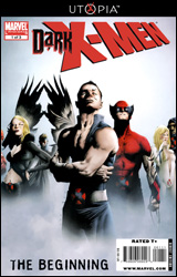 Dark X-Men: The Beginning #1
Publisher: Marvel
Released: 08 July 2009
Writers: Paul Cornell, James Asmus, and Shane McCarthy
Pencilers: Leonard Kirk, Jesse Delperdang, and Ibraim Roberson
Inkers: Jay Leisten, Jesse Delperdang, Andy Lanning, and Ibraim Roberson
Colorists: Brian Reber, Ranier Beredo, and Matt Milla
Letterer: Rob Steen
Cover: Jae Lee
Cover Price: $3.99
Review: Chris Johnson
Ever since receiving the keys to the kingdom, Norman Osborn has had a bit of an obsession with things that are dark: dark chocolate, Dark Shadows, and forming his own supervillain teams. After creating his own Illuminati and Avengers, Norman has now set his sights on the X-Men. This issue introduces us to three of its members: Namor, Mimic, and Dark Beast.
The majority of the first story, written by Paul Cornell, is a discussion between Osborn and Namor over the Sub-Mariner's decision to join the Dark X-Men. Namor has joined at the request of Emma Frost and Osborn is naturally intrigued to know why. It's not a bad story, just a very straightforward one. Namor's reasoning threw me for a loop at first, but it certainly makes sense. The only major negative in the story is Cornell's characterization of Osborn, which feels somewhat off. On the art side of things, Leonard Kirk turns in solid work as always, especially where facial expressions are concerned.
From a story prominently featuring Osborn, we turn to one featuring him for a single page, this time focusing on Mimic. The story is mostly a recap of the character's history, narrated in captions to Osborn. Such recaps can be tedious and unnecessary, but James Asmus' script is able to make Mimic sympathetic and familiar to the uninitiated. I am most familiar with Jesse Delperdang's work as an inker, but he is quite adept at penciling, doing an excellent job of conveying the different events and moods on the tour through Mimic's life.
I doubt Marvel deliberately planned the lineup as such, but the best was indeed saved for last. The final story of the issue sees Norman Osborn offering the Dark Beast the best scientific equipment money can buy if he performs certain experiments for him. Of all the writers in the issue, Shane McCarthy captures Norman the best. There are several similarities and differences that exist between the two characters, and McCarthy hits upon them perfectly — especially the common history of the two experimenting upon themselves. The great writing is matched by great art. I had never heard of Ibraim Roberson before reading this issue, but he is now an artist I will be keeping an eye out for. His art, combined with Matt Milla's coloring, produces some brilliant pages. The agitation gradually building in Norman and the enjoyment Dark Beast is feeling from the situation are perfectly captured in the characters' faces and body language. There is one panel of awkward anatomy that crops up, but overlooking that, Roberson has an incredibly bright future ahead for him. While the previous stories were good, I would buy a Norman Osborn / Dark Beast miniseries by this creative team in a heartbeat — even if it was priced at $3.99.
While we're all tired of tie-ins to this or that, occasionally you'll find a pleasant surprise buried in with the rest, and this is one of them: borrow it.
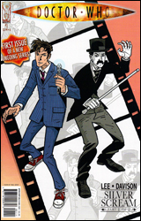 Doctor Who #1
Publisher: IDW
Released: 08 July 2009
Writer: Tony Lee
Artist: Al Davison
Colorist: Lovern Kindzierski
Letterer: Robbie Robbins
Cover: Paul Grist
Cover Price: $3.99
Review: Dan Toland
Licensed comics are, of course, usually garbage. To find one that's not a complete and utter waste of your time is a pleasant surprise. To find one that's actually pretty good is almost unheard of. So imagine my disappointment when I saw Doctor Who #1 in my inbox.
I don't know if you've heard, but I'm a bit of a fan of the show. No, really, it's true. And the last thing I wanted to do was read yet another crappy installment of whatever tripe these people came up with; after all, after the excellent Doctor Who: The Forgotten miniseries, it would undoubtedly be a long time before we got anything remotely readable featuring the Time Lord in the comic format.
Then I saw that Tony Lee was writing it, and my mind opened a bit. He did a great job on The Forgotten, so I figured IDW was paying attention when they launched the new Doctor Who ongoing. And he doesn't disappoint. From a Who fan's perspective, he's got David Tennant down cold ("Are you going to talk all of the time, Doctor?" "Probably."), and from a comic fan's perspective, he delivers an interesting story. It's the 1920s, and the Doctor is visiting silent-movie era Hollywood. Famous comedian Archie Maplin (yeah, I know, just go with it) has leased some of his studio space to a producer who may, in fact, be even more evil than your ordinary, run-of-the-mill Hollywood producer. (I promise, it's at least a little more interesting than I just made it sound.)
Lee's script is pretty damn good. Set after the conclusion of the most recent season, he perfectly captures the tone of the television series. The art's not half bad, either. The Doctor doesn't always bear a striking resemblance to Tennant, but he tells the story remarkably well and never gets in his own way. I like the color palette as well. Everything's very bright, with lots of primary colors; it's actually quite cheerful in its own way.
Let's be honest: this is going to be for fans first and foremost. And if you're a fan of the TV show, you'll want to borrow this. It really works hard at evoking the vibe of the show. Non-fans will probably give this a quick flip through to see if there's anything in it that grabs them. I'm very interested to see where this goes, and if they can keep the quality up.
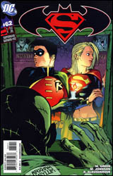 Superman / Batman #62
Publisher: DC Comics
Released: 15 July 2009
Writers: Michael Green and Mike Johnson
Penciler: Rafael Albuquerque
Inker: Rafael Albuquerque
Colorist: David Baron
Letterer: Rob Leigh
Cover: Rafael Albuquerque
Cover Price: $2.99
Review: Chris Johnson
Everyone loves a good old-fashioned summer blockbuster; all you have to do is kick back, relax, not analyze what you're watching, and just enjoy. Superman / Batman began as a title aiming to fill just that niche, and while it has branched off since the departure of its original creative team, I'm sure it has had one or two summer blockbusters since then. This latest issue of Superman / Batman, however, reads more like a suspense thriller than anything else. The framing sequence shows Robin and Supergirl meeting in a diner, in their civilian identities of course, to have lunch and discuss the life of a superhero. During the conversation, Robin asks if Supergirl remembers when they first teamed up, providing a segue into the flashback sequence / story. Like every third Sunday of the month, the inmates had taken over Arkham Asylum, and it was up to a not-exactly-on-friendly-terms-yet Robin and Supergirl to end the crisis. As they journeyed through the asylum they encountered a number of horrors, including The Joker playing doctor; Mad Hatter, Clayface, Scarecrow, and Two-Face having a tea party; Poison Ivy and Killer Croc warming up to each other; and a mystery villain behind it all. Along the way, they learn to work past the traditional first team-up bickering.
I'm a bit torn on the story. It somewhat features the tired cliché of superheroes fighting when they meet, albeit Robin and Supergirl fight with words and there are no buildings turned into rubble. I'm also leaning towards rioting at Arkham being a cliché at this point, but I think it worked here. This is Supergirl's first encounter with the asylum, and seeing how it affects her does make the story more interesting. Of course, this does partially lead to another cliché: a hero's actions at the beginning of the story being questioned by the other, and then vice versa occurs at the end of the story. The characterization was more or less spot on, though Two-Face came off more as some common thug than the character he is. The sequence with the "mystery villain" was a nice, tense moment, too. My favorite part of the issue, however, was the framing sequence. The lightheartedness of the two young heroes discussing life and their "bosses" was a nice balance to the darkness of the flashback.
Part of what makes the framing sequence so effective is Rafael Albuquerque's artwork. While I haven't read a lot of stories featuring his work, I'm rapidly becoming a fan. When searching for a word to describe his artwork, "fun" comes to mind — though that doesn't mean he can't handle dark sequences. Albuquerque's versatility can be seen in his ability to draw all of the characters in this issue and draw them well, from the teenage superheroes to femme fatales to beasts. I also appreciated how Albuquerque draws Supergirl. Instead of the over-sexualized image that has appeared in most modern interpretations, Albuquerque's Supergirl is more along the lines of the cute teenager she should be portrayed as. There were a few wonky faces that I noticed, but overall, Albuquerque's artwork is fantastic and he is well on his way to becoming one of the industry's top talents.
While the story was good, it isn't what I would call an essential read. Albuquerque's artwork though, as I previously stated, is excellent and is worth giving this issue a flip through all on its own.


