Is It Wednesday Yet?
14 July 2009 � Here we are again with another installment of your favorite comic book review series. As always, the reviews are free of spoilers, so read on without fear of having your experience ruined!
Our grading scale is simple:
Buy: An excellent comic book.
Borrow: A good comic, but save yourself some money by reading a friend's copy.
Flip Through: Give it a once-over at the comic shop.
Skip: This doesn't need to be explained.
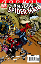 Amazing Spider-Man Annual #36
Publisher: Marvel
Released: 01 July 2009
Writer: Marc Guggenheim
Penciler: Pat Olliffe
Inkers: Pat Olliffe and Andy Lanning
Colorist: Antonio Fabela
Letterer: VC's Joe Caramagna
Cover: Olivier Coipel
Cover Price: $3.99
Review: drqshadow
Peter Parker's dear old Aunt May has gone and got herself engaged. That's right, the old maid is ready to take on a new suitor, and despite her previous missteps in the ways of love (RE: Doc Ock), in this instance she seems to have chosen wisely. The only snag? Her bubbling hubby-to-be just so happens to be the father of a certain cigar-chomping, short-tempered, flat-topped newspaper editor by the name of J. Jonah Jameson. If you can't see how that might throw Peter for a loop, well, perhaps it's time to catch-up on some back issues.
Marc Guggenheim's story offers a split focus: half on the engagement party and half on the ensuing superpowered rumble. Watching Peter and Jonah snipe at each other from across a dinner table makes for a few amusing moments, but doesn't really add anything to their relationship. If anything, Peter comes off every bit as petty and irritating as his longtime nemesis during that long, drab meal, which makes the whole ordeal even less appealing. If they're both being smarmy dicks, whose side am I supposed to be on?
It only gets worse when the action spills onto the streets, and Guggenheim takes every possible opportunity to remind us that this story is taking place in Boston. Between the constant flaunting of the city's notorious accent, the excess of commentary from the peanut gallery, and the random dude decked out from head to toe in Red Sox gear, I was ready for Spidey to start throwing punches at the crowd. Never has the word "wicked" been uttered so many times in a two-page span.
While Pat Olliffe's accompanying artwork doesn't exactly benefit from the comparison to Olivier Coipel's gorgeous cover, it still manages to get the job done. If you're looking for anything more, though, you're out of luck, because Olliffe doesn't bring much else to the table. His work is serviceable; it's easy to follow and fundamentally sound, but often overly safe and unspectacular. He paints the page with the same lack of excitement during Spidey's sudden brawl as he does Aunt May's hugs n' kisses with the future in-laws. It's a one-note approach, and while I can't really fault his technique, I'm not all that excited by it either. Match that with the grossly generic costume design he establishes for the new villain (dubbed Velociraptor) and you've got enough stale bread to feed a flock of seagulls.
With artwork that could often be mistaken for fill-in work from the early 1990s and an excess of jokes that widely miss the mark, this would've been bad enough without the eyeball-rolling revelation near its conclusion. Even with the teaser that's dropped during those final pages, the lack of consequence present in this issue is staggering. The storytelling plays it so safe that I felt like I'd been running in place for 30 pages, and Guggenheim never makes amends. This issue deserves a special term all to itself, because somehow the word "filler" doesn't really do it justice. Even if you're a serious Spidey fanboy, skip it.
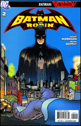 Batman & Robin #2
Publisher: DC Comics
Released: 01 July 2009
Writer: Grant Morrison
Artist: Frank Quitely
Colorist: Alex Sinclair
Letterer: Patrick Brosseau
Cover: Frank Quitely
Cover Price: $2.99
Review: Dan Toland
In this issue we're get treated to Dick Grayson having a serious case of the mopes after a fight at police headquarters (brought to us this week by evil carny folk, and yes, I actually just typed that) goes completely pear shaped � due in no small part to the personification of utter douchebaggery that is Damian Wayne. As Dick whines a bit and waits for Alfred to give him a pat on the head and a cup of hot chocolate to make him feel better, Damian strikes out on his own. Yeah, that's gonna end well.
This really should have been the most irritating comic I've ever read. It's not, and that's due in no small part to Morrison and his obvious affection for the characters. Yes, Dick is indulging in some serious mopery here, but he never seems shrill or obnoxious doing it. Morrison is getting across what should be obvious, but some writers seem to have trouble doing: impersonating Batman is hard. Whether you subscribe to the theory that he knows who Bruce is or not, Gordon doesn't for one minute buy that the guy standing in front of him is the real Batman. He's been saddled with a borderline psychotic for a sidekick. Even the cape is driving him crazy. Morrison makes Dick's points feel like legitimate concerns, and when Alfred gives us the obligatory "you can do it" speech, it's something I know I wouldn't have thought of and yet is totally true to the characters.
Aiding and abetting Morrison nicely is the artwork. Quitely doesn't need me to shill for him, but holy crap, is this book pretty! The fight scene is simultaneously balletic and brutal, and in the quieter moments you can see every mote of emotion on the characters' faces. Everything down to the panel layout is spot on. Special mention has to be made of the coloring, which is fantastic. Everything is lush and vibrant.
The underlying story may not be the most riveting ever, but the characterization is flawless and the art is beautiful. It's definitely worth a borrow.
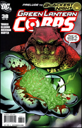 Green Lantern Corps #38
Publisher: DC Comics
Released: 01 July 2009
Writer: Peter J. Tomasi
Artist: Patrick Gleason
Inkers: Rebecca Buchman and Tom Nguyen
Colorists: Randy Mayor and Gabriel Eltaeb
Letterer: Steve Wands
Cover: Pete Pantazis
Cover Price: $2.99
Review: Chris Johnson
A symbol important to the Green Lantern Corps has been attacked on Oa. Lantern Soranik Natu deals with a recent revelation concerning her lineage. Mongul, leading his own faction of the Sinestro Corps, begins to rethink his strategy. The Guardians grant even more power to the Alpha Lanterns, and even harsher punishments upon the prisoners held captive on Oa. Kyle Rayner and Guy Gardner make a potentially costly stand for their beliefs concerning the Corps. And while all of these story threads are weaving, the threat of the Blackest Night looms closer than ever before. There are issues that conclude a story arc and then there are issues that conclude a story arc with a green-tinted bang. Green Lantern Corps #38, if the bad joke wasn't a giveaway, falls in the latter category.
While this issue has your full attention by its end, it does not begin that way. The words that Peter Tomasi scripted for the opening pages are just that: words on a page. There's no feeling that these are living, breathing characters; one voice is shared by three different characters. This feeling ends, though, as soon as the scene shifts to Soranik Natu. From then on, Tomasi's writing breathes life into the characters and they become fully realized. Emotional scenes featuring Soranik, Guy, and Kyle don't come off as clich�d; they're very real, intense, and raw. Though he only appears for a panel, the reader is able to grasp Mongul as the type of villain who does not allow a momentary setback to dissuade him from his plans.
While Tomasi's writing is in the positive column for me, I'm torn over Patrick Gleason's artwork. His style is extremely similar to that of Doug Mahnke, which I find to be both a positive and a negative. With Doug Mahnke coming on as the regular Green Lantern artist, the two books will now have a much more consistent style. That being said, I find some of the issues I have with Mahnke's style present in Gleason's work. Like Mahnke, Gleason's strength is in drawing non-human characters. With a Corps full of aliens, Gleason seems tailor-made for the book, but his human characters are a bit hit or miss. Most of the time, his Kyle and Guy look fine, but then there will be a panel where Kyle appears too bulky or Guy's face feels off. In the end though, his adeptness at drawing alien characters outweighs a few wonky humans.
If you're already reading GLC, you're going to buy this issue no matter what I say. However, if you're only reading Green Lantern, borrow this issue from a friend.
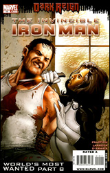 Invincible Iron Man #15
Publisher: Marvel
Released: 01 July 2009
Writer: Matt Fraction
Artist: Salvador Larroca
Colorist: Frank D'Armata
Letterer: Joe Caramagna
Cover: Salvador Larroca
Cover Price: $2.99
Review: Chris Johnson
Imagine you're Tony Stark. You've got the money, the cars, the women, the suit of armor, and you also happen to be director of SHIELD. (You also get put in your place by Bucky Barnes on a regular basis, but we'll leave that part out.) Sounds like a pretty good life, right? Now imagine that you've lost everything, you're public enemy number one under Norman Osborn's new regime, you're losing your memories at a such a rate that you need a Post-it Note to remember how to use a screwdriver, and one of your crazy ex-girlfriends has a sniper rifle pointed at you. Oh, and you've also sent Maria Hill on a mission to take something to Captain America, but since Maria is so out of it, the only person who can help her doesn't want to bother with her. Sounds like fun, huh?
Most of my knowledge of Iron Man comes from the Silver Age, so I don't know if Fraction is riffing on an older story, but the idea of Tony Stark slowly losing his intelligence, basically losing what makes him who he is, is a great concept. While I was a little wary of it at the beginning, Fraction does an excellent job of conveying Tony's deterioration, both in his actions and dialog. While we don't get a lot of dialog from her until the end of the issue, Fraction also writes a great Madame Masque, and what does end up happening at the end of the issue definitely has my interest piqued.
That being said, I do have a few problems. While probably important for the overall story, I thought the Maria Hill scenes slowed the issue down. And it's probably due to reading 25 issues of Captain America, but I found Fraction's dialog for Natasha to be quite off. My major issue, however, was the romance between Tony and Pepper. Previously it seemed playful, but here it's much more forced � although they did share a nice moment in Tony's Russian lab.
I have not read a lot of comics featuring Salvador Larroca's art, and those that I have were done in his modern style. After reading this issue, though, I have come to a conclusion: when Larroca is working with superheroes and villains, his art looks fantastic. His snow scenes in the issue were probably the best, conveying a great deal of mood. When he has to draw human faces, however, that's when the artwork falters. Pepper's face on the very first page leaps out at you � and not in a good way. Tony's face, already looking quite odd without his trademark moustache, sometimes made me think I was looking at a college student. There are a few inconsistencies throughout, but not so many that every page becomes a scavenger hunt.
Despite the somewhat stalling Maria Hill scenes, the issue as a whole is strong � although it may work more for fans of Iron Man than the casual reader. In the end, as the Crimson Dynamo would say, "In Soviet Russia, Invincible Iron Man #15 flips through you."
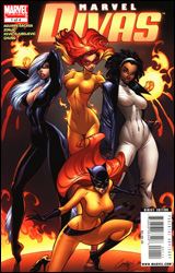 Marvel Divas #1
Publisher: Marvel
Released: 01 July 2009
Writer: Roberto Aguirre-Sacasa
Artist: Tonci Zonjic
Colorists: Jelena Kevic Djurdjevic and June Chung
Letterers: Cory Petit and Chris Eliopoulos
Cover: J. Scott Campbell
Cover Price: $3.99
Review: Aaron Robinson
Looking at the cover, I'm not quite sure what the higher ups at Marvel were thinking when they started promoting this book. It's a story about the love lives of Marvel heroines in the style of Sex and the City, and yet, for some reason, the cover features the girls striking sexy poses, each with the anatomy of a Barbie doll. Anyone picking this up expecting lots of cheesecake will find themselves disappointed, and the cover seems designed to scare away female readers. There's mixed signals being sent here, and I can only hope Marvel learns from this mistake.
The story is centered around Patsy Walker (Hellcat), Angelica Jones (Firestar), Felicia Hardy (Black Cat), and Monica Rambeau (Photon). The four gain an unlikely friendship after an uneventful night at a speed dating event for heroines. Whilst they all have different powers, personalities, and roles, they share one similar attribute: bad luck with men. Over the course of the story, Walker releases her latest novel, chronicling the ups and downs of her love life, Rambeau tells of her short-lived romance with Brother Voodoo, while Hardy explains how her relationship with Thomas Fireheart has been strained by a recent business decision. But the sudden appearance of Jones leads to the biggest surprise of the night.
Initially, I thought the concept of Marvel Divas was pretty cool. I can totally dig a superhero book that lets the fighting take a backseat to developing the characters. I was pleasantly surprised to find there was no villain cackling in the background, and most of the book is just the girls in a bar relaying stories of past and current relationships. But that's where the story stopped impressing me. I understand that it's supposed to pay homage to Sex and the City, but so much of the book feels like it's been directly lifted off the show. That would be fine if a spin was put on the concept, but there's none of that. I mean, they're superheroes, yet you could give them other jobs, and nothing would be lost in the process. It just feels like wasted potential.
It's not all bad; at least there are clever moments here and there in the dialog. Aguirre-Sacasa gleefully breaks the fourth wall several times, but he doesn't overdo it. And even though the characters act like the stars of Sex and the City, they all retain their personalities. The one exception is Jones, who seems to have lost her recent edge for a more awkward, flighty personality. The idea of having the four girls meet whilst speed dating is a strange one, too.
The only thing saving this from a skip is the artwork. For a book that's really low on action, Zonjic puts a lot of work into making the book feel lively. Even when the characters are just sitting around talking they manage to look energetic, and his scenery is fantastic. It straddles the line between being cartoony and realistic, and the balance works perfectly for Divas. Props to Djurdjevic and Chung for the coloring job; it's vibrant without being overdone.
A part of me wants to recommend this book for trying something different, but it just wasn't all that fun. It's a clever, yet wasted idea. And with the cover art, I have a hard time believing this will find the audience it's after. I guess it's at least worthy of a flip though.
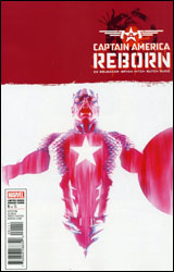 Reborn #1
Publisher: Marvel
Released: 01 July 2009
Writer: Ed Brubaker
Penciler: Bryan Hitch
Inker: Butch Guice
Colorist: Paul Mounts
Letterer: VC's Joe Caramagna
Cover: Alex Ross
Cover Price: $3.99
Review: drqshadow
There's been a lot left undetermined regarding the life, death, and ultimate fate of Steve Rogers. What's clear is that he was gunned down in cold blood on the steps of a DC courthouse, mourned by an entire nation, and quietly sent to his final resting place below the Arctic Ocean by a small group of friends. But even today, two years since his assassination, many of Cap's closest friends smell a cover-up. And when Sharon Carter suddenly starts to recall the details of her brainwashed fatal strike on that rainy autumn day, the floodgates burst wide open. Is Rogers truly dead? More peculiar, could he be alive? The answer to both questions might just be no.
Naturally, the only man most fans would trust with attempting to revive such a revered icon would be Ed Brubaker, the very same writer who penned Steve's final moments over two years ago. Under Bru's watch, Captain America has become a commercial and critical success, reinventing the character (not to mention the men who play him) and his closest companions while slowly altering the book's personality. His complex / interwoven plots, slow pace, and frequently political overtones have given the series a mature slant that seems much more at home with America's present identity both at home and abroad.
Make no mistake, much of that carries over to what Brubaker has produced in this first episode of Reborn. We're dealing with the same cast � naturally expanded to include many of the big players elsewhere in the Marvel Universe � they're working within the same dark, seedy world, and much of the plot is dependent upon a lot of quiet, effective espionage work. Familiarity isn't the problem, it's the dramatic turn into the realm of bad science fiction the issue takes around the halfway point that's stuck in my craw. The hinging point of Steve's death and ultimate resurrection, the device at its core, comes so completely out of left field that it requires more of a suspension of disbelief than I'm willing to provide. There was a certain degree of sad irony to the way Steve died, amidst the panic of a sniper's bullet on those cold courthouse steps. Here was a man that had personally stared down the onslaught of the Nazi war machine and emerged unscathed, but he still wasn't safe on the front lawn of his home country's justice system. Can the big payoff to that stirring scene really be something so far-fetched?
Taking time away from his run on Fantastic Four, resident Marvel superstar Bryan Hitch provides Reborn with its artwork. Sadly, even his efforts are disappointing, especially when compared to the recent success he's had alongside Mark Millar on FF and the seminal first two installments of The Ultimates. Hitch still delivers a small spattering of unmistakable panels and spreads this month, but spends the rest of the volume seemingly obsessed with matching the tone and style of Alex Maleev, Sean Phillips, and, more likely, Cap mainstay Steve Epting. The attempt is admirable, but only seems to weigh down Hitch's normally striking attention to detail and dazzling compositions. With the exception of a few occasional splashes of color, the thick strokes and drab, murky atmosphere that coat this issue's visuals are hard to get through � often rendering the work of one of my favorite artists nearly unrecognizable. I can't help but wonder if the typically slow-but-reliable Hitch has bitten off more than he can chew by taking on this project.
Look, at the end of the day this is a comic book; strange things happen routinely and are accepted as fact. I get that. It's just a tremendous disappointment to see something so smart, so different, distilled into yet another empty, confusing, cheesy event. If you've been enjoying Brubaker's run on Captain America, you'll find plenty to enjoy here. But you'll more than likely be just as sorely disappointed in the way they explain away Steve's triumphant return as I was. Flip through it and see for yourself.
Editor's note: Though the cover of the book notes the title as Captain America Reborn, the actual title is simply Reborn.
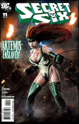 Secret Six #11
Publisher: DC Comics
Released: 01 July 2009
Writer: Gail Simone
Penciler: Nicola Scott
Inkers: Doug Hazelwood and Mark McKenna
Colorist: Jason Wright
Letterer: Travis Lanham
Cover: Daniel Luvisi
Cover Price: $2.99
Review: Dan Toland
Well, the cover promises to have everyone's third or fourth favorite Amazon, Artemis, "enslaved!" If that doesn't get your attention, I can't help you.
As far as I can make out, the Six have taken a contract in some country or other, or maybe a particular political group, or something, where they're dedicated to the re-establishment of slavery. I think. There's not a huge amount of backstory given, and we have no recap page. Anyway, they're working for some people who want to force other people to build shit. And this doesn't sit too well with some of the team. Will the Secret Six be able to make it to the end of the issue still friends? Oh noes! Oh, and yeah, Artemis is all tied up for some reason.
Here we have a situation where a recap would really have come in handy. We don't know where they are, we're not sure why we should care or whose side to be on (not that you run into a lot of pro-slavery platforms), and the whole thing begins with a standoff that gets resolved rather quickly and is never explained to the people who have the unmitigated audacity not to have read issue #10. Once you give up and get used to the idea that nothing is going to be made clear, this isn't a bad read. I like Simone, and her usual handle on characterization and dialog serves the issue well. Artemis is given a really good character moment as she dresses down her jailer, and Jeannette has a lot of good lines as she does whatever it is that character does.
Scott's artwork is decent. At no point was I blown away by anything, but neither did I find anything that bothered me. She delivers good, solid, clean work. (Well, there is a panel where I'm pretty sure Ragdoll has three arms, but that's neither here nor there.)
The lack of a recap really hurt my enjoyment of this issue. As it stands, the dialog is good and the characterization is there, but I don't know what's going on. And, to be frank, I don't care all that much. Flip through this one to see if it's your cup of tea, but don't get too hung up on it.
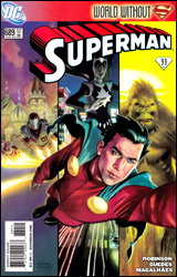 Superman #689
Publisher: DC Comics
Writer: James Robinson
Penciler: Renato Guedes
Inker: Jose Wilson Magalhaes
Colorist: David Curiel
Letterer: John J. Hill
Cover Art: Andrew Robinson
Cover Price: $2.99
Review: Aaron Robinson
Without any knowledge of the current DC Universe beyond a few tidbits of information, I wasn't really sure how to go into Superman #689. My fears were only made worse when I saw "World Without Superman" written across the top of the comic. It appears Superman has had to deal with things elsewhere, leaving the Superman-like hero Mon-El to protect the world in his absence. The issue is essentially just Mon-El travelling around the world, punching bad things in the face, and helping out a whole bunch of lesser-known DC characters along the way. At the same time a bunch of subplots all get explored in various depths; one involving Guardian's encounter with a telepathic alien, one involving media mogul Morgan Edge's plans to rid the planet of its otherworldly inhabitants, one involving General Lane plotting murders and scheming mysteriously, and one involving John Henry Irons giving a tour of his facility.
For a book that features dozens of characters, none of which being Superman, I actually managed to follow it just fine. That's largely thanks to Mon-El, who's only just escaped the Phantom Zone. For him, the world is a strange and unfamiliar place. It not only makes for an interesting story, it's also a decent starting point for new readers. The various subplots were a little harder to follow, but that's understandable, and without any kind of recap page, a bit hard to avoid.
Robinson doesn't weave an amazing, intricate story, but what does transpire is pretty solid. He advances the story in little increments while giving Guedes the chance to draw page after page of Mon-El and various other heroes and villains fighting. My one issue with the writing is the way the book ends; it's a pretty weak cliffhanger. I can't say I had any problems with Guedes art. The book is constantly changing locations and characters, and he steps up to the plate each time. It's a book full of splash pages, and that isn't a bad thing.
Whether or not you'll want to read this issue depends on how much the idea of Mon-El punching bad things interests you, because that's pretty much what this is. I'll give it a solid borrow.


