Is It Wednesday Yet?
05 May 2009 — Here we are again with another installment of your favorite comic book review series. As always, the reviews are free of spoilers, so read on without fear of having your experience ruined!
Our grading scale is simple:
Buy: An excellent comic book.
Borrow: A good comic, but save yourself some money by reading a friend's copy.
Flip Through: Give it a once-over at the comic shop.
Skip: This doesn't need to be explained.
 Buck Rogers #0
Publisher: Dynamite Entertainment
Released: 22 April 2009
Writer: Scott Beatty
Artist: Carlos Rafael
Letterer: Simon Bowland
Colorist: Carlos Lopez
Cover: John Cassaday
Review: drqshadow
Now pressing past his 80th birthday, Buck Rogers is still going strong as an important part of pop culture and science fiction history. He's gone from the height of popularity to the laughingstock of an industry and back again, endured parody after parody and outlasted each of his imitators. Now, with a renewed interest from the retro audience, he's back to launch a brand new ongoing series from Dynamite Entertainment.
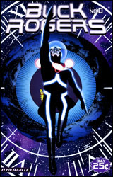
Under artist Carlos Rafael's watch, the character has undergone a sharp makeover. His new wardrobe is an interesting mix of modern sci-fi tendencies and kitschy nods to the character's past. Buck's gown has been simplified and streamlined, but the helmet and needlessly tall leather boots are undeniable throwbacks to his earlier days. The set of curvy, brightly glowing blue racing stripes that work their way across his body may modernize his appearance, but they also give the impression that he's more than just an adventurous guy floating through outer space. In these threads, he looks primed and ready to be the next bearer of the Nova Force. Rogers still carries a bright yellow raygun that was hard to swallow in the 1950s, but it's balanced by the cold, metal sheen of its companion: a generic modern pistol. It sounds like a marriage made in the depths of Hell, but it works surprisingly well.
Rafael feels right at home in a book that centers itself on space exploration and alien habitats. His best work is early in the issue, when the story is more concerned with introducing this particular set of alien invaders rather than exterminating them. He brings a nice sense of scale to the page when the pace is leisurely and the intent is to dazzle readers with unfamiliar landscapes and wide-angle shots of the Earth, but as things pick up he loses his focus. In the action scenes specifically, I often had trouble figuring out which stock action pose Rogers was striking.
Scott Beatty has written the character with a brash, loud-mouthed tough guy image that sometimes feels a bit forced. He's quick with the one-liners, even if they aren't all that amusing or inventive. Buck's bravado and arrogance often rubs me the wrong way, and his "kill everything and run" mentality only reinforces that line of thought. In a way, I guess, that superficial ugliness makes him more human, just in a way that's anything but flattering. I was hoping for more adventuring and less gunslinging, but that's not the MO of Buck's new series.
I don't have a problem with pure action just for the fun of it, which is just about all you'll get in Buck Rogers #0. Without an appealing lead character, though, it loses some of its edge. This isn't bad — Scott Beatty shows us he has enough imagination to make this thing work, and Carlos Rafael's artwork matches that creativity — it's just shallow and didn't particularly move me to investigate the regular series. For the cover price of a quarter, I guess you can't ask for too much. Flip through it, but you probably won't read it more than once.
 Fantastic Force #1
Publisher: Marvel
Released: 22 April 2009
Writer: Joe Ahearne
Penciler: Steve Kurth
Inker: Serge Lapoint
Colorist: Chris Sotomayor
Letterer: VC's Rus Wooton
Cover: Brian Hitch
Review: Preston Nelson
What makes a truly great team book? It's arguable, but more often than not, a truly great team book comes from characters whose relationships seem real. Most famously, the Fantastic Four has always thrived on its group dynamic. Sue and Reed are married, but Reed is truly married to science. Johnny is the kid brother: temperamental, but always itching to prove himself. And Ben is the dependable oaf who's prone to bouts of self-loathing, but always willing to fight for his family. And that's what they were, a family. Fantastic Force is taking its cues from the classic family dynamic, but, while the book isn't truly failing, it's not quite the spiritual successor it's trying to be.
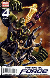
Five hundred years in the future, Earth is used up and humanity is forced to make Nu-Earth. For some reason, Galactus takes issue with that and shows up, preparing to do his "eat your planet" thing. All the superhumans manage to band together to stop the big purple glutton, but at a catastrophic loss to their own numbers. As a matter of fact, only six survive: Bruce Robert Banner, Jr. (descendant of the Hulk, with a mind as sharp as Mr. Fantastic); Lightwave (the team's Human Torch); Psionics (the telekinetic daughter of Lightwave); Natalie X (a powerful telepath); Alex Ultron (a descendant of the original Ultron, complete with emotions); and The Hooded Man.
I don't want to get too off track here, but can we all guess who the hooded man is? If you said a completely original character with new powers and a cool look, you're totally wrong. Dear God, I wish you were right, but you're not. You see, since this is Marvel, no team is complete without a certain Canadian and his damn metal claws. Yup, the Hooded Man is future Wolverine. I honestly wish I cared enough to rant about it at this point, but it's just sad. In the book's defense, they use Wolverine / Hooded Man, pretty well. He lectures Banner, his stepson, about getting in touch with his inner animal during combat, which is something the kid doesn't much listen to. The Hooded Man's costume is awesome, too, which is why I was so disappointed when it just turned out to be Wolverine. But if the book had to have Wolverine, they did a nice job of making me hate him a lot less than usual.
Another character point well worth raising is the young Banner. You see, this team's Hulk is always the big green guy. But, he's still the shy introspective genius that he always was. No rages, no roars, only the curious intellgence that we've traditionally associated with characters like Mr. Fantastic or Beast. It's a choice that I've not seen made very often, but I really like it. Maybe it's because I happen to identify on a personal level with the intellectual in the body of the brute, or maybe it's just because it's so different than what I'm used to. When Hooded Man is extolling the virtues of just losing yourself in the battle, Banner cuts him off, reminding him that when he's off in a berserker rage, someone has to hang back to clean up his mess.
I think the biggest problem with this book is that while it's trying to be original and new, it feels really derivative. It feels like things I've seen before with different labels. Alex Ultron is the best example of this, I suppose. The descendant of a psychotic robot villain is on a team of superheroes in the future? Brainiac 5 is gonna be pissed!
The guy even looks so much like Colossus that Hooded Man cracks a joke about it. And that feeling of deja vu really hurts what could be a fun book. The art isn't great, but all the same it's not distractingly bad, either. There's some really cool stuff with character designs, notably Hooded Man, Hulk and Natalie X, but some of the background characters are lacking. The book has really strong potential, but potential isn't worth that much. Flip through it.
 Skrull Kill Krew #1
Publisher: Marvel
Released: 22 April 2009
Writer: Adam Felber
Penciler: Mark Robinson
Inker: Mike Getty
Colorist: Andres Mossa
Letterer: Joe Caramanga
Cover: Mario Alberti
Review: Preston Nelson
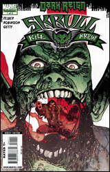
Was this serious? It kinda felt like the old issues of Lobo, back when it was still a parody and all about being so over-the-top that it was hilarious. I mean, this had some cute jokes, but it was totally serious. And I think the thing that's the most unsettling about this is that the art is about as cartoony as you can get in a book unless you're drawing Wizard of Oz or Tiny Titans.
Right, context. Well, those of use who know the story of the original Skrull invasion know that Reed Richards tricked the first Skrull invaders into shifting into cows, and then mindwiped them, so that they actually believed that they were cows. Of course, cows tend to be slaughtered and eaten, and so were these Skrull-cows. For some reason, anyone that ate a Skrullburger gained shape-shifting abilities and a serious mad-on at the Skrulls. Namely the book's main character, Ryder. Some Skrulls kidnaps some girls, by tricking them into a meat packing plant by saying it's a dance club, and having a Skrullian Thor stand out front. Ryder takes offense to this and resolves to save them. It's not deep. It's not written well. And the art is jarring.
I'm not going to say characterization is easy, because good characterization isn't. But average characterization isn't that difficult. And I know that the author is trying to be edgy and violent and cool, but if you write your main character as an unlikable piece of trash, that doesn't make him a bad boy, it makes him an unlikeable piece of trash. I didn't like reading Ryder; I didn't root for him. As a matter of fact, I was hoping that the Skrull Thor would mash Ryder's head in with his hammer. Ryder looks, acts and feels dated, what with his guns and dreadlocks and sunglasses on at night. I swear to god, he's a few pouches short from an appearance in Youngblood.
As much as I've said that the art doesn't fit, I don't dislike it. I just dislike it here. It's very kinetic and colorful, it's got a very bouncy, fun tone, but if you've read any of my thoughts, you'll see that it's a heck of a departure from the story. I'd like to see this guy draw Speedball or Spider-Man, even a Fantastic Four book. But not this bile.
Skip it as hard as you can.
 Viking #1
Publisher: Image
Released: 22 April 2009
Writer: Ivan Brandon
Artist: Nic Klein
Letterers: Kristyn Ferretti and Nic Klein
Cover: Tom Muller
Review: drqshadow
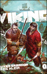
Like a Scandinavian Robin Hood with a depleted army of merry men, the ragtag group of leading men in Viking makes its living thieving from those who "need less than they have." Of course, their intentions aren't nearly as noble; these warriors are in it for themselves, and sometimes the wealthy aren't always as rotten as they seem to be. But therein lies the book's deepest conundrum: to side with the privileged (who hoard everything they touch), or the daring (who slaughter whatever gets in their way). Decisions, decisions.
Ivan Brandon is credited specifically with the script, which frankly I found downright awful. There's something to be said for grounding a series in a specific era via appropriate verbiage, but there should also be an unspoken rule that if the reader can't follow it, you're doing something wrong. From all indications these Norse creatures are speaking English, but the meat of their message is lost amidst this desire to sound authentic. What's worse, on the few occasions I did get the gist of what was being said, it was never anything particularly important. These guys wax philosophical about the most mundane details and address each other like strangers, even if they're blood relatives.
The plot fares no better. Viking leaps from one scene to the next like the Hulk from curbside to canyon, sometimes even departing mid-sentence. If anything made sense in the first place I'd call it confusing, but that would insinuate a certain level of initial awareness that simply isn't present. The subject matter is like a dream: one minute we're sharing a casual meal with a cabin of shipmates, then scarcely three panels later all but one have literally lost their heads. An old man fishes for eels using the severed, rotting head of a horse as bait. When he finds success, the scene is treated nonchalantly, like this kind of thing should be common knowledge. The whole issue is like that: one surreal, excessively macabre scene after the next. It makes a few genuinely interesting observations, but they each seem to involve something taking a spear through its side.
Nic Klein's artwork is the issue's greatest asset, and even it has moments of weakness. Klein amps up the strangeness presented by the story with an odd blend of paint and ink. His efforts shift suddenly and unexpectedly from a more traditional, sharp mixture of strict black lines and computer-aided coloring techniques to the softer, more neurotic direction of his paintings. The switch occurs several times a page, and sometimes more than once within a single panel. That results in compositions that often blend together into one giant, colorful, illegible blob. His style flails about with equal inconsistency, never deciding whether it would like to deal in harsh realism or exaggerated caricature. If he could stick to one or the other, there's plenty of evidence he could be producing some great work, but his indecision is costly.
Viking is one big mess, a collection of clashing styles and incompatible influences both in its writing and its artwork. I can't fault it for lacking originality, nor for taking any risks in a medium that's always looking for something a little bit different. Its intentions were pure, its collaborators more than willing to take a few chances, but such efforts don't always result in great rewards. This issue showcases a number of characters with great promise, but I just couldn't connect with any of them. I found this to be bewildering, frustrating and unrewarding — a fine concept that was lost somewhere before its execution. Skip it.


