Is It Wednesday Yet?
16 April 2009 — Here we are again with another installment of your favorite comic book review series. As always, the reviews are free of spoilers, so read on without fear of having your experience ruined!
Our grading scale is simple:
Buy: An excellent comic book.
Borrow: A good comic, but save yourself some money by reading a friend's copy.
Flip Through: Give it a once-over at the comic shop.
Skip: This doesn't need to be explained.
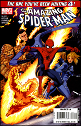 Amazing Spider-Man #590
Publisher: Marvel
Released: 01 April 2009
Writer: Dan Slott
Penciler: Barry Kitson
Inker: Mark Farmer
Colorist: Dean White
Letterer: VC's Joe Caramagna
Cover: Barry Kitson
Review: Preston Nelson
Like it or not, "One More Day" changed the Spider-Man status quo. Not only did it erase his marriage to MJ, it also made everyone forget who Spider-Man is. No one can remember his face. Naturally, this is going to cause friction with a lot of people in Peter's life, particularly with his buddies the Fantastic Four.
A few years back, Spidey and the FF went into the macroverse (think Pym's microverse, but the other end of the spectrum), and they saved a small civilization of humanoid creatures. Funny thing is, Spider-Man was unmasked the whole time. After a cold opening with a very funny tease of Spider-Man's more macabre moments, the Four reappear and whisk Peter back to the macroverse to answer a distress call.
Slott's writing is often a subject of debate, but I can't think of too many active writers that I like more. He's perfect for a book like Amazing Spider-Man, since he has such a firm grasp of both humor and drama. Peter is funny when he's supposed to be funny, and he's dark when he's supposed to be. He's got a well-written protective streak about his mask, as no one can ever know his identity. And as always, Slott writing the Thing is perfect. He's grouchy, he's funny and he loves to fight. The exchanges between Reed and Peter are great as well, showing just how bright Peter is. A complaint that needs to be addressed, however, is Slott's handling of Johnny Storm. I understand that he would be upset and uneasy with Spidey, given the whole inability to remember Peter's face. He's rightful to be suspicious, but he's actually a whiny, petulant jerk. It's just terrible characterization.
Kitson's art is good, but Dean White's coloring brings out the best in it. Specifically, the effects on Susan's powers. And this issue really does some little things well. Like, as the Four and Spidey are departing, Susan is handing her children to Alicia Masters and her new beau. Ben, who's in the frame, has his eyes locked on Alicia, a real sadness permeating him. I don't know if Slott wrote that into the script or if Kitson just drew it, but it was an incredible moment.
Completely average book with a few great moments and a fun, Silver Age feel. It continues the trend of Dan Slott turning editorial mandates into something worthwhile and interesting. Borrow it.
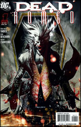 Dead Romeo #1
Publisher: DC Comics
Released: 01 April 2009
Writer: Jesse Blaze Snider
Penciler: Ryan Benjamin
Inker: Saleem Crawford
Colorist: Joel Benjamin
Letterer: Travis Lanham
Cover: Ryan Benjamin
Review: drqshadow
The latest in a string of vampire concepts to strike pop culture, Dead Romeo investigates the activities of nine freshly reincarnated blood-sucking monsters and their quest to, well, we don't really know that just yet. All that's certain is that it involves sharp teeth, grimy alleyways and gore. Lots and lots of gore.
The author, Jesse Blaze Snider, delivers a cast of characters that's so bland and one-dimensional I can't help but wonder if he's doing it on purpose. We've got an actor-turned-vampire, a roided-out bodybuilder vampire, a gun-wielding vampire, a rapist vampire — and the list goes on. And if you expect any of them to have a touch of depth, personality or anything beyond a weak gimmick to separate them from their running buddies, you're being overly optimistic. This book has awful dialog, a weak underlying premise and an indecisive, painfully forced protagonist. Our hero spends a whopping three pages of quality time with the leading lady, consisting of a few terrible pick-up lines and a curt parting of ways, before she's thrown into harm's way and he must choose between her life and an eternity amidst hellfire and brimstone. Seriously, that's the long and the short of this entire issue. Is there only one woman in this city? The man returned from the dead, immediately found the nearest warm female body (she was asleep on a tombstone), made a genuinely rotten attempt at flirtation and now he's contemplating eternal damnation to save her life? If this is the kind of substance I can expect from the rest of this miniseries, I think it can let me off right here, thanks.
The artwork, provided by journeyman Ryan Benjamin, can't seem to decide on an identity. On some pages he's mimicking Brandon Peterson, on others he looks to be offering up an homage to Pat Lee and Dreamwave Productions. I'm genuinely surprised a lot of these pages were credited to the same artist, their appearance is that radically different. Benjamin overloads this issue with two-page spreads, which comprise about three-quarters of the story, and delivers them with varying degrees of legibility. His action scenes are angled and directed so strangely, I still don't really have much of a clue about what actually happened. He takes the story's darker overtones just a step too far, bathing the page with so much black ink it's often completely illegible. Our introduction to the bulk of Dead Romeo's cast takes place in a bar so prohibitively dark, I couldn't put a single name to a face when they were suddenly thrown into a fight two pages later.
Benjamin's work never gets any better than it is on the cover, and that's a major disappointment. Casual readers might be misled by that truly gorgeous composition, which overflows with the kind of restraint, nuance and character that's missing from the issue's internals. Before that first page, Ryan looks like a talented, disciplined, striking new visual artist. After his first few internal layouts shatter that façade, it's a long, slippery downward slope.
Not to mince words, but don't waste your time with Dead Romeo. It's recycled, rehashed and regurgitated material that's been done better. You can admire the book's greatest asset, its cover, right there on the shelf without even lifting a finger. Skip it.
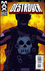 Destroyer #1
Publisher: Marvel
Released: 01 April 2009
Writer: Robert Kirkman
Artist: Cory Walker
Colorist: Val Staples
Letterer: VC's Rus Wooton
Cover: Jason Pearson
Review: Preston Nelson
Let me get this out of the way: Destroyer's look is stupid. It is mind-bendingly, extra-crispy, handfuls of Viagra stupid. He has some Skrully mask, a Punisher flak-jacket and a red spandex shirt. It's awful.
That said, I've never read a book like this. Quite literally, the first frame is Destroyer putting his fist through a disposable minion's head, as a hunk of jaw and eye fly at the reader. In short, it's violent as all hell. It's flat-out insane in the opening, a big bundle of extreme violence and explosions, kinda like if Quentin Tarantino and Michael Bay had a smart-talking baby. And then, we cut to Destroyer in his civilian guise, Kevin "Keen" Marlowe, being the best grandpa in the world, at his granddaughter's birthday party.
You see, Keen Marlowe has been kicking the crap out of bad guys since World War II. While Cap got all the glory and the press, Destroyer actually did some real good, working from behind enemy lines. But Keen is getting old, and Keen has a family that he loves and wants to protect. And Keen knows that the world is a deadly, dangerous place. And Keen knows his clock is ticking.
I think you get where this is going.
It's a great revamp for a Golden Age character that I hadn't even heard of before reading this issue. He's brutally efficient, but he's not haunted, he's not obsessed. He's just good at his job. He has a family that he loves and a job that he's pretty damn good at. The concept is great, and it's Kirkman. I mean, what else do I have to say? Kirkman is an incredible writer, who is utterly perfect for this violence and humanity. He's as good as he's ever been here. Cory Walker's art is great in the action sections, but does tend to suffer a bit during the quieter moments with Keen and his wife. Walker has a very cinematic style, with really strong composition, but he has very little idea how to draw those quiet moments.
Flaws aside, this is going to be a wonderful limited series. Get on board early. Buy it.
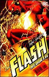 The Flash: Rebirth #1
Publisher: DC Comics
Released: 01 April 2009
Writer: Geoff Johns
Artist: Ethan Van Scriver
Colorist: Alex Sinclair
Letterer: Rob Leigh
Cover: Ethan Van Scriver
Review: drqshadow
It's time for a regime change within the Flash mythos. Or rather, a regime reversion. Wally West is out, and Barry Allen is back in. For all intents and purposes, DC seems to have chosen the right men for the job. The miniseries teams former Flash scribe Geoff Johns with his Green Lantern: Rebirth collaborator, artist Ethan Van Scriver.
Despite the speedy nature of its namesake, this series really doesn't get off to much of a fast start. In his return to Central City after three years, Geoff Johns allows himself (and his story) to linger a bit too long in the nostalgia of the moment. It's nice to look back, to share a few stories with the heroes that ran alongside Barry back in the day, but at some point you'll start to wonder when the parade is going to end. It's two pages of talk about the old days, one page of requisite observations about how the world has changed since he's been gone. Johns doesn't make these scenes a burden — in fact, I feel like I know more about Barry as a personality now than I ever did before — they're just so numerous, so universally slow in pace, that I found my appetite for drama overcoming my interest in supplemental characterization. It's written well, but it doesn't feel like a genuine event. There's too much complacency and not enough crisis, for lack of a better word.
Van Scriver's artwork is quite the paradox. To say it's obsessively meticulous simply wouldn't suffice — the man deals in detail like the Devil does sin. He simply wallows in it, fills every last corner of every last panel with a precise rendering of something, no matter how inconsequential. In that regard, he's really something to behold: his cityscapes are marvelous, and the cluttered forensics office that houses the issue's opening scenes gives him every opportunity to totally cut loose and have some fun.
But that level of specialization carries a price tag, and in this case it's beautiful, abundant work at the cost of heart-tugging emotion. Ethan spends so much time and effort ensuring every last detail in the environment is just right that he often overlooks the facial expressions and body language of the characters that reside alongside them. In this regard, he has a lot in common with Midnight Nation and Supreme Power's Gary Frank. Both bring a style and sensibility to the page that I can't help but admire, but at the same time there's just something missing from their cast. It's like they don't have the capacity to emote as loudly (or maybe as flamboyantly) as I've come to expect from this medium. This is especially pronounced when Van Scriver turns his focus exclusively to the more garishly outfitted heroes and villains. I can accept a somewhat sterile, robotic physical presence from the city's pedestrians, but when an entire room of rogues also suffers from the same malady, the jig is up.
As a character study, this is a triumph. And maybe that's all Johns and Van Scriver intended it to be: a love letter to fans of the old Flash, and a reminder of why he's so adored for the newer audience. Despite a few intriguing hints of what's to come, scattered around the last pages of this chapter, there isn't much else to the issue than that. Borrow it and drink in the characterization, but don't step in expecting an event. Not just yet, anyway.


