Is It Wednesday Yet?
26 March 2009 � Here we are again with another installment of your favorite comic book review series. As always, the reviews are free of spoilers, so read on without fear of having your experience ruined!
Our grading scale is simple:
Buy: An excellent comic book.
Borrow: A good comic, but save yourself some money by reading a friend's copy.
Flip Through: Give it a once-over at the comic shop.
Skip: This doesn't need to be explained.
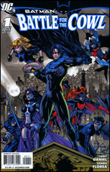 Batman: Battle for the Cowl #1
Publisher: DC Comics
Released: 11 March 2009
Writer: Tony Daniel
Penciler: Tony Daniel
Inker: Sandu Florea
Colorist: Ian Hannin
Letterer: Jared K. Fletcher
Cover: Tony Daniel
Review: drqshadow
In the aftermath of Final Crisis, Gotham City is in tatters. With its shadowy guardian presumed dead, the city's criminal element has been energized and mobilized, leaving the remainder of Batman's associates struggling to keep up. Thus far Nightwing, Robin, Oracle and friends have managed to stem the tide, but a looming showdown between the rival gangs following Two-Face and the Penguin (not to mention a diabolical jail break outside the gates of Arkham Asylum) may prove to be too much for any number of heroes to tackle. And that doesn't even account for the in-fighting and conflicting emotions surrounding the very cape and cowl that Bruce made famous.
Sadly, despite a steep, heavy-handed narration that tries desperately to instill a sense of gravity to the issue, in the end this goes almost nowhere. While writer / artist Tony Daniel delivers no less than three gigantic fireballs, a wrecked Batmobile and a random Singapore cane match between Nightwing and Alfred, so much of the chapter is spent treading water and covering old ground that I was downright begging for some semblance of forward momentum as the final pages trickled by. I have to imagine that the road toward selecting a new Batman involves more than a series of fistfights with nameless, faceless goons and a thin "Imposter Bats" storyline, but this is just a three-issue miniseries and that's all the first issue's provided.
I was expecting a more proactive stance from these characters, a more animated debate about the positives and negatives of replacing Bruce Wayne. Instead they seem content to hang back, watch what the enemy is up to and react when the situation demands it. Was Bruce the only one with any balls in this family? If so, who was the character I used to enjoy reading so much in Nightwing a few years ago? This is a rudderless ship right now, steering directly toward a jagged coastline, and the crew seems more interested in staring off into the distance and waiting for a new captain to announce himself than turning the wheel themselves.
Daniel's artwork isn't the worst DC has to offer, but it also isn't the best. While his work has improved notably since our paths first crossed during his brief run on Spawn, it's also become much more generic. His lines are tighter, more refined, more detailed, but the poses his heroes strike and the constant scowls they wear come straight from the book of overused superhero clich�s. The constant overlap between panels may help his work standout, but it also tends to be confusing and unnervingly busy, particularly during the fight scenes. On the few occasions Daniel's story slows down enough to allow for a quiet panel or two, it forces so much onto the page that the fleeting moment is lost. I don't hate the way this series looks, but I certainly don't love it, either.
Try as the publisher might to convince me Battle for the Cowl is a landmark event on par with The Death of Superman, in the end it's really much closer to that story's meager follow-up: The Reign of the Supermen. While this issue offers plenty of acceptable choices for the role of Bruce Wayne's immediate successor, it does nothing to get me excited about a single one of them, nor does it convince me any are ready or even willing to accept the responsibility. At the end of the day I was left thinking the best possible outcome would be a sudden, suspiciously explained return from the grave and an abrupt return to the status quo. Which, come to think of it, is precisely how Reign of the Supermen ended. This is a lot of hot air. Flip through it if you're curious and want to stay current, but don't let the publicity take you for a ride.
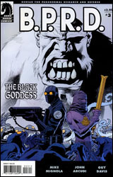 BPRD: The Black Goddess #3
Publisher: Dark Horse
Released: 11 March 2009
Writers: Mike Mignola and John Arcudi
Artist: Guy Davis
Colorist: Dave Stewart
Letterer: Clem Robins
Cover: Kevin Nowlan
Review: drqshadow
Spinning out of the pages of Hellboy comes BPRD, an ongoing account of the adventurous organization who provides our last line of defense in the battle against the occult, the paranormal and the just plain unknown. Perfectly willing to fight fire with fire, the Bureau itself retains the services of a number of friendly supernatural beings, including but not limited to demons, amphibious men, telekinetics and pyrokinetics. This time the international organization is on the case of Martin Gilfryd, a museum curator from the early 1900s whose fascination with Eastern folklore bordered a bit too closely on the unhealthy. Reborn in the present as Memnan Saa, the legendary master of fire and dragons, Gilfryd has already proven to be more of a threat than any member of the Bureau could have predicted.
Though Hellboy himself doesn't make an appearance this month, writers Mike Mignola and John Arcudi pack the issue with the same sense of curious adventurism and jolting action that have come to characterize the big red guy's escapades. Something I've always admired about Mignola's writing is his ability to effortlessly intertwine fact with fiction with folklore, blurring the lines between the three and convincing his audience that what they're witnessing, no matter how unbelievable, is actually rooted somewhat in reality. Although the peak of the fairy tale is more than a generation behind us, the books in the Hellboy family have done everything in their power to remind us of what we found so endearing with them in the first place. The marriage they provide between the limitless possibilities of those old yarns and the factual basis, strong characterization and stunning visuals demanded by modern readers is one of a kind. The Black Goddess draws from that same pool, and if that hasn't grown old by now I can't imagine it ever will.
Industry veteran Guy Davis continues to provide BPRD's artwork, bringing with him a style that's at the very least reminiscent of Mignola's simple, unmistakable work with the characters. And though Davis' efforts are inarguably simple and technically sound, he really doesn't benefit from that natural comparison, no matter how unfair that may be. He lacks the fine control of Mignola; his compositions seem more uncertain and free-flowing. While that looser take works to his benefit on a few occasions this month, particularly when the narrative shifts to look back at the path that led Gilfryd to become the Memnan Saa, it doesn't always fare so well. His work has trouble with facial expressions, and really isn't the best way to depict an enormous battle scene. Davis is playing the right song; he's just a hair out of tune.
Still, The Black Goddess is just what you think it is. Mignola's universe continues to impress me with its versatility and uncompromising high quality, which is amazing considering how long it's been around. As long as there remain unexplored myths and legends somewhere in the world, the BPRD will be around to investigate their origins and cast new light on an old subject. Although the series could do with a tad more consistency in its artwork and you'll want to read the preceding two issues before bothering with this one, it's still worth your time. Borrow it.
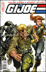 GI Joe #3
Publisher: IDW
Released: 11 March 2009
Writer: Chuck Dixon
Penciler: Robert Atkins
Inker: Clyaton Brown
Colorist: Andrew Crossley
Letterer: Chris Mowry
Cover: Robert Atkins
Review: Preston Nelson
Apologies to those older than me, but as someone who was born in the late 1980s, I was just a touch too young to ever get on board the GI Joe train. I vaguely recall seeing a few episodes of the cartoon in my youth, but even that's pretty much limited to Sgt. Slaughter being around, I think. Needless to say, this review isn't going to be enhanced by nostalgic feelings, which is a shame, as this book needs something to get me into it.
The concept is pretty simple: the Joes have recovered something from a sunken ship, and they've taken it back to The Pit for examination. Somebody is pretty pissed off about this, and sends killer robots after the Joes, leading to a massive shoot out. There's some pretty run-of-the-mill stuff with Baroness and an extremely man-pretty (and mask-less) Destro. And that's really just it. I mean, it's not terribly offensive, but it's really shallow. I mean, I could be missing something, but I'm not getting anything out of this that I couldn't get out of watching someone else play Halo.
I'll compliment the art, as Atkins has done some pretty nice, if decidedly average stuff. It fits the sort of "Michael Bay explodey-boom" aesthetic that the book has going for it, and is both inked and colored very nicely. The aforementioned frames with Baroness and Destro are the highlight, as they're very nice to look at, but like the rest of the book, kind of underwhelming to read.
One real complaint: Snake-Eyes is the one Joe that I can always identify at first glance, and for that reason, he's a character I suppose I could probably get into. If you look at the cover to this book, you'll see Snake-Eyes is on it. However, nowhere in the book does Snake-Eyes appear. Not even for one panel. Now, I know he's a ninja and could be hiding on every panel, and I wouldn't see him unless he wanted me to � but that's not good enough. Do not promise me Snake-Eyes, unless Snake-Eyes you shall deliver!
As a whole, it's a mostly unremarkable book, but there have been far greater transgressions committed against comics. Flip through it, and see if it ignites some nostalgic sparks in you.
 Resident Evil #1
Publisher: Wildstorm
Released: 11 March 2009
Writer: Ricardo Sanchez
Penciler: Kevin Sharpe
Inkers: various
Colorist: Milen Parvanov
Letterer: Kurt Hathaway
Cover: Kevin Sharpe
Review: Preston Nelson
You know what the best part of the Resident Evil franchise is (scantily clad Milla Jovovich aside)? Killing zombies. Heck, no one likes a good zombie bloodbath more than me. And you know what would be among the worst ideas ever released upon mankind? A comic focusing on the weaker points of the Resident Evil franchise, like characterization, dialog and plot, with almost no zombie death. And even worse, throw it in space, for needless comparisons to Dead Space and even Jason X!
And of course, that's exactly what we have.
For some reason, the Umbrella Corporation's bio-weapons are on a mostly empty space station. And rather than sending in a team of heavily armed marines, some government morons send in a lone female scientist.
And that's it. Literally, that's the entire issue. There's some flashbacks to some guy fighting some mutants in a European country, but the entirety of the issue consists of the lone female scientist essentially going "Yoo-hoo? Is anyone in here?" And I don't feel like I'm spoiling the plot, because there is no damn plot! If I want slow, building terror and real suspense, I'll read The Walking Dead. If I want to see a woman in a tank top and miniskirt kill 40 zombies in 30 seconds, I'll pick up Resident Evil. Honestly, I think that's my biggest problem with the entire franchise; it thinks it's so much more than it is. Resident Evil is violence, with the occasional side of cheesecake. But all the same, bad dialog and all, they get on their high horse, with some half-assed message, thinking it makes them deep, not realizing what a joke the whole thing is to everyone else.
God, even the credits are infuriating. They are quite literally the smallest and pushed aside credits I have ever seen in a comic. As if the writers and artists said, "If no one notices I wrote it, I might not have to claim it." And why in the world did this book need six freaking inkers? If that doesn't scream, "Let's polish this turd as quickly as possible, and never speak of it again," I don't know what does.
And honestly, the art isn't that bad. It's not earth-shattering, but there is nothing wrong with it. There's some nicely done shots and a couple of pretty cool designs, but honestly, that's the cherry on top of the shit sandwich that is this book. Skip it.


