Is It Wednesday Yet?
02 December 2008 � Here we are again with another installment of your favorite comic book review series. As always, the reviews are free of spoilers, so read on without fear of having your experience ruined!
Our grading scale is simple:
Buy: An excellent comic book.
Borrow: A good comic, but save yourself some money by reading a friend's copy.
Flip Through: Give it a once-over at the comic shop.
Skip: This doesn't need to be explained.
 The Brave and the Bold #19
Publisher: DC Comics
Released: 19 November 2008
Writer: David Hine
Penciler: Doug Braithwaite
Inker: Bill Reinhold
Colorist: Brian Reber
Letterer: Rob Leigh
Cover: Dougie Braithwaite
Review: drqshadow
A long-lasting staple of the DC line, The Brave and the Bold told the stories of DC's mightiest team-ups for nearly 30 years before its cancellation in the early 1980s. Now, nearly two years into its second run, the series is once again blending established characters with lesser-known faces. This month, for example, features an intergalactic SOS that's answered by both Hal Jordan and The Phantom Stranger. Sounds like business as usual, right? Well, here's the catch: that cry for help from a far-away galaxy was conveyed by a comatose child in a West Virginia hospital.
Cast in the unenviable role as a placeholder, biding time with the series until J. Michael Straczynski takes over in 2009, writer David Hine is nonetheless making the best of his limited window of opportunity. This issue's story, an unexpected blending of horror, sci-fi and medical drama, is both smart and interesting. While Hine has a tendency to lose himself in scientific detail, especially during the onset, such moments lend the story authenticity and immediately deliver the sharp, distinctive tone that flows from cover to cover. This writer displays the ability to deliver tremendous detail and sobering circumstance with only a few panels of explanation and a minimum of dialog. He's done a lot of research, added a few original twists of his own and compressed it all into a format that's brief but powerful.
When the narration leaves the Earth, Hine's imagination really shines. While the story itself has a very specific underlying purpose, the author still takes the opportunity to stop and smell the roses � so to speak � enveloping his readers in the culture and personality of a heretofore-undocumented alien world and noting its similarities to our own. If the spectacular adventure of the primary story weren't so good, I could get lost in the minutiae of this alien culture without qualm. Such attention to detail is unusual, especially from temporary talent, and I'll be keeping an eye out for more of Hine's work in the future.
Artist Doug Braithwaite is an equally imaginative, if somewhat less consistent, talent. Braithwaite's strict, lifelike style is a good partner for the story's stoic flavor, and delivers the straight, intellectual appearance that his writer was seemingly after. The artist's renditions of the vast alien wilderness are fantastic, and his dramatic timing is topnotch. My only misgiving lies with the drastic, and often distracting, level of detail that he brings to the page, which often hampers the book's legibility. It's a minor issue and one of personal preference, but an issue all the same.
I was tremendously surprised and impressed by this issue. Oftentimes, the arrival of a star-studded creative team is immediately preceded by a series' worst moments, filler work by creators with little time or investment in the book and its characters. That couldn't be further from the truth in the case of David Hine and Doug Braithwaite. In the interim before the more widely anticipated arrival of JMS and company, this pair has delivered something to be heralded. It's smart and compelling, with a cliffhanger that has me anxious to see the resolution. Buy it and see for yourself.
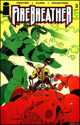 Firebreather #3
Publisher: Image
Released: 19 November 2008
Writer: Phil Hester
Artist: Andy Kuhn
Colorist: Bill Crabtree
Cover: Andy Kuhn
Review: Guest
Duncan Rosenblatt is just like any other high school student. He has to contend with exams, crushes and even the divorce of his parents. Oh, but his father is a dragon, making him a weird orange half-human hybrid. The book literally spends one line on his parents and assumes that's all we need to know. His mother is a human, and his father is a dragon. How does that work? Granted, I don't need you to draw me a diagram, but did they actually explain in a previous issue how a human female and a massive dragon were able to, you know, mate? What was the dating period like? Did they go to Applebee's? How does a dragon pay for steak fajitas? Duncan seems to be the only of his kind, so clearly this sort of thing doesn't usually happen in this universe. Even weirder, no one seems to care that Duncan is a dragon-boy. His classmates treat him just like any other schmuck. I wasn't popular at all in high school, but if I had wings and could breathe fire, you can bet your ass I was going to be invited to all the parties. Instead, he's just peer mediating an emo girl, taking driver's ed (never mind that he can fly) and stumbling to talk to the bitchy hot blond that every school seems to have. (Except she delves into a level of bitchy that not even I've encountered before. She actually gets pissed off that Duncan isn't obsessed with her enough to know her entire daily schedule. Though it's pretty clear that she's eventually going to fall for the deformed orange kid, which nauseates me to no end. If they have a kid, would it only be a quarter dragon? Would it have really tiny wings and only breathe smoke?)
My issue with the whole dragon thing aside, it would be a bit easier to swallow if the characters were, for lack of a better term, more human. Don't get me wrong, I really like Hester, but what we have here is a book set in high school written by someone that hasn't been in high school for decades. As such, the dialog isn't the most natural or realistic. There is the occasional good line, but most of the time you find yourself asking what the point of it all is.
I haven't even scratched the superhero element of the book, mostly because it's a bit of a non-factor here � aside from an admittedly well-done cliffhanger. One could contend that the whole reasoning for the mundane first half was to contrast with the grim developments of the second, but by the end of the book, I found myself not caring.
The art is, shall we say, minimalist. Certain panels are competent enough, but many others stoop down to Dark Knight Strikes Again levels with more vibrant coloring. I suppose it fits the tone of the mellow school scenes, but once you get to any semblance of action, it feels silly.
Try as it might, it's not a horrible book, but not really engaging either. It certainly didn't offend me, and getting through it was easy enough. But it's not a pretty book, and the story is so inconceivable that it can be more than a little difficult to take seriously. I'm going to be generous and say you should flip through this one.
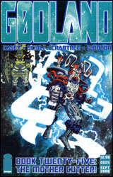 Godland #25
Publisher: Image
Released: 19 November 2008
Writer: Joe Casey
Artist: Tom Scioli
Colorist: Bill Crabtree
Letterer: Rus Wooton
Cover: Tom Scioli
Review: Preston Nelson
Holy Fourth World, Batman! This thing reads and looks like Jack Kirby just finished drawing Adam Archer's face. Though I never much got into Kirby's Fourth World stuff, I do appreciate what it brought to the greater DC Universe. But that doesn't make it my bag, all the same. This book is clearly either a loving tribute, or the most opaque pastiche ever. I'm not entirely sure which, but I can tell you one thing: whatever it was going for, it didn't work for me. What was cool in 1970 isn't necessarily cool now. Apologies to the Vietnam War, Richard Nixon and Doonesbury.
Now, I'm aware that I've just offended half of the readers, but let me explain. The Fourth World Stuff worked because it was new and cutting edge. Fast forward 40 years and I expect my comic books to have made strides. And, to be fair, most of them have � but by choice, this book hasn't.
Adam Archer is an astronaut that somehow became Dr. Manhattan. Well, pretty much, he's orange instead. And he got his powers from the Cosmic Council or something. I don't know. Adam is searching for his sister, who got upset that her superhero brother is overshadowing her and went into deep space to hang with the aliens. Plus, a couple of fat-Samurai-Generation-One-Transformers are fighting orange-faced Darkseid and his legion of giant cyborg monkey-things. Lost yet? Yeah, me too. You know, if this was actually Transformers fighting Darkseid and an army of monkeys, it would read a lot better.
The artist is doing his very best Jack Kirby impression, and, to be fair, it does seem like the King's work. My problem is simple: Jack Kirby's work has not aged that well. Why would I read a book with characters that look like they could have been scratched into the wall of a Neolithic cave when guys like Mike Deodato, Jr. and Alex Ross have near photorealism in their work? And they know how to draw a shadow, too.
The dialog is the worst thing I have ever read. And though it seems like I say it every week, this stuff is the most stilted pseudo-Cosmic Stoner Flower-Child Wannabe Poetry crap that I've ever laid eyes on. It worked in the late 60s when Kirby and Stan Lee did it with the Silver Surfer, because they were doing it at the exact right moment in time. Plus they had the touch. These two, however, do not. It reads like they just took snippets out of random Silver Surfer and Fourth World issues and stuck them in here with no regard to context. To be fair, there is one great line when Archer busts through a wall, but that's the only thing in the whole issue that worked for me.
These guys do a really great Jack Kirby impression. However, I'm pretty sure that if the King were sitting next to me today, he'd say that doing your own thing and making your own mark is preferable to ripping someone else off � I mean, doing a loving tribute. Skip it.
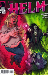 The Helm #4
Publisher: Dark Horse
Released: 19 November 2008
Writer: Jim Hardison
Penciler: Bart Sears
Inker: Randy Elliott
Colorist: Dan Jackson
Letterer: Dave Lanphear
Cover: Bart Sears
Review: drqshadow
Ever find something at a garage sale that's so completely, ridiculously obscure, you absolutely have to have it? Matt Blurdy had one of those moments just recently, with the object in question being an aged Norse helmet that just so happened to start talking once he'd got it home. And the things this magical piece of headgear has been telling him � that he's the next big hero, that the forces of evil are closing in, that his old boss at the video store is an evil necromancer � they're enough to send any self-respecting nerd out on the warpath.
In Matt, The Helm's protagonist, writer Jim Hardison has pieced together a good approximation of the innocent gullibility and self-conscious apprehension that most AD&D-playing dweebs share. Is that helmet really talking to me? Am I really the Chosen One of my generation? Or am I lost so far in my own imagination that it's time for a trip to the psychiatric ward? The age of wonder is well behind us, and nowadays if a golden helmet with voice and locomotion were to surface in someone's living room, I have to imagine its reception would be a bit different from the one it received back in the Middle Ages.
I remember adoring Bart Sears' work on the early issues of Wizard Magazine, and later with Alan Moore on the underappreciated Violator miniseries before I lost track of his career. Or maybe I just lost track of his style, because outside of the cover his work is borderline unrecognizable. Sears has reinvented himself since I saw him last, cutting a great deal of the elaborate detail that had become his calling card and transforming himself into a smoother, cleaner, more animation-inspired artist. I can still see a lot of the old Bart Sears in there, particularly in his love for deep, fluid shadows and the gentle curves of his lines, but what he's become on the surface is something entirely different. In the past he had the nasty tendency to get hopelessly lost in the specifics of his work, producing heroes who were muscular beyond the limits of good reason and postured so awkwardly, I think they may have been punishing themselves. Now he may have overcompensated, simplifying his efforts so much that his artwork no longer seems like the labor of love that it once was.
For the most part, this story is light fare with little real surprises. It's an imaginative concept, fleshed out by an average supporting cast and an identifiable lead character, but it never takes any risks and as a result isn't terribly exciting. It's worth flipping through, but there isn't enough substance here to make me a repeat customer.
 Madman Atomic Comics #11
Publisher: Image
Released: 19 November 2008
Writer: Mike Allred
Artist: Mike Allred
Colorist: Laura Allred
Letterer: Nate Piekos
Cover: Mike Allred
Review: Preston Nelson
Until I read this issue, I knew Madman as "that guy Kid's WB ripped off for Freakazoid!," and as someone who loved Freakazoid!, I've always harbored a little grudge against Mike Allred's Madman for putting bad thoughts about one of my favorite cartoons in my head. Well, apparently, I've been missing something pretty darn good.
Madman is Frank Einstein (Get it, Frank-Einstein? Frankenstein?), a former mob hitman, killed and brought back to life by a couple of mad scientists, gaining fantastic superpowers in the process. He rolls with aliens and other freaks like him, fighting crime and being crazy, while trying to put together the pieces of his pre-death days.
Right from the recap page, you can tell that this is a book that doesn't take itself too seriously. How can I tell that from the recap page? Because it gives you every page from the last issue. Yup, every single one, shrunk to fit, with no dialog. I honestly thought that there was something wrong with the issue at first glance, but no. These little touches are what the issue gets right, most of all. Upon entering his childhood home (which he recently came into possession of), Madman starts hearing a voice in his head. This voice is written in white lettering in an opaque black box. A bit later, Frank remarks that the voice is getting fainter, and sure enough, the black box begins to become translucent.
The story is a bit confusing at points, but I think it's supposed to be. Allred keeps dropping enough hints to keep you interested, if not intrigued. Frank doesn't know his past and neither should you. The whole issue is a whirlwind of strange visuals, working together to give Madman a frantic, hurried feel. Allred's art is very nicely polished, accentuated by the colors of his wife, Laura. I want to give Allred credit for something, too. There's a sequence where Madman is running, vaulting over banisters and the like. Allred doesn't try to infer motion, he merely placed Frank in snapshots. It's really unique and gives this book a wonderful aesthetic.
Borrow it. It's a great book that leaves you wanting more.
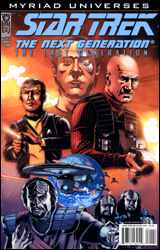 Star Trek: The Next Generation - The Last Generation #1
Publisher: IDW
Released: 19 November 2008
Writer: Andrew Steven Harris
Penciler: Gordon Purcell
Inker: Bob Almond
Colorist: Mario Boon
Letterer: Robbie Robbins
Cover: Pablo Raimondi
Review: drqshadow
How passionate are you about the Star Trek franchise? Fervent enough to follow an alternate-reality take on the Next Generation timeline? If so, you've hit the jackpot with The Last Generation. Staged in a parallel galaxy in which the Klingons have conquered Earth and ruled for 70 years, the series follows an outlaw resistance group led by Jean-Luc Picard as they struggle to free their species from extraterrestrial oppression.
While the story's basic premise relies on some very specific details from the Star Trek mythos, there's something here for both passive and hardcore fans alike. Even non-fanatical followers of the franchise will know the difference between the Worf of the standard TNG and his counterpart in The Last Generation, and the story's author, Andrew Steven Harris, stuffs this first issue full of Easter Eggs and subtle winks at his more astute readers while still keeping the narrative moving.
But where his love for Trek trivia is obvious from the start, Harris' passion for writing doesn't follow suit. Although the story's concept may be rich and original, in execution it's full of holes, tasteless dialog, redundant battle scenes and fabricated drama. Every single fight scene ends in precisely the same way: with the unexpected cavalry arriving, hoorayyy. Plus, the cast has zero chemistry, and the narrative jumps around like a manic child on Jolt Cola and Fruity Pebbles.
The writer's collaborator, Gordon Purcell, doesn't even fare that well. His artwork is downright terrible, a bad parody of fan work that may be the worst I've seen in print since the industry-wide glut of the early 90s. I'm used to seeing licensed books shoveled out with little regard paid to quality, but this is ridiculous. Purcell's work is busy, two-dimensional, faceless and amateur at its finest moments, and downright illegible at its worst. To his credit, he manages a close enough likeness to the major characters, but, honestly, this stuff is so bad I'm surprised I didn't see the edges of a spiral-bound notebook on a few pages. It's hideous, and deals a significant blow to the story's legitimacy before it can even get off the ground.
I wouldn't recommend this to even the most devoted Trekkie. While the foundation may hold some interest � an all-conquering race of Klingons who finally live up to their potential as the baddest of all bad guys � the basic concept is the only thing here that's actually working. Insufferable storytelling combined with terrifically rotten artwork makes The Last Generation an undeniable failure. Set your phasers to skip.
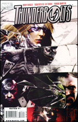 Thunderbolts #126
Publisher: Marvel
Released: 19 November 2008
Writer: Andy Diggle
Artist: Roberto De La Torre
Colorist: Frank Martin
Letterer: Comiccraft's Alberto Deschene
Cover: Francesco Mattina
Review: Preston Nelson
I highly regard the current incarnation of Thunderbolts as one of the best teams in current comics � Marvel or DC. Further more, I regard Warren Ellis and Mike Deodato's run on the book as crown jewels in both of their careers. And outside of Mac Gargan, I call the characterization flawless. In short, I'm a fan of the series. But as these things tend to, Little Preston started making less money, and, after Ellis and Deodato left the series, Thunderbolts was cut from the rotation (along with most of Marvel's Secret Invasion tie-ins).
If the book was this good during Secret Invasion, I'm a moron for dropping it.
Before I gush about the plot, I must say that De La Torre is a much better fit for this book than I thought he'd be, for one reason only: Norman Osborn is no longer Tommy Lee Jones. Osborn looks weathered but dangerous. Venom (though briefly featured) isn't the over-muscled Spider-Man; he's a hulking monster. And the Radioactive Man effects are incredible. Chen Lu often looks like a mini-neon Hulk, but he's iridescent here. He practically glows (which is less De La Torre, and more Frank Martin). The art is less photo-realistic than I'm used to here, but the stylization works.
The best part of this book has always been the characterization. Even back when it was a team of scrubs under Hawkeye, the character's emotions and thoughts always took center stage. And here, it continues to thrive. The book does feel a bit fractured, as there are many storylines going on. Osborn talks to Congress and tries to win the hearts and minds of the American people and their new President. Someone finally calls Penance on his whiny, emo crap. Swordsman (of all people) gets a few pages dedicated to himself. And while these moments are all great, it can be a bit overwhelming.
It's a gorgeous, smart book with a great cast of characters. Buy it if you like good comics.
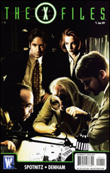 X-Files #1
Publisher: DC Comics / Wildstorm
Released: 19 November 2008
Writer: Frank Spotnitz
Artist: Brian Denham
Colorist: Kelsey Shannon
Letterer: Ed Dukeshire
Cover: Tony Shasteen
Review: Guest
Mulder and Scully are put on the case of investigating the apparent suicide of a man that slowly went insane. I don't think it's too much of a spoiler to say that things aren't what they seem, and that something fishy is underneath it all. Later, for no apparent reason, Mulder starts to show the same symptoms of the deceased man, and it's a really slow-paced and confusing race to figure out who the bad guys in suits are this month.
I guess it's time to revoke my geek card; I was never a fan of The X-Files. Something always bothered me about the fact that nothing ever seemed to happen. Alright, it's season 48, and they still can't prove aliens exist on a technicality or because the very government they work for is covering it up. Wouldn't you just quit at that point? Those swank government benefits can't really be worth all of the abductions, probes and hysteria that result from such service. Even if I was a fan, I'd have to admit that certain things just don't translate well to comics. A dry, humorless show full of talking heads and a paranormal slant simply becomes a dry, humorless book full of talking heads with a "boo, gotcha" last panel.
This book is, in many ways, a snapshot of everything I hated about the show. There's the clich�d white-collar villain at the driving range, the government cover-up and the team figuring out the entire case simply by the color of an empty flash drive. Scully, after all she's been through, still doesn't believe anything. On that note, Mulder and Scully have walked the dinosaur together at least a dozen times (and made a baby), but still can't call each other by their first names? And will someone please pay the electric bill so we can turn on some goddamn lights? This book is so faithful to the show that it's crippled by it. Without a special effects budget to worry about, the writers should be able to take the concept into some really cool and innovative directions, but instead, it's exactly what you would expect � and I don't see that as a good thing. It's also full of poetic wordplay: "Thank you for your time, we appreciate your time."
The art is serviceable, though not without its issues. If you are going to draw College Park, Maryland, know what it actually looks like. I live not even 20 minutes away, and I can assure you that it's not a pulsing metropolis of high buildings with thousands of windows. It also appears that the point of half the book was to make Gillian Anderson look as confused as possible in every panel. Nearly every time you see Scully, her mouth is agape and her eyes wide as if the core of the underworld was opening in front of her � or she was being forced to watch an Uwe Boll film.
If you don't care about the show, you have no reason to look at this. And if you're a fan, then my opinion isn't going to matter anyway. Skip it.
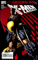 X-Men: Legacy #218
Publisher: Marvel
Released: 19 November 2008
Writer: Mike Carey
Penciler: Scot Eaton
Inker: Andrew Hennessy
Colorists: Jason Keith and Brian Reber
Letterer: VC's Cory Petit
Cover: Mike Deodato, Jr.
Review: Guest
Oh X-Men, you used to be so exciting, so memorable, so relevant. Now, you've seemingly become a parody of yourself, picking at the scabs you should have let heal a long time ago.
During one of Wolverine's million shags over the years, he managed to father a son named Daken, who takes after his old man in every aspect up to and including his bad hairstyle choices. For a while Daken blamed Logan for the death of his mother, but has recently fallen under a case of amnesia, leaving him open to influence from the one man that was able to help Wolverine so long ago: Professor Charles Xavier. Because an X-plot can never be too complicated, the Hellfire Club and a new (well, old) threat known as Miss Sinister also have eeeevil plans for Daken, but need Professor X to disable a psychic booby trap left in Daken's mind.
This issue is "The Adventures of Jim and Charlie," and very little else. It's a search and rescue mission wherein they either succeed or fail. There is no deep overarching metaphor at work, or a big reveal on the horizon. They've taken what sounds like a twisting complex plot on paper and stripped it down to the most straightforward, simple issue that I've read in quite a while. I suppose I should be commending this; it's the easiest to follow X-comic in ages, and the art from Scot Eaton is pretty damn good. While I could have done without the sight of naked psychic Charles Xavier, any man that can draw Wolverine stuck in a camel clutch gets points for me. But then why didn't I like this book?
It becomes increasingly apparent every month that Marvel's mutants shouldn't even be a part of the mainstream universe, always looking to hit on very poignant topics of racism and hatred that fall apart once you realize that every city in America has half a dozen costumed freaks running around at any moment. I admit this is more an observation of the X-books in general than this issue in particular, but it needs to be said to help understand why a book that should work effectively, doesn't. Writing for the X-Men at this point is like playing the same game of Jenga for decades, but instead of putting pieces aside, you have to pile them back on top again. You don't want to pick from the foundation because the whole thing will fall apart, but you also don't want to stack too high or it will come crumbling down. So instead you just stare at the tower and hope it stands. You do nothing. You can't do anything because the tower has already be picked at so much that it can barely stand.
The few things that are new have little to no impact. Sinister is a woman now. What does that mean? She wears skimpy clothes and can get knocked out by one punch. Shaw hasn't changed since 1979, and Wolverine is, well, he's Wolverine. Something needs to be done, not only to this book but all of the X-books. Not another event, not another chest-baby, but something. A story that everyone can get behind, a theme that we can relate to, maybe even a character that hasn't had much of the limelight. Because as it stands, the X-Men are no longer the cutting edge of comics, the start and end of the Marvel Universe or even, as stated before, very relevant.
Skip this, and hope that one day things improve.


