Is It Wednesday Yet?
11 November 2008 � Here we are again with another installment of your favorite comic book review series. As always, the reviews are free of spoilers, so read on without fear of having your experience ruined!
Our grading scale is simple:
Buy: An excellent comic book.
Borrow: A good comic, but save yourself some money by reading a friend's copy.
Flip Through: Give it a once-over at the comic shop.
Skip: This doesn't need to be explained.
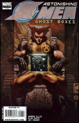 Astonishing X-Men: Ghost Boxes #1
Publisher: Marvel
Released: 29 October 2008
Writer: Warren Ellis
Penciler: Alan Davis
Inker: Mark Farmer
Artist: Adi Granov
Colorist: Rob Schwager
Letterer: Joe Caramagna
Cover: Simone Bianchi
Review: Guest
Best of luck to you if you haven't been reading Astonishing X-Men for the past few months, as I haven't a clue what's going on here. Subject X is dead, but he isn't. There's the Ghost Box, which is kinda working. And there's a gaggle of X-Men that don't even get out a single line of dialog before a fireball is smashed into their face. Then we get another story set on an alternate Earth that somehow involves the exact same team of X-Men... but in a sepia tone-coated early 20th century... in which they have a jet. They fit all of this into 16 pages. The remainder of the book is a script of the story you just read, and it doesn't make any more sense the second time around. So basically you're getting two eight-page stories that mean absolutely nothing.
Oh, and you're asked to pay $3.99 for this. Even if this was an epic, gripping tale, I couldn't recommend you pay full price for this little content. The only way I could endorse this is if those 16 pages were about Emma making flapjacks naked and then later taking Scott to the Boob Festival for his birthday. And I'm quite sure you can find something like that for free if you spend enough time on Google.
There are two artists here. Firstly, there's Alan Davis. I've always seen him as a competent, if unremarkable artist. He served the book well here, and worked with what he was given � all eight pages of it. The second half is by Adi Granov, who does some beautiful work, but it very much suffers from Alex Ross syndrome, in that no one looks like a person. Everyone is simply a statue placed into a scene.
I'm usually the first person to defend Warren Ellis, and have admitted numerous times that I'm a blatant fan of his work, but this is where I draw the line. I know he loves his alternate universes, but there's a balance that needs to be reached. If the next issue is another 16-page debacle, then I'm forced to wonder why they simply didn't make this a longer one-shot. Skip this. There's absolutely no reason to waste your money.
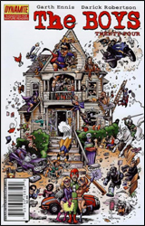 The Boys #24
Publisher: Dynamite
Released: 29 October 2008
Writer: Garth Ennis
Artist: Darick Robertson
Colorist: Tony Avina
Letterer: Simon Bowland
Cover: Darick Robertson
Review: drqshadow
It's already been a fairly speckled run for The Boys, both between the covers and behind the scenes. Wildstorm dropped the series, which focuses on the misadventures of a hush-hush team of government operatives who supervise the superhuman community, just six months after its debut. Its creators didn't bat an eyelash, taking their book to a new publisher and resuming publication without even altering the issue count, let alone the book's content. With a more liberal publisher now willing to back it, the series continued its harsh examination of superheroes and the seedy world they inhabit during their time away from the spandex.
As a brazen Garth Ennis fanboy, I actually followed The Boys regularly for its first year. After 12 issues, however, I discovered that I'd had just about enough of the writer's self-indulgence; perhaps Ennis is one of those men whose ideas, almost illegible on their own, only truly blossom under the watchful eye of an editor. Look, I get that he doesn't like superheroes. Point made. I got it when he was in charge of The Punisher just before the series moved to the MAX imprint and gave him (and the character) a new lease on life. That doesn't mean I'm all that eager to sit back and watch him shit all over the things that I like about the genre, especially when the territory he's blazing isn't entirely fresh.
Well, it didn't take long for me to realize that the book hasn't changed a bit since we parted ways. It's still as profane as ever, painting the entire superhero population with the same thick brush. It's not necessarily the subject matter that gets stuck in my craw so much as it is its reluctance to explore any other areas of that niche. As I said, it's been a year since I took a peek at this series, but the subject matter hasn't changed one iota. They're still investigating a squad of sex-crazed frat boys with superhuman abilities, only the names and faces have been switched out. Forward progress? What's that?
Of course, if we've resigned ourselves to the book's fate and surrendered to its redundant subject matter, we really couldn't ask for a more appropriate artist than Darick Robertson. His loose, shadowy, humor-injected style bathes its readers in the kind of dirty atmosphere that I'd expect in such environs. The world isn't a clean, shiny place as it is, and its darkest corners can get pretty filthy, which is where Robertson feels the most at ease. He's clearly having a hell of a time with the series, illustrating the kind of sick, twisted situations he missed during his time on Nightcrawler and New Warriors. An occasionally rushed panel or two asides, this is Darick Robertson doing what he does best.
Some leopards don't change their spots, and The Boys is precisely that kind of beast. If you've been impressed by Garth Ennis' penchant for gross-out humor and envelope-pushing imagination, you'll feel right at home here. It's Ennis unleashed, but this car doesn't have more than one gear. If that's your bag, The Boys is a dream come true. If you're hungry for a bit more substance from your reading material, give it a skip.
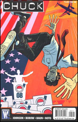 Chuck #5
Publisher: DC Comics / Wildstorm
Released: 29 October 2008
Writers: Peter Johnson and Zev Borow
Penciler: Jeremy Haun
Inkers: Jeremy Haun, Cliff Rathburn and Shawn Crystal
Colorist: Wes Hartman
Letterer: Travis Lanham
Cover: Kristian Donaldson
Review: drqshadow
If you own a TV, you've probably seen the ads for the show this series is based on. In Chuck, the story's namesake and lead character, we've got an employee for a major electronics retailer with a deep appreciation for technology. When he catches an e-mail from an old college buddy who landed a job with the CIA, the message fires a whole mess of spy secrets into his brain before deleting itself from his inbox. His gig at Best Buy now a distant memory, Chuck is suddenly trotting around the globe with a small troupe of beautiful killers, serving his country and rescuing its celebrity political candidates. Personally, I've never watched the NBC series, so I may not be the target market here. Then again, maybe I'm exactly the person they're hoping to attract.
Co-writers Peter Johnson and Zev Borow (co-producer and writer of the show) provide a smooth transition between the Wildstorm miniseries and its TV cousin. The issue is blessed with a deep, personable cast and an interesting basic premise, but the writers' penchant for one-liners sometimes gets to be a bit much. A well-timed joke to break the tension is one thing, especially when your lead character bows so constantly to the everyman stereotype. But when a series can't go a page or so without firing a pun, it's something else entirely. Johnson and Borow keep the plot moving and the surprises coming, but nothing seems to carry any permanence (one henchman takes a bullet in the face and shouts "Ow!" before resuming the chase) and that takes its toll.
Artist Jeremy Haun owes a great debt to his colorist, Wes Hartman, whose efforts enliven his compositions and add mood and atmosphere where it would otherwise be lacking. Despite Hartman's best efforts, though, the core of this artwork often feels stiff and unnatural, particularly when the spies are fleeing down the side of a mountain aboard a set of snowboards, with a dozen bad guys somehow managing to give chase side-by-side-by-side-by-side. How often do they get the opportunity to practice their downhill slope sniping formations? I've seen some of Haun's other work, and when he can pull it together he shows a lot of potential, but most of this issue is spent wallowing in mediocrity.
There's a fine line between politely asking your readers to suspend their disbelief and bluntly insulting their intelligence, and sadly Chuck lost sight of it long ago. I can buy the story's far-fetched premise, but the sheer number of coincidences and unreasonable situations that lead to the conclusion of this issue stretch my patience beyond the point of no return. With no less than seven gunfights, an evil clone and a fistfight aboard a spiraling personal jet, Chuck reads like an extra-cheesy director's cut of Moonraker. And I don't mean that as a compliment. Skip it; what starts out well enough quickly falls apart.
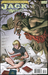 Jack of Fables #27
Publisher: DC Comics / Vertigo
Released: 29 October 2008
Writers: Bill Willingham and Matthew Sturges
Penciler: Russ Braun
Inker: Jose Marzan, Jr.
Colorist: Daniel Vozzo
Letterer: Todd Klein
Cover: Brian Bolland
Review: Preston Nelson
Jack of Fables is one of the best concepts I've ever seen put to paper. All the Fables in the world come together as part of a Revolution. Humpty Dumpty is a horrifying mass of shattered eggshell and clothing. Toy Soldiers are 10 feet tall and have blades for fingers. And the only thing standing between the violent death of everyone else is (Little) Jack Horner.
This is a spinoff of Fables and it rolls with the concept started there, but it doesn't go anywhere with it. It has a ton of wonderful ideas, all happening at once, leaving the reader a bit lost. It's much the same problem I had with the parent comic. You have too many characters to count: The Mad Hatter, March Hare and Dormouse. You have Goldilocks. You have Paul Bunyan and Babe the Blue Ox. And a fair few of them have been reinvented into something twisted, and it's tremendous. And even better than that, concepts have been personified, such as the Fourth Wall and her three brothers, and even more notably, Deus Ex Machina or Dex, as he prefers.
And while the concept and characters are frighteningly original, the story is stagnant. This issue has a tremendously transitional feel, leaving new readers very lost. The worst part is, this transition should be something special, but it's just not. Tensions are running high and the world is on the verge of collapse, but nothing in the book demands that you care. People die, but it doesn't matter, as there is no emotional investment. That's where this book falls apart for me; it's such a tremendous concept that's underserved by mediocre characterization and writing.
The art is nothing special, but it's inoffensive at worst. Some of the character designs are inventive, but in the end we've seen them reimagined time and time again. Forms and figures are generally pretty solid, but the sexualization of characters like Goldilocks is a little hard to swallow. I understand that these are the adult versions of classic characters, but something just doesn't sit well with me.
I wish this book had something to really rag on or rave about, but it just doesn't. I'll give them credit for trying something more than "superhero punches villain," but everything else is just so nondescript. If you're into the concept or Fables, give it a try. Otherwise, skip it.
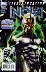 Nova #18
Publisher: Marvel
Released: 29 October 2008
Writers: Dan Abnett and Andy Lanning
Pencilers: Wellinton Alves and Geraldo Borges
Inker: Scott Hanna
Colorist: Guru eFX
Letterer: Virtual Calligraphy
Cover: Francesco Mattina
Review: drqshadow
If it's not one interstellar invasion, it's another. Mere months after helping the Kree fight off the invading Phalanx in Annihilation, current Nova Corps representative Richard Rider has fallen face-first into the Skrull's assault on Earth. When the green skins target Project PEGASUS, the government research facility that just so happens to employ Richard's brother, Nova's battleground seems to have been chosen for him. And, as fate would have it, he's got some help; Darkhawk and Quasar have already taken a stand in that very same facility. But didn't Quasar bite the bullet years ago? Well, you know what they say about death in comics.
This month's issue feels like it's out of place with the identity that the series had worked to define in previous issues. Much of that can probably be attributed to Nova's demotion to secondary status in favor of an ensemble cast. To an extent that's understandable, as there isn't a lot of appeal to a giant battle scene with what must be a thousand villains and just one hero, but the writers' unfamiliarity with the new faces is patently obvious. Dan Abnett and Andy Lanning have worked hard to turn Nova himself into a well-rounded, likeable, intelligent lead character but they've had no such luxury with Darkhawk and Quasar. By comparison, the new faces are mere caricatures and don't add anything to the book beyond their additional muscle. Their dialog is thin and generic, and I just couldn't connect emotionally with them. Here's hoping their presence in the series is short-lived.
Wellinton Alves and Geraldo Borges deliver solid visuals throughout, despite the complexity of their mission. It's no easy task to illustrate a large-scale battle scene, particularly one with two specific points of narration, but the duo manages to do so in style. Darkhawk and Nova's ongoing brawl with a platoon of Skrulls manages to remain legible while also dealing out a considerable amount of detail. It carries the impressive magnitude that such a large-scale battlefield demands, while also retaining the simplicity and character that typifies the art team's combined efforts. George Perez, take note: you may finally have company in this regard.
Despite the influx of new faces, Nova can still be an entertaining read. While the entirety of this issue is spent in battle, that doesn't come at the expense of characterization or dialog. In fact, more the opposite; the heroes spend almost ever moment they're engaged with the enemy yakking it up with each other, catching up on old times. To an extent, that marginalizes the importance of their situation, but the Skrull threat is so constantly upgraded that it manages to balance out in the end. While Darkhawk and Quasar didn't do much for me as focal points this month, their presence and subsequent stumbling under the spotlight emphasizes just how strong a character Nova himself has become of late. And if he can ever escape from this endless string of crossovers, maybe he'll get a chance to let the rest of the Marvel Universe in on that secret. Flip through it; this issue is far from essential reading for dedicated readers, but if you've missed the Nova boat so far, it provides a fine opportunity to jump on board against a familiar backdrop.
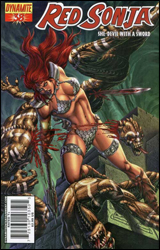 Red Sonja #38
Publisher: Dynamite
Released: 29 October 2008
Writer: Brain Reed
Artist: Walter Geovani
Colorist: Vinicius Andrade
Letterer: Simon Bowland
Cover: Mel Rubi
Review: Guest
As someone that's never read Red Sonja before, I have to say that I'm pleasantly surprised just how many items it manages to hit on my Personal Enjoyment Checklist. Hot redhead? Check. Chain mail bikini? Check. Over-the-top blood and gore? Check and check.
Okay, there's more to it than that; with her village destroyed and a bunch of memories that may not even be her own, Sonja is flanked by the grizzled Osin, who, despite looking like a department store Santa on roids, is quite the ass kicker. He also appears to have the hand of a jackal for some reason. Together, they have to rush the Baracha Isles and get some answers about Sonja's past. More specifically, they want the man who murdered her husband. It's a simple story, but it's done astoundingly well. You're given that right combination of action and story, but you're also left wanting more � which is the mark of any well-constructed work. And for what is essentially a pirate issue, that's really saying something.
There is the expected cheesecake, but Reed makes a point to show you that there's more to her than that. Yes, she has giant boobs, but she can also hold her own in a fight. And she'll even outsmart you if you're not careful. When she knocks a guy's teeth in with her knee, you don't notice the fact that she's wearing lipstick. For a medium in which ugly heroines simply do not exist, it's one hell of an accomplishment.
The artwork is an absolute delight. The contrast of colors really make certain features such as blue eyes pop out, and seemingly every page has something new to catch your eye. I found myself going back to find things I didn't see the first time. Everything, from the scenery to the characters, jumps from the page, and there's a sense or movement to it all. Each face is portrait-quality, and none of it feels particularly overdone.
As for gripes? There was a spelling error on page 11. Seriously, that's all I got.
I have to say that this one really surprised me. It's a gorgeous, easy-to-follow issue, and a pretty good jumping on point, too. If this is what can be expected every month, they may have just earned themselves a new regular reader. Buy it.
 Superman / Batman #53
Publisher: DC Comics
Released: 29 October 2008
Writers: Michael Green and Mike Johnson
Penciler: Rags Morales
Inker: John Dell
Colorist: Nei Ruffino
Letterer: Rob Leigh
Cover: Rags Morales
Review: Guest
When Bruce Wayne has business in Metropolis, Bats and Supes will often switch patrols for a brief period. Of course, that leaves the whole question of why no one notices that Superman is suddenly in Gotham whenever Bruce Wayne leaves for business. But that whole point is given about 12 seconds of time before it's swiftly forgotten. I know why it's there, as this arc is clearly going to deal with the idea of reversed roles, but it's still rather confusing and bares little impact on the story. To top it off, you have to endure more of that wacky dual monologue that's become such a parody of itself at this point. Batman and Superman are different. We get it, guys.
So the guys at DC threw a dart at the wall and hit a villain they haven't used in a bit. Said villain shows up here, makes a ruckus and than does something so utterly random that it affects Batman and Superman in a very significant way. I have to be rather vague because the twist, while not explained in the least, is still cool and makes for some interesting possibilities; one member of the group is essentially useless now, and it will be exciting to see how they both survive outside of their respective comfort zones.
The art is, quite frankly, atrocious. While likely nothing is probably ever going to touch Michael Turner's brief run, there's a certain visual quality that you would expect in a book like this, and it's simply not there. Morales' faces are a real problem, as Bruce Wayne is constantly switching between a lanky used car salesman and Namor's retarded twin brother. Supes doesn't fare much better, as every close-up of his mug makes you wonder if he indulged in one too many Krispy Kremes down at the Fortress of Solitude, as an extra Super Chin appears to have grown out of nowhere. Oftentimes Bruce looks more like Superman than Superman, and one woman in particular that the narrative describes as "young" and "perfect" looks like someone's grandmother with breast implants. To cap things off, I swear at one point, I saw a nipple. If it wasn't a nipple, it was a mild tumor.
Give this a flip through. The story has some potential to do some pretty cool things, but the art is a huge detriment.
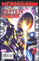 Ultimate Captain America Annual #1
Publisher: Marvel
Released: 29 October 2008
Writer: Jeph Loeb
Penciler: Rafael Sandoval
Inker:Roger Bonet
Artist: Marko Djurdjevic
Colorist: Marte Gracia
Letterer: Richard Starkings, Comicraft and Albert Deschesne
Cover: Brandon Peterson
Review: Preston Nelson
The Ultimate incarnation of Captain America is generally regarded as a strong update of a character that can often come across as cheesy. Where the usual incarnation of Cap had become a more serious character before his death, Ultimate Cap has always been a much more realistic portrayal of the man out of time. This Cap is straight out of the 1940s: jingoistic, angry and a very flawed human being. This Cap is also a lot more fun to read. And while Cap is very prevalent in this issue, it's not really about him. He's playing the voice to a man who can't speak for himself: T'Challa, The Black Panther.
Set before Ultimates3, this issue is the origin of Black Panther, and sets up the reasoning behind Cap hiding under the mask. Because Panther is mute, there's something tragic hanging in the air around this issue. The man who would be king, a man who is an eloquent, inspirational speaker has lost the ability to do so, in order to prove himself to his father. Due to injuries he sustains, T'Challa ends up in the care of Weapon X. They heal him, but they give him Wolverine-like claws, as well as heightened senses and other abilities. It's a dramatic reimagining of the character, and it works.
The real focus of the story is the relationship that T'Challa and Steve Rogers cultivate. Fury asks Cap to train T'Challa, and vouch for him to join the Ultimates. Trough training together, these two men grow into a real friendship, and the reveals in Ultimates3 make sense. And this story serves to plant seeds of distrust between Fury and Rogers, as well.
The issue has some great art. To open the issue, there are low-light shots of T'Challa stalking through the brush of Wakanda. These give a dark, brooding, powerful atmosphere, and they contrast greatly with the bright lights of the Triskelion, giving us the same fears as T'Challa, taken from his home and made into something more.
I've honestly seen no flaws here. What you have is a tragic yet beautiful story, retelling the origin of an amazing character in a manner that truly befits him: buy it.
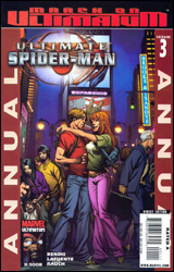 Ultimate Spider-Man Annual #3
Publisher: Marvel
Released: 29 October 2008
Writer: Brian Michael Bendis
Artist: David Lafuente
Colorist: John Rauch
Letterer: VC's Cory Petit
Cover: Mark Brooks and Richard Isanove
Review: Preston Nelson
Before "One More Day," before the unmasking, before clones, Peter Parker was a high school kid trying to do his part to save the world, and Ultimate Spider-Man brings us back to those simpler times. Peter is trying to balance his life as Spider-Man alongside his life as a nephew, student, photographer and boyfriend � and, surprisingly, he's not doing all that badly right now.
This issue opens with Peter and Mary Jane lying in bed, discussing whether they're ready to take the next step in their relationship. Now, more than anyone, I despise contrived teen drama, especially in my comics. I didn't buy Dawson's Creek, I bought Ultimate Spider-Man; I want to see people fight, darn it! But in this case, it works. The interactions that Peter and MJ share aren't whiny and contrived, they're honest and heartfelt. And the book even goes a step beyond; they leave it up in the air. You don't find out if they did it or not until much later in the issue. So, the next morning, when MJ sees Peter and freaks out, you're left wondering what went wrong. Did he accidentally web her in the eye? Did he become a Man-Spider? Or maybe something much more mundane and realistic happened, I dunno.
While the real interactions of the teenagers in the book are the high point, the actual action sequences and resulting villain are quite underwhelming. There's a redesign of a classic Spider-Man rogue that had previously not made an appearance in Ultimate Spider-Man, but that falls flat, too. Bendis scripts real, meaningful interactions between his characters, but as soon as the mask goes on, those hearts and souls become masked, too. Of note, though, is how far Peter has come; here he's outright working beside the police, rather than having to hide, lest he be arrested, too.
The art has a clear anime / manga influence, but again, it works. I love it when Peter is depicted as scrawny. Even the "swimmer's build" seems too bulky for Peter. This kid is all skin and bones and he really feels like a nerd, rather than someone who's hiding behind the guise of being one.
The book is a tough sell. The part that I expected to hate was my favorite, and my usual favorite bits kind of sucked. But, at least MJ won't be selling her relationship to Mephisto anytime soon on this side of the 616 / Ultimate divide, because I honestly believe in this couple far more than I ever believed in the "wedded bliss" of their adult counterparts. And that's where this issue really shines. It's worthy of a borrow, if nothing more.


