Is It Wednesday Yet?
15 July 2008
15 July 2008 � Here we are again with another installment of your favorite comic book review series. As always the comics you're about to read about won't be released until tomorrow (16 July 2008), so these reviews are free of spoilers and should help inform your purchases on new comic book day.
Our grading scale is simple:
Buy: An excellent comic book.
Borrow: A good comic, but save yourself some money by reading a friend's copy.
Flip Through: Give it a once-over at the comic shop.
Skip: This doesn't need to be explained.
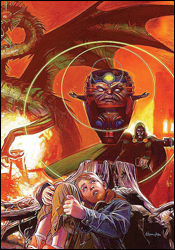 1985 #3
Writer: Mark Millar
Artist: Tommy Lee Edwards
Letterer: John Workman
Cover: Tommy Lee Edwards
Review: Dan Toland
In the real world � our world � Marvel supervillains have moved into the old Wyncham house. Toby, a young boy who reads enough Marvel comics to know exactly who they are, is the only person to have seen them. And no one believes him. Not even Jerry, his father.
The first thing that hits you about this book, even more so than in most others, is the art. When I opened the file, the first thing I thought was, "What the hell is this?" It's blocky, cartoonish and sketchy, and looks in places like it had been drawn with a Sharpie. However, the more I look at it, the more it grows on me. Quite a bit, in fact. It's quite abstract in parts. And in its way, it's very detailed and moody. More on this in a second.
Millar's script is very interesting. It starts off as a quiet character study, showing us Jerry's life, and how he connects with his son; it's very gentle, and unlike what we expect from Millar. And then, halfway through, the tone of the book turns on a dime, and it's Edwards' art that sells it more than anything else. Things get incredibly dark very quickly, and one of the most frightening / gruesome images I've seen in a comic is absolutely nailed because of Edwards' cartoony style. And it involves the Mole Man. The Mole Man! Any team that can take the freaking Mole Man and create any kind of a moment like this deserves every penny it gets. And a cookie. And an Eisner.
The really interesting thing with this issue is that while it has the prerequisite cliffhanger ending, it could almost stand by itself. Honestly, the only reason I know there were any issues before this one is because the cover says so. Everything's very self-contained, and you know everything you need to know in order to enjoy this issue on its own merits.
1985 is a really interesting idea. It's nice to see Marvel stepping out of its comfort zone a little bit � not for the only time this week � and this pays off fairly well. Tie Millar's script with artwork that seems tailor-made for this type of story, and it comes together in a package that works very well. Give it a borrow; I'm interested in seeing where this goes.
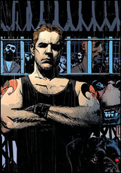 Foolkiller: White Angels #1
Writer: Gregg Hurwitz
Artist: Paul Azaceta
Colorist: Nick Filardi
Letterer: VC's Joe Caramagna
Cover: Tomm Coker and Daniel Freedman
Review: drqshadow
A street-smart investor in his professional life, Mike Trace had it all. He built an empire from nothing, played the game and come out ahead. But when one of his business decisions resulted in the loss of innocent life, Trace had a moment of clarity. Realizing that his wealth made him nearly untouchable and therefore above suspicion in such matters, he adopted the mantle of the Foolkiller and set out to punish his former peers for their own negligent crimes. When he's finished dispensing his own form of justice, Mike decorates the scene with his calling card: the tarot of the fool.
Gregg Hurwitz has made no secret of his intentions here: he wanted to write a gritty crime thriller within Marvel's MAX imprint, but Garth Ennis had the regular gig on The Punisher. So it should come as no surprise that Hurwitz's Foolkiller is basically Frank Castle, Jr. Sure, each character has their own little ticks, things that set them apart from one another, but at the very core they're strikingly similar. Both see corruption in everything and set out to remedy it the only way they know how: mass murder, justice of the eye-for-an-eye variety.
In more ways than one, Foolkiller accomplishes its goals. The seedy, grimy criminal atmosphere that pours out of most issues of The Punisher has been replicated authentically. While the Punisher generally stomps his way through New York, the streets of LA referenced in these pages are every bit the mirror image of their cousins in the Big Apple. Sadly, the story's setting is a more interesting character than the men and women who run around inside of it. Where Frank Castle has a wordless sort of charm and charisma, Mike Trace has nothing of the sort. As a personality he's paper-thin and uninteresting, just another grim face in an ocean of look-alikes, and his supporting cast is generally in the same boat. This plot shows a lot of promise, but without an engaging character or two to push it along, it loses its luster rather quickly. Hurwitz has the mood right and shows a willingness to push the envelope, but can't quite engage his readers like he should.
The new series benefits tremendously from the artistic contributions of Paul Azaceta, whose heavy, deliberate lines give the book an instant dramatic face. His thick, moody blocks of shadow provide just enough detail to remain legible, and paint each page with the kind of ambiance usually reserved for hardboiled crime fiction. He shows restraint when necessary, pulling back from an artist's natural tendency to over-render a page in that constant search for a perfect balance between simplicity and detail. His characters display vibrant personalities, even though they're never fully explored by the storytelling. Azaceta's artwork is largely responsible for most of the issue's successes, and Hurwitz couldn't have asked for a better partner.
In its second miniseries, Foolkiller shows a lot of promise but doesn't always follow through. Its astoundingly rich environment is wasted on a meager cast and a pale impersonation of another story's protagonist. This isn't an unbridled success, but it isn't an outright failure, either. Flip through it for the exceptional artwork and strong scenery � they're the real stars of this show.
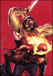 Ghost Rider #25
Writer: Jason Aaron
Artist: Tan Eng Huat
Colorist: Jose Villarubia
Letterer: VC's Joe Caramagna
Cover: Marko Djurdjevic
Review: drqshadow
Everything we were taught in Sunday school is wrong. The bad guys take their orders from Heaven. The good guys are trapped somewhere further south. And the guy with the flaming skull for a head is actually the property of God. Naturally, these recent revelations have left Johnny Blaze a little confused. Well, maybe confused isn't the right word. Angry? Hungry for answers? Racing for revenge? Either way, Blaze is sincerely ticked off and anxious to share a piece of his mind with the big dude upstairs. Only problem is, he doesn't know where to begin.
This month, fresh off a visit to the nearby hospital, Rider makes his way to a maximum-security prison deep in the heart of the Lone Star State. And naturally, just like the infirmary before it, the jail is positively teeming with angels, demons and religious fanatics. Writer Jason Aaron doesn't shortchange his readers on characters, that's for sure; the prison is bursting at the seams with tattooed miscreants, each one all too willing to share his own lengthy religious-themed backstory. But don't mistake that for depth. Despite their wordy elaborations, not one of the prisoners really clicks, stands out from the pack or establishes themselves as anything more than a bag of hot air.
The first dozen pages in particular are excruciatingly slow, weighted down with far too much dialog for their own good. Aaron wastes our time with the life stories of characters who don't even make it out of the scene alive (let alone the issue), which makes the whole mess even more unforgivable. Why spend three pages of incessant character development if your plan is to throw it all out the window, Deep Blue Sea style, at the first sign of trouble?
Tan Eng Huat's artwork doesn't lack in style, although that doesn't mean it's particularly successful, either. His characters are rounded and exaggerated to a fault; they're too complex and detailed for their own good. His style is so busy, I often had trouble navigating a character-heavy panel or fight scene. And while he delivers on a few noteworthy splash pages, for the most part he brings more than any page can handle. His work is like a blend of Angel Medina and Greg Capullo's individual runs on Spawn: so caught up in delivering something different that it loses touch with its readers. In a few specific moments, Huat gives us something truly remarkable, but to find them you'll have to wade through a lot of busy, over-exaggerated crap. He's an improvement over the stale, faceless artwork that's personified the series up until this point, but that isn't saying much.
This is a lot of setup with no payoff. It's disjointed, awkward pacing matched with uncertain storytelling and questionable characterization. Ghost Rider uses a handful of powers I didn't think he actually had, and when they don't have an effect on his enemy, I'm left to wonder why we saw them in the first place. The artwork is infrequently glorious, but typically overdone and difficult to follow. When the stars align and the two pages of good writing match up with the three solid artistic moments, Ghost Rider is surprisingly good. It's the rest of the issue that concerns me. Skip it.
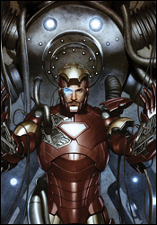 Iron Man: Director of SHIELD #31
Writer: Stuart Moore
Pencilers: Carlo Pagulayan and Steve Kurth
Inkers: Jeffrey Huet and Andrew Hennessey
Colorist: Joel Seguin
Letterer: VC's Joe Caramagna
Cover: Adi Granov
Review: Dan Toland
Okay, when a story opens with "Paladin � yes, Paladin, the third-tier character with the goofy purple costume � has just kicked Iron Man's ass," something is terribly wrong with the state of the universe.
Here's where we're at: SHIELD has been called in to the nation of Kirikhstan to deal with a nuclear bomb threat. This has been set in motion by Stark's former friend Rahimov and his partner, the aforementioned goofy-suited purple guy. As purple guy shuts off Iron Man's armor, SHIELD weapons director Nicolas Weir (who hates Stark, and has therefore joined the same club as the rest of the Marvel Universe) performs an experiment on the Overkill Horn, a device designed to set off your enemy's weapons. Instead, it evolves into the Overkill Mind, and absorbs Weir into itself. Which, trust me, is kinda gross. Now the Overkill Mind is off to Kirikhstan to join in.
Remember Voltron? Remember the episode where the Robeast would come in and break some stuff, and the Voltron Force would attack it with the five lions? And then the lions would get their asses handed to them, until someone had the bright idea to form Voltron, which would immediately annihilate the Robeast with one swing of the sword? (Of course you do; that was every episode.) That's what this book reminded me of. Here, the part of the lions will be played by SHIELD, who battle ineffectively until Iron Man comes in and cleans everything up in a couple of panels. I think this is supposed to accentuate how powerful Iron Man is, but all it does is highlight how useless SHIELD has become over the past few years. It's a shame, because there are some seriously cool concepts floating around in this series, and I think that they could really take off if Iron Man weren't overshadowing everything. I would love to read a really good SHIELD series, but this ain't it. As it stands, this is a third Iron Man book that happens to have SHIELD as its main supporting cast. And as great as his movie was, I don't really think Iron Man rates three solo books as well as Mighty Avengers. Also, I just reviewed a book last week in which Tony was facing off against an international bombing plot; I know it's hard to come up with good challenges for Iron Man, but come on!
There are a lot of artists handling things in the issue, which goes some way to explaining the fact that the artwork is so inconsistent. It's never awful, per se, but it's never stellar, either; it's best at the beginning of the book, although whoever is drawing these pages is having a hell of a time with the shape of Maria Hill's head. Still, it's fairly clean work, and the storytelling is decent; it's certainly better than it has a right to be, with all the different art teams working on it.
Give it a quick flip through, but don't spend any more time on it than that.
 Pilot Season: Urban Myths
Writer: Jay Faerber
Artist: Jorge Molina
Letterer: Troy Peteri
Cover: Jorge Molina
Review: drqshadow
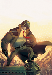
A detective tale in the same vein as Icon's Powers, Top Cow's Urban Myths sets its roots firmly in the realm of fantasy. Rather than Brian Michael Bendis' city of superheroes, Myths populates its streets with every variety of mythical creature imaginable. A Centaur policeman races through the alleyway in pursuit of a terrified suspect, while a Minotaur toils in nearby traffic. The story's lead, Jack Kaklamanis, just so happens to be the private eye son of Medusa. His steel mask a precaution against the curse of his inheritance, he doesn't object to removing it when a situation warrants swift action.
Jorge Molina's artwork steals this show. It's absolutely fantastic, like watching a topnotch animated film in a printed format. His work has the simplicity of Bruce Timm, the depth and detail of Joe Madureira and the rich, moody palette of Dreamwave Productions. His noir-inspired, dilapidated city fills the issue's backgrounds with substance and character, but enhances the occupants of the foreground and never interrupts the story's flow. I must've spent 15 minutes simply absorbing and admiring the intricacies of these first six pages.
Molina's character designs overflow with authenticity and personality. Their roots set in the real world, the denizens of Urban Myths stomp around in everyday attire, offset by little touches of individuality. A steel mask here, a single glaring eye there � the absurdity of each character's nature is granted a certain amount of believability when paired with the real world roots of the remainder of their wardrobe. When he's illustrating a pair of hillbilly Cyclopes, they look, move and act like you'd imagine redneck one-eyes actually would. Bulky and top heavy, they lumber awkwardly across the page. Their buckteeth and permanent slouches only enhance the nature of their personalities.
Fortunately, writer Jay Faerber gives the artwork all the room it needs to shine. Heavy on concept but not necessarily on words, Faerber's writing delivers imaginative ideas without an excess of narration, which leaves his artist plenty of room to play around in the panels. While this issue's underlying storyline is fairly straightforward and rudimentary, the real focus is on introducing readers to this fantastic new world and cluing them in on the possibilities contained therein. I'm not sure that detective stories are Faerber's forte, but set against this kind of a backdrop I'd read just about anything competent. He fills the reader's head with deep, visually surprising characters at every turn, which keeps the theme alive and the story trucking. Jack's detective work gives him a rare glimpse at all of the city's highs and many of its lows, and provides an excellent perspective.
Urban Myths is the kind of book that lives or dies based on the reader's willingness to surrender their preconceived notions, the writer's ability to convince them to do so and the artist's talent to deliver on its big ideas. It connects big time on all fronts. It's a fantastic journey, and hopefully it's just the first of many to come. I'm signing on for the whole series if it ever gets off the ground, and with any luck I won't be alone. Buy it. Vote for it. Make it a success. Great collaborations like this don't come around too often.
 Sky Doll #3
Writers: Alessandro Barbucci and Barbara Canepa
Adapted: CB Cebulski
Artist: Alessandro Barbucci and Barbara Canepa
Letterer: VC's Joe Caramagna
Cover: Alessandro Barbucci and Barbara Canepa
Review: Dan Toland
Okay. I'm about to do something I don't normally do. Something that goes against every instinct I have. I'm going to praise Joe Quesada.
In all seriousness, I know I don't agree with every decision that gets made at the company, and that I give him a fair amount of crap, but Quesada really is the best thing that's happened to Marvel in a very long time. Marvel is taking risks and producing experimental work that hasn't been seen since the days of Epic Illustrated and the black and white magazines. The fact that projects like Sky Doll are coming out with Marvel's name on them is a sign of the company's growth.
And yes, Marvel had to do this sooner or later; DC's been coming out with more adult "arty" books for well over 20 years now. But the fact is, while Marvel can better afford to throw multiple experiments at the wall to see what sticks now that the movie checks have cleared, there hasn't been an editor-in-chief at Marvel who has done anything like this since Jim Shooter. So, well done, Joe. That thing with Logan? I'm past it. (Anita Blake, on the other hand.)
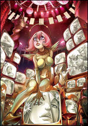
So, with that out of the way, what exactly are we dealing with here? Sky Doll is a reprint of a European comic, extremely reminiscent of Heavy Metal, about a galaxy ruled by a "papess" named Lodovica, primarily through total manipulation of the media, largely through the prodigious use of staged "miracles" and the constant distraction of omnipresent erotica. An opposing papacy, Agape, has been banished, her followers labeled as rebels and heretics. Noa, the Sky Doll of the title, is a robot created primarily to serve the state. And because the state is founded largely on sex and perversion, Noa's jobs tended to be base in nature. She has met up with Roy and Jahu, two servants of the Lodovic Empire, who have been sent to quash a burgeoning new religion on the planet Aqua. However, in their travels, the group finds that the Lodovic system they work for, and its papess, may not be all they're cracked up to be.
That's it in a nutshell. In truth, there's a hell of a lot going on here, and the fact is that, having missed the first two volumes, it was extremely difficult to catch up. I worked at it pretty hard, though, because this book has an awful lot going for it. First and foremost, the art is absolutely gorgeous. I wasn't kidding when I said this reminded me of Heavy Metal; this is clearly a very European style, and I was reminded of Moebius to a certain extent. The world created here is exquisitely detailed, very well designed and just gorgeous to look at. I swear there's some anime influence in here as well.
What struck me was how adult this story is. Not in the "Hey, that robot has boobies!" sense, although, yes, the robot has boobies. This story is taking on organized religion, sexual mores, the way the government can use the media to manipulate its people and, perhaps most dangerously of all, Oprah. This is a fiercely intelligent story. It is also an extremely dense one. If you're going to read this, you have to commit to it. The first time I opened the file I skimmed through it, got very confused, briefly wondered how the hell I was going to encapsulate it, and turned off the computer to lose myself in the warm embrace of the dumbest TV show I could find. Once I plowed through it, though, I found it to be immensely rewarding.
With all that said, this is a tough book to wholeheartedly recommend. This story isn't making fun of God; it's making fun of His fan club. However, in my experience, His fan club frequently can't tell the difference. So, if that's a concern, know that going in. But more than that; without having read the first two volumes, it's quite difficult to make heads or tails out of anything here. I'm going to have to pull out the buyrow. It's completely, utterly, totally worth both your time and your six dollars. However, you may want to think about tracking down the first two books. But even if you don't buy this, you must read it.
 Universal War One #1
Writer: Denis Bajram
Adapted: Paul Benjamin
Artist: Denis Bajram
Letterer: VC's Joe Caramagna
Cover: Denis Bajram
Review: drqshadow
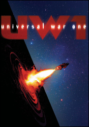
In the distant future, the human population has spilled over to coat our entire solar system. Civilization has split between the warm core planets and the more remote, desolate outlying planets. And (surprise), the human race still hasn't figured out how to peacefully coexist. But in the midst of a bitter civil war between entire planets, something unexpected happened: a thick black wall suddenly materialized, dividing the warring factions and their shared solar system in two. Absorbing all light and matter, humanity's only chance to learn more about this invading, unfamiliar object lies in the hands of the Purgatory Squadron. The nearest ship to the wall at the time of its appearance, the Purgatory just so happens to be a collection of lowlifes and criminals, granted a second chance at life by serving onboard. Not exactly the kind of people you'd want to entrust with the future of mankind.
Denis Bajram plays all roles in Universal War One: writer, artist, colorist. I imagine he'd be handling the lettering too, if he'd originally written the series in English. As a writer, he's deeply concerned with the details and intricacies of his story, and as an artist he's pretty much the same.
His storytelling is extremely wordy, but I can't say I didn't expect that coming in. Truly, that seems to be one of the staples of celestial sci-fi: overload them with details, so they'll believe you know what you're talking about. In this case, the trick works. The crew of one of his ships could be debating the rate of temperature increase in one of their onboard breakfast pastries for all I know, but because they speak about it with such conviction and eventually translate it to plain English, it lends them a certain degree of authority. I'm not a big fan of the sheer volume of text in this book, especially since each and every panel is treated to a minimum of 20 words, but that's clearly one of the writer's passions and it's not all stale and boring, so I can live with it.
The scope of Bajram's story is probably Universal War One's greatest strength. For the magnitude of an all-out military action between planets to be truly comprehended, it needs to be treated as a relatively big deal. This author covers almost every aspect of such a battle, from the lowly field sergeant to the highest-ranked colonel. It didn't take long for me to buy into the authenticity of this story, and once you've taken that plunge you're basically hooked for the duration. It's slow-moving, but the author knows how to use that pace to his advantage when the time is right.
Bajram's artwork is intricate and detailed, heavily researched and meticulously planned. He's clearly taken his time developing this series, and the depth of his investigation shows in the consistency of his illustrations. He's envisioned a fleet of spaceships, detailed so rigorously that it's almost as though he's drawn them from life. His vision of civilization on the crust of an inhospitable land is believably desolate.
This isn't a romantic prophecy, and that means it's something I can actually wrap my mind around. If humanity were indeed hurriedly populating the surface of Neptune, I imagine the first priority would be on sustainability and not aesthetics � which doesn't speak well for the dynamism or excitement of Bajram's artwork, I know. To be frank, his work isn't particularly explosive, but it's not a problem because the story doesn't call for that. What he brings is an almost military precision: scenery that looks as though it were actually seen through the windshield of a space-faring craft, equipment that was built to serve a purpose (not to look pretty) and a cast that looks like everyday people. While it's not a take that readers of Marvel's mainstream superheroes will probably enjoy, fans of good science fiction will welcome it with open arms.
That last line pretty much sums this book up. If you're out for a wild, guns-blazing romp through the cosmos, keep looking. This book isn't for you. However, if you're in the market for a smart, detailed sci-fi epic, this might be right up your alley. Fans of Isaac Asimov, Arthur C. Clarke or Philip K. Dick will find plenty to keep them entertained. And while it does have touches of Hollywood and the slow pace ultimately hurts, it's far from crippling. Borrow this and see if it's your cup of tea. It's going to be a long one, but something tells me it'll be worth the trip.
 Witchblade #119
Writer: Ron Marz
Artist: Stjepan Sejic
Letterer: Troy Peteri
Cover: Stjepan Sejic
Review: Dan Toland
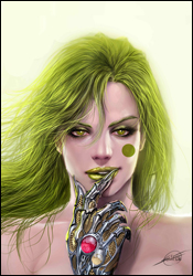
This month, Sara Pezzini has a big fight with a lady with green hair.
Seriously, that's about it.
It's a good thing this is so pretty.
I'd go into a little more detail about the plot, but � and I'm seriously not trying to be a wiseass here � there isn't any. The attempt is made to bulk up the issue by having the story told through flashbacks, but in general it's just page after page of Sara throwing punches.
Those pages, however, look fantastic. Sejic's images are always striking. While his people are lifelike and clearly defined, it's his world that really catches my eye here. It's very easy, and all too common, for an artist to be so hung up on drawing the characters and what they're doing, that their surroundings are given short shrift. Not so here. Every brick, every blade of grass, every ceiling tile is rendered very carefully, and it goes a long way to creating a sense of real plausibility in a world so entrenched in the fantastic. Furthermore, his use of color, light and shadow is remarkable. Every area that Sara appears in creates its own mood, and that's all due to Sejic's labors. And finally, the fight itself looks outstanding. The characters move fluidly while still managing to remain within the bounds of what the human body can actually be expected to do, and real power and speed comes across beautifully with the use of some subtle background blurring. This is a gorgeous book.
Which is why someone felt the need to slap captions all over it.
I have never been a huge fan of Ron Marz, and now I'm reminded why. Considering the thinness of the plot, Marz has seriously overwritten to compensate. The dialog is stiff and unbelievable; if you were watching a TV show in which the characters were speaking the way they're written here, you wouldn't make it five minutes before switching over to Run's House. And there's way too much of it. There is not a single panel that doesn't have either a caption or a word balloon, and more likely than not there'll be three or four of them. And frequently, the caption is describing what's in the panel. It just isn't necessary. Sejic's art is perfectly clear and more than capable of conveying the story; a picture of someone jumping out of a car does not have to have "I jumped out of the car!" taking up 20% of the panel.
It looks like the story might be leading into something, but as a standalone issue it doesn't really have anything to grab you. Flip through this issue to soak in the art, which is really worth a look, but the writing drags this down something fierce.

