Is It Wednesday Yet?
08 July 2008
08 July 2008 � Here we are again with another installment of your favorite comic book review series. As always the comics you're about to read about won't be released until tomorrow (09 July 2008), so these reviews are free of spoilers and should help inform your purchases on new comic book day.
Our grading scale is simple:
Buy: An excellent comic book.
Borrow: A good comic, but save yourself some money by reading a friend's copy.
Flip Through: Give it a once-over at the comic shop.
Skip: This doesn't need to be explained.
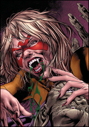 Captain Britain and MI: 13 #3
Writer: Paul Cornell
Penciler: Leonard Kirk
Inkers: Jesse Delperdang with Scott Hanna
Colorist: Brian Reber
Letterer: VC's Joe Caramagna
Cover: Bryan Hitch
Review: Dan Toland
You have to hand it to the Skrulls; they are covering all the bases. Great Britain is being invaded by a contingent of magically adept Skrulls, in an effort to seize control of Avalon. They've taken control of all of Earth's magic and rested it in the power of a single Super-Skrull, who looks very fetching in Doctor Strange's Cloak of Levitation. Standing against the Skrulls in London are the British Army, aided by the Black Knight (who seems to think that it's 1994, and has dressed appropriately in a leather jacket and jeans) and Faiza (a doctor who's been zapped by a Skrull machine and given powers that I haven't quite figured out). On the Avalon front, the Skrulls are being met by John the Skrull (who is awesome), Spitfire (who looks too much like Amazing Friends -era Firestar) and Pete Wisdom (who is listening to the voices in his head, urging him to do something potentially catastrophic). Meanwhile, Captain Britain is still dead, and no one has been able to pull Excalibur (the sword, not the book that lets Marvel keep their trademark on Meggan in effect) from its stone.
What we have here is, to be totally honest, a book filled to bursting with characters I have never given more than half a thought to. So imagine my surprise when I actually found myself very interested in this story. It's especially odd, when most of the issue is "The odds are hopeless! We can't win! They'll know they've been in a fight, but all hope is lost! Except, wait... what's that?" You can see the ending coming from page one, and the fact that I still felt a shiver of anticipation to get there is a testament to the writer. Television scribe Paul Cornell has written a love letter to his native Britain and the spirit that has kept it from being subjugated for almost a thousand years. And that is infectious as hell. So when the big reveal happens, the one that's been telegraphed throughout, what should be pretty cheesy is wholly effective and awe-inspiring. That's good writing.
Kirk's artwork does what it sets out to do. It's not terribly steady, but it's never bad. Some of the panels are incredible, and showcase amazing attention to detail. And there's actually not a huge amount of action, but what there is, is handled extremely well. There's one panel towards the end, in which the Black Knight launches himself screaming at the Super-Skrull, which is poster-worthy. Sometimes, though, the art shows signs of being rushed or uninterested. And he doesn't do as well with the women as he does with the men. Although, to be fair, Michelangelo himself could be rendering Spitfire and she would still look outrageously goofy.
This is a Secret Invasion tie-in, and though it's not essential reading, it is definitely worth your time. Borrow it, despite there not being a whole story here; the lead-in is easily gleaned from the issue and some characters that could use a little airing out are given their due.
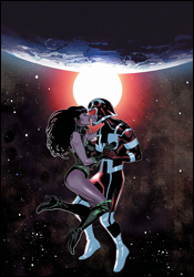 Eternals #2
Writers: Charles and Daniel Knauf
Artist: Daniel Acuna
Letterer: Todd Klein
Cover: Daniel Acuna
Review: drqshadow
Since awakening from their amnesic slumber during Neil Gaiman's miniseries two years ago, the first handful of Eternals have been on a constant vigil for more of their forgotten peers. But where the big family had previously been merely racing against the boot-up speed of a sleeping god, today their troubles have multiplied. With the devious Horde on its way to devour the Earth, it's never been so important to locate and enlighten more confused Eternals.
I was a fan of Gaiman and Romita's Eternals . Not a frothing, sequel-hungry fanatic, but a fan nonetheless. I found the story to be inconsequential and spacey at times, but the grand scale of what was going on and both creators' knack for powerful, easy-to-read moments of grandeur kept me buying and reading the series until its conclusion. As the immediate follow-up to that tale, the ongoing series pales in comparison. Charles and Daniel Knauf, known for their work on Iron Man and, more notably, HBO's Carnivale , have taken the premise of the limited series and weighted it down considerably. Where I often worried that there wasn't enough going on in the miniseries, there's too much happening here. Everyone, it seems, has a secret agenda and they're all too happy to grimace, posture and tell you all about it.
It wasn't long before I learned to loathe any and all of this issue's dialog. Most of its cast uses such a wide vocabulary that it's tough to say whether they're speaking off-the-cuff or off a teleprompter. The permeating sense of awe and wonder that I loved in the miniseries has been carried over, albeit partially, but it offers nothing new. It's still cool to see a stationary Celestial looming silently over the Golden Gate Bridge, but that was Neil Gaiman's contribution, not the Knaufs'. What innovations the writers do bring to the series are so focused on conveying the galactic importance of the book's message that they never slow down and think about how difficult the issue is to read. Did we really need a monotone narration from the dreaming Celestial in this series? It was hard enough to follow what the more human characters were saying, now you're asking me to focus on the emotionless, almost computer-like mentality of an all-seeing, all-knowing god? No thanks.
On the visual end, Daniel Acuna does a lot of good and a lot of not-so-good. His rich, colorful style immediately gives the book a strong identity, but his troubles with consistency always get in the way. When he's on � visualizing the SHIELD Helicarrier or a charismatic cult figure set against the backdrop of the towering Celestial in San Francisco � he's dynamite. When he isn't � dealing with hokey alien forms � he'd be lucky to pass as average. It's like his readers have to pay the piper for every enjoyable moment he delivers. He shows flashes of brilliance, but they're constantly counterbalanced by surges of ugly.
There are times I think this Eternals gets what made its predecessor tick, and times I think it's hopelessly lost. The family's search for their missing siblings could make for the driving force of an epic tale, but the Knaufs shift it to the background, more interested in tying Iron Man and the Order into the proceedings. I had a lot of trouble keeping up with their excessive dialog (which always seemed to be muddying up Daniel Acuna's best illustrations), and finished this issue relieved for crossing the finish line, not anxious to see what twists the story will take next month. This isn't total garbage, but it isn't good, either. Skip it and wait to see if things improve later on.
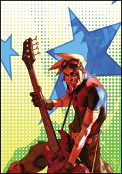 GeNext #3
Writer: Chris Claremont
Penciler: Patrick Scherberger
Inker: Norman Lee
Colorist: Chris Sotomayor
Letterer: Ed Dukeshire
Cover: Doug Alexander Gregory
Review: drqshadow
The original X-Men you know and love are out the door. They're last year's model, outdated and retired, finally making way for their children and grandchildren to inherit the group's timeless struggle. But what if that isn't a battle these kids want to fight? Are the grandchildren of Storm, Gambit and Colossus cut from the same cloth as their revolutionary parents, or do they want to define their own legacy away from their forefathers' battlegrounds?
Chris Claremont has already developed his share of hypothetical futures within the framework of the X-Men. Hell, even without Claremont at the helm, the series has been fairly notorious over the years for its tendency to delve into this kind of subject matter. Between "Days of Future Past," "Age of Apocalypse" and "X-Cutioner's Song" alone, they've covered a lot of similar territory, so I worry that yet another book set in an uncertain future might be a case of going back to the well too often.
But the premise is a good one, and Claremont's writing within is much more concise and heartfelt than anything I've seen him produce in ages. His focus here seems more on rewarding his readers with a strong idea and a simple execution than on confusing them with endless twists and turns, terribly overwritten dialog and an overabundance of characters. Frankly, the writing in GeNext is so remarkably different from any of Claremont's work in the last 20 years that I'm having a hard time believing he's the one responsible. By limiting his cast to five primary students and a small team of supporting characters, he's allowed himself to develop each of them as distinct individuals. Whether this was by design or not, he's recaptured much of the spirit of the first few issues of the X-Men , back when the team was a small group of uncertain, unrefined teens. They didn't know who they were, where they were going or how they'd get there, and that made them relatable. In the 45 years since, those characters have grown and changed, and the tone of their series has followed. In that respect, the style and attitude of this book is both a breath of fresh air and a reminder of where it all started.
That doesn't mean GeNext lacks shortcomings. For a series that purports to be focused on the X-Men's grandchildren, an awful lot of this issue focuses on Cyclops and the Beast, who aren't exactly recognizable in their new roles as teachers at Xavier's Institute. Of the familiar faces that make an appearance, only the Beast looks to have aged, and even he seems physically capable of jumping right into the fray at a moment's notice. In the big picture, these are just minor qualms, but they did serve to keep me scratching my head all the same.
Patrick Scherberger's artwork provides an excellent partner for the energetic, youthful tone the series takes. Much like Humberto Ramos' breakthrough run on Impulse , Sherberger's uncomplicated, personality-driven work is right at home in this world and with these characters. He ensures that things never get too serious (even when Cyclops worries aloud about the next time he'll have to inform a parent about their child's death), and gives the book an appropriate measure of childlike innocence without diminishing the magnitude of some of its more solemn moments. Perhaps most importantly, the five central characters actually look like kids. Even Pavel, Colossus's enormous grandson with arms the size of a pair of BMWs, has a bright, unblemished face that betrays his true age.
This was a wonderful surprise. It's the most fun I've had reading a Claremont book in as long as I can remember, and a fine look back at the team's past under the guise of a glance at its future. Both the story and the artwork have their moments of weakness, but as a whole this was a very nice package and a far cry from what I expected. Borrow it from a friend and relish the moment. With a little more consequence and a crackdown on those aggravating age discrepancies, this could turn into something really hot.
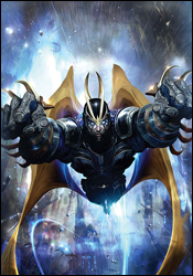 Guardians of the Galaxy #3
Writers: Dan Abnett and Andy Lanning
Penciler: Paul Pelletier
Inker: Rick Magyar
Colorist: Nathan Fairbairn
Letterer: VC's Joe Caramagna
Cover: Clint Langley
Review: Dan Toland
One of the first comics I remember owning is Incredible Hulk #271, the first appearance of Rocket Raccoon. (It's coverless, but I still have it.) I was seven, and that was pretty much the point at which Marvel hooked me. If the Hulk can team with a talking raccoon and his walrus sidekick on a giant space station, taking on an evil mole and the Bunny Brigade, comics can officially do anything. That doesn't really have anything to do with this book, but it does, perhaps, go to explain why a book with a tough-talking anthropomorphic raccoon (without, alas, intrepid assistant Wal Russ) is going to automatically have points added to it. Just so you know.
So, in this issue, the team is inside a Dyson sphere (a hypothetical artificial shell constructed around a star for the purpose of capturing the solar energy and providing virtually limitless power; they were on that episode of Star Trek: The Next Generation with Scotty) facing off against the Cardinals of the Universal Church of Truth. Y'see, the Guardians had managed to destroy one of the Church's templeships, and they're finding that holy retribution can be a bitch.
The story is solid, if not terribly out of the ordinary. The dialog is a highlight (the team members all interact very well, and each has a distinctive personality), and the conceit of moving the story along via "debriefing logs" works to further this. Although, telling the story after the fact does tend to take away any suspense as to whether they make it out okay. This is a character-driven book, rather than a plot-driven one.
Pelletier's art is easily the best thing here. His run on Nova has been nothing short of spectacular, and here he gets to bring his flair for huge, cosmic adventure to a book with a much larger central cast. Magyar (making the leap with Pelletier) provides inks which are a little thicker and not quite as detailed as they were on the earlier title, but they both turn in very good work. The Cardinals, in order to be any kind of credible threat when you have Adam Warlock and Quasar on your team, need to give the appearance of virtual invulnerability. You can't just say, "Holy crap, these guys are tough." The art must sell it. And it does; I don't see them lasting long in the hands of almost any other artists, but these guys give every indication of being fully capable of handing Warlock his ass and taking his lunch money.
The writing is perfectly serviceable, if unspectacular. The art, however, more than makes up for it. On top of which, Rocket freaking Raccoon! Borrow this issue to see if it rings any bells for you. It's not for everyone, but it's definitely worth a look.
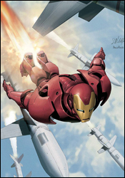 The Invincible Iron Man #3
Writer: Matt Fraction
Artist: Salvador LaRocca
Colorist: Frank D'Armata
Letterer: Chris Eliopoulos
Cover: Salvador LaRocca
Review: Dan Toland
Oh, good. I was worried I wasn't going to get any Iron Man this week.
Ezekiel "Zeke" Stane, son of Tony's old adversary Obadiah, is running riot. He's orchestrated suicide bombings on Tanzania and the Philippines, both using Stark's Iron Man technology. Tony investigates, but it's not until he and Pepper Potts are attending a gala in Taiwan (at which more of these bombers attack) that he figures out who the mastermind is.
Oh, don't worry, Tony's got magic armor. He'll be fine. Everyone else at the gala? Completely screwed.
Tony: Please let Pepper be all right!
Me: What about the other people at the party?
Tony: Who to the what now?
Me: Your guests.
Tony: Huh? Oh, them. I think they died. Why do you ask?
Me: Sigh.
I am really getting to like Zeke Stane. I liked him in The Order and I like him here. He has the potential to be the next real breakout villain of the Marvel Universe. We'll know for sure when someone other than Fraction writes him, but he's what Iron Man's always needed: a comparably equipped villain who can realistically stand toe-to-toe with Tony, and at the same time, isn't a horrible and embarrassing Asian stereotype. He's the anti-Iron Man, while at the same time being an over-the-top crazy guy with enough money and power to get people to let him get on with what he needs to do. Marvel has arguably not had a really successful new villain since Venom and Apocalypse were introduced within a couple of months of each other back in 1986, and they could use one.
I realize that she's been back for a little while, and that her presence in the movie made her a lock for the ongoing supporting cast, but I also really like that Pepper has been moved to the forefront. Events in this issue indicate major happenings for the character in the near future, and it looks to be an interesting ride.
How's this issue? Not bad at all. In sharp contrast to every other book on the racks, Fraction writes a very personable Tony Stark capable of bantering with Maria Hill one minute and taking out Chinese drones the next (in a way that makes him seem cool, and not like a total ass; Bendis, take note). He does dialog and exposition equally well, and things move along at an excellent pace without either confusing or talking down to the reader.
LaRocca's artwork is simply stunning. When the worst thing you notice is that Pepper seems to have a very bizarre three-toed claw-foot, you've got a great artist at work. His storytelling is flawless. The attention to detail is amazing, and he inks himself spectacularly. I haven't always liked everything he's done, but this work is just gorgeous.
There's really no reason not to buy this. Good story, great artwork, promises of interesting stuff to come and a lead character I don't want to punch in the crotch. Who could ask for anything more?
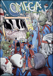 Omega: The Unknown #10
Writers: Jonathan Lethem and Karl Rusnak
Artist: Farel Dalrymple
Letterer: Farel Dalrymple
Colorist: Paul Hornscheimer
Cover: Farel Dalrymple
Review: Dan Toland
Hi. I'm Dan. You might remember me as the Is It Wednesday Yet? guy who didn't totally hate the issue of Omega: The Unknown Mike shoved in his general direction last February. As I recall, I found the issue to be somewhat confusing, but noted that it had striking imagery and that Marvel needed to be given credit for trying something out of its comfort zone.
And what we get here is each of the creators giving the finger to the poor schmuck who shelled out $3.00 for this. Metaphorically speaking. I mean, if that was literally it � a different picture of an obscene gesture on every page � at least I would have been able to follow it. No, instead, they get all artsy about it. Well, artsy in that "college sophomore in a black turtleneck" way.
You know, I realize I spend a lot of time saying "this book was confusing" or "this is a mess" or "I didn't follow what was happening." But there's no way I can adequately describe the depths of that feeling when discussing this comic. This comic makes Ulysses look like a beach read. So, you know what? The only way I can express my feelings about this book is to share the pain with you. And remember, recap pages are for uneducated philistines!
The book opens with Omega crawling out of a giant Ω-shaped hole. He looks in a shop window at a TV covering news reports of the hole. Then he meets a homeless man who bills himself as the world's greatest tap dancer. After he spends an entire page (I'd complain, except that it's probably the most interesting thing to happen in the issue) watching him tap dance wordlessly, the dancer takes Omega to an enclave of homeless people. Afterwards, some food vendors start their day. Someone buys a hotdog. Salt seems to have something to do with something. A package courier makes some deliveries. One of these packages, a doll, makes its recipient very angry, and he tries to attack it with his feet. After this, the Minkettes bury the Mink (who I guess died last month) and his hand (which also stopped walking around of its own accord). Meanwhile, a guy walks home. He goes upstairs, takes a shower, goes to bed and wakes up the next morning. Then, the kid who I guess has something to do with Omega is looking into the Ω-hole with two girls. They run off. The kid, who has some of Omega's stuff, gets rid of it. Then they all get coffee. One of the girls goes to school. Another one walks off to do something else and the kid is left alone to go into an empty office and work on a robot. Finally, in the subway tunnels where the homeless apparently have an underground kingdom, one guy is dressing up as the Mink. Omega, who by now is wheelchair-bound, is wheeled in and put into the set of Hollywood Squares that they've built out of leftover lumber and concrete blocks. The camera closes in on Omega's eye, inside which lives a tiny little man who carries around an empty mason jar, which he wants to show you.
And there are a grand total of two word balloons in the whole book. Yeah, did I mention that the entire comic was silent?
There you go. That's the entire issue. I just saved you $3.00.
You're welcome.
Is it possible to spoil something that no one in their right mind should have any intention of reading? Seriously, if you even entertain thoughts of buying this book, go check yourself into the hospital, because you have no business walking around and making your own decisions. At that point, the decision to skip this will be made for you � in between doses of Lorazepam.
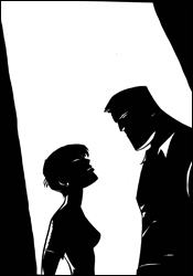 Powers #29
Writer: Brian Michael Bendis
Artist: Michael Avon Oeming
Colorist: Nick Filardi
Letterer: Chris Eliopoulos
Cover: Michael Avon Oeming
Review: drqshadow
Kids have been showing up dead on the streets. A new virus, granting the user powers for a limited period of time, is to blame. It seems that one of the bug's nastier side effects is that it needs continuous replenishment; if the user doesn't feed his or her addiction by siphoning energy from another superpowered individual, they slip away into nothingness. Thing is, nobody can survive the siphoning process, and that's led to users cannibalizing their own ranks and a massive spike in deaths attributed to the disease. Deena has been infected, and it's destroyed her life. And now Retro Girl, under deep cover, is the helpless captive of a gang of addicts.
Needless to say, this isn't an arc you're going to want to jump into mid-stream. New readers will find themselves quickly overwhelmed with this issue in particular, being the culmination of several long, interwoven story threads. If you don't know who Deena Pilgrim is, why it's such a big deal that she's developed powers of her own or what it means to see her sitting underneath a green light in the interrogation room, you're going to want to keep walking. The action is fast and furious, and Bendis doesn't have time to slow down and spell it all out for you. Longtime readers, on the other hand, will continue to find themselves rewarded for their loyalty. Powers has been building to this issue for years, and it's an emotional roller coaster.
This cast has never been so sharp, nor so emotionally charged. I've been following these characters for so long, I almost consider them to be distant friends. Bendis has been quietly building his toy box since day one, and the entire cast is so well-defined by now that even the most fringe-level supporting character can jump right in and play a major dramatic role. What's more, he doesn't hesitate to throw major characters into the fire and, if need be, pull the trigger. I'd struggle to name a single book that's taken the kind of risks with their main characters as Bendis has with Deena Pilgrim over the course of the last 20 issues. As the peak of her latest progression, this issue is both her finest hour and her lowest point, and if you're aware of what's led up to it, it's utterly riveting.
Michael Avon Oeming, the only artist the series has ever known, is finally showing signs of a return to form. His work has been on a downward slant in recent months, and maybe the influx of outside projects he's taken is to blame. Or maybe it's the jump to a larger monthly page count that Powers has taken. Whatever the case, his work has been suffering, until now. His work with facial expressions, with dramatic lighting, with iconic still frames, it's all handled wonderfully from cover to cover. Especially the facial expressions; without an overlying narration, this story relies heavily on its effective use to convey emotion, and Oeming hits the nail on the head every single time. The oversimplified, rushed nature that had characterized his style in recent issues is mostly gone, and it's clear that he's taken a serious interest in making this issue all that it can be. My fingers are crossed he can keep it up.
It's a shame that reading and enjoying Powers is so dependent upon the understanding of everything that's come before, because this storyline has been downright phenomenal. If you're a member of the club, this issue is the cherry on top � an outstanding conclusion to an amazing arc that delivers on a dozen different levels. It's just not very welcoming to new readers, by its nature it really can't be, and that's a real tragedy. Longtime readers need to buy this. But fresh faces should borrow it (and every single preceding issue) from a good friend.
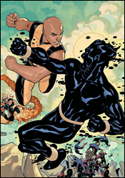 Young X-Men #4
Writer: Marc Guggenheim
Penciler: Yanick Paquette
Inker: Ray Snyder
Colorist: Rob Schwager with Protobunker
Letterer: Dave Sharpe
Cover: Terry and Rachel Dodson
Review: drqshadow
With the X-Men a thing of the past and Cyclops doing his best to piece together as many covert teams as possible, it was only a matter of time before he turned his attention to reviving the New Mutants. As the last generation of mutants on the face of the planet, Wolf Cub, Dust, Blindfold, Rockslide and Ink already have a natural bond. Now organized as an active team of faux X-Men, they can use their mutual attachment for a common purpose: find the bad guys and beat the crap out of them. The only problem? Not everyone is loyal to the cause.
Marc Guggenheim's story is bare bones at best. This month's tale portrays a trip to the tattoo parlor and a fight with the Hellfire club that seems to serve no purpose. When his characters are clever, a phenomenon that happens once or twice in this issue, they show glimmers of promise, of hope that the series could turn into something worthwhile. Ink's mutant power of using his tattoos to effect actions in the real world is truly unique and potentially intriguing; how many characters literally wear their powers on their sleeve? But most of the time, the cast is so worried about looking cool and saying something cute that they give the impression they're trying too hard and spoil any positive progress they may have made earlier in the issue. Okay, Ink can use the radioactive symbol tattooed on his right hand to make people sick, but explain again how a tiny lightning bolt on his temple gives him telepathy?
I never found myself giving much of a damn about these characters, even when it was revealed that there's a traitor in the mix. Their dialog is so forced and hackneyed that I kept praying they'd just keep their mouths shut and get to the action, but the action scenes were so short on ingenuity that I was counting the minutes until they ended. Cyclops is presented as a strategic genius, the head honcho who's teaching the team everything he knows, but when he's taken out of the equation before his plan can even get started, it made me wonder why they'd agreed to follow him in the first place. There's no consequence to this story, no substance, nothing to keep me coming back next month.
I didn't get a lot out of Yanick Paquette's artwork, either. His work is excessively simplistic, with an obvious emphasis on minimal linework, but lacks the expression and personality to make such a direction work. Rather than giving Young X-Men a sleek, smooth, simplistic feel, he delivers something that feels routinely unfinished and occasionally insulting. When he takes it upon himself to render a page with a bit more attention to detail, his work improves marginally at best. His is a style that seems to drain much of the life from a page, regardless of its contents. His matter-of-fact renditions of what should be spectacular firefights may ground the book in reality, but that doesn't mean they're much fun to look at. About once every dozen pages, the stars align and he knocks out something that's genuinely good, but such instances are so infrequent that it's tough to even acknowledge them.
There's no reason for this series to be around. It's poorly written, and is crammed into a corner of the X-universe I'd much rather see left unexplored. Plus, it does nothing to validate its existence from cover to mind-numbing cover. It's paired with nasty artwork that can't do what it sets out to and further muddies the waters by removing any semblance of excitement from the equation. No matter which way you look at it, Young X-Men just isn't pretty. Skip it and pat yourself on the back for doing so.

