Is It Wednesday Yet?
17 June 2008
17 June 2008 � Here we are again with another installment of your favorite comic book review series. As always the comics you're about to read about won't be released until tomorrow (18 June 2008), so these reviews are free of spoilers and should help inform your purchases on new comic book day.
Our grading scale is simple:
Buy: An excellent comic book.
Borrow: A good comic, but save yourself some money by reading a friend's copy.
Flip Through: Give it a once-over at the comic shop.
Skip: This doesn't need to be explained.
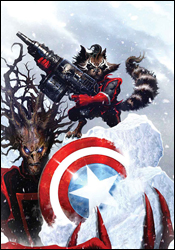 Guardians of the Galaxy #2
Writers: Dan Abnett and Andy Lanning
Penciler: Paul Pelletier
Inker: Rick Magyar
Colorist: Nathan Fairbairn
Letterer: VC's Joe Caramagna
Cover: Clint Langley
Review: drqshadow
Fresh off his own self-titled miniseries during Annihilation, the gun-slinging human Star-Lord and his galactic running buddies are back to protect the cosmos from a shadowy threat in this, their own self-titled ongoing series. I found the aforementioned Annihilation: Conquest - Star-Lord series to be good fun, and while a majority of the squad has returned for this spin-off, they're in the hands of an entirely new creative team. So there's reason for a bit of uncertainty.
Fortunately, Dan Abnett and Andy Lanning have remained true to the tone that Keith Giffen had written into the original miniseries. This is an adventure title, mixed with healthy doses of action and good humor. And while it occasionally gets a little carried away, much of its appeal lies in those moments of excess. It tests the limits of what its readers should be willing to accept, and maybe pushes them a bit beyond that level of tolerance, but then reins it all back in with a well-timed pun or unexpected resolution. I won't lie, there are moments in this issue where you'll roll your eyes and think "I can't believe they're trying this," but when it's all said and done, you'll look back and relish the ride.
Abnett and Lanning have also done a nice job of tying in several minor plot points and characters from the enormous Annihilation saga. That serves to give the series a readymade backstory and a deeper, more diverse cast than most new titles ever get to enjoy. The duo even ties in a few pleasant surprises for readers familiar with the wealth of books that came before, which makes the experience quite rewarding. When you see Cosmo, the space-faring canine from a few issues of Nova, you'll think "Hey, I know him!"
Yes, there's a talking dog. He's wearing an old Russian cosmonaut's helmet. There's a talking raccoon with a hand cannon, too, but surprisingly enough neither feels overly cutesy or cartoonish. What's more, they're absolutely vital to the team. Without Cosmo and Rocket Raccoon, the team would be little more than another gathering of grim, stone-faced superheroes. This new team of Guardians offers a great balance between the serious, the certain and the ridiculous, and in the end that combination is what keeps the book so interesting.
Paul Pelletier picks up the artistic duties relinquished by Timothy Green II, and approaches the book a bit differently than his predecessor. Where Green lavished the miniseries with a rich, hyper-detailed style in the same vein as Travis Charest, Pelletier's work is very close to the lighter, more expressive work of Mark Bagley. Actually, his stuff is so akin to Bagley's I was surprised to find his name absent from the credits. This isn't necessarily a bad thing � I've long been a fan of the man's work, and Pelletier's rendition of it is a loyal homage � it's just a little unsettling at first.
Despite his obvious inspirations, Pelletier's artwork is quite strong overall, and makes a fine match for the fast-paced, popcorn-stuffing flavor of the story. When Abnett and Lanning are playing up the tension in the moments before a large battle, Paul is right there with them, absorbed in the moment and delivering the appropriate atmosphere. When the story takes a serious turn, he changes the mood to match. When it needs humor, he's on top of it. He's a great fit for the sudden, repeated changes of tone that the plot requires.
While I'm worried by the more serious, generic bits of foreshadowing that are strewn throughout this issue, as a standalone tale I really enjoyed the issue. Guardians of the Galaxy never does what you expect, and proves to be a refreshingly different read. Its strange pace and sudden, jarring changes in style mean that it's probably not for everyone, but it's worth a borrow anyway to see if it connects with you in the same way it did for me.
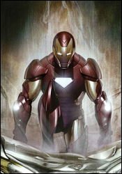 Iron Man: Director of SHIELD #30
Writer: Stuart Moore
Pencilers: Roberto de la Torre, Carlo Pagulayan and Steve Kurth
Inkers: Roberto de la Torre, Jeffrey Huet and Andrew Hennessy
Colorist: Dean White
Letterer: VC's Joe Caramagna
Cover: Adi Granov
Review: drqshadow
Everything's been getting a bit too radioactive in Iron Man's world lately. While Tony Stark himself is entangled in a nuclear threat somewhere in Eastern Europe, one of his SHIELD agents is tinkering around with a forgotten relic of the Cold War: the Overkill Horn. Designed to activate any nuclear device in the world without the need for a launch code, the Horn provides the power of a god to anyone fortunate enough to lay their hands on it. So how honest are the intentions of this SHIELD underling? Turns out, he's only human.
With three different artists and just as many inkers, it's easy to classify this as a filler issue, dropped in during the regular artist's month off. And, to an extent, that's exactly how it looks. None of the artists in question are delivering work that's really top-tier, and I don't see anything here to merit a jump in status. Writer Stuart Moore does his part to limit the damage by segmenting off each artist's contribution to a specific moment in time, but that can only accomplish so much.
This artistic team misses countless opportunities for gigantic visuals and complicates the story with clunky, inconsistent paneling. Their work is universally ho-hum, even when it's meant to be flying off the page, and as such they do a disservice to the story. It's not easy to siphon the energy from a scene that features a man in a flying robotic suit of armor exchanging gunfire with a platoon of soldiers, but these guys found a way. I never felt excited by what was going on, and never felt motivated to turn the page to see how things played out. It was business as usual, both for the characters in the story and for this reviewer reading it. Not everything can be a home run, I guess.
Stuart Moore's story is fresh, if not always compelling. His take on overseas sentiment against American ideals is timely, and I don't have a hard time believing that a foreign army would take potshots at a visible US target like Iron Man. He's delving into the tough grey area that exists between clear-cut right and wrong answers, and Stark's hesitance to engage these troops for merely defending their territory is understandable. It's a brave new world out there, and it's no longer cool or appropriate to shoot first (or even second) without a valid reason. Moore understands this, and while it's not the centerpiece of the story, it's a welcome addition all the same.
Unfortunately, despite the exhausting amount of detail and modern relevance it involves, I had a hard time getting into his story. Moore's characters all seem to lack humanity. They refuse to show any sign of weakness, or really anything beyond bold, absolute certainty. He allows himself to get too caught up in the particulars of the concepts he's imagined (which are admittedly pretty cool), but he loses sight of the main narrative along the way. I found myself intrigued by his interest in those small concepts, but bored silly by the slow movement of the plot itself.
Even in more capable artistic hands, this story would have stumbled. But matching a slow, dreary pace with a team of unexciting artists is a recipe for disaster. There's something of value here, but you have to do a lot of digging to uncover it, and you'll wind up casting the majority of the story by the wayside in the process. It's not really worth the effort. Skip it.
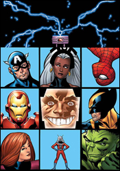 Marvel Adventures The Avengers #25
Writer: Jeff Parker
Penciler: Ig Guara
Inker: Sandro Ribeiro
Colorist: Ulises Arreola
Letterer: Dave Sharpe
Cover: Leonard Kirk
Review: drqshadow
Like a good Saturday morning cartoon, the Marvel Adventures line has a simple set of goals at the start of every episode. They aim to deliver an entertaining action tale, to raise a few issues along the way and to restore the status quo before reaching that final page. If you're looking for a quick, entertaining read without all the strings of a mainstream series, this is your best bet.
Jeff Parker's story fits the mold perfectly. This is a quick, enjoyable ride alongside just about every marketable face in the Marvel Universe. His story this month � that of a service which allows its clientele to momentarily control the minds of a celebrity or superhero � is straight out of a cartoon and is something that wouldn't fly within the current Marvel Universe. It's a simple concept, treated imaginably enough to entertain young and old alike, and doesn't worry itself with any explanations. It works, it's keeping the Avengers from doing their jobs, and that's about all you need to know. Clearly, Parker subscribes to the "unstable molecules" scientific method � tell 'em as little as you can and move on with the story � a true Marvel staple.
But while I can't fault his concept for getting a little silly and playing around with the format a bit, I did have some problems with the finer points of his storytelling. His dialog, for one, is extremely corny. A lot of that is a tongue-in-cheek parody of the Paris Hilton generation, granted, but just because the joke is funny the first time doesn't mean it's something you should carry throughout the issue. He also has a tendency to insult his characters' intelligence, and that's mildly disturbing. Iron Man takes the Wrecking Crew for granted before their battle, when the villainous team typically deserves a lot more respect than that. Later, when the team goes incognito into the brain-snatching service's headquarters, they don't stop addressing each other by their superheroic identities, even when they're standing right in front of the company's executives. Just because the characters in the story are clueless, doesn't mean the readers are, too.
Artist Ig Guara has been on this title for some time now, and he's really starting to come into his own within the format. His style is perfectly suited to the lighter storytelling that's expected of books within the line, and instead of growing tired of the kid-focused nature of such a book, he's using it as his own personal playground. A lot of the things he's trying would seem excessive in a more mainstream comic, but because the rules here are a bit more lax, he's really able to cut loose and try some new things.
Sometimes his experiments don't work. But when they do, they make any and all preceding failures absolutely worth it. His contributions here are tremendous and innovative. For instance, when Wolverine is slammed into the roof of a museum, Guara tilts the camera backwards to make that moment of impact as disorienting as it is powerful. Even off the battlefield, in the more mundane environment of the post-fight meeting room, he brings an original slant to the book's visual identity. The guy's always looking for an excuse to try a new perspective and a fresh pose, and the enthusiasm he brings to his work is infectious. Guara still has a few wrinkles in his style, struggling particularly with his cast's facial expressions, but he brings so much to the title that such shortcomings can be overlooked for the moment. With any luck, he'll remain on this book for a long time.
This series is a blast. Both the writer and the artist are having the time of their lives playing around with these characters without repercussions, and it shows. While the story does occasionally border on the ridiculous, and the artwork has its moments of weakness, as a whole, this is more fun than I've had reading a comic in some time. Buy it if you need a distraction. It's childish, but it's still a great ride.
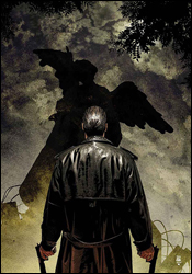 Punisher #58
Writer: Garth Ennis
Artist: Goran Parlov
Colorist: Lee Loughridge
Letterer: VC's Cory Petit
Cover: Tim Bradstreet
Review: Dan Toland
In 1971, a battle in Vietnam went about as wrong as it's possible for these sorts of things to go. The sole survivor was (spoiler) Frank Castle. Nearly four decades later, Frank has still not let that go, and is having a disagreement with some of the old officers that masterminded the complete catastrophe in question. As per usual, said disagreement tends to be fairly violent in nature. However, the officers have figured out that pretty much the only thing on the planet Frank won't shoot is another soldier. That, of course, is when we learn that Frank can be awfully creative when it comes to inflicting bodily harm on a person. After this, the soldiers come after Frank, who has wired... a statue... to explode... for some reason. And so help him God, he'll blow that statue up. Blow it up good.
This is part four of the "Valley Forge, Valley Forge" storyline, and as a single issue, it's really not worth your time. Don't get me wrong; it's written well, and it sure sounds like whatever led us to this point was pretty interesting. And wherever this is going ought to be good. But this issue in particular? There's a standoff, a fair amount of plot exposition and a one-sided battle. And the only reason that battle is there is to get us to the next thing. I read this when it was first sent to me, and I got about halfway through reading it a second time before I realized that I had read it before. It's a placeholder issue, pure and simple.
Ennis' writing is, as usual, good. The personalities (or lack thereof) of each of the main characters are established in a panel or two, and Ennis can always be relied upon for colorful dialog. The art, I'm less impressed with. It looks terribly rushed, to the point that it almost appears not to have been penciled at all; the pages seem to have been drawn with a pen and sent in to be printed on the first draft. In panels with multiple characters, it can be impossible to tell which is which, and Frank himself is downright cartoonish at times. And if there's a book in which that should never happen, it's this one.
This is gonna be a short one, kids; the comic just doesn't bear a lot of analysis. There's almost no reason to waste your time on this: it's a slight, woefully incomplete story with lackluster art. Even the colors are drab and boring. Skip it.
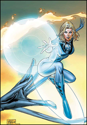 Ultimate Fantastic Four #55
Writer: Mike Carey
Penciler: Tyler Kirkham
Colorist: Blond
Letterer: VC's Russ Wooton
Cover: Billy Tan and Frank D'Armata
Review: Dan Toland
Previously: Sue went to Oregon and found a big egg. On her way home, she was followed by the legendary force of swift Oregonian justice known as the Seven, who are, as it turns out, a bunch of jackasses. (Sounds exciting. Sorry I missed it.) Now, SHIELD psychologist Agatha Harkness gets to sit everyone down in a room to explore their feelings. Meanwhile, Sue pokes around at the egg a bit.
It's almost as exciting as it sounds.
Which is not to say it's poorly written; it's not. Carey's dialog and characterization are, for the most part, fairly close to the mark. It's a little clunky in places, but he gets the characters' voices correct. The situations they seem to be getting put into, on the other hand, are at least 15 different kinds of goofy. If someone walked up to me and described the contents of the issue, and then asked me to pay three dollars for listening to it, I think I would probably have to look for the hospital orderly with the huge butterfly net that would surely have been wandering around looking for the guy. There are some amusing character moments � primarily with Ben and Johnny, as per usual � but while Harkness is supposed to be unlikable, she's too much so.
The art is really not impressing me; this is "classic" Image artwork. Johnny looks to be on Lou Ferrigno's workout plan in some panels. The male characters are severely over-rendered, with lines and crosshatching up the wazoo; the women, on the other hand, have no shadow or definition on their faces whatsoever. They're cartoony and exaggerated � a cross between Michael Turner and the junior Romita, and everyone got a free collagen injection in their Fruity Pebbles this morning. Other panels look almost like they came from Kirkham's sketchbook: they're vague and incomplete.
Another knock is that the issue is smack dab in the middle of a storyline, and there's very little in this issue that stands on its own without having read the issues before. Reed and Sue have been having trouble lately, and they touch on that here some, but overall there's nothing to tell you what's come before.
Overall, as I said, there are some nice character moments, and while the Harkness scenes are pretty ludicrous, they're not wholly unentertaining in their way. Give this a quick flip thorough if you happen across it, but I wouldn't bother actually seeking it out or anything.
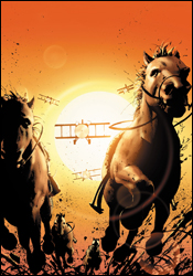 War is Hell: The First Flight of the Phantom Eagle #4
Writer: Garth Ennis
Artist: Howard Chaykin
Colorist: Brian Reber
Letterer: Todd Klein
Cover: John Cassaday with Laura Martin
Review: Dan Toland
The limited series featuring the secret origin of Karl Kaufman, the Phantom Eagle, continues in its MAX-imprinted, profanity-laced, intestines-on-display glory. Previously, some stuff happened, but it doesn't really have much to do with what's going on here, so never mind.
The first thing that strikes me is how (relatively) restrained Garth Ennis is being. I have to hand it to him; he could have taken this title and run with it, giving us all the insanity and gore and general Garth Ennisy goodness that usually comes with his projects. But the fact that he's writing about this particular time period, when people just weren't (we imagine) like that, seems to be staying his hand. Oh, don't get me wrong; you read this and you know who wrote it, even if you skipped over the credits. But he's keeping things realistic, and I have to tip my hat to him.
There are two questions which have puzzled even those of the highest levels of consciousness since the beginning of time. Firstly, can even Garth Ennis take a five-page scene of some people playing checkers and complaining about how crappy the whole war thing is getting, and make it even kind of interesting? The answer to this question, alas, is no. Anytime a pilot isn't screaming through the morning sky eating fiery-hot cocoa-flavored death, there's altogether too much sitting around and talking in this book.
Can Howard Chaykin draw? That's the second question. And, yes, he can � provided he's drawing the right thing. And it turns out the right thing is a World War I aerial dogfight. These scenes are beautiful and exciting. Just when I'd lost hope in him, he pulls this out. Anytime he's doing anything else (e.g. the talking bits), he reverts to the usual Cabbage Patch faces that we here at Earth-2.net have come to know and love so well over the past few months. But the combat scenes are totally worth it.
The coloring in this issue is freaking gorgeous! The first part takes place at dawn, and the skies are awash in soft pinks and purples. Admittedly, I don't usually notice this stuff, but this is breathtaking. Reber does a damn fine coloring job all through the issue.
This book does have some stuff to recommend. Basically, whenever someone's in a plane, it's totally worth your time. It's exciting, and amazing to look at. Even the colors are a step up. When everyone's on the ground, it's less interesting, and is kind of a washout. This book definitely rates a fairly thorough flip through for the combat scenes alone. I'd be interested in seeing if the story as a whole will come together as a collection.
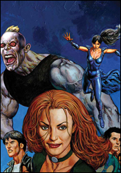 X-Factor #32
Writer: Peter David
Penciler: Valentine DeLandro
Inkers: Drew Hennessey and Craig Leung
Colorists: Jeromy Cox and Chris Sotomayor
Letterer: VC's Cory Petit
Cover: Glenn Fabry
Review: Dan Toland
Previously in X-Factor, Arcade turned up and blew the hell out of Mutant Town. Val Cooper and the Office of National Emergency rolled in to clean up the mess. That's it. There was so little to catch up on, most of the recap page is actually devoted to a cute story about Peter David's kids.
So now, as Jamie tries to help people who've been injured (as the rest of X-Factor sits in their living room listening to Daniel Powter songs), Val is present to give him the government's sales pitch (e.g. come work for us or we make your lives far more interesting than you need them to be). You know, the usual. Someday Marvel's going to release a comic in which the government stays the hell out of someone's sock drawer for a month, and when that happens, the world as we know it may very possibly come to an end. (You may not remember this, but once upon a time, there were comic books in which a bad guy tried to rob a bank or something, and the good guy would come in and stop him. There'd be a fight, and the good guy would win. He would go about his business and not have to worry about the black cloud of international espionage and intrigue overwhelming the very fabric of his soul at all times. Simplistic, perhaps, but it didn't make me want to crawl into bed and hide, either.)
I haven't been overly impressed with David's writing of late, but I enjoyed this. His ear for dialog and characterization is working really well here, and the script turns from snarky jokes to tense confrontations to tragic moments and back again with ease. David has long been one of the most consistent writers in comics, and it's really good to see this again after getting so angry at She-Hulk.
DeLandro's art is not bad at all. It's not the most consistent I've ever seen, and in places it cuts a few corners, but on the whole it's expressive and moody. Every character has his or her own definable, recognizable face. Much of the success in the artwork, though, comes from the fact that people are telling their stories through body language, and I can always get behind an artist who can pull that off. Furthermore, he makes excellent use of light and shadow. All in all, despite the fact that the art looks somewhat rushed in places, I really liked what I saw here.
I really hate it when the comic I enjoy the most in a given week is an X-book. It just feels dirty and wrong somehow. Nevertheless, such is the case. It gets some points taken off for the "heroes getting hassled by the establishment" thing that Marvel is running into the ground right now, but on the whole it's an entertaining read. With some good character development and pretty decent artwork, this one rates a solid borrow.


