Is It Wednesday Yet?
03 June 2008
03 June 2008 � Here we are again with another installment of your favorite comic book review series. As always the comics you're about to read about won't be released until tomorrow (04 June 2008), so these reviews are free of spoilers and should help inform your purchases on new comic book day.
Our grading scale is simple:
Buy: An excellent comic book.
Borrow: A good comic, but save yourself some money by reading a friend's copy.
Flip Through: Give it a once-over at the comic shop.
Skip: This doesn't need to be explained.
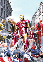 Avengers / Invaders #2
Plot: Alex Ross and Jim Kreuger
Writer: Jim Krueger
Penciler: Steve Sadowski
Colorist: inLight Studios
Letterer: Todd Klein
Cover A: Alex Ross
Cover B: Mike Perkins and Laura Martin
Review: Dan Toland
While battling Nazis developing occult weapons, Captain America, Bucky, Namor and the rest of the Invaders are flung forward in time from 1943 to 2008. When they land, they're immediately plunged into the middle of a battle between the Thunderbolts and the very anti-registration Spider-Man. Immediately sensing that the guy dressed as a bug is on the right side and the government-sponsored bounty hunters were not, the Invaders trash them with very little difficulty. (Don't be impressed. Outside of their own book, Cub Scout Pack 572 could hammer the Thunderbolts.) Of course, Tony Stark sees all of this and gets ready to throw the Avengers at the situation.
There are a couple of interesting things going on with the story. First, Tony seemingly realizes he's been an asshat lately. I don't know if this was consciously done as a step towards rehabilitating the character, but Marvel has been handed an opportunity to fix something that's broken. Additionally, the Invaders are written a little differently than everyone else; Krueger is able to give them a bit more of a retro vibe. And there are a couple of decent character moments. On the whole, though, there's not much to the story. It's a fight, followed by some aftermath.
That fight works, though, due in large part to the art. Sadowski has created some tremendous images. His characters don't look like costumes; they're men wearing costumes. Furthermore, his action scenes are very good, and his facial expressions are topnotch. Admittedly, some of the panels are a little rough, but the action and the movement are great. Also, when for decades women have been depicted with exaggerated attributes on a fairly consistent basis while male characters resemble Ken dolls, the guys here all have bulges. Of course, when you put a guy in spandex � or, apparently, Iron Man armor � it stands to reason there's going to be a bulge involved.
I really dug the coloring. It serves, in some way, to further delineate the line between the two sets of heroes; the Invaders are all colored in bright, primary colors, and while many of the Avengers utilize the same colors, they're a bit more muted. Additionally, in a nice touch, Namor has the reddish-brown hair he had before Fantastic Four #4.
This is a fantastic-looking comic. The story's not bad, but it is the second part of a longer tale, so it feels like the incomplete fragment of a story that it is. Borrow this, though. It looks tremendous, and it's a lot of fun. When it comes out in a collection, I'm buying it that week.
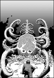 Haunt of Horror: Lovecraft #1
Writer: Richard Corben
Artist: Richard Corben
Letterer: Richard Corben
Cover: Richard Corben
Review: drqshadow
Following up his recent MAX miniseries, Haunt of Horror: Edgar Allen Poe, longtime Heavy Metal artist Richard Corben turns his attention to another famed horror writer in this three-issue series. With Haunt of Horror: Lovecraft, Corben puts his own unique spin on three of HP Lovecraft's wildest tales, then reprints the original source material immediately after. Lovecraft's influence has been notable in comics for ages now, so it should be interesting to see how well his stories make the translation from the written world to the illustrated.
For this premiere issue, Corben has chosen two poems and a short story; "Dagon," "Recognition" and "A Memory." While he's changed around a few details in each story, it's never done maliciously or offensively; rather, it merely feels like an alternate telling of the same story. Some of the details are different, but the overall picture is very much the same.
I love the decision to include the original text in its entirety. While I chose to read them first, no matter which order they're read in, they provide great insight and further depth to each of these stories. Where Corben's tales must frequently sacrifice specific details for the sake of brevity, those clipped words make the written verse more than just a repetition of a story that's already been told. Much in the way that a movie can never reach a viewer in quite the same way as a novel, there's no way a seven-page comic strip can go into the same amount of detail as a five-page short story. Here, it's a mutually beneficial relationship: the paneled rendition enhances the story with its mood, style and personality, while the written stories add substance and further detail to the illustrated work.
Richard Corben has been active in comics for decades, and his mastery of the form stands evident throughout this issue. While his illustrations may not be picturesque, they aren't intended to be; his rendering style is exaggerated, overflowing with texture and identity, drawing the reader into the story. Much of what's so striking about this work is that it doesn't fit into any of the standard mainstream archetypes. It has a feel to it that's dated, but still relevant � like it's straight out of the underground comix movement of the late 1960s, but it takes itself more seriously than that. Truly, these are some stunning layouts � rich, toned and easy to read, but still startlingly original. Corben knows how to lead the reader's eye across the page, noticing every detail along the way, and how to bathe the book in a sharp contrast between black and white. In full color, this work wouldn't have been nearly as effective or half as beautiful.
This is a rare beauty, a literal translation of an existing work that isn't afraid to make the story its own. After more than 30 years in the field, Richard Corben's work is magnificent, worthy of far greater attention than it's granted. While his writing may take these disturbing tales to new places, the mood and the outcome is still the same, and his artwork gives them an incredible identity that the original tales never could have delivered. Buy this, even if you aren't a fan of horror in comics. It's a lesson in great storytelling.
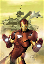 Invincible Iron Man #2
Writer: Matt Fraction
Artist: Salvador Larroca
Colorist: Frank D'Armata
Letterer: Chris Eliopoulos
Cover: Salvador Larroca
Review: drqshadow
Last month, ol' Shell-head's new series jumped straight into action. When a horrific suicide bombing massacred hundreds in eastern Africa and forensic evidence seemed to finger some of Tony Stark's Iron Man-exclusive technology, it's naturally of great concern to the current director of SHIELD. After some research indicates that the culprit is a splinter group known as AGM, (Advanced Genocide Mechanics, naturally) Stark pinpoints their HQ, dons the gold and crimson armor and fires headlong into battle.
Writer Matt Fraction's take on Stark is a good one, and is consistent with the character's other appearances elsewhere in the Marvel Universe. The best part of the character lately has been the peeks we're given into his psyche, into his tendency to analyze the flaws and shortcomings of his inventions right in the middle of a firefight. Fraction has a firm handle on that aspect of the character, and even manages to slip in a good-sized dose of dry humor and self-deprecation along the way. It's easy to see that Stark is his own worst critic, and while he's talking to himself about the problems with his designs, the readers are granted a firsthand example of why those mistakes could lead to death on the battlefield. In this issue, as Tony announces that he needs "to not have giant rockets strapped to my feet anymore," heat-seeking rockets lock onto their targets and chase him into the atmosphere. Easy to see why that would be a problem.
Fraction has a flair for good action scenes and impressive freeze frames, which he gladly carries over to each character he touches. Sure, the concept of Iron Man blasting through the sky to grab MODOG (Mental Organism Designed Only for Genocide) by the hair is plenty dramatic, but the added emphasis of a sonic boom that strikes at precisely the moment of impact makes it that much more impressive. Sure, it doesn't exactly make perfect sense (why wouldn't the power of that impact just tear his enemy's hair out by the roots?), but if you're already willing to accept the existence of a giant floating head bent on world domination, why not make a few exceptions for dramatics? Besides, Matt is gifted enough as a writer to capture his audience's attention with a good action scene, distracting them from such real-world questions through sheer ingenuity. While the story slows down near the midway point, the abundance of fresh ideas and high concepts keep it an entertaining, intriguing read.
Salvador Larroca's accompanying artwork, however, is much harder to get a handle on. Everything is so shiny and unblemished that it gives the entire issue a fake, plasticky flavor that's not entirely welcome. Tony's moustache is trimmed so neatly that he's either got a robot dedicated to maintaining a perfect arc from nose to mouth or he's glued the thing to his upper lip. Larroca's take on MODOG early in the issue is inconsistent and spotty, not to mention totally out of line with the excessively clean environment he's thrust into. It doesn't look like he and Iron Man should be occupying the same universe, let alone the same panel. On a few occasions, specifically during the more pronounced action scenes, the artist really brings his best and delivers a great panel or two, but for the most part this is a forgettable contribution. It's a pity, because I've enjoyed Larroca's work elsewhere, but this just isn't his finest hour.
It's still early in this book's life, so I'll give it some leeway, but it doesn't seem like it's really found an identity or deliberate direction yet. Matt Fraction is trying a few things, and most of them are working, but it's lacking a distinct course. Pair that with a subpar appearance from Salvador Larroca, and you've got an issue that isn't necessarily a bad read, but is worlds away from being anything more. It's worth a flip through and maybe a bit more, but I'm not exactly frothing at the mouth in anticipation of what's going to happen next month.
 Ultimate Origins #1
Writer: Brian Michael Bendis
Artist: Butch Guice
Colorist: Justin Ponsor
Letterer: Chris Eliopoulos
Cover: Gabrielle Dell'Otto and Dean White
Review: Dan Toland
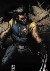
This comic begins "the story that finally reveals the conspiracies behind the entire Ultimate Universe." I know this because I read the blurb on Marvel.com. I did not, alas, pick it up from anything I read in the story. Let me see if I can get this straight. First, Bruce Banner is yelling at Spider-Man. Then the army rolls in, forcing Banner to Hulk up before he takes off. After that it's World War II, and the Super-Soldier program is not off to the best start ever. Also, soldiers Fury, Howlett and Fisk are stealing some crap. The government does not, however, deliver a proportionate response.
I have to wonder why comic companies even bother serializing certain stories. This issue does not make a lick of sense. Not at all. Once this gets collected, it'll probably read a lot more effectively. As a single issue, this just doesn't work. It's got all of what I don't especially care for about Bendis' writing (e.g. the oiliness of the government, the rampant sense of gloom and awfulness hanging over everything), and none of the wit or intelligence that makes him so compulsively readable.
Another pitfall the book suffers is relying on the fact that they're retelling a story from 20 years ago, only with an Ultimate bent, to keep your interest. Honestly, I stopped reading Ultimate books in large part because I had no interest in rereading old stories. I mean, I got to the big cliffhanger ending, and all I could think to myself was, "But I already read this."
I've been a fan of Jackson Guice for decades, but this artwork, while it isn't truly bad, is just not doing it for me. Some of the close-ups are detailed and have great facial expressions, but a lot of the issue is sketchy and rough. There was an instance of Howlett's healing factor kicking in, and I had no idea that's what it was until someone in the story pointed out that he was healing. I honestly thought it was just two panels of Wolverine lying down. Sometimes it might be a matter of the fact that I'm looking at pdf files, but a lot of these pages just aren't clear.
I don't think I've ever been this surprised by the outcome of an issue after looking at the credits. Bendis and Guice should have been a no-brainer of a buy from me. But after reading this issue a total of three times, and still not being totally clear on what's happening, and unimpressed by the majority of the artwork, I have to give this one a skip.


