Is It Wednesday Yet?
06 May 2008
06 May 2008 � Here we are again with another installment of your favorite comic book review series. As always the comics you're about to read about won't be released until tomorrow (07 May 2008), so these reviews are free of spoilers and should help inform your purchases on new comic book day.
Our grading scale is simple:
Buy: An excellent comic book.
Borrow: A good comic, but save yourself some money by reading a friend's copy.
Flip Through: Give it a once-over at the comic shop.
Skip: This doesn't need to be explained.
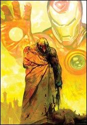
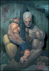 Cable #3
Writer: Duane Swierczynski
Artist: Ariel Olivetti
Colorist: Ariel Olivetti
Letterer: VC's Joe Caramagna
Cover: Ariel Olivetti
Review: Dan Toland
Well, I guess it was my turn.
Hang on, let me... yeah, that baby's still on his chest. You know how in a lot of sitcoms they put students or dads-to-be through an exercise where they have to carry around a sack of flour as a substitute for a baby? After the first commercial break said sack is covered in duct tape and scorch marks. And I assume that most teenagers and nervous dads have at least managed to avoid any time-traveling firefights. Did no one put Cable through even this basic home economics training?
Has the artist or anyone involved in the production of this book ever actually seen a baby? Either Cable is nine feet tall, or this kid is roughly eight inches from toes to crown. She's getting carried around in the palm of his hand. What she lacks in basic anatomy or perspective sense, however, she more than makes up for in being so good-natured and well-behaved. Even when Bishop throws a semi at Cable � absolutely nailing him and driving him into the blacktop � that kid doesn't so much as squirm.
Oh, this book sucks so hard.
I guess some stuff actually happens here. Cable zaps himself into a future New Jersey which has been overrun by a militia. While said militia holds Bishop captive, subjecting themselves to his schoolyard, homophobic taunts, Cable is tended to by a nurse who watches him climb out from under the semi, and after spending minutes in Cable's presence, decides that he's the man who can make life in the Garden State a little less dystopic and oppressive. "You're a good father. I can tell by the way you have a baby strapped to your chest so you can have both hands free while you and that other guy are shooting at each other. Which means you're a good man." (Liberally paraphrased, of course.)
There's nothing I can point to within the writing that's a positive. Swierczynski's script is not very good. While the basic premise of having to protect the first mutant born after M-Day is solid enough, the actual writing is ugly and uninteresting. Sophie, the nurse, believes in the heroism we're told Cable radiates, not because of anything he says or does, but because the story needs her to in order to proceed. There's an awful lot of "$#*&" sprinkled liberally throughout the issue as well. I don't have a problem with swearing, but either swear or don't. When you're writing to hit a T+ rating, the decision is made for you, and all curse symbols do is call attention to that. It doesn't make Bishop the least bit intimidating. It makes him seem watered-down and parent-friendly.
The art actually isn't bad at all. Bishop and Cable are both as wide as they are tall, have no discernible necks to speak of, fists as large as their heads and possess arms bigger than their legs. They've stepped out of a 1994 issue of X-Force. But everyone else looks great. The militia members each have their own distinguishable faces, Sophie is pleasant and I always like it when pencils are colored directly without inks. For that matter, Cable isn't actually drawn badly, either, considering that Olivetti is consistent with the completely retarded character design.
The artwork is not, alas, good enough to atone for the weak plot, downright bad scripting and the utter inanity of the goddamn baby on Cable's chest. How is this book not cancelled yet? Skip it.
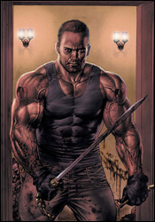 Foolkiller #5
Writer: Gregg Hurwitz
Artist: Lan Medina
Colorist: Avalon's Andy Troy
Letterer: VC's Joe Caramagna
Cover: Lan Medina
Review: Guest
Setting: Marvel offices, last fall.
Editor: Hey there, Gregg! Ready for this project?
Hurwitz: Sure am! I get to work on Punisher, right?
Editor: No.
Hurwitz: But... but I really want to work on The Punisher.
Editor: Yeah, but we're putting you on Foolkiller!
Hurwitz: Who?
Editor: He's like the Punisher, but he kills... fools...?
Hurwitz: Can I pretend I'm writing The Punisher?
Editor: Sure.
Right from the very first page, Foolkiller is, in many ways, a contradiction. It tries to be fresh and full of impact, looking to reach a gritty resonance with its narrative. The problem is, it blatantly wants to be Garth Ennis' Punisher. You can't read the first few pages without it smacking you in the face.
This book, mercifully the conclusion of this miniseries, follows the plight of Nate McBride, a man that is, as the book points out, a fool. Stealing money from his employer (gambling house twointhebush.com), he draws the ire of his clearly shady colleagues and gets his wife and daughter killed. (I should take this moment to mention that this is the man we're supposed to sympathize with, a man whose own selfish desires caused the death of his family.) Looking to protect his only living daughter, Nate searches for the Foolkiller, who despite needing Nate's help waits for Nate to find him instead of the other way around. With information given to him from our resident fool, the Foolkiller goes on a killing spree through the organization, looking to kill head honcho The Cheese before fellow assassin Sickle Moon can kill Nate's daughter.
Now, of course, the natural question would be as follows: why doesn't Foolkiller just go after Sickle Moon for the big dramatic assassin showdown? More importantly, why does Foolkiller care about the daughter of Nate, a man that used to work for the very company he is currently slaughtering every member of? The whole book is just a mess from a characterization and storytelling standpoint. There's a lot of blood and guts, plus plenty of out of place quips. But none of it really amounts to anything, which leads to a third act that feels ultimately cheap and unfulfilling.
I'd give the book credit if it were making strides to be at least somewhat distinctive, but the sad reality is that Frank Castle could have been drawn in the exact same panels as Foolkiller himself and the story would have remained absolutely unchanged. Which begs the biggest question of them all: why make this book at all? Marvel already has an ultra-violent crime thriller under its MAX imprint. It's called, ironically enough, The Punisher.
I will, however give credit where it's due, as Lan Medina's work here is beautiful and distinctive. With a talent to equally portray sexuality, grief and unflinching violence, it's enough that I would normally suggest a flip for the art alone. But luckily, you can see Medina's work elsewhere, like in Fables or even that other book... what's it called? Oh yeah, The Punisher!
Skip it and be glad it's over.
 Logan #3
Writer: Brian K. Vaughan
Artist: Eduardo Risso
Colorist: Dean White
Letterer: VC's Joe Caramagna
Cover: Eduardo Risso
Review: Guest
I have a theory about Wolverine. Granted, it's not the most absurd idea ever conceived, but I wanted to share it with you before we go any further. I believe eventually, no matter how long it takes, Marvel will at some point reveal that Logan has done the horizontal mamba with every single female character in the Marvel universe. The man is rapidly approaching Gene Simmons levels of nooky, as we're now at the point where a new character can barely even get settled in before it's revealed that she gave up the goods to Logan at some point in her life.
The reason I point this out is because often we'll be told a dramatic tale about a past love of Logan's, and the effect she had on his life that supposedly resonates to this day. Of course, the problem is that, again, he's bedded thousands of ladies in his life and it's pretty much impossible to believe that this man, no matter how long he's lived, has fallen so deeply in love with this many Japanese women.
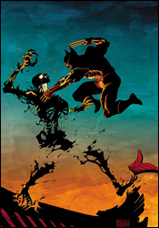
The story is one we've come to expect. Back in World War II Logan had a tryst with a woman named Atsuko, who was killed by a fellow soldier / mutant. Decades later, with Logan's revenge Rolodex apparently clear this week, they meet at the Hiroshima blast point to settle the score.
That's really all there is to it. There's the expected fight that ensues, occasionally broken by flashbacks of Logan and Atsuko swooning over each other. It's a tale that could have pretty much written itself, which makes me wonder what exactly Vaughan was doing here. Perhaps it's the crux that comes with having to write for such a stale character, as all of the major Wolverine Issue Requirements (patent pending) are hit here.
Grizzled philosophical monolog? Check.
Logan showing his alpha male ability to instantly bang any woman within a three mile radius? Check.
Wolverine nonsensically losing a vital organ in a fight to demonstrate his healing factor, but ultimately making him look completely incompetent from a fighting standpoint? Double check.
Even with all of these gripes, I can't fully recommend skipping this one, solely because Dean White's watercolors are a thing of sheer beauty and unlike the work of anyone else out there right now. I would kill to see what this man could do for a book like Immortal Iron Fist or even Daredevil, as his muted tones work much better than they perhaps have any right to, making me very torn on this book as a whole. Here we have artists that hit a homerun, with a writer that we know can do so much better. Give it a flip through.
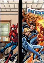 Marvel Adventures Spider-Man #39
Writer: Marc Sumerak
Artist: Ryan Stegman
Colorist: Guru eFX
Letterer: Dave Sharpe
Cover: Skottie Young
Review: Dan Toland
Finally, at long last, an officially sanctioned Marvel comic (even though it's in Adventures continuity) gives the fans something they've been clamoring for since the Lee / Romita days: Peter Parker in lederhosen!
This moment of pure fanboy bliss is framed by a story in which Peter takes Kristoff, a Latverian exchange student, on a tour of New York. Kristoff is then attacked and held captive by the Fantastic Four. Unfortunately, the only way for this story to consume an entire issue is to have the Fantastic Four act completely out of character. A single word balloon in which Reed explained himself would have tied everything together and had the whole thing make sense. It also would have killed the story dead on page 18, so we get a contrived situation to push the action along. That's a shame, because, other than this really glaring irritation, this is a fantastic little issue.
I'm really liking Ryan Stegman's artwork. His Spidey looks great, but even more so, his Peter is probably the most effectively rendered "awkward teenage nerd" I've seen in a long time, and I am including Mark Bagley in that. He's a little too short, but otherwise it's a fantastic rendition. In fact, the art is solid all over the place. It's a touch on the cartoony side, but very clean, bright and fun.
And that's something you could say about the story as well. Yes, it's got that clunky bit in the middle, and yes it's the "heroes have a misunderstanding but then they figure it out and team to face the common enemy" that Marvel's been pumping out since Amazing Spider-Man #1. But it's done really well. Sumerak focuses all his energy on Peter, knowing that a personable, funny, likable Spidey will carry the story all on his own, although it does mean that for the most part, the other characters will come across as a little wooden.
This isn't an award-winner, but it's a fun comic that's totally kid-friendly. Despite its slightness, I'm gonna give this one a borrow. Sit, read it, enjoy it, but if you spend money on it, you clearly have too much and need to send me some.
 Moon Knight #18
Plot: Mike Benson and Charlie Huston
Script: Mike Benson
Layouts: Javier Saltares
Artist: Mark Texeira
Colorist: Dan Brown
Letterer: VC's Joe Caramagna
Cover: Arthur Suydam
Review: Dan Toland
So, leading into this month, Marc "I can't believe it's not Batman" Spector is being framed for murder. Well, different murders than all the ones he has actually committed. Anyway, Carson Knowles, the Black Spectre, is doing his part to make Spector look very bad in the eyes of Tony Stark, Supreme Overlord of the Marvel Universe, who is finally asking the same question I have been for over a year: how the hell did this whackaloon get a registration card in the first place?
We're at part five of the "God and Country" storyline, and, to his credit, Benson manages to get the reader up to speed without a huge amount of clunky exposition. We're finding Marc in the midst of house arrest, tormented by memories of his past actions and his inability to convince anyone of his innocence of crimes that no one really has any difficulty imagining him committing. Spector is an insane, brutal thug, fully aware of this, and is determined to become better. There's a great character somewhere in there, but it's always been weighed down by the very basic fact that Moon Knight is, at heart, a Batman wannabe. This series is finally doing what it needs to do to get out from under that � by pushing it to its extreme. Moon Knight has a lot of potential. It's not as good as it could be, however. Not even close.
Which is not to say it's bad. Benson's script is decent, moving the story along at a good clip while managing to add character moments here and there. Though it does suffer from "Part Five of Whatever" syndrome, and can't possibly fully satisfy on its own. Marvel would do this series a huge favor by making it a MAX book, as well. Benson is telling a very gritty tale, and Moon Knight's ties to the Marvel Universe mean that he has to pull back on the reins. Once the storyline ends and the "Moon Knight as registered hero" angle plays out, it's something Marvel should seriously consider.
I'm not overly crazy about Tex's art. I'm having a hard time figuring out if I'm overestimating how good his work on Ghost Rider was, or if it really has dropped off this much. It's too dark, it's muddy and I spent way too much time asking myself, "Wait, who's this guy? Why did we cut over to � oh. It's Spector. Never mind." There are way too many men with short brown hair running around in this issue. However, what little action there is looks great. There's a very brief battle between Spector and Knowles, and it's pretty exciting.
This issue is more about the potential it has than the actual content. The issue is worth a flip through. This could turn into a fantastic series, but as it stands currently, it's simply a serviceable one.
 Young X-Men #2
Writer: Marc Guggenheim
Penciler: Yanick Paquette
Inker: Ray Snyder
Colorist: Rob Schwager
Letterer: Dave Sharpe
Cover: Terry and Rachel Dodson
Review: Guest
Fresh off a nice little shit-storm of M-Day, a chest-baby and Professor Xavier getting shot in the freaking head, Cyclops has compiled a new team of X-babies to hunt the new Brotherhood, which inexplicably consists entirely of former New Mutants members. The whole situation looks fishy on the surface, and the fishiness continues pretty steadily with each passing page. It's pretty clear that several characters are lying, though their motivations are still up in the air. It makes for a rather straightforward, though still intriguing tale, as the reader tries to piece together everything the characters might be missing.
I'll say this much, regardless of my opinion, you'll at the very least want to give it a look, because there is a point during this issue where the writer pretty much tells you that a certain person is a Skrull, and that's one surefire way to get new readers into a book like this. A cheap tactic, for sure, but it's one that works.
Even without that extra element though, the book works on a very fundamental level. There's action pretty early on, some much needed explanation of each member's individual power and more than a few funny lines courtesy of baffon-esque golem Rockslide. Instead of going with long blocks of expositional dialog to explain each character's backstory, we're given the glimpse into their personalities through context, just as you would if these were actual living, breathing people. You know within the first few pages that Rockslide is the doofus, Wolf Cub is the confident leader, Ink is the cocky dickhead, Dust is the only serious (RE: competent) member of the team and Blindfold is, to put it bluntly, ape-shit insane.
It's a diverse enough team that I think, if given time to build a dynamic, could make for a really interesting read down the line, but here, in the development stages, you get the feeling that the team could as easily last for only two more issues, let alone 200, and from that, you're given the grim confliction of trying to care for characters that may or may not be long for this world. This is, I think, the basic problem with so many teams and so many characters in the universe. Outside of a couple dozen, everyone else is disposable.
Paquette's work here is competent, though not at all distinctive. It looks like so many Marvel artists before and so many that will surely come later. I'm still not sure whether or not this is a good thing, as the work itself is often surprisingly detailed, but still manages to be less than eye-catching. It could be worse.
I say give this one a borrow. It's a simple tale that stands on its own, and worth a look simply for the revelations within.


