Is It Wednesday Yet?
08 April 2008
08 April 2008 � Here we are again with another installment of your favorite comic book review series. As always the comics you're about to read about won't be released until tomorrow (09 April 2008), so these reviews are free of spoilers and should help inform your purchases on new comic book day.
Our grading scale is simple:
Buy: An excellent comic book.
Borrow: A good comic, but save yourself some money by reading a friend's copy.
Flip Through: Give it a once-over at the comic shop.
Skip: This doesn't need to be explained.
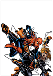 The Amazing Spider-Girl #19
Writer / Co-Plotter: Tom DeFalco
Penciler / Co-Plotter: Ron Frenz
Inker: Sal Buscema
Colorists: Bruno Hang and Impacto Studios
Letterer: Dave Sharpe
Cover: Ron Frenz
Review: Dan Toland
Tom DeFalco, former writer of many Spider-Man comic books during the Jim Shooter Era, writes as if dialog hasn't evolved in the past two decades. And, if I'm being really honest, that's not always such a bad thing. I grew up in the Jim Shooter days, and reading this issue was like reading the new issue of Amazing Spider-Man I'd bought at Christie's Market with my paper route money. Amazing Spider-Girl is probably the only comic on the racks today that seems to remember there's an audience of young readers out there that are too old for Power Pack, but still want fun, done-in-one comic books.
The bulk of the issue has to do with Araña, who has up to this point been helping the Hobgoblin in his efforts to seize control of the New York underworld from Black Tarantula. Now, this month, Araña wants to test May. Or something. For whatever reason. I dunno. Anyway, they fight.
DeFalco's scripting is what you generally expect: solid, not flashy, generally fun. He writes May's character very well; as he should, seeing as how he created her. He really seems to enjoy writing this title, and that's infectious. May is a very quick, funny character, and isn't a thousand miles away from the way her father is written when it's being done right. Other than May, the characterizations tend to be less successful; it's another example of an older man writing teenagers, making sure all the stock characters are there: the bitchy rival, the lunkhead jock, the mousy best friend, etc. (And said lunkhead jock, Gene "son of Flash" Thompson, seriously needs to be pushed into traffic. He's one of the more irritating characters to come along in quite some time.) At least DeFalco is wise enough not to overload the dialog with today's youthful vernacular.
Even before I looked at the credits, I took one glance at this book and knew that Sal Buscema was in on this. He's been working at Marvel practically since the Coolidge administration and his style, especially the "Oh my! I seem to have been punched in the face and subsequently sent flying!" facial expression, is like a fingerprint. His inks completely overwhelm the pencils. Something's up with him, though. He's never been what you'd think of as a superstar � John Morrow is never going to come out with The Sal Buscema Collector � but his work has always been extremely solid and dependable. However, while the storytelling and layout are quite good, nobody has the same face from one panel to another. Faces are misshapen and uneven. In one instance, a cheerleader suggests to May that she try out for the dance squad. I looked at this cheerleader, and thought to myself, "Wow. Maybe times have changed, but when I was in high school, they wouldn't let you be a cheerleader once you looked older than the teachers." And due to the fact that I'm pretty familiar with both Frenz and Buscema's styles, I tend to think this is on Our Pal Sal rather than Frenz.
Amazing Spider-Girl is an odd beast. It's completely and totally unlike anything else in comics today. It aspires to be nothing more than a workmanlike, fun, lightweight throwback to the way comics used to be. It's generally successful in this. This, in and of itself, however, is not enough to float a series. One of the defining attributes of Spider-Girl is how determined it is to be uninspired. With that, I'm going to give this issue a flip through; this may not be your cup of tea, but if you're a True Believer from way back, it might be right up your alley. I enjoyed it for what it is, and I could see myself picking up the digest when it comes out.
 Fantastic Four #556
Writer: Mark Millar
Penciler: Bryan Hitch
Inkers: Bryan Hitch and Andrew Currie
Colorist: Paul Mounts
Letterer: VC's Russ Wooton
Cover: Bryan Hitch
Review: Dan Toland
So, what's happening is that Sue is putting together a team of heroes for charity. Ben is beginning a relationship with a Yancy Street schoolteacher. Johnny has apparently decided that being the world-famous Human Torch of the equally world-famous Fantastic Four does not bring with it enough attention, and has decided to be in a rock band with its own reality TV show. And Alyssa Castle, Reed's ex, is working with her husband on building a new Earth in a parallel dimension for the day when we inevitably foul this one up. This new world (helpfully called Nu-World) has no weapons except for CAP (Conserve and Protect), an extremely powerful robot painted to look like Captain America, which is designed to patrol Nu-World and keep it safe. Naturally, CAP goes batty, comes to our Earth and promptly begins to kill pretty much everyone.
First of all, this cover screams, "I need to buy this!" For the past several millennia, comic covers have come in two varieties: either the heroes are scowling at the reader, or else the hero and the bad guy are getting ready to tussle, and that first punch hasn't quite connected yet. However, once upon a time, the legends tell of attempts that were made to create covers that actually tried to engage the prospective buyer with an image that made him want to part with his lunch money to find out what happened inside. ("What's this? Superman is unzipping his skin to reveal that he's really Comet the Super-Horse? Okay, DC, you've got my .75¢!") This is the definition of eye-catching.
Hey, cool! There's a story inside, too!
Other than a short scene in which (among other things which should prove very interesting) Johnny has a short conversation with a techie whose T-shirt wanted to let you, the reader, know about Guitar Hero III Mobile (and a two panel gag with Sue about how Wolverine is in too many damn books, and by itself should earn Millar an Eisner), this issue doesn't go into any side stories other than that of the battle with CAP. While Reed is off-world, the rest of the team is called in by Alyssa to help stop CAP from disintegrating any more servicemen. It doesn't go well.
All right: yes, this is the third part of a four-issue story. And yes, usually I'll rant and gripe about that. But hot damn, this is cool! CAP is virtually unstoppable. Seriously. CAP could rip the head off a Sentinel and wear the rest of it like a belt. Absolutely nothing seems to slow it down. This is seriously one of the most exciting menaces I've seen in a comic in quite some time, and I honestly have no idea how this is gonna get resolved, and that's pretty awesome.
The only complaint I have about the book is with Hitch's artwork; it's really very busy and detailed, and as most of the issue takes place in Alaska � in the middle of a swirling blizzard � there are times when there's just too much going on in a panel to be able to figure out exactly what's happening. On the whole though, this is Hitch's usual knockout stuff.
As this is, in fact, part of a longer storyline, you should probably borrow this issue if you haven't read the first two and are determined for some reason not to. You should totally read the first two. In fact, you should buy this book every month until Millar and Hitch leave. So I'm kind of saying buy and borrow. Buyrow. That's a new word I just made up. Anytime you use it I get a quarter.
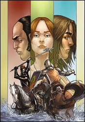 The Hedge Knight II: Sworn Sword #6
Writers: George R. Martin with Ben Avery
Artist: Mike S. Miller
Colorist: Rob Ruffolo
Letterer: Bill Tortolini
Cover: Mike S. Miller
Review: drqshadow
Some books enrage me by not including a recap page, while others carry the concept a bit too far. Hedge Knight II is a good example of the latter, devoting two lengthy paragraphs to a detailed history of the series and the family tree of most of its cast. Fair enough, I guess. Given the choice, I'd rather be in the know than in the dark.
The book's lead character, Dunk, is a knight-for-hire, roaming the countryside with his squire, Egg. After the death of his master, Dunk took up the old man's sword and shield, dubbed himself Ser Duncan the Tall and set about making a name. It wasn't long before he'd pissed off the local prince, gone to trial and subsequently fled the land. Now residing in the countryside, in the service of the retired Ser Eustace, Duncan and Egg find themselves once again at a point of conflict.
Despite the verbose introduction, George R. Martin's storytelling is a very easy read, nicely paced without getting too caught up in the Olde English dialect. With a few exceptions near the end of the issue, no word balloons drag on for longer than they should, and everyone gets a chance to deliver a big line or two. Martin creates strong characters with obvious pride and distinct motivations, and while you won't be pulling for all of them, you'll at least understand where they're coming from. His cast is deep and developed, but not overly complicated or full of hot air. It's a nice, quick read but that doesn't mean it's without substance.
Martin takes great care in explaining the particulars of a medieval battlefield, enlightening the reader while keeping up a brisk pace. When Duncan duels with another knight early in this issue, both men's strategies are concisely detailed before the first strike is thrown. If that sounds like an unnecessary feature, it's not. The writer manages to explain everything an unfamiliar reader would ever need to know about the fight quickly and concisely. It deepens your understanding and appreciation for these aged arts, and without their presence, the battles would quickly regress into stereotypical melees.
Ben Avery's artwork is a decent counterpart for that meticulous, yet simple attention to detail. His pages are largely uncomplicated and stylized, but clearly a lot of effort was made to retain the authenticity of each knight's unique suit of armor and the civilians' manner of dress and posturing. His linework is generally very good � detailed when it needs to be and clean when it doesn't � but he doesn't bring a lot of excitement to the table. Even during the more explosive scenes, I didn't find myself overly enthused; it's more of a document of events than an exaggeration of an action scene. He has a gift for denoting each character's personality in their faces (which is a bit of a rarity among modern artists), and helps further highlight the depth Martin has poured into each of them. Avery has problems with his storytelling, though, particularly during battles. There were several instances where, despite the writer's descriptions, I wasn't quite sure what had happened, and I have to blame the artwork for that.
Hedge Knight II is worth a good look. I'm not typically one for stories set in this era, but I'd be willing to make an exception here. The book isn't without its flaws, particularly on the artistic side, but it's worlds better than I expected. Borrow this from a friend � if any of your friends have actually bought it. It's solid enough.
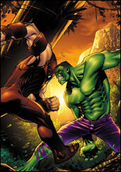 Marvel Adventures Hulk #10
Writer: Paul Benjamin
Penciler: Steve Scott
Inker: Terry Pallot
Colorist: Sotocolor's R. Street
Letterer: Dave Sharpe
Cover: Sean Murphy
Review: drqshadow
This month's Marvel Adventures Hulk doesn't beat around the bush; on the first page, the Hulk is facing off with Juggernaut at the edge of a cliff. By the middle of this issue, you'll find yourself wishing the mutant menace had just gone ahead and hurled Hulky over the edge, because the story goes into a straight freefall almost immediately.
Paul Benjamin's writing is blunt and often dull. I didn't care for him the last time I reviewed an issue of MAH, and although this one is a good deal better than the last, it's still a far cry from anything I'd recommend to my friends. Benjamin sets the story in an interesting locale � the dank, unexplored jungles of Korea � but his writing is still full of holes. He frequently feels the need to remind the reader that Banner = Hulk / Hulk = Banner, most notably through the repeated use of a Hulk-themed narration that runs throughout Bruce's scenes. Maybe once or twice it would've been cute (probably not, but hey, maybe), but the gimmick grows old. It doesn't add anything to the story, and it's annoying. If it were a dialog box on my laptop, I'd click "don't show me this again."
His characterizations are almost universally weak and obnoxious, too. I realize that Benjamin is trying to get me to identify with the "everyman" Rick Jones character when he bemoans the lack of American Idol in an underdeveloped village or celebrates "pwning" the Juggernaut, but that only makes me want to see the Hulk step on his throat. His take on Cain Marko is one-dimensional and overplayed, slapping around villagers and monkeys alike in a vain attempt to look like a badass. Even his Bruce Banner is uninspiring, constantly worrying that the slightest jolt will turn him green and never really doing anything all that brainy. I know Banner is meant to be kind of a pussy, a direct contrast to the mindless physicality of the Hulk, but the guy has to have more on his mind than "OMG! Hulk time?!" all day long.
Steve Scott's artwork is serviceable, although I have to wonder about his assignment on the Marvel Adventures line. His work is frequently moody, dark and mature, while the entire premise of this line is to provide a lighter, more welcoming atmosphere geared toward younger audiences. Normally, I'd be all about mixing and matching styles, trying new things in different places, but this is a poor pairing. His work is technically good, often reminiscent of Leinil Francis Yu, although not nearly as loose and sketchy. He makes the most of his opportunities to spotlight Cain Marko's intimidating physical presence when he's not wearing his Juggernaut armor, and his scene-setting backdrops are often downright gorgeous.
One thing that Scott's artwork doesn't do justice, surprisingly, is the Hulk himself. His Juggernaut is fairly pitiful too, while we're on the subject. When he's depicting Marko in his civvies, Banner with his glasses and a variety of Korean villagers, his work is fine. But once Cain dons that red suit of armor and the Hulk is unleashed, the quality of his artwork goes right down the drain. How can you assign a guy to a Hulk story if his rendition of the Green Goliath is this dull?
Steve Scott's artwork can't save this story. Skip it at all costs.
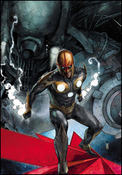 Nova #12
Writers: Dan Abnett and Andy Lanning
Penciler: Paul Pelletier
Colorist: Guru eFX
Inker: Rick Magyar
Letterer: VC's Cory Petit
Cover: Alex Maleev
Review: Guest
A galactic police force, the Nova Corps protected peace and order throughout the universe!
Sound familiar?
For the longest time, I had dismissed Nova as Marvel's blatant attempt at a Green Lantern rip-off. That was, of course, until Annihilation, when the entire Nova Corps was wiped out. We're at the point when Green Lanterns get killed on what seems like a weekly basis, and are instantly replaceable, but to wipe out all but one? That takes balls. And if Nova has anything, it's massive balls.
The story leading up to this issue is a twister of a tale, but I'll try my best to explain. The Phalanx are in the midst of a Kree-holocaust of sorts when our hero, Richard Rider, gets himself caught and infected with a Transmode virus. He eventually escaped to the lost Technarch homeworld of Kvch, which is deserted with the exception of old New Mutant's mainstay Warlock and his pupil, Tyro. Oh, and there's no cure for the virus, which turned two Phalanx hunters into a giant living Babel Spire, which has summoned a Siredam.
If that last paragraph was nonsensical, all you really need to know is that things are bad. Really bad!
With the territory of cosmic stories often comes the ability to lose readers. The sheer unfamiliarity of the setting can sometimes be too jarring for an audience to get behind, and throwing random unpronounceable names into the fray can often make matters worse. Thankfully, that isn't the case here. This issue is a roller coaster of a tale with the brisk pacing of a floppy and the substance of a full trade. Five issues of action, emotion and development are all done in the span of a single issue. And it works. I'm frankly baffled by the fact that it works so well. There's real passion behind this story, and it's made even more amazing by the fact that a majority of the characters aren't human.
The art is, in a word, freaking amazing. Okay, that's two words, but that's how great it is. The amount of detail throughout is astounding, almost to the point that it's distracting. After reading an issue once or twice, I'll often discard it, never to be read again, but I kept going back to this just to look at it. The way that Paul Pelletier was able to give the Phalanx such an organic, while still technological appearance is highly commendable, and quite frankly I could write so much more about the art alone. This man needs to be drawing more books. I'd buy them all.
But you should just see for yourself. This one is a buy, even if you have no interest in the arc. From beginning to end, it's a well-constructed issue.
 Punisher #56
Writer: Garth Ennis
Artist: Goran Parlov
Colorist: Lee Loughridge
Letterer: VC's Cory Petit
Cover: Tim Bradstreet
Review: Guest
There's a strange morality to Frank Castle's profession of choice. The man isn't beyond murder, extortion, kidnapping or even torture to meet his ends. But there are certain things he simply won't do, and attacking American soldiers is one of them. Taking this fact to heart, an assembled group of Army and Air Force officers have been assembled to stop the Punisher for good.
It's a fantastic concept, and frankly, I'm surprised it hasn't been done on this scale earlier. Castle is being faced with a problem he can't simply shoot his way out of, and he's a stronger character for it. It shows that there is actually a rationale, even a code of honor to his work, and that even a vigilante has self-imposed lines he won't cross.
I have a hard time saying anything bad about Garth Ennis. The man was responsible for writing my favorite comic of all-time: Preacher. So even if there was an issue with the narrative, I'm not the guy to notice it. Ennis has done a fine piece of storytelling here, setting the stage for a human chess game in which you really don't want either side to lose. Castle has his reasons for doing what he does, and, while not entirely consistent, you can at least sympathize with his thought process. But at the same time, these soldiers are fighting for what they believe in, and are not just simpleminded thugs looking for a fight. It's the heart of real conflict: two sides with differing ideas on how the world should work. In this case, these two sides wish to protect the people around them, but through different methods.
Interjected into the main story are excerpts from a fictional book titled Valley Forge, pertaining to Vietnam and dropping subtle hints to the story. It's an innovative narrative device, and I imagine it will continue throughout the remainder of the arc. What's really of note here, however, is how great of a writer Ennis is even without the benefit of images to tell his story. The man could quite easily become an accomplished novelist on his own merits, and that's not something that could be said of many other comic scribes.
I wish I could be equally complementary of Parlov's visual work, but sadly, I've seen much better. Despite his apparent skill in drawing thick porno mustaches, the rest of his efforts here are rather inconsistent. There are notable occasions when characters will have equal amounts of detail at drastically different distances, and there was one panel in particular in which it looked like he forgot to give a character eyes.
What we have here is a book that's pretty much exactly the sum of its parts: great storytelling with merely average art. For that reason alone, I can't give it a resounding recommendation, but I'd still say borrow it to see what Ennis has done. This issue, in terms of the arc, is hardly essential reading, but it could be a sign of great things to come.


