Is It Wednesday Yet?
01 April 2008
01 April 2008 � Here we are again with another installment of your favorite comic book review series. As always the comics you're about to read about won't be released until tomorrow (02 April 2008), so these reviews are free of spoilers and should help inform your purchases on new comic book day.
Our grading scale is simple:
Buy: An excellent comic book.
Borrow: A good comic, but save yourself some money by reading a friend's copy.
Flip Through: Give it a once-over at the comic shop.
Skip: This doesn't need to be explained.
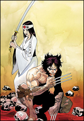
 Cable # 2
Writer: Duane Swierczynski
Artist: Ariel Olivetti
Letterer: VC's Joe Caramagna
Cover: Ariel Olivetti
Review: Guest
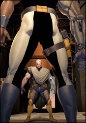
Baby on his chest. He has a baby on his chest. Cable is fighting people with a goddamn baby on his chest!
What. The. Fuck?
It's about two in the morning. It's been roughly 10 minutes since I finished reading Cable #2, and I'm sitting here in front of my computer screen, the only source of light in the room, trying to figure out what the hell I just read. My brain is fried. I'd been an avid Marvel reader in the early 90s. I knew all about Cable, and was familiar with some of the stupid stories he'd been in. But I figured with the advancements in comic book storytelling those days would be long past.
I was wrong. Cable is exactly how I remember him, and that sure as hell isn't a good thing.
So he's fighting Bishop � again � over their respective dystopian futures. Cable (who I'll once again remind you has a baby strapped to his chest) is getting shot at, and is crawling along the ground on his chest, bleeding. Um... what? So this infant is being transported around in a metal seat on Cable's chest while he flips and shoots around and plays Mr. Bad Ass, and is completely unfazed by this. Does this baby have the mutant power of absolute indifference?
Which brings me to my next question: why are they still fighting? If the future is so completely fucked � if no matter what Bishop does it still results in chaos and turmoil � then I have a solution for him: suicide. I know that in some utterly contrived way, he's trying to change the future so that he was never born, but my suggestion is much quicker. Plus, who reading this honestly thinks something will be resolved by the end?
Allow me to discuss the art before I blow a gasket. I can appreciate what Ariel Olivetti was trying to do here. I really can. But he failed. First off, he apparently forgot he was drawing Bishop and drew Luke Cage instead. Perhaps he dreamt that he was working on a better book, like New Avengers. But even that doesn't forgive the fact that his characters are as lifeless as the story. Oftentimes, they look as if they were cut and pasted onto the backgrounds, their facial expressions not really correlating to anything. It's sad.
Not only should you skip it, but you should violently attack anyone that you see attempting to purchase it.
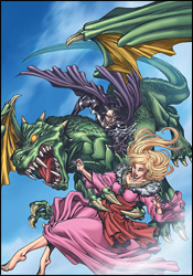
 Clandestine #3
Writer: Alan Davis
Penciler: Alan Davis
Inker: Mark Farmer
Colorist: Paul Mounts
Letterer: Artmonkey's Dave Lanphear
Cover: Alan Davis
Review: Dan Toland
Speaking as someone who has never read a Clandestine comic before, I would just like to take this opportunity to say, "Huh...?" I can't make heads or tails of anything that's going on. According to the recap, Dominic has traveled to another Earth and met with Excalibur, which is pretty cool. Elsewhere, Walter is changing into his blue-skinned beast form against his will. Kay and Sam go to a goth wedding. And kids Rory and Pandora are left on their own after their father, Adam, apparently explodes.
As far as I can tell, this issue assumes you've read not only the previous two issues, but also the original series, 14 years ago. There's a great, old fashioned feel to the potential of the Destine family, almost like a 1930s pulp vibe: want superheroics? You got Rory and Pandora. Want supernatural body-swapping tales? Here's Kay Cera. Sci-fi genius and technology? Newton. Swashbuckling throughout the ages? Adam.
But shoving all of that into 22 pages of story somehow fails to make this particular story any less confusing, and, frankly, nothing in this book gives me any inclination to read the rest of the series. You can't possibly tell a completely satisfying story about all these people in a five-issue miniseries. Especially when one of those issues is filled with Excalibur, instead.
However, you do still have Alan Davis, and that is always a huge plus. Davis is one of my all-time favorite artists, and he doesn't disappoint here. He does it all equally well: action, mood, quiet scenes, etc. And let's face it; if you need someone to draw a picture of Captain Britain punching a big lizard in the face, Alan Davis is the man you want on the job.
And he makes one particular choice that you almost never see; when setting a story in the past, there's a temptation to update the characters somewhat, so as not to date the original story and preserve the sliding timeline. However, here, when Dominic finds himself in the middle of Excalibur's "universe traveling" storyline from the late 1980s, there's Rachel "Phoenix" Summers with her legendary (and totally absurd) mullet, fully intact. These could very easily have been lost pages from that era. The look and feel is recaptured flawlessly. (In fact, Dom's got a pretty healthy mullet going, himself. Actually, someone may want to take Davis down to the barbershop to take a look at the big book with all the new haircuts; everyone in Clandestine looks like they found a style they liked in 1994 and just stuck with it.)
Something is intrinsically wrong when a book has this much potential and creativity, yet I find myself talking incessantly about the guest stars and haircuts. It's like Davis has a dozen stories he wants to tell but is only being given five issues. So instead of picking the best one and crafting it until it's perfect, he's trying to compress them all into the limited space he's been given. The result is a very pretty to look at mess. Flip through this for the art, and for the nostalgia factor of seeing Excalibur.
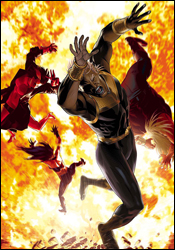
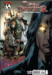 The Darkness: Butcher
Writer: Rob Levin
Artist: Michael Broussard
Colorist: Larry Molinar
Letterer: Troy Peteri
Cover: Michael Broussard
Review: Guest
After waiting for the inherent giddiness of reviewing a Top Cow comic to subside, I ripped into Butcher much like Jackie would rip into his foes. I can say, rather succinctly, that I got pretty much exactly what I expected from this book, for better or worse.
In this one-shot we get a story centered around Joyce Butcher, the grizzled "cleaner" for Darkness possessor Jackie Estacado. While Butcher may look more like a Viking than a guy that cleans up brain matter, he comes off as an instantly likeable character. He's down-to-earth, street smart and very human. His disturbing, dirty work is routine to him at this point. He's almost bored with it. And when he gets thrown into a confusing situation, he echoes our thoughts as he asks, "What the hell is going on?"
The answer to this question, however, is rather unclear. Keeping with the tones of the main series, this book is a bleak, sci-fi noir tale with sharp dialog and great art, but as for following a coherent storyline, there are some issues. Any new readers looking to jump onto the main series from here can forget it. The book will throw you names, plot points and curveballs that can leave you scratching your head. As someone who's familiar with the mythos, though not a frequent reader, I was able to get the general idea of the narrative down, but there were moments that left me with the ever-dangerous combination of intrigue and confusion. When these two elements are mixed correctly, you can hook a reader into becoming a regular costumer, but with too much of the latter, you can push away those you're trying to attract.
The art, as it's pretty much always been with the series, is eye-catching and detailed. Though sometimes, it can be too detailed. There's an old saying in drawing instruction: for every line you add to a character's face, a year is added to that character's life. By that rule, every character in this book is roughly three centuries old. The same method used in shading the faces is also used for expression, making you wonder if certain characters are grimacing or just suffering from arthritis. It's a minor gripe, as the majority of the book is handled well from a visual perspective.
For longtime readers of The Darkness, this is a pretty easy decision, as the twists and turns within are sure to carry a much more significant relevance. For everyone else, this is an interesting tale, but one that seems more like an advertisement for the main series than a standalone story. I say give it a flip through and draw your own conclusions. And remember to tackle that guy eyeballing Cable.
 Kick-Ass #2
Writer: Mark Millar
Penciler: John Romita, Jr.
Inker: Tom Palmer
Colorist: Dean White
Letterer: Chris Eliopoulos
Cover: John Romita, Jr.
Review: drqshadow
Last month, Mark Millar and John Romita, Jr. introduced us to Kick-Ass, the saga of a teenaged boy who's taken the initiative in applying the fantastic adventures of his favorite comic book superheroes to the real world. Sadly, he may have been misled as to the practicality of that pursuit; in his first patrol he was stabbed and beaten, then bowled over by a Mercedes that fled the scene before he'd even hit the ground. Now he's clinging to life in a hospital bed, miles from his goals, with his chances of walking again looking more and more grim as the hours of unconsciousness slip into days.
I was overjoyed to see this book in my review pile this week. I'd picked up the first issue on a whim and found it a quick, exciting read that left me hungry for more. While the tempo slows in this issue, the tone remains the same. The protagonist, Dave Lizewski, is a smart, imaginative young kid who's relatable and inspiring. He's learned some tough lessons about the world in these first issues, and it's already becoming evident that his growth as an individual is one of the story's central themes. Although he's still an adolescent, he isn't treated with kid gloves. Millar lets him shine through as a mature, intellectual mind with broad views and wisdom beyond his years.
Although the first half of the issue's dialog is almost entirely internal, it doesn't feel redundant and overplayed. Dave is well-spoken, but doesn't seem haughty, and some of his lines are downright brilliant. "And so, after four operations, two months of counseling, three metal plates fitted inside my head and endless weeks of physical rehabilitation, I finally realized why there's no such thing as superheroes in the real world." That's gorgeous. That's a mission statement for this entire series, conducted over the course of four panels. This is a title that can cover brutal violence and quiet introspection within just a few pages, yet it's never disjointed or awkward. It's just right.
His partner in crime, John Romita Jr., needs little introduction. Although he's been in the business for over two decades, his art remains fresh and unique. He's one of those rare artists whose work is instantly identifiable, whether he's dealing with superpowers and firefights or wheelchairs and hospital rooms. Although he's had better contributions (a lot of this issue looks like it was rushed out the door, especially early in the book), his work remains in the industry's upper echelon and his layouts alone justify his ongoing presence. When Dave is briefly hallucinating about reincarnation, Romita treats both imagination and reality as one, telling both stories without missing a beat. I don't think I'd have trusted such a complicated moment to anyone else.
Mark Millar has fast become one of my favorite modern writers, and Romita has long been among my favorite artists. Although Millar isn't above making a few mistakes, he almost never fails to surprise, to push the envelope. Every one of his books has its own identity, and Kick-Ass is just the latest and greatest. He's giving us phenomenal action, sharp characters and tough questions, and Romita is bringing them all to life as only he can. I can't say enough good things about these guys, and their work together is a rare example of top-level talent living up to steep expectations. Buy it if you see it, this is great.
 Logan #2
Writer: Brian K. Vaughan
Artist: Eduardo Risso
Colorist: Dean White
Letterer: VC's Joe Caramagna
Cover: Eduardo Risso
Review: drqshadow
Superstar creative teams seem to be the trend at Marvel recently. Whether it's Joe Madureira and Jeph Loeb, Mark Millar and Bryan Hitch, David Lapham and Tony Harris or Brian K. Vaughan and Eduardo Risso, the name of the game seems to be mixing and matching big names on some of the publisher's top characters. For Risso and Vaughan's Logan, the focus is more specifically on a long-forgotten chapter in Wolverine's history. We're suddenly remembering details about Logan's past right alongside the adamantium-clawed Avenger himself, and not all of the memories are good ones.
Brian K. Vaughan, fresh off the conclusion of Y: The Last Man, is just the latest to explore the Canucklehead's undocumented history, and while his take on the character isn't the best, it's also not the worst. He tells this story with a strikingly small cast, but grants each character enough quirks and touches of individuality to fill in the gaps. Vaughan's storytelling is decent at best, though, and never really seems to hit its stride. The story's setting in World War II-era Japan is intriguing, although the big surprise near the end of the issue is a bit over-the-top, and leads me to wonder if there has ever been a major historical event that occurred without Logan's immediate presence. Marvel needs to show a little more restraint, or else we'll be seeing a panel where Logan was on the grassy knoll.
During his run on 100 Bullets, Eduardo Risso has become one of the industry's best-kept secrets. His work with the seedy businessmen and stone-cold killers of the Vertigo series has been consistently atmospheric, gritty and inventive. His linework is thick but controlled, his characters undeniably human and justifiably flawed. Perhaps his greatest strength lies in telling stories with lighting alone; he can soak an environment in atmosphere through little more than the placement of its illumination. His characters wade effortlessly through the shadows as though they were a warm bath.
In Logan, he successfully carries over each of his remarkable abilities, but something's still a little off. I think it's his take on Wolverine himself. The most visible member of the X-Men, Logan never truly looks like himself in this book. Risso seems to struggle with spandex, which is understandable since it's not something he's been asked to handle at all during his tenure on 100 Bullets. He's typically great at developing and depicting a real badass (hell, Lono is basically an evil Wolverine in a Hawaiian shirt), but this rendition of Logan stinks. His work throughout this book, particularly in its backgrounds, is great, but his take on Logan is almost bad enough to spoil it all.
Logan is a tricky book to critique. On one hand, its successes are tremendous; Risso's backgrounds are universally fantastic, and the new characters that Vaughan has introduced play off each other very well. On the other hand, its failures are equally spectacular; the artist's take on Logan himself, the brevity of the story and its ridiculous conclusion. I'm going to be gentle with this one and say it's worth borrowing. I was hoping for a little more than I got, but wasn't entirely disappointed, either.
 Lords of Avalon: Sword of Darkness #3
Writer: Sherrilyn Kenyon
Adaptor: Robin Furth
Artist: Tommy Ohtsuka
Letterer: Bill Tortolini
Cover: Tommy Ohtsuka and Guru eFX
Review: Dan Toland
This adaptation of Kenyon's novel takes place in Camelot, several hundred years after the glory days of Arthur and his knights, most of whom are long dead. Sorceress Morgan le Fay, Arthur's sister, stepped in and took control of Camelot, and has been ruling it ever since. By her side is the new Pendragon, the Kerrigan, who is wholly evil, except for when he isn't. Case in point: Kerrigan is protecting Seren, a peasant weaver who is destined to give birth to the next Penmerlin (someone who will stand against the evil ruling Camelot) from Morgan, who is kind of his ally, but not really. There's a lot to soak in, and we're at the halfway point here, but you really do catch on pretty quickly. So anyway, when last we left Seren, a gargoyle was carrying her off, on her way to be delivered to Morgan.
The very first thing that you run into here is that, as an adaptation, this feels like it's been chopped up from a much longer story. I haven't read the original novels, but I really do get the sense that this was meant to be considerably longer and more detailed. The bones of the story seem like they're solid; I would love to read a story like this, because there's definite potential here for a great novel. This comic book, however, feels a little rushed and incomplete.
Did you ever see Disney's Beauty and the Beast? The Beast is stomping around his castle, saying, "I'm the Beast! Roar! I'm dangerous! Don't mess with me, 'cause I'm the Beast!" And then his staff would roll their eyes, and say, "Yes, we know. You're very scary. Are you ready for breakfast yet?" And the Beast would roar, and gnash his teeth, and say, "The Beast demands Lucky Charms!" And the staff would say, "Well, you've already gotten into the Lucky Charms and eaten all the marshmallows. Do you still want them?" And the Beast growls, "No marshmallows? How could you let this happen? Prepare for punishment!" So the staff says, "Look, we have some Cap'n Crunch Crunch Berries. You like Crunch Berries. Would you like that instead?" And the Beast thinks about it, and says, "I will eat your Crunch Berries. You may live for another day. Pray that you never fail the Beast again! The next time, I may not be so lenient!" To which the staff replies, "Uh huh. Look, we're running a wash later. Please throw your sheets in this time, we can smell them from outside." That, right there, is the Kerrigan. The story goes to great pains to let us know what a bad, bad man he is, but he never actually, you know, does anything. The fact that his staff really doesn't take him very seriously goes even further to undermine this.
The artwork is manga-influenced, and doesn't work at all. Not to say that it's bad, because it's not. It's very clean and expressive. However, if an adult reader were to pick this book up, they would immediately assume it's for kids and put it down.
In the end, this book suffers from the same fate most adaptations do, in that it can't hope to tell the same complete story as the property it's adapting. The fact that it's been saddled with kid-friendly art is not going to help, and neither is the lack of character development. There's no real reason to look this one over. Skip it.
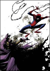 Marvel Adventures Spider-Man #38
Writer: Chris Kipiniak
Penciler: David Nakayama
Inker: Gary Martin
Colorist: Guru eFX
Letterer: Dave Sharpe
Cover: Skottie Young
Review: Guest
You've got to respect the Marvel Adventures line, especially when it comes to the web-slinger. Even if you can't ignore that these stories are mainly written for a younger audience, you have to love that they bring Spider-Man back to a simpler time: before clones, registration and Faustian deals. It also gives us a chance to see some of Spider-Man's lamer villains, like Swarm.
Nazi bees. My God.
I'll admit that being assigned the "kids book" didn't sound like the ultimate gig at first, but, much to my surprise, I ended up liking it. I mean, I really liked it! It's amazing what stripping away years of headaches and continuity can do for a character like Spider-Man. It's part of what made Ultimate Spider-Man work so well. While I don't think Marvel should keep resetting Peter's life every few years � as they're want to do � for the purposes of this line, keeping him in high school is perfect. These aren't huge overarching stories; they're short, easy to digest issues with a full beginning, middle and end. They're like the Saturday morning cartoons of comics. It's not just a good way of hooking new, young readers, but it's a way to give writers more freedom in their interpretations of the characters, not overly marred by continuity.
As for the story, it's well-done. The writing is legitimately funny, with Spidey in the role of the quick-talking jokester that he was always meant to be, and there's a narrative that anyone can understand. Good storytelling, at its most base, can transcend age barriers. While this book is undoubtedly intended for children, adult readers it won't feel insulted � and may even find themselves having fun along the way. There are also clear moral lessons taught within that can easily be repeated to any young scraps within reach of our canes and straining, wrinkled vocal cords, as we tell them about the days when Spider-Man had to swing uphill in the snow to school everyday.
The art is bright and clean, very much in that anime style, and it's pretty hard to criticize anything here anyway, as the intended audience surely won't find issue with it.
Overall, what we have is a fun all-ages adventure that you can confidently read, enjoy, then give to your little cousin. Buy it.
 New Exiles #4
Writer: Chris Claremont
Penciler: Tom Grummett
Inker: Scott Hanna
Colorist: Wilfredo Quintana
Letterer: Tom Orzechowski
Cover: Michael Golden
Review: drqshadow
A ragtag cluster of discarded and forgotten characters from around the Marvel Universe, the Exiles shoulder the task of protecting each planet, reality and possibility in the Omniverse from outside threats. Currently stationed on Earth-6706, the team has been separated from one another and forced to make sense of this disastrous alternate reality on their own. Before the good-intentioned Exiles have had a chance to gather their bearings, however, the planet's resident Black Panther, an evil woman with an entire army at her disposal, strikes from the shadows.
If that opening paragraph wasn't hint enough, this book is terribly complicated. As if the proposition of interacting with one parallel reality wasn't enough, writer Chris Claremont has taken on the task of managing a whole grab bag full of them. And, given his tendency toward convoluted storytelling, he really isn't the ideal writer for this kind of situation. I had to read the first page three times before I had even a vague understanding of what was going on. It doesn't help that he massacres these panels with unnecessary dialog in both thought balloons and lengthy spoken monologs. What are the rest of the heroes doing while Black Panther stands and speaks, Sue Storm's life in her hands? Are they just listening? Why aren't they trying to save her?
While the idea of working with characters so far outside the mainstream continuity should open up nearly infinite possibilities, Claremont instead chooses to use it as an excuse to dispense dozens of mildly different takes on existing characters. Without other ongoing books to tie into, the sky should be the limit for his riff on the Fantastic Four and Namor, but he still treats them gingerly, like he's afraid he might break them. It's all well and good that Sue and Namor are lovebirds in this reality, but I'm afraid that kind of premise isn't strong enough to carry an entire story arc on its own. Without the benefit of a long history, these characters come of as pale impersonations of their more familiar brothers and sisters, and Claremont does nothing to help them make waves.
Tom Grummett's artwork has a few very specific moments of clarity, usually featuring Psylocke, but for the most part comes across as blas�. Part of that can be attributed to his unenviable task of composing a very specific, detailed battle scene without getting in the way of the endless word balloons, but that doesn't excuse the cast's stiff, boring posturing or his poor consistency. Namor's appearance changes from panel to panel, and Sabretooth looks more like a haggard old reject from the grunge scene than a ferocious warrior. His work with backgrounds and machinery is fairly good, and clearly much more of an emphasis than his character renderings, but that's really a case of too little, too late. This writing stinks, and outside of a few noteworthy exceptions, the artwork follows suit.
New Exiles is almost all wrong. Instead of trying new things with familiar faces, Chris Claremont is debating the subtle differences in Atlantean politics between our reality and that of Earth-6706. He's wasting his opportunities to unleash something totally new on the scene by going back to his same tired bag of tricks: pointless battles, unnecessary dialog and dull, repetitive characterization. Tom Grummett, sadly, is just more of the same. His work is uninspiring and drab, without a visual punch or flair for the dramatic. Skip it.
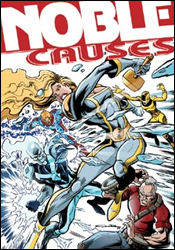 Noble Causes #34
Writer: Jay Faerber
Artist:Yildiray Cinar
Colorist: Ryan Vera
Letterer: Charles Pritchett
Cover: Yildriray Cinar
Review: drqshadow
Image's Noble Causes, a self-professed "superhero soap opera," is the ongoing saga of the Noble family, a wealthy tribe of superpowered kin. Where its peers seem to focus more on the dynamic of good versus evil and the physical battles that ensue, Causes takes a more active interest in the clan's personal lives. Recently, the book has thrown the status quo to the wind and leapt five years into its own future... mixing up the cast and changing the landscape considerably.
Writer Jay Faerber's familiarity with the characters is clear. Although this issue features a lot of different faces, they're all treated to their own unique identity, and as a new reader I never felt lost or overwhelmed. There's a lot of internal conflict amongst this team, and some heavy accusations are tossed around within the first few pages, but Faerber does a fine job of keeping everyone up to speed, regardless of their familiarity with the story so far. That's a lot easier said than done without the benefit of an introductory "previously in..." blurb.
The concept of a dysfunctional superhero family isn't entirely unique, although the writer does enough to distance Noble Causes' approach from the competition. Occasionally, he allows the soap opera aspects of the series to get the better of him (there's more than one overly dramatic outburst in this issue), but he generally balances that with honest conversation and a touch of action.
My biggest gripe is that although the Nobles deal with plenty of adversity in this issue, it's all sorted out so quickly and easily that nothing seems to be of any real circumstance. The heroes bicker fiercely amongst themselves, but ultimately take the moral high road and talk through their differences, diffusing the situation while also draining it of its drama. Their battles with villains are so humdrum and easy that I wonder why the bad guys even bother putting up a fight. How long would the dynamic between Spider-Man and J. Jonah Jameson have lasted if they'd casually shook hands and agreed to disagree after the Daily Bugle's first negative story about the web-slinger went to press? There's a lot of potential to tell some really emotional stories here, but because the conflicts are solved so cleanly, they never get the chance to develop into something of substance. When Faerber finally drops a pair of bombshells at the end of the issue, I'm already resigned to the fact that they'll be wrapped up before issue 35 is laid to rest.
Turkish-based artist Yildiray Cinar gives the series a very clean, open visual identity. While his artwork is extremely simple and under-detailed, that doesn't mean his characters are unrealistic or exaggerated. Where Bruce Timm and Michael Avon Oeming use a similarly light-handed approach with their linework, Cinar's characters have little else in common with theirs. They retain a very lifelike, realistic shape and size, without complicating the page with excessive detail. While the book takes pride in its focus on character interactions over explosive fight scenes, this issue was peppered with enough action to keep Cinar busy throughout.
I had a hard time making heads or tails of this book. I liked the atypical direction it takes with a very common subject, humanizing its superheroes by spotlighting their rocky relationship as a family, but never felt a sense of urgency or importance to any of their actions. I loved the brunt of Yildiray Cinar's artistic contributions, but found his lack of backgrounds and occasional loss of focus to be distracting blemishes on his style. It has its ups and its downs, I suppose. Flip through it. It's not quite good enough to go out of your way for, but not nearly bad enough to discredit.
Note: This issue of Noble Causes won't be released until 21 May. If you'd like to order it now, however, make sure to give the following code to your retailer: MAR082103.
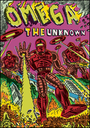 Omega: The Unknown #7
Writers: Jonathan Lethem and Karl Rusnak
Pencilers: Farel Dalrymple and Gary Panter
Inker: Farel Dalrymple
Colorist: Paul Hornschemeier
Letterer: Farel Dalrymple
Cover: Farel Dalrymple
Review: Guest
Yeah. I'm totally being punished for something.
With all the quirky irreverence of a bad indy movie, Omega: The Unknown bursts onto... wait, "bursts" isn't the right word. Omega: The Unknown takes a brisk deadpan jog onto the scene!
First and foremost, a tiny rant, if I can be so allowed. You see, they invented this thing back in the day; they've been in comics for quite a while now. It's called a recap page. What a recap page does is that it allows new readers to pick up a book in the middle of a narrative and not be completely lost. They work wonders, really, and as someone that has to review these on a weekly basis, I have to admit that I don't read every comic written by everyone every week, so they're very helpful to myself personally. Now, for someone reading Omega: The Unknown, you're shit out of luck. There's no recap page. You're just expected to know everything about all of the characters up to this point.
I think "The Unknown" sums it up pretty well, as I had no goddamn clue what was going on here. There's a guy with a hook for a hand, he's sort of a dick. There are robots. Capitalism is super duper evil. And there's lots of talking. I read this book four times and that's all I really got out of it, and I don't care to know any more. Comics aren't a crossword puzzle. It's not my job to figure out what's going on with the minuscule number of contextual clues given to me. It's the book's job to make me want to know what's going on. You can stare at your shoes and be completely unimpressed by the wacky "unconventional" world you live in, but if I don't know anything about you as a character? Forget it; you're not worth my time. I'm tired of people expecting praise simply for being different. It's the kind of thing that I'm faced with all the time in video games, too. Being "unconventional" or "innovative" isn't enough if you can't be bothered to publish something worth buying.
As for the art, I guess it works for what they were going for. It's lazy and looks like something from the MTV animation department circa 1993. The direction is a mess. There are no narrative panels, nothing to let you know that you've transitioned to a different scene. Some pages have as many as three different scenes going on at once! I guess coherent storytelling is too "conformist," and we can't have that.
Don't touch this book. It's lazy, disjointed and expects too much of the reader. I seriously wish we had a rating lower than skip, because that's what this book deserves.
 Punisher War Journal #18
Writer: Matt Fraction
Artist: Howard Chaykin
Colorists: Edgar Delgado and Jesus Aburto
Letterer: VC's Joe Caramagna
Cover: Alex Maleev
Review: Dan Toland
So, what we're dealing with here is Jigsaw. Back in the day, the Punisher pushed Jigsaw's face through a plate glass window, and now he's horribly disfigured. He's holding a guy who is not Wolverine � but some schmuck who looked at Wolverine's haircut and decided that's who he wanted to be when he grew up � captive in a pawnshop. Jigsaw proceeds to poke the guy with knives a few times before getting dressed as Professor Zoom, the Reverse-Punisher of the 25th Century. Meanwhile, he's sent Ian � the police candidate who somehow survived a firefight between the Punisher and SHIELD, who has subsequently been brainwashed by a psychiatrist in Jigsaw's employ � to handle the matter of Not-Wolverine's brothers, a pair of dirty cops who Jigsaw blames for his adventure with the plate glass window. Yeah, the one that the Punisher actually pushed him though. Look, just go along with it.
That is what we're being asked to spend $2.99 on.
Okay. I want to start by talking about Fraction's handling of Jigsaw. I thought that this was very good. Jigsaw is a rarity in comics: a completely, undeniably insane person who doesn't feel like a Joker retread or a 1980s movie homicidal maniac. Jigsaw is having trouble keeping his thoughts straight, he repeats himself constantly, his speech is racing, rambling and at times incoherent. You can see his struggle to remember at the end of a sentence what the beginning of the sentence was about. It is, odd to say, the most realistic portrayal of mental illness in a comic book villain I've seen in some time.
Other than that, though, this is a mess. The story is the opening act of a hundred direct-to-video cop movies. I mean, the only female character actually screams, "Die, pigs! Die!" That's not something I thought characters were allowed to do after 1978. Oh! And if you text "shred" to 46966, you can play Guitar Hero III on your cell phone. "How does he know this," I hear you ask? Because there is not one, but two ads for Guitar Hero III in the body of the comic story itself. There are close-ups of advertisements, while story is happening in the background.
Finally, there is the matter of Howard Chaykin's art. Oh, Howard. Honestly, guys, Howard Chaykin was at one time one of the most exciting and important figures in comics. I understand completely that the economy is tough; times are hard and very few people can afford to turn down work. Even so, the American Flagg guy shouldn't be drawing Punisher comics. And, if he's going to, he shouldn't try to draw them with his feet. I don't know what happened, but this artwork is hideous. I had the damnedest time trying to figure out who Jigsaw was, because the faces are over-rendered and misshapen. A comic book shouldn't be this difficult to look at.
There's just no reason to read this. It's certainly not the worst comic I've ever read, but the story and art just doesn't justify the energy it would take to actually look through the book. Skip this and save your time, more than your money.
 The Twelve #4
Writer: J. Michael Straczynski
Penciler: Chris Weston
Inker: Garry Leach
Colorist: Chris Chuckry
Letterer: Comicraft's Jimmy Betancourt
Cover: Kaare Andrews
Review: Dan Toland
In which the effort to acclimate to the 21st century continues.
The story is progressing slowly, but it is progressing. It seems that JMS is more interested exploring the psychology of these people than in telling their story. If that sounds like a complaint, it's not. The story is a basic one: heroes from the 40s wake up in 2008. They're either going to acclimate or they won't. How they acclimate is by far a more interesting story, and JMS is correct in focusing on this.
The first thing that hits me is just how right the characterization seems to be. Every single one of these characters looks and sounds like they just stepped off the bus from 1943. And it's not the 1940s from the movies; these are your grandparents. Well, your grandparents with more ass kicking and fewer fishing stories. Their speech patterns are very distinct, and JMS nails it perfectly.
It's also easy to remember the good stuff about the time period and ignore some of the uglier truths that (hopefully) we've managed to learn from, but this story doesn't hide from the anti-Semitism and racial prejudice that would have been, if not necessarily worse, then at least more open in the 1940s. Mister E had hidden his Jewish heritage to make his life easier, and now finds himself the target of his son's anger, who is disgusted by his father's willingness to abandon who he was. Mister E now finds himself having to come to terms with what he's done and who he is, in light of the overwhelming changes that have been made.
I really like the characterizations here. Each of the Twelve has his or her own distinct voice; Master Mind Excello sounds like a 30s serial genius scientist; Rockman is quiet and lonely, desperate to reunite with his family; the Blue Blade is a gigantic asshat, thinking nonstop of fame and fortune, constantly putting on a show without being fully aware he's doing it (and, most tellingly, being the only one to attend a social gathering in costume); the Black Widow, the expression on whose face (a constant "who farted?") tells her story loud and clear; but most of all, the Phantom Reporter, the narrator, who's just a guy. He's a regular guy who put on a mask and started beating up bad guys, who's now in this weird situation and is adjusting to things fairly well.
Weston's art is quite good. Every character has a distinctive, realistic face; the backdrops and surrounding rooms are all intricately designed and detailed, and look wonderful; and the action scenes, as sparse as they may be, are dynamic and exciting. I've not read anything he's drawn before, but I'm going to be keeping an eye out for his name in the future. I'm really digging this artwork.
As a standalone issue, there's not a lot going on here, but it's definitely worth your time. Borrow this issue, unless you've already read the first three issues, and plan on buying the next eight. This is an excellent story, and one that I look forward to every month.


