Is It Wednesday Yet?
18 March 2008
18 March 2008 — Here we are again with another installment of your favorite comic book review series. As always the comics you're about to read about won't be released until tomorrow (19 March 2008), so these reviews are free of spoilers and should help inform your purchases on new comic book day.
Our grading scale is simple:
Buy: An excellent comic book.
Borrow: A good comic, but save yourself some money by reading a friend's copy.
Flip Through: Give it a once-over at the comic shop.
Skip: This doesn't need to be explained.
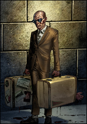 Foolkiller #4
Writer: Gregg Hurwitz
Artist: Lan Medina
Colorist: Avalon's Andy Troy
Letterer: VC's Joe Caramagna
Cover: Lan Medina
Review: Dan Toland
Nate McBride, a former enforcer for the gambling site twointhebush.com, was caught stealing $40,000 from his employer; as a result, his wife and youngest daughter were brutally killed, he had his hand mangled in a garbage disposal and his other daughter will be killed if he doesn't come up with the money. He's been led to the Foolkiller, an insane vigilante using the information Nate can give him about twointhebush.com to work his way up the organization, dispatching everyone he comes across in fairly gruesome ways.
First and foremost, this story owes absolutely everything to Garth Ennis' run on The Punisher. No one is even trying to hide it. This is a Punisher story, only without any of the humor and over-the-top craziness that Ennis brings to the table. What we have here is a brutal, unflinching, ugly story about someone who ought to be strapped to a table in a hospital somewhere, slashing and shooting and dismembering his way through at least a dozen people. However, the people he's after are just as bad. This was not an easy story to read. I'm not a prude, but this is insane. And you can never, not ever, get your mind off the fact that you're reading a Punisher rip-off. That said, as a piece of hardboiled crime fiction, this gets pretty exciting in places. It reads like an action film, and everything moves extremely quickly.
Lan Medina's artwork is outstanding. Absolutely outstanding. Everyone has his own, recognizable face, without the crutch of having each character resemble a famous Hollywood actor. The cops look like cops, down to the cheesy porn mustache one of them wears. He's got a great feel for action, mood, lighting, emotion and for copious bloodletting; I'm looking at this issue, and I'm not seeing anything that he's not doing really well. This looks like it was colored directly from the pencils, and the lack of an inker credit seems to confirm this. It's wonderful.
I want to say a word or two about the hitman the bad guys bring in. This is one of the better character introductions I've read in some time, using misdirection to expertly subvert what our expectations should be. And then he carries himself through the rest of the issue really well, having a striking physical presence and establishing himself quickly as someone who can give the Foolkiller a run for his money. Very good character creation by both Hurwitz and Medina here.
Despite losing points for originality and being, well, kinda gross, Foolkiller #4 is a solid borrow — largely on the strength of its fantabulous artwork, and also because, despite its shortcomings, there's a solid story buried underneath everything.
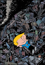 Franklin Richards: Spring Break
Writers: Mark Sumerak and Chris Eliopoulos
Artist: Chris Eliopoulos
Colorist: Brad Anderson
Letterer: Chris Eliopoulos
Cover: Chris Eliopoulos
Review: Dan Toland
When I was a kid and I was getting dragged to the department store (which happened way more frequently than any kid should ever have to endure), occasionally as part of my reward for not complaining too terribly much, I would be allowed to get one of those poly-bagged three-pack of comics that were sold in the toy section. Usually, the comics would have the Whitman logo stamped all over them. (Whitman was the reprint house for what had been Gold Key Comics, one of the major publishing houses in the 1960s and 70s, and had been responsible for many of the licensed comics at that time.) It was through Whitman that I had my first exposure to very old issues of Turok: Son of Stone, Magnus: Robot Fighter, Doctor Solar: Man of the Atom, as well as Flash Gordon and Buck Rogers. I even got a reprint of an old EC comic once, and that scared me so bad my mother took it away. By and large, however, the lion's share of what I got from Whitman's Bag-o-Comics were humor titles, almost always with licensed cartoon characters from Hanna-Barbera, Looney Tunes, Walter Lantz and Harvey Comics. These humor titles were a huge part of my young life, and I would read these comics until they fell apart; they weren't always very funny, but they had a quality of comfort and pleasure that superhero books lacked.
So imagine my surprise when I opened Franklin Richards: Spring Break and got all the same feelings rushing back to me. This is delightful. I think I would probably have enjoyed it a lot more when I was much younger, but there's quite a bit here that makes the book worthwhile. Franklin Richards, for the uninitiated, stars the titular son of Reed and Sue Richards, and HERBIE, the much put-upon robot nanny Reed built for his son.
The first story (of five) is "Iron Mania," in which Franklin constructs a fully functional Iron Man Mark I suit of armor, without really thinking things through. Hilarity ensues.
Next is "Time Trouble," in which Franklin uses a device capable of slowing down and speeding up time to make his school day easier, without really thinking things through. Hilarity ensues.
In "Science Un-Fair," Franklin uses a device his dad invented to win the science fair, without really thinking etc. (Sense a pattern?)
You can probably glean from the title what happens in "Booming Burps."
Finally comes "Robo-Rampage," in which HERBIE attempts to understand why Franklin's so fascinated by video games. He promptly downloads a bunch of games and goes crazy emulating all of them.
These stories are of varying quality, but they're all at least cute and in some cases actually very smart. "Robo-Rampage" is easily the best one, and that's largely because it focuses on HERBIE, who usually serves as the straight man. (HERBIE is seven levels of awesome, by the way.)
Sumerak writes for kids very well, but a special point has to be made about Eliopoulos' artwork: it's wonderful. It's cartoony and exaggerated and very funny, but it also gets emotion across very well. In "Robo-Rampage" Franklin tells HERBIE he doesn't want to play with him because of the robot's usual role as professional killjoy. HERBIE slumps his shoulders and looks back at Franklin with incredible sadness in his eyes, before slowly leaving the room. I swear to God I'm not making this up: when I saw those panels, I actually heard myself say, "Awwwwww," because I felt so bad for him.
I have to give this two scores. This is a book you'll want to flip though for yourself; you may see something in it that grabs you, and if nothing else, the art is very good. If you have a kid in your life that you want to introduce to comics, this is an absolute buy.
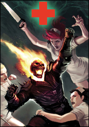 Ghost Rider #21
Writer: Jason Aaron
Artist: Roland Boschi
Colorist: Dan Brown
Letterer: VC's Joe Caramagna
Cover: Marko Djurdjevic
Review: drqshadow
Since Johnny Blaze reprised his leading role in the pages of Ghost Rider almost two years ago, he's been hit with a series of revelations that have changed the way he looks at himself. Particularly surprising was the realization that the Spirit of Vengeance which shares his body wasn't of demonic origin as he'd always presumed, but was actually assigned to him as part of a heavenly "black ops" program. When God doesn't want to get his hands dirty, I guess, he dials up the guy with the flaming skull and a magic motorcycle. Only now, the angel in charge of the whole program has developed grand aspirations, including but not limited to the highest post of them all. The angel, named Zadkiel, wants to evict God from his throne and rule Heaven in his place. I guess some people never learn.
Roland Boschi contributes the artwork this month, and while he's certainly a step up from what Javier Saltares was producing the last time I read an issue of Ghost Rider, he's got a few rough patches of his own. His work blends the simple, gestural qualities of Tim Sale with the composition style of the Kubert family, but doesn't compare favorably to either. On the occasions that he seems to get it, such as an early scene-setting panel that portrays Blaze's morning campsite, the artwork is vividly Kubert-inspired, but missing a sense of life and identity.
When his style emulates Tim Sale's, it retains that sense of mesmerizing simplicity, but totally misses the beauty of the Long Halloween artist's linework. Where Sale's illustrations live and breathe, painting their way across the page, Boschi's work is unrefined, jerky and often clumsy. Frequently, his characters' facial expressions don't match what they're saying or doing. Yet, every once in a while a flicker of hope will peek through. Boschi has the tools to make something of himself: he keeps a good pace, and can tell a story with or without the aid of word balloons. He isn't there yet, but, with a bit of refinement and a more discernible identity, he could become someone noteworthy.
Like his partner, Jason Aaron's writing is a marked improvement over Daniel Way's efforts a few months back. His storytelling is much easier to follow, despite a few awkward shifts from inaction to sudden, jolting fireworks and knife fights. And he shows restraint and a knack for legibility in much of his dialog. I can safely say that this month's conflict is one of the more unique pairings I've ever stumbled across, and while it occasionally gets a bit too close to cliché for my liking, it never actually goes too far in that respect.
Even though it directly involves a battle between angels and repeated references to biblical material, the story really isn't what I expected. That's both a good thing and a bad thing. On one hand, Aaron is exploring new territory with a character that badly needs it. On the other, his quirky writing style and oddball situations have almost completely reversed the book's personality in a very short period of time. In my eyes, it's a welcome change because what came before was just rotten — but he runs the risk of alienating older readers by changing the game so drastically.
Ghost Rider is grasping for an identity, and while both Boschi and Aaron certainly provide something different in that arena, I'm not sure they're a permanent solution. But, to be fair, they are at the very least a step in the right direction. Flip through this, even if the character has never appealed to you. It's trying to reinvent itself, which is more than I can say for a lot of books in a similar predicament.
 The Immortal Iron Fist #13
Writers: Matt Fraction and Ed Brubaker
Artists: Tonci Zonjic, David Aja and Kano
Colorist: Matt Hollingsworth
Letterer: Artmonkeys Studios
Cover: Kaare Andrews
Review: Guest
Attempting to merge the best from the kung fu and comic worlds, Iron Fist is a fresh, if still unrefined book that is unlike anything else in the Marvel Universe. The martial arts tale of Danny Rand is, if nothing else, unique, and for that it should be praised.
As far as it actually working, from a comic standpoint, however, is another story altogether.
First things first, if you've never read an issue of Iron Fist before, you're in for quite the history lesson. Seriously, I spent more time reading the recap than it took me to digest the actual story. While the arc itself is rather simple, you're instantly thrown a barrage of names without any context in a blind hope that you'll figure it out on your own. The fact that there are, at times, up to four different stories going on at once doesn't seem to help matters. The raw gist of it is this: Xao's taken the Heroes for Hire prisoner and is looking to cross the dimensions to destroy K'un once and for all. Of course, since it's his book and all, Danny is the only one that can stop him.
Without question, this is a book with a clear vision. That's not the problem. The real issue stems from the fact that Iron Fist is, in a way, burdened by his own inclusion in the core Marvel Universe. While the cheesy dialog and stylistic points are definitely intact, the action is sparse and lacking energy, making the kung fu elements a mere afterthought. Danny, while a capable martial artist, doesn't feel like a kung fu star. Instead, he's just another guy in a mask looking to save the world.
No matter how many artists get thrown on the book, Fraction and Brubaker are, in the end, still writing a bland superhero story, and that is what's so frustrating about this series. The potential is there, but the direction is what's off. Kung fu, at its core, is very simple: two guys spit out a few out-of-sync lines of (what can loosely be referred to as) dialog, then fight — for honor, justice or a ham sandwich. Instead what we get is a comic book for the ADD generation: quick scene after quick scene, but with nothing much really happening in the process. The scribes at the helm have an eye for the occasional keen line of dialog, but it's of little incident when most of the characters speak in a manner that's so cheesy and over-the-top that it doesn't realize that it's either.
There is hope at the end of the tunnel, however, as the ending hints at a loud action-packed conclusion come next issue, but then again, that gives you very little reason to buy this one. All and all, I wasn't terribly offended by this book, but at the same time it was remarkably dull. I say give it a flip through, and then you can share with me in the hope that this book and character get a new, fun direction in the near future.
 The Incredible Hercules #115
Writers: Fred Van Lente and Greg Pak
Penciler: Khoi Pham
Inkers: Paul Neary and Danny Miki
Colorist: Dennis Calero
Letterer: VC's Joe Caramagna
Cover: Arthur Adams
Review: Guest
I'll be the first to say, that going in, my interest in this book was about as low as you could imagine.
That was of course until I came to the first page and was told of a "gangsta-style whup ass." Minutes later, I was able to finally remove my foot from my mouth and all was suddenly right with the world. To say I was surprised by the quality of this book is an understatement. From the first panel, Incredible Hercules kicks into high gear, bringing the action hard and fast, while still managing to supply an easy-to-follow story, a bunch of laughs and some dramatic resonance all within a whirlwind of a read.
A vengeful Amadeus Cho is looking to mess SHIELD up big time with a computer virus of his own creation, while his ally, Big Herc, looks to convince him otherwise — all the while also dealing with his brother, Ares, and the perils of constantly being shirtless. No one was more surprised than I to see that such a blatantly unoriginal character could be so much fun. Instead of the expectedly overdone tales to the note of "thee" and "thou," we get a book that isn't afraid to make fun of itself, or its source material. Van Lente and Pak not only understand good pacing, but they've seemingly mastered the concept that a character can be all the more sympathetic and appealing in their most dire moments if they can make us laugh first. I came in not knowing or caring of either Herc or Cho, and through their simple interactions with each other, I now can't wait to see what happens to them next.
Khoi Pham's work accents the book perfectly. Herc is appropriately portrayed as the grimy, muscled, mountain of hair. As you might expect, even his shoulders have shoulders. The nerdy Cho, on the other hand, looks as if he might break in half during a strong gust of wind, and the size difference serves to make their bickering all the more entertaining from a visual standpoint. The book isn't all slapstick and visual gags, however, as the more serious panels are drawn and toned in such a why that the dialog is almost unnecessary. We know what these characters are thinking and feeling, and don't need paragraphs of exposition to let us know.
Never let the advantages of a lowered expectation go unnoticed, though in this case, it would have hardly mattered. Every issue of a comic, in theory, should be a 32-page advertisement for the next month's installment. In that respect, this book has undoubtedly done its job, and if every issue of Incredible Hercules is like this one, then they just earned themselves a regular reader. Buy it.
 Iron Man #27
Writers: Daniel and Charles Knauf
Penciler: Carlo Pagulayan
Inker: Jeffrey Huet
Colorist: Dean White
Letterer: VC's Joe Caramagna
Cover: Gerald Parel
Review: Guest
"Ironmanamania" may sound like a delicious meal from the kitchen of Chef Boyardee, but in actuality, it's the term I use to describe 2008 — a year that's destined to belong to old Chrome Dome, what with a blockbuster feature film on the way, ads for Iron Man cupcakes and perhaps the most prominent role in the Marvel Universe next to a metal-clawed Canadian that won't stay out of everyone else's books. It seems like Tony Stark can do no wrong.
After suffering a big blast from attempting to destroy the Mandarin's Extremis virus, Stark finds himself knocked silly and talking to himself in the middle of a field, and for once it's not because of alcohol.
Being the responsible registered hero that he is, more than a few people frown on Stark's apparent endangerment of the general populous, and hoopla ensues, as expected.
What follows is a solid, but uneventful narrative that's more court drama than superhero comic. It works on all its most basic levels, but lacks that ever-present hook that forces you to read through to the next page. A bevy of cameos help a bit, but there's really not much going on at or beneath the surface that could serve to stir the intrigue pot a bit. The dialog is serviceable, though a bit wordy. Tony is reliable in his role as the arrogant authoritarian, and his self-assuredness jumps off the page, while the rest of the cast are of little concern.
The artwork does what it can to spruce up the rather slow story, and the team of Pagulayan and White do a superb job bringing a rich detail to the characters. The scenery itself is also demanding of attention, and a genuine care appears to have been taken with every panel, in stark (no pun intended) contrast to many titles out there that can feel so utterly rushed. For some reason, I found Tony's Power Ranger-esque fashion choice of gold and red to be a lot funnier than it was probably intended, but it was a nice detail nonetheless.
Despite the "mania" running wild in the Iron Man world, what you get here is a rather dull experience for any new readers trying to catch-up on the tales of a man with rockets in his boots. His portrayals in Mighty Avengers and the recent Power Pack crossover do much more justice to the character and the hero. A rather predictable twist of an ending does little to add to what is ultimately a pretty, but boring book. Flip through it for the art, then go back to praying for a good movie.
 The Order #9
Writer: Matt Fraction
Breakdowns: Barry Kitson
Penciler: Javier Saltares
Inkers: Stefano Gaudiano and Derek Fridolfs
Colorist: Sotocolor's J. Roberts
Letterer: Artmonkeys Studios
Cover: Barry Kitson
Review: Dan Toland
The Order, the California-based crown jewel in Tony Stark's "Initiative" program, has gone through a volatile cast change after most of the starting squad was replaced for violating their ethics clauses (in this case, drinking and partying; oh, Tony, don't ever let a good double standard get in your way). The son of Tony's old enemy Obadiah Stane, Ezekiel "Zeke" Stane, has been engineering a multi-pronged plot against the Order by sending a girl gang called the Black Dahlias, an army of android General Softlys, the Infernal Man and former Order member Maul to destroy the Order once and for all.
Muhuahahahahahaha.
I'm sorry; for some reason I can't not write about Stane like he's a Republic serial villain. He's well-written, but the character has Doctor Evil written all over him.
If I had read the first eight issues I might have had some idea of what the hell is happening here. But I can say that everyone is fleshed out and has a definable personality. Fraction's dialog is quite good. And the issue (despite the confusing recap page) is rather straightforward. It's the penultimate act before the final showdown, so everything is getting ratcheted up to its highest point, so there's a lot going on that Fraction is juggling effortlessly.
When I read the preview on Marvel.com and it said that Barry Kitson was handling pencils, I got pretty excited. I've liked Kitson ever since JLA: Year One. However, Marvel.com is a lying liar who lies, and Kitson is not the penciler. He does provide the breakdowns, and his style is somewhat evident in the earlier part of the book, but around halfway through the art becomes a little sloppy. The fact that two inkers are credited here probably has more than a little to do with that. It's easy sometimes to forget what an inker can bring to art, and just as easy to forget what an inker can take away from it.
Again, a big pet peeve of mine is a comic that's written for the trade, and this is no exception. Give this one a flip through, and I'll look at the story as a whole when it becomes available in trade format. And by then, we'll find out if the Order can possibly escape from the sinister machinations of Stane, who leads them all to certain death, where death is certain — and deadly!
(Seriously, Fraction writes Stane pretty well. I'm not sure why I'm doing that.)
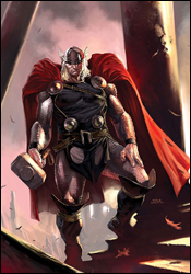 Thor #7
Writer: J. Michael Straczynski
Penciler: Marko Djurdjevic
Inker: Danny Miki
Colorist: Jelena Kevic-Djurdjevic
Letters: Chris Eliopoulos
Cover: Olivier Coipel and Marko Djurdjevic
Review: drqshadow
Following the events of his first arc since returning from "the sleep of the gods," Thor is completely and utterly exhausted. I suppose rebuilding the mythical settlement of Asgard and individually seeking out its inhabitants is a bit more work than one man can handle in a single storyline. This month, the Thunder God rests, which releases his mortal counterpart, Donald Blake, into the Asgardian streets.
I've enjoyed the few preceding chapters of this new series, mainly because writer J. Michael Straczynski had been spinning a different type of yarn than I was used to. Where the book's previous runs had lost my interest by focusing on long speeches in Middle English and deep, frequent ventures into Norse mythology, Straczynski grabbed my attention by placing Thor in a modern environment. I liked the comparison between the modern perspective and the ancient sentiment of the Thunder God himself, and felt it was a fresh take on a character that I'd long since grown tired of.
With this issue, Straczynski veers from that path and returns to territory that should be familiar for longtime fans. While he tries to balance this shift with an alternate storyline that focuses on Donald Blake's adventures in the modern world, the bulk of the book belongs to Thor. Within just a few pages of the story's return to high-and-mighty mythical themes, I was once again turned off to the character. I can understand that there's an audience for this kind of longwinded, complex storytelling with an ancient flavor, but I don't count myself among its followers. This issue feels like a huge step backwards.
Marko Djurdjevic, most recently known for his work as the Daredevil cover artist, provides the visuals this month. Djurdjevic's style is something of an acquired taste, particularly when he's dealing with the actual Asgardian denizens. He never seems to fully take hold of the mythical setting, at least not in the same way he does the scenes taking place in the modern world. When we're following Donald Blake around America, his work is very good — his personality shines through in the details, which are abundant, and he constantly fills the frame with unique, inspired camera angles. When the setting switches back to Thor's perspective, be it in Asgard or another mythical setting, Djurdjevic's work stumbles. His characters grow stiff and overcomplicated, while his backgrounds lose those great touches of personality. He's a completely different artist when he's illustrating civilians than he is when he's portraying the heroes themselves, and I greatly prefer his work with the former.
I'm sure many fans will rejoice at the release of this issue, hailing it a return to form for the series, but I found myself disappointed. Marko Djurdjevic's artwork has the unfortunate task of following a run by Olivier Coipel that I absolutely adored, and though it has its own merits, it can't compare to what came before. J. Michael Straczynski's storytelling has slowed down markedly since the last time I read Thor — not to mention the change in direction — and before long I found myself counting the pages until the issue was finished. I say flip through this, especially if you're a longtime fan of the character, but in my eyes it fell short.
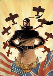 War is Hell: The First Flight of the Phantom Eagle #1
Writer: Garth Ennis
Artist: Howard Chaykin
Colorist: Brian Reber
Letterer: Todd Klein
Cover: John Cassaday
Review: drqshadow
If there's one thing Garth Ennis doesn't fear, it's boundaries — the concept of doing something that's out of fashion, or something that hasn't been done before, it doesn't faze him. War is Hell is a prime example: the shelves aren't exactly overflowing with stories about the world's first fighter pilots, confusedly strafing the skies during World War I before the inclusion of parachutes were deemed appropriate (higher-ups feared that the aircraft would be abandoned too quickly if pilots were provided an escape route). But Ennis has a story to tell, and when he's motivated like this, it's best not to get in his way.
He's clearly done a good bit of research, too, because while the storytelling itself may be fictional, its backdrop is draped in authenticity. Bits and pieces of trivia, tidbits and facts dating back nearly a full century are scattered about this issue, and they do nothing but enhance the story. While the actual storytelling is about as subtle as a butcher knife, coated with the writer's trademark gallows humor (the personality and ultimate fate of Captain Clark is pure Ennis), that historical backdrop gives it the right dosage of reality to keep things grounded and generally readable.
One of the writer's longstanding faults is his passion for foreign accents and regional dialects, and that's especially noticeable here. When a pair of British officers share a conversation near the issue's outset, it's bathed in a combination of military jargon and European lingo that I found borderline unintelligible. That the dialog is so tough to follow is a bad thing, too, because there's so goddamn much of it. When the action is focused on the skies and the war taking place up there, it's pure adrenaline, but once the squadron's wheels touch grass, it's wall-to-wall discourse.
Handling the artistic chores is Howard Chaykin, who I've had absolutely no time for recently. His work on Wolverine was so bad, I audibly groaned when I opened this issue and discovered he was the artist. Surprisingly, though, his work within this issue is much stronger than his efforts with the hairy mutant. Chaykin is still a long ways from my good graces, and his panels are still very difficult to read on a few occasions, but he's at least proven that he does have something to contribute. While he often struggles to accurately portray a human subject, his work with aircraft and the landscape is absolutely gorgeous. When he illustrates the unbridled madness of a dogfight — explosions, gunfire and bodies floating around the page in a slow, chaotic dance — the result is both horrific and beautiful. It's obvious that the skies are where his passion lies, and it's a shame that he doesn't get more of an opportunity to show that in this issue.
Ultimately, your opinion of The First Flight of the Phantom Eagle is going to depend on your opinion of Garth Ennis. If you share his black sense of humor, as I do, you'll laugh a handful of times throughout the issue. If you don't, well, you might want to turn your attention elsewhere, because despite the aid of some great research and a compelling subject, much of the issue exists solely to build to the next morbid punch line. It's not the writer's best work, but it's an entertaining, original jaunt through the history books all the same. I'd recommend you borrow it if just to try something different, although your mileage may vary.


