Is It Wednesday Yet?
04 March 2008
04 March 2008 — Here we are again with another installment of your favorite comic book review series. As always the comics you're about to read about won't be released until tomorrow (05 March 2008), so these reviews are free of spoilers and should help inform your purchases on new comic book day.
Our grading scale is simple:
Buy: An excellent comic book.
Borrow: A good comic, but save yourself some money by reading a friend's copy.
Flip Through: Give it a once-over at the comic shop.
Skip: This doesn't need to be explained.
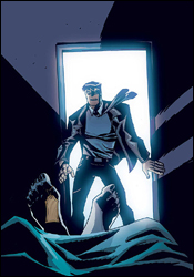
 Clandestine #2
Writer: Alan Davis
Penciler: Alan Davis
Inker: Mark Farmer
Colorist: SotoColor's J. Brown
Letterer: Artmonkey's Dave Lanphear
Cover: Alan Davis
Review: drqshadow
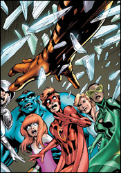
Clandestine tells the story of Adam Destine, a normal human turned immortal after a dream-clouded encounter with an ethereal, angelic woman. In the 800 years he's survived since being granted with such overwhelming longevity, Adam has fought wars, toppled dynasties and produced more than a dozen children — each of whom has a special power or two of their own. As writer / artist Alan Davis' long-forgotten pet project, Clandestine ran for a dozen issues in the 1990s before being cast aside for nearly 15 years. Like its namesake, however, the story lives on and Davis has finally returned to resume its telling.
A good amount of this issue takes place through a series of flashbacks, which have the potential to be especially cool, considering the lead character's rich history during landmark moments throughout human history. Those stories are kept so brief and fleeting, though, that before I could begin to immerse myself in them, the narrative would suddenly snap back to the present, abandoning the ancient tales before they've even begun. When the storytelling is set in the present world, it's kept so busy and overfilled with new faces, new attitudes and overlapping storylines that I never felt like I was truly given a chance to gather my bearings. Davis is trying to cram four issues' worth of story into the first dozen pages, and the result is a big mess.
The dialog, especially during the opening battle scene, is so tough to follow and continuity-laden that it led me to shake my head more than once. Who has time to shout something like, "You are more than human, but I do not recognize you as sons of Attilan... whatever your origin, you defy the will of Tral, so you must die," while being charged by a tiger-man with a scythe on an open battlefield? Furthermore, Sons of Attilan, the Will of Tral and the Shalu Monastery are all openly discussed within the first four pages, but as a new reader I have no idea what any of it means. How can I appreciate the importance of these events if they're referencing a cluster of events that presumably took place in a series that was published in 1994?
Davis' artwork, sadly, has lost much of its luster. His layouts are still fairly strong, although they occasionally grow too complicated and difficult to read (he's a big fan of crowding the panel with unnecessarily close shots of the characters in action), but his decades in the field have taught him a lot in this regard. It's his actual rendering that's slid recently. When he was paired with Chris Claremont on Excalibur years ago, Davis effortlessly gave his characters rich personality, individuality and depth with a minimum of strokes. It's something that really set him apart in an era of excessive detail, and is a lot of the reason why I remember that run with Captain Britain, Nightcrawler and Kitty Pryde so fondly.
Alan Davis has evidently been left in the past, as these artistic contributions are largely over-thought and excessively complicated. While his signature dynamic action poses are still evident throughout this issue, they're paired with an unfamiliar abundance of extra textures and unneeded details. While much of the industry has seemingly moved to embrace a style that the writer / artist helped to develop earlier in his career, he's shifted closer to the style evidenced by the "serious" strips in a Sunday newspaper. There's a small degree of playfulness remaining in his work, but it's hidden deeply behind a frequently drab, surprisingly hollow façade. For years, I've loved this guy's art, but it's just not the same.
Clandestine is a classic example of a good concept that's been allowed to outgrow its boundaries. Alan Davis' imagination remains sharp, but his self-censorship has evidently gone to lunch. On the fleeting moments that his ideas are an unbridled success (like when Walter, the gargantuan intellectual, must use a pair of pencils to strike the keys of his typewriter), they're quickly overshadowed by a reckless abundance of word balloons and more dangling plot threads than could be resolved in a full trade paperback. This isn't without its moments of inspiration, but you've got to dig pretty deep to find them. Flip through this if you're a fan. Otherwise, don't waste your time. It's not intended for new readers.
 Logan #1
Writer: Brian K. Vaughn
Artist: Eduardo Risso
Colorist: Dean White
Letterer: VC's Joe Caramagna
Cover: Eduardo Risso
Review: Dan Toland
Because you demanded it!
Because the pages of Wolverine, Wolverine: Origins, Uncanny X-Men, X-Men, Astonishing X-Men, Ultimate X-Men, X-Force, New Avengers, Marvel Adventures The Avengers and Wolverine: First Class are not enough to contain him!
Because Marvel thinks you might still have $3.99 somewhere on your person!
Can you stand the two-fisted, pulse-pounding fury that is Logan?
So first of all, who the hell thought, "You know what the world is missing? An eleventh book with Wolverine in it. I'm not sure why I didn't think of that before. I'm a genius. Memo to self: made another gutsy decision today. Celebrate with the Funny Face pancakes at IHOP and another gold chain."
So, other than the almost stupefying wrongheadedness of this book even existing, how's the comic itself? Here's the first image we get treated to: "When you rip a guy's heart out, the blood inside stinks of hot iron and dead blossoms."
Lovely.
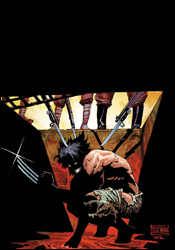
In Logan #1, the titular Canadian mutant looks back over his life story — for the very first time this month. Brian K. Vaughn, a writer who really ought to know better, channels the very worst parts of Chris Claremont, bringing Wolverine to Japan and giving his "I'm a mutant / healing factor / best there is at what I do" speech right away, then thinking back to World War II, when he was put in a Japanese POW camp, in a cell with, if the art is to be believed, a caveman. He and Captain Caveman escape from the camp, and then he has sex with a Japanese girl that he prevents Captain Cavemen from shooting. To be continued.
Vaughn can write. I've seen him do it. But this is like he's going out of his way to do his Claremont impersonation: what worked in the 1982 Frank Miller miniseries (and kept working for a few years after that) is trotted out for us again, and when you take the most overexposed character in the history of comics and put him in the same situation he's been in a hundred times before, regardless of the fact that it's set about 30 years earlier than usual, you're going to get a story that I feel like I've read before. A few times. When I was in high school. Although he does manage to point out that racism is bad. Which is important — for those of you who didn't know.
And what is the deal with Eduardo Risso and his superstar artist status? Has the world gone insane? I know he's been extremely fortunate to be on the Brian Azzarello / 100 Bullets train, but the artwork I'm looking at here is awful. Just awful. I mean, it's moody in places, and I'll give him his due for that, but it's cartoony, and the anatomy is wrong, and he can't draw a face the same way twice. Logan looks like he would have trouble standing upright on account of his gigantic head. And he can't seem to decide if Captain Caveman is tall or short, rail-thin or big and muscular. It just looks amateurish.
I do want to give Dean White his due. I don't usually notice coloring in a book, unless it's really bad, but there are some wonderful coloring choices here that really add to the mood of a number of pages.
So in all, we have a shopworn story, brought to life by woefully substandard art, in a book that shouldn't exist, for a full dollar more than you would pay for any other superhero title this week. I will seriously come to your house and eat your cat if you buy this. Don't even look at it. Just skip it.
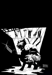 Logan #1 (black and white variant)
Writer: Brian K. Vaughn
Artist: Eduardo Risso
Letterer: VC's Joe Caramagna
Cover: Eduardo Risso
Review: Michael David Sims
Having read Dan's review of Logan #1, I was curious to see if I agreed with his opinion. And I do — to a point. First, there's absolutely no reason this three-issue miniseries couldn't have been an arc in Wolverine: Origins. Why publish an ongoing comic that's all about exploring Wolverine's past if you're going to continue to publish miniseries that do exactly the same? ("Wolverine sells" is the answer, I know, but I have to wonder what would sell more: a miniseries written by BKV, or a storyline in Origins written by the same author? After the mini ends, that's it. No more money. After the storyline ends, readers might be inclined to continue reading the ongoing comic post-Vaughn. One retains readers, the other doesn't. But whatever, I don't know how the marketing machine works, so maybe I've got it all wrong.) Second, had I not seen Vaughn's name in the credits, I never would have guessed he was writing this. Everything about the writing seems aged: "Case you hadn't heard, I'm what they call a mutant." Nowadays, with the very successful movies, there isn't anyone who hasn't heard of the X-Men, so why in the world would anyone, especially BKV, write such a line? Even someone who's picking up a comic book for the very first time knows who Wolverine is and what he can do, so there's really no need for the "My name is Wally West" / Flash-like bit. (Or is there...? More on this later.)
It's Eduardo Risso that causes the first split in opinions between Dan and myself. Personally, I think Risso is a modern master who deserves more credit that he's given. As glad as I am that he's stuck with 100 Bullets, it's also a shame because it means only those who've read that comic have seen his skills. Once that series ends and he moves to other projects, a lot of people are going to be asking, "Who's this?" And that's sad, because he's been a major part of one of the best books of the last decade. In Logan #1 his work isn't his finest, that's true, but it's still strong, vivid and invokes so many moods: danger, suspense, passion.
The second split is that, after having read the black and white variant of Logan #1, I came to understand what this project is all about: it's a loving tribute to Chris Claremont and Frank Miller's four-issue Wolverine miniseries. Reading Logan without Dean White's lush colors shows just how influential Frank Miller has been on Eduardo Risso. (Anyone who's seen Risso's artwork knows this, but this book further illustrates the point.) When coupled with Vaughn's Claremontian writing here, it all makes sense. Marvel didn't want the current, indestructible Wolverine. What they wanted was the man who could be shattered — especially when it comes to affairs of the heart. And that's why the writing seems dated, because Marvel wanted that retro vibe.
As weird as it sounds, I say borrow the black and white variant, and flip through the color edition. If you're a fan of Frank Miller and artists who've been influenced by him, you need to read the black and white version to fully appreciate what Marvel was going for here. (That's not a slight against colorist Dean White, who did a wonderful job on the regular edition. It's just that the point of Logan very well might be lost if you're taking in more than the words and inks.) If you're a fan of Chris Claremont's golden years on Uncanny X-Men, Vaughn does a good job of capturing that mood. And, of course, if you love the Claremont / Miller Wolverine series, Logan is also a no-brainer.
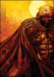 Moon Knight #16
Writers: Mike Benson and Charlie Huston
Artist: Mark Texeira
Colorist: Dan Brown
Letterer: VC's Joe Caramagna
Cover: Arthur Suydam
Review: Guest
Comics are a weird beast. Since the universe is always persisting, month to month, writers can often hold back on profound character development for fear of alienating their audience. Wolverine was designed as a character that cannot die, and justifiably so is not the character you would look towards in terms of taking risks, but there are other books, heroes under the radar that are making strides and not apologizing for it.
Moon Knight has been criticized as being "Marvel's second-rate Batman." While both are undoubtedly batshit insane (no pun intended), I was always of the opinion that Marc Spector had a distinct flavor of his own, with his story focusing much more on the idea of his redemption, and for that you want to see him win that much more.
A battle two years ago with the villain Bushman took its toll on Marc, not just physically, but through the hallucinations he suffers to this day. In this issue, he's not fighting a conveniently equally matched supervillain. He's not throwing out a one liner every other panel. He's simply trying to put his life back together, despite what's going on in the world around him. It's the tale of a recently registered superhero trying to play by the book for once in his life, and the sheer amount of willpower it takes not to destroy every piece of scum in the streets. He's angry, confused and, like the best comic book characters, distinctively flawed. A subplot featuring the newly-released Carson Knowles just adds to the intrigue. It works together beautifully with the cliffhanger ending to make you legitimately want to know what happens next.
The art, while unspectacular, matches the tone and subtlety of the narrative, showing bits of detail that would be lost in other books. Several pages have no dialog, but nonetheless do not fail in telling the story. Marc painfully putting his costume on over his aching limbs would usually be free reign for the ever clichéd monolog of "I'm getting too old for this shit," but instead, they let the expression on his face do all of the talking. He's tired, pissed and just a little more force behind his punch is all it would take for him to cross the line between hero and murderer — but he can't, because he knows that's the difference between the normal and the superheroes.
If you haven't gathered yet, this book is a buy of the highest recommendation. Frankly, it's a beautiful issue with depth and resonance not often seen in a world full of brightly colored spandex.
 Powers #28
Writer: Brian Michael Bendis
Artist: Michael Avon Oeming
Letterer: Chris Eliopoulos
Cover: Michael Avon Oeming
Review: Dan Toland
A serial killer is kidnapping and murdering young girls, using the same powers that detective Christian Walker's partner, Deena Pilgrim, has acquired. While Deena finds herself a target of the department's inquiries, Calista, the new Retro Girl, goes undercover to try to flush him out.
I read Powers off and on back in the Image days, but I've been out of it for a few years. I'm finding myself getting back into the flow pretty quickly, though. Bendis is more interested in writing a noir story than a superhero one, and he succeeds on that score. Oh, there're superpowers flying around right and left, but the focus of the story is always going to be the detective work of Walker.
We're coming in halfway through a storyline here. There's no recap page, so Bendis has to catch us up within the story itself; it took me a couple of times reading through the issue to totally get what's going on, but its all there.
First and foremost, Bendis does his usual sterling job, even if it's a tad overwritten. There's a lot of dialog on some of these pages. Still, he gets wonderful characterization in, and there are quite a few very tense moments.
(I realized that I am getting quite old, because I found myself going, "Why so much swearing? There doesn't need to be so much swearing. Oh, such a pottymouth." All I need to do is write a letter to the editor and call in to a talk radio program, and my transformation into my grandmother will be complete.)
Mike Oeming's art — I don't know. It's crude and rough as hell. In places, it's just plain weird. Calista has a 14-inch waist. Sometimes I find myself staring at a panel, and I just can't figure out what I'm looking at. And Oeming is a big fan of the "use the same panel four to six times in succession" school of page layouts. When used sparingly, it's effective for humor or tension-inducing purposes, but he overdoes it. Quite a bit. And with all that said, I can't see another artist working on this book. It's not the easiest world to look at, but it's distinctively his, and there are some truly stunning pieces of artwork in this book; on page 15, the aftermath of a battle between Deena Pilgrim and a roomful of bad guys succeeds in not only giving us the scope of Deena's power, but her reaction to being on this side of things, which she's clearly not ready for. It's a powerful set of images, and it's done without a word of dialog.
At $3.95, this is a little more expensive than Marvel's usual fare, but you get 32 pages of solid story, no ads, followed by the best letters pages in comics. So it's a good value for the money. At the end of the day, this book has always been written for the trade, and this issue is no exception. It is, again, the middle of a multi-issue storyline, and while it has some great moments, I can't recommend a purchase, when the story as a whole will become available a few months down the road. Borrow this, because it will absolutely give you an afternoon's entertainment, and the recipe for Chik-Fil-A. No, I'm not kidding.
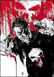 Punisher War Journal #17
Writer: Matt Fraction
Artist: Howard Chaykin
Colorist: Edgar Delgado and Jesus Aburto
Letterer: VC's Joe Caramagna
Cover: Alex Maleev
Review: Guest
No one will ever accuse the Punisher of quiet subtlety.
When one picks up an installment of Frank Castle's ongoing saga, they know what to expect: page after page of gun porn with some story mixed in for good measure. So imagine my surprise when I discovered that old Skull-Shirt doesn't even make an appearance until the last three pages of this book. No, this is not a Castle story; instead, we are focused on the tale of his recently appointed sidekick and "reformed" villain, Stuart Clarke.
There are a few inherent flaws from the get-go. First and foremost, Clarke, despite being played as the awkward nerd, isn't a likeable character in the least, as he's instantly shown to be a disillusioned whiner that is obsessed with Tony Stark. His self-pitying inner monolog is a running theme throughout, and makes him all the more disliked with every muttering of "I just put on body armor and committed a bunch of crimes, what's wrong with that?!"
The whole "reformed" idea goes out the window rather quickly as well, with Stuart not hesitating to make a complete ass of himself throughout the issue, relying on his new buddy Frank Castle to pick up the pieces. It begs the question as to why he was given a second chance in the first place, as he clearly has no moral quandary with doing some decidedly shady things, and it makes Frank seem all the worse for trusting him. I felt like I was reading a bio on an Iron Man villain, until Frank showed up at the end and I remembered I was reading a story about the Punisher's sidekick. Frank's impact was kept to an absolute minimum, and his short involvement does not paint him as the hardened street-smart vigilante, but instead as a simple hitman, cheapening his impact and the whole story in general.
The art is, in a word, inconsistent. Castle constantly jumps between looking like a roided-up Black Adam / Jay Leno after swallowing animal feces. Tony Stark looks like Vincent Price. And Stuart Clarke has an uncanny resemblance to Art Garfunkle — which I'll go out on a limb and assume wasn't intentional. The whole book screams of rush job, with Liefeld-syndrome running rampant; tiny, underdeveloped legs hold up massive upper bodies, and Clarke's love interest quite literally has a different face from panel to panel. One such instance has her looking like Gollum from Lord of the Rings, only in a flowered bathrobe instead of pining for "precious."
I'll give the wonderful gentlemen that worked on this book the benefit of the doubt and assume that they all suffered from a simultaneous seizure in the process of making this issue. There are millions of ways to better spend your $2.99; for instance, you could buy a jug of antifreeze, a box of colored pencils, a pre-owned VHS copy of the Witches of Eastwick or even two Big Mo's. Do not buy this book. Do not flip through it or even borrow it. Skip it under all circumstances.


