Is It Wednesday Yet?
05 February 2008
05 February 2008 � Here we are again with another installment of your favorite comic book review series. As always the comics you're about to read about won't be released until tomorrow (06 February 2008), so these reviews are free of spoilers and should help inform your purchases on new comic book day.
Our grading scale is simple:
Buy: An excellent comic book.
Borrow: A good comic, but save yourself some money by reading a friend's copy.
Flip Through: Give it a once-over at the comic shop.
Skip: This doesn't need to be explained.
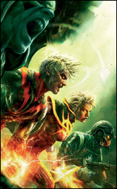 Annihilation: Conquest #4
Writers: Dan Abnett and Andy Lanning
Penciler: Tom Raney
Inker: Scott Hanna
Colorist: Frank D'Armata
Letterer: Joe Caramagna
Cover: Aleksi Briclot
Review: Tim Glancy
Much like the movie industry, the comic book industry thrives on the big events to generate buzz and a lion's share of the revenue. Also like the movies, there are events that are greeted with a great deal of fanfare and some that bomb. And then there are the movies and books that start off with very little buzz � are passed over for ones with bigger budgets and stronger hype machines � but find a way to gain a fanbase.
Such was the case with Annihilation. The original Annihilation event started right around the same time as Civil War; while Civil War promised a huge war between superheroes, Annihilation was a sci-fi epic filled with supposedly third-string characters. I don't think that anyone was really clamoring for a Ronan the Accuser or Nova book. However � thanks to twists and turns, great action sequences and interesting character development � the original Annihilation ended up being a tremendous read. Add in an amazing ending and the elevation of Nova, and you can see why Annihilation had people talking.
Another thing that comics and movies have in common is the love of sequels. You can usually count on a successful movie to generate a few sequels, and comics are no different nowadays. Since Annihilation was a critical � and at some level � commercial success, Marvel naturally published a sequel. Cast changes were made, just as they would be in Hollywood, however, unlike a Hollywood sequel, Annihilation: Conquest isn't a watered-down money grab. Enough of the original spirit remains to make this a natural, worthwhile successor.
Much credit has to go to writers Dan Abnett and Andy Lanning. Tying all of these characters and plots together while mixing in a liberal amount of action could have been a convoluted mess, but they never lost sight of the larger picture. However, not everything is rosy. Some of the characters seemed to have fallen to the wayside. Wraith, for example, went from being an extremely interesting character to background noise. With a cast this large, it's understandable that some characters would get shortchanged, but some people might be disappointed by it. Small complaints aside, the writing team is doing an excellent job of juggling an interesting story with fast, explosive action. They've also filled this book with hopelessness. You can sense the desperation in these characters. And even though that might be too much in some books, it works here.
The art team keeps up with the writing, making this book very visually appealing. I have always thought that mechanical or robotic creatures are among the hardest for artists to conquer. For every group that does it well, there are five groups who foul it up. Thankfully, the villains in this book, especially Ultron and "The Select," a group of former resistance members turned slaves, all look spectacular. They all feel like powerful, futuristic robots. As stunning as everything is, the colors really stood out. Not only are they consistent, but the way light radiates off the characters is pure dynamite. There might be higher profile teams on other comics, but none are this consistent.
I really can't say enough about this whole Annihilation craze. I started reading it because I had to, and I keep reading it because I love it. Not only do I recommend buying this book, I recommend going to a local book store and reading all the Annihilation trades. I doubt you will regret it.
 Moon Knight #15
Writers: Mike Benson and Charlie Huston
Artist: Mark Texeira
Layouts: Javier Saltares
Colorist: Dan Brown
Letterer: VC's Joe Caramagna
Cover: Arthur Suydam
Review: drqshadow
Times have been rough in Moon Knight lately: after a brutal battle in an alley with the Bushman two years ago, the Knight crossed the most sacred of lines. At the conclusion of the fight, Moon Knight was victorious, but his opponent lay dead. In the two years since that fateful evening, Marc Spector has been haunted by visions of a dark-minded spirit, hounding his every step and shouting instructions along the way. It's made his daily routine into a chore, and kept his guilt over the death of Bushman at the front of his mind.
I made no secret about my disdain for this book last month, when I wished the series an early death, but I gave it the benefit of a clean slate this time around. And, to be fair, the story's marginally better than it was last time. It's still nothing I'm going to go out of my way to follow, and it often floats directionlessly for page after agonizing page, but there's at the very least a touch of forward motion present this time around.
Mike Benson and Charlie Huston are finally going forward a bit with the registration storyline they've been teasing for the last few months, although it doesn't seem to be a very pressing matter. In his brief appearance, Tony Stark is handled decently enough, and the reasons he's taking an interest in a hero like the Moon Knight are laid out pretty well. It's not like this is a completely worthless story, but the wooden characterization, slow pace and lengthy, rotten dialog drain it of any and all momentum that the plot happens to build.
The opening pages seem to show an improvement in Mark Texeira's artwork, as Moon Knight nearly beats a bare-chested bad guy to death with clenched fists, but that quickly spirals downward. Colorist Dan Brown tries his best to add some life to the page, giving Tex's illustrations a soft, painterly touch in a few isolated instances, but it's not enough. These layouts are so dull and boring, lacking in life and personality, I don't know that there's anything here worth saving. Nobody looks comfortable (or even familiar) in their own body throughout the issue, everyone (even the supporting cast) is built like Brock Lesnar, and there's nothing drawing me into these compositions. Tex, man, what happened to you?
While this month's issue is an improvement over the last, I'm still not enjoying what I'm seeing. The storylines in the forefront are excruciatingly boring, none of the characters have an identity, and nothing that happens carries any weight. Mark Texeira's artwork is about as bad as I've ever seen it, too, which doesn't help matters. It's not at the bottom of the barrel, but it's scraping pretty close. Skip it if you aren't a masochist � it's still light-years away from being something I'd willingly buy on a regular basis.
 Ms. Marvel #24
Writer: Brian Reed
Penciler: Aaron Lopresti
Inker: Matt Ryan
Colorist: Chris Sotomayor
Letterer: Dave Sharpe
Cover: Greg Horn
Review: drqshadow
I'm having a hard time understanding the recent extraterrestrial events in Ms. Marvel. Evidently, she's battled the invading forces of the Brood alongside a shape-shifter named Cru, who somehow handed over a few shards of her own genetic material to the titular superhero. Since then, Carol's been surviving wounds she shouldn't, inexplicably losing faith in her own body and hearing voices. Now Cru wants her genetics back, there's a new Brood Queen in town and Carol's powers are continuing to expand.
Sounds like an awful lot, right? Fortunately, in action it's not so bad. Brian Reed has a talent for compressing such complicated events into a clean, reader-friendly format. He occasionally overdoes it with the internal monologs (especially considering each box of introspection is accompanied by a gaudy lightning bolt icon; it's cute once in a while, but five of them within two panels is too much), but even those are thankfully kept brief and straight to the point. Although the majority of this issue is slobberknocking action, it maintains an intelligent dialog and never seems to regress into mindless fistfights and power blasts for their own sake. There's some weighty stuff going on with serious consequences, and Reed is able to surprise readers on several instances in this issue.
With that said, I've never been much of a Brood fan. There's something about a mass of gigantic, sharp-toothed sentient insects that removes me from that suspension of disbelief and takes me out of the story. They're treated semi-seriously here, as a real threat, but one that says things like, "I'll snap you in half and eat your innards," randomly and repeatedly from cover to cover. Still, it's a solid enough conclusion to the arc, which leaves just enough threads dangling to keep readers coming back for another month.
Aaron Lopresti's artwork is a great match for the tone of Brian Reed's tale � it's just simple enough to keep the page's focus on the storytelling and not his linework, but detailed enough to enliven the page with an extra touch of depth. He's got a nice firm understanding of the primary cast: Carol, Wonder Man, Sleepwalker, Agent Sum, and gives each of them a unique face. His fundamentals are spot-on, but he could do with a little work on his splash pages. As an all-out action issue, he's asked to provide several of them (the first six pages are nothing but full-page spreads) and they generally underwhelm. They're missing the rich creativity and ease of motion evidenced in his other pages, like he's overreaching in search of some unseen perfection. When he's constrained within a solid set of panels, he's great, but he has trouble translating his style into a larger format without that rigid frame.
If you've been reading Ms. Marvel for a while, you should know what to expect here. It's solid storytelling, albeit with a moderately low-level cast, accompanied by fine artwork that's good enough to slip by unnoticed but not great enough to demand your attention. There are a couple of big shocks, and they deliver. Normally, this would be something I'd recommend you merely flip through unless you have a special interest in the cast, but this is a minor step above that. Borrow a copy � it's worth a look.
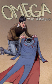 Omega: The Unknown #5
Writers: Jonathan Lethem and Karl Rusnak
Artist: Farel Dalrymple
Colorist: Paul Hornscheimer
Letterer: Farel Dalrymple
Cover: Farel Dalrymple
Review: Dan Toland
Previously in Omega: The Unknown... I have no idea. None. There is no recap page. I have not read any of the previous four issues. And I never read the Steve Gerber series. So I have no point of reference. I am totally, utterly lost.
The first three pages give us a little bit of exposition in the form of a "father / son" chat between a kid and his older sister's boyfriend. We learn that said boyfriend is:
01. A superhero called the Mink
02. The recipient of a hook-hand after he lost his older model to a flesh-eating nanovirus
03. Kind of a jackass. (And not just because he's wearing a fuchsia Yankees jersey. Go, Sox!)
The kid, Alex, has apparently had a busy four issues prior to this, as robot parents, accidents at school and superpowers are all mentioned in passing, as is Alex's (unexplained, or even touched upon in any kind of detail) relationship with Omega. Alex doesn't trust this guy, tells him as much and takes off.
Meanwhile, Omega (I assume this is Omega, because, even though no one actually says so, he's the only person in the issue wearing an Ω-shaped headband, which is kinda hilarious) has a job flipping burgers, which he probably loses as soon as he goes completely apeshit and starts throwing coworkers through the front window. With that, the Mink and his swarming legions of Minkettes are off looking for Omega. Also meanwhile, Alex and his friend go on a bus trip to suburbia, trying to get some answers to questions that I have to assume were raised in an earlier issue. Oh, and the Mink's missing hand has gone weird.
So yeah, this is confusing. It's also interesting. The dialog is pretty good, and is really quite funny in several places. The Mink is a character that grew on me a little bit � he's a ludicrous figure: sketchy and kinda sleazy, but a bit of a dork when it comes to it. He's not a supervillain. He's the bad guy in your favorite 80s teen comedy: the evil developer who wants to teardown the clubhouse / record store / mall / teen hangout to build a golf course with his face on it, and doesn't believe for a minute that the ragtag gang of lovable misfits will actually be able to get the mortgage money by midnight tonight. Overuse would turn this guy into the most hated character in literature, but used sparingly, in this type of story, he works.
Remember when you were in English class, and you would look at the kid sitting next to you, and while everyone else was trying to make the teacher believe they actually read Middlemarch, he was drawing art for the photocopied punk rock 'zine that he was always trying to hand you? That's what Dalrymple's art reminds me of. The art is fascinating to me: it's DIY indy artwork in a Marvel comic, and wouldn't look out of place on the shelf between Hate and Milk & Cheese. It's nothing like anything else Marvel is producing, and it absolutely works for this story. This is something that will repel a lot of people: it's a style of artwork that just doesn't appear in superhero comics, and I admit, if I opened an issue of New Avengers and saw this artwork, I'd put it down. But this is almost like an old Vertigo book published by Marvel, and on that level, it's perfect.
A quick word about the coloring: it's weird. Since computers came into play, colors have become a lot subtler and very, very varied, but here, if something is orange, it's orange! And more stuff is orange than you might expect. There's a lot of orange, and green, and a lot of fuchsia. If it's not in the big box of Crayola (the really big one, with the sharpener built-in) then it's not on Hornscheimer's palate. I don't dislike it, but it's unusual. It's actually not totally unlike Laura Allred's work.
The lack of a recap page really hurt this issue; I don't know what's really going on, but it looks like it may have been interesting. I can't recommend buying this issue, because it makes no sense whatsoever on its own. I will say that I'll seriously consider buying the trade when it comes out later this year. In the meantime, flip though this one to see if anything � the artwork, the story, some of the random oddness � grabs you. With this book, Marvel is really doing something it almost never does, and that can only be applauded.
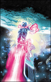 Silver Surfer: In Thy Name #4
Writer: Simon Spurrier
Artist: Tan Eng Huat
Colorist: Jose Villarrubia
Letterer: VC's Cory Petit
Cover: Tan Eng Huat
Review: Dan Toland
Previously, Brekknis � a small world in a federation of planets called the Ama Collective � was getting ready to go to war with that same Collective over the suppression of the people's religion. Brekknis wants to rebel, Ama wants to destroy the Brekks utterly. Both sides are getting ready to roll, until the Surfer, tired of all these shenanigans, shows up with Galactus � threatening to have him devour whichever world shoots first.
If you're going to swing a hammer at someone, you really can't do better than Galactus.
Therefore, we're treated to some truly exciting negotiations, diplomacy and scenes of people generally sitting at a table talking. All the while, the Surfer broods and mopes and beats himself over the head with guilt at the fear-mongering and manipulation he's using to get to the greater good.
So, did you ever read that story where the Surfer does the internal monolog thing, and spends a lot of time politely asking the bad guys to please stop being so bad, and then finally has his patience pushed to its limit, remembers he is the holder of the Power Cosmic, dispatches the bad guys in about two panels, and then broods for a couple of panels about how alone he is before flying away? Of course you have, because it's every single story that's ever been written about the Silver Surfer. Well, if you like it, then you're in luck, because here it is again.
Way too much of this issue is spent with the two sides talking in their room, and then poking their heads out the door to ask, "Can we come out now?" To which Surfer replies, "No." And then the two sides go back in their room to talk some more, so that the cycle can repeat a few more times. Through these interminable scenes, this comic taught me that politicians are sinister and not to be trusted. This is an election year, so thanks, Marvel. That's actually good information to have. (Mmmm, sarcasm.)
The art is okay. It's extremely detailed, to the point of being busy and difficult to decipher at times. Huat creates alien worlds very well; there's a representation on the first page of a number of small, primitive alien creatures living on a floating rock that is very well realized. His Surfer is a little less successful; he's cartoony, simplistic and the anatomy is off. That's the style, and I just don't care for it personally. There are a few very pretty shots, though, especially in space. On the whole, though, it's just too cluttered, and more than once I had to really stare at a page to figure out what the hell it was I was looking at.
Sometimes I think about all the work that goes into putting a comic book in my hands: there are writers, artists and editors, and the people who print, package and ship the books. Look at all the hard work, put in by so many people, to ensure that 15 minutes of my life are completely wasted, gone forever, time that I will never have for anything else ever again. God, I think I hate comics now. Skip this book and avoid my fate. I would rather eat this comic book than read it again. Seriously.


