Is It Wednesday Yet?
11 December 2007
11 December 2007 — Here we are again with another installment of your favorite comic book review series. As always the comics you're about to read about won't be released until tomorrow (12 December 2007), so these reviews are free of spoilers and should help inform your purchases on new comic book day.
Our grading scale is simple:
Buy: An excellent comic book.
Borrow: A good comic, but save yourself some money by reading a friend's copy.
Flip Through: Give it a once-over at the comic shop.
Skip: This doesn't need to be explained.
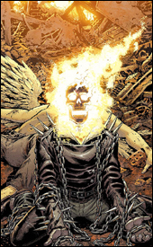 Ghost Rider #18
Writer: Daniel Way
Artists: Javier Saltares and Tom Palmer
Colorist: Dan Brown
Letterer: VC's Joe Caramagna
Cover: Tony Moore
Review: Tim Glancy
NOOOOO!!!!!
That was my initial reaction to seeing this book in my inbox. I hate Ghost Rider. As you may remember from my review of the second part of this storyline back in September, I don't like the character, and I don't like this type of character — and nothing has changed. I still don't know why this book is around. I still don't know what is going on. And I still want to know why Marvel can't bring back Darkhawk in a solo book instead.
This is the fifth part of the six-part "Revelations" arc, and it appears that stuff has happened since last time. The Devil is on Earth, but in 666 different bodies. And Ghost Rider, along with two angels, has to kill them all. However, the power that the person held is transferred among the remaining persons until there is only one, and presumably Ghost Rider will kill that one too. So it's that Jet Li movie, The One, without any cool karate... but with demons... and a guy who is on fire... and two half naked angels. So I guess that makes it The One crossed with Dogma crossed with... um... Ghost Rider?
At least the writing is seemingly more focused here than last time. There is a pretty decent reveal at the end of the book, and while I couldn't care less about it, Ghost Rider fans should find it interesting. Way has focused the story a lot more this time around, and this issue was a lot easier to follow. The characters are written better too, with each one feeling true to their cause and personalities. The only character that might have taken a step back is the character that was written best last time, the main demon / devil character. Last time I read this book, he came across as a unique villain, whereas now he seems to be a demonic James Bond villain.
The art is about the same as last time. Good in the close-ups and solid all-around, but really lacking that special punch. I think the problem might be that the material isn't the best for this art team. Sometimes it looks beautiful. Other times, not so much — especially when it comes to the action / battle scenes. At one point I realized I've seen everything this team has to offer.
In comparing this issue of Ghost Rider to the last one I reviewed, this is a tremendous book. However, looking at it on its own merits, this book is still a long way from where it should be. You can go ahead and flip through this one. The reveal is interesting and some of the book is entertaining, but "some" isn't good enough
 Marvel Comics Presents #4
Writers: Marc Guggenheim, Kathryn Immonen, Josh Fialkov and Rich Koslowski
Artists: Francis Tsai, Stuart Immonen, Christopher Moeller and Andrea Di Vito
Inkers: Dave Wilkins, Wade Von Grawbadger
Colorists: Tony Washington, Dave McCaig and Laura Villari
Letterers: Dave Sharpe and Todd Klein
Cover: Michael Choi
Review: Tim Glancy
"There isn't a force on Heaven or Earth that could get me to buy this book."
The above is a phrase that was typed by yours truly on the Earth-2.net forums in regards to Marvel Comics Presents #2. I should have known that these words would come back to haunt me. At least I can honestly say that I have still never purchased the book.
So for the uninitiated, Marvel Comics Presents is a new anthology series in the vein of the old Marvel Comics Presents. Most people remember Marvel Comics Presents as the home to one of the greatest stories of all time: "Weapon X" by Barry Windsor-Smith. The old MCP was also a place for Marvel to spotlight lesser-known characters and creators, as well as a place to throw new material against the wall to see if it stuck.
The new book is similar to that with the exception of the whole "greatest story of all time" thing. I can actually dig what Marvel is trying to do here; they have thousands of characters, many of whom I love, and this is where they'll see the light of day. It's also a good vehicle to get new names out there while telling stories that aren't quite what you'd expect from Marvel.
The problem is that with four stories per issue there are bound to be ups and downs. For as good as "Weapon X" was, there were dozens of stinkers scattered throughout the original MCP — same thing here. The four stories in this issue range from great to awful, and unfortunately there's not much in between. The opening story, "Vanguard," is a wonderful crime / mystery story, but that shouldn't come as a surprise considering it's written by Marc Guggenheim. What is a surprise, however, is the art. Very real and gritty, the art captures the essence of the story and helps draw the reader in. Francis Tsai and Tony Washington really nail what Guggenheim is going for here, and the whole package is great. I could have read a ton more of this, and I might actually check the next issue just to see where this goes.
From the peaks to the valley, because next is the conclusion to "Hellcat." I guess something has caused Hellcat to split into a ton of different versions of herself, and now she is trying to get them all back together. Kathryn and Stuart Immonen handle this one, and while the art by Stuart is great, the writing leaves a lot to be desired. Perhaps it's because I missed the first three parts, but I read this three times before I had the slightest idea what was happening... and I'm still not sure I really understood it.
From there we climb back up with "Outlaw Kid." A standalone story, this is an interesting story to say the least. Josh Fialkov does a great job of taking a character and a time that really doesn't appeal to most modern comic book fans and creating a story interesting enough to grab them. The art is exceptionally beautiful thanks to Chris Moeller, who really gives it that Western feel. There is a dirty, old look to the art, and it helps so much when the subject matter is supposed to invoke those feelings. After reading this one I actually wanted an Outlaw Kid series, that's how much I enjoyed it.
Finally, and talk about saving the worst for last, is part four of the twelve-part "Weapon Omega" story. I am going to make this short, because I don't need the grief right now, but this one is terrible. The art's fine — it's pretty standard actually — but the story just... bad. This one falls under the Initiative banner, which I am beginning to think is less about capes registering and more about Tony Stark / Iron Man showing up in every Marvel book until his movie comes out. To tell the truth, I don't even know what happened: a boring character from the boring Omega Flight series did something boring, and then someone vomited. So if you have a vomit fetish, by all means buy this one. However, for the rest of you folks out there, flip through this book — read "Vanguard" and "Outlaw Kid," but skip the rest of the issue.
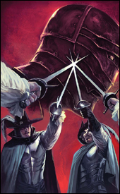 Marvel Illustrated: The Man in the Iron Mask #6
Writer: Roy Thomas
Penciler: Hugo Petrus
Inker: Tom Palmer
Colorist: June Chung
Letterer: VC's Joe Caramagna
Cover: Marko Djurdjevic
Review: Tim Glancy
Dear Grandma,
I had a great week. Well, to be honest, I haven't. I got fired, am trying to plan a move to Massachusetts and I am having a really hard time with things. However, there was some good news this week. I received your package in the mail, and along with the cookies, socks and undies, I was delighted to find a comic book. And then the delight turned to sheer terror when I looked and saw it was another Marvel Illustrated title.
Love,
Tim
And that is the only way it is okay to even think about reading one of these books. Ever. I don't really see why Marvel wastes the paper and money printing these books. The fact is, no matter what they do with one of these books, it will never even compare to the source material. Comics remain popular because they are filled with stories that can't be told in other mediums, be it on TV or at the movies. The same can be said about novels: adapting a classic novel into a comic doesn't work. Much is lost in the translation, so to speak.
Once again, Roy Thomas is charged with the terrible task of taking a beloved story and trying to make it into a passable comic book. And, once again, it doesn't work. Though the dialog might work in a novel, it's forced in a comic book. Also, the beauty of reading a great novel is in using your imagination to create the scenes and characters. In a comic, that is taken away from you, and you are forced to read the classic story through a stranger's eyes.
The art is, for the lack of a better term, isn't even passable. I mean, there were some panels where boots seemingly melted into pants — you really couldn't tell where one ended and the other began. If you went back and read every review I've written and compiled every negative thing I've ever said about art, you could paste them into this review right here. Terrible backgrounds? Check. Boring character deigns? You got it. No attention paid to detail? Sure thing. About the only thing in this book that's worthwhile are the colors. June Chung nailed the period tones and mood — everything's very earthy and realistic. So good job, June!
On Wednesday, do yourself a favor. Find your local library or book store and grab The Man in the Iron Mask novel by Alexandre Dumas. When it comes to the comic adaptation by Roy Thomas, however, skip it!
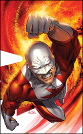
 Punisher: War Journal #14
Writer: Matt Fraction
Artist: Scott Wegener
Colorist: Shannon Blanchard
Letterer: VC's Joe Caramagna
Cover: Ariel Olivetti
Review: drqshadow
The Punisher has been messing around with Spider-Man's rogue's gallery lately, specifically the Rhino, so it was probably only a matter of time until he crossed paths with the web-slinger himself. Sure enough, the two met last month and came to blows, with Spidey restraining the Punisher just in time for the son of Kraven to get the drop on them both. Now Rhino's being held in Kraven Junior's superpowered "zoo," the Punisher is back at square one and god only knows what's happened to Spider-Man.
Writer Matt Fraction is someone I'm still trying to get a firm handle on. I loved his work when I first discovered it in his creator-owned Last of the Independents, but haven't been as impressed by his recent, more mainstream work. War Journal has been his playground since his arrival at Marvel, and it's certainly been through some ups and downs. The current story is more of an up, fortunately, and though it covers a lot of territory I never felt bogged down or overwhelmed by the events. Fraction has a talent for telling an intriguing story without a mess of words, and that makes his writing very easy to read and enjoy. It's not going to explore any deep, dark intellectual corners, but it's at least very entertaining — like a strong summer blockbuster. It's smarter than a simple guns-blazing 'splosion fest, but it's never too smart.
Scott Wegener's artwork matches the lighter tone of the story fairly well, although he has regular moments of weakness. His clean, thick-lined style serves the fast pace of the action scenes very well, and he knows how to bring motion to the page without overdoing things. He has an original take on the characters that's fun to witness, especially in the animal-inspired villains that populate Kraven's prisons. He knows his way around the Punisher (although Frank's always wearing his prolific skull-imprinted top, even in broad daylight) and knows how to highlight the difference in size between a muscular boulder of a man and an average civilian.
The artist's storytelling is frequently difficult to follow, though, and his speedy, under-detailed illustrations often look like they were rushed to meet a deadline and incomplete. It's all right to limit the amount of lines on any given page — artists like Mike Mignola have been doing it successfully for years — but that luxury must be backed by a strong layout and precise, consistent modeling before it can work. Wegener isn't quite at that level, and several of his pages required a second and third look before I could even figure out what was supposed to be going on. He has moments where I think he's maximizing his potential, then others where I'm sure he's got a long way to go.
I suppose it's understandable that Marvel would want a cleaner ongoing series for this character, since Garth Ennis's Punisher is definitely not for everyone, but the differences between that book and this one are significant. Naturally, you can't have the Punisher blowing people's heads off with a shotgun in a non-MAX title, but Frank should still be preparing for his work with the same mindset, that same military precision. Instead, it's like he's a different character. He doesn't case a joint before he barrels in with a small armory strapped to his back. He makes the same kind of mistakes that he'd take advantage of in the mature-themed Ennis book. It looks and feels like the same guy, but he's been partially lobotomized.
And that's really my biggest qualm with War Journal. The writing is inventive and explosive — you're never more than three or four pages from the next punch or muzzle flash — but it doesn't fit the mold established by the Punisher's other book. This is fine light reading, and if Frank weren't doing what he is in another series, I'd probably be able to look past a lot of these inaccuracies. I guess as an alternate-continuity take on the character, I'd say this is worth borrowing. It's got a lot of bright moments but it also has some issues with consistency, so just remember to temper your expectations.
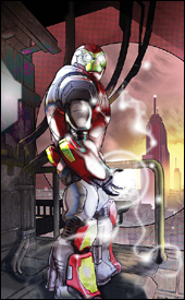 Ultimate Iron Man II #1
Writer: Orson Scott
Artist: Pasqual Ferry
Colorist: Dean White
Letterer: VC's Cory Petit
Cover: Pasqual Ferry
Review: drqshadow
Picking up where the previous series left off, Ultimate Iron Man II is, naturally, the tale of Tony Stark and his development and initial field tests of the Iron Man armor. As is typical of the Ultimate Universe, this take on the character is a little different than the same old story: this Tony is a very young man, trying to make his way out from under his father's long shadow. He needs the suit to be a success, not just for personal satisfaction but in order to have a chance at survival in a ruthless corporate climate.
Fortunately, young Stark and his coworkers provide a rich, well-developed cast of characters and author Orson Scott lets them do their thing without much interference. He knows how to establish someone's intelligence without stuffing their dialog full of big words and technical jargon, which is wonderful to see in action. A lot of time a genius' intellect shines twice as brightly in the way they carry themselves during adversity and criticism, and that's where these guys are really in their element. When the government shows an interest in Stark's robotic suits, Tony and his friends aren't intimidated by the men in black, they stand firm under that scrutiny and emerge as stronger individuals because of it. But that doesn't mean they're all business, either. From the few glimpses we get into the suit's development cycle, it's immediately evident that they're all completely and utterly psyched about this project. They can't wait to show off some of the armor's new features, and that gives them a specific emotional attachment to the plot.
The writer's placement of this story in the recent past — about 10 years prior to the current events in the Ultimate universe — presents a unique opportunity to enrich and broaden characters who have already appeared in other titles within the universe. Dr. Molekevic for example, from early Ultimate Fantastic Four continuity, is a prominent member of Stark's staff. He's still years from becoming an evil, villainous mastermind, but even now, the seeds are being planted for his eventual turn. It's that attention to detail and the big picture that's helps shift this book from just another re-imagined heavy hitter to something worth taking note of.
Pasqual Ferry's artwork is gorgeous throughout the issue, showing hints of Bill Sienkiewicz in his simplified, yet complicated character models and touches of Moebius with his fantastic techno-organic backgrounds and environments. He keeps the pages surprisingly clean and legible without sacrificing any detail or flair. In a series that's primarily focused on a robotic suit of armor, both of those tendencies can be lifesavers. By sketching a detailed, seemingly lifelike representation of the Iron Man armor, he gains some credibility by helping readers suspend their disbelief a bit. But, at the same time, by keeping the page clear of debris he saves the layout from feeling too weighty and complicated. This is a book that's beautifully authentic, but also easy to follow.
My primary complaint was that I had trouble accepting the lead character as Tony Stark, at least visually. Where I'm used to Tony as the mature, suave, middle-aged inventor, here he looks unusually young and unproven. That's not something I can fault the artist for, since this is written as a flashback tale, and in that respect the story also works very well, so I can't blame the writer. Still, it's something that bothered me — like watching a famous role played by a new actor. Even though Pierce Brosnan made a fine James Bond, there were plenty of moments in Goldeneye where I had to keep reminding myself who he was supposed to be portraying. The motions are right, the personality is there, but it just doesn't seem like it's the same character because I'm so used to seeing him in a certain way.
As somebody who didn't read a word of the first series, I found Ultimate Iron Man II very easy to climb into and immediately understandable. The bulky "previously in" blurb is somewhat imposing and lengthier than it really needs to be, but even if you're the kind of reader who skips that stuff, you won't feel lost or overwhelmed. A sharp, entertaining story and some very good artwork make this one a buy in my opinion.
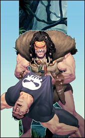
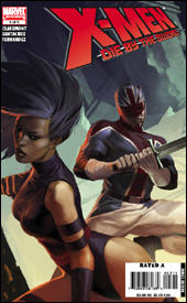 X-Men: Die by the Sword #5
Writer: Chris Claremont
Penciler: Juan Santacruz
Inker: Raul Fernandez
Colorist: Rob Ro
Letterer: Simon Bowland
Cover: Jelena Djurdjevic
Review: drqshadow
When I read the summary of the previous issues, I knew almost immediately that this was going to be a bumpy ride. To the surprise of no one, writer Chris Claremont has managed to combine two teams of dull, discarded fringe X-Men into one mammoth, convoluted, excruciating crossover. Not only that, but he's managed to up the ante by surrounding them with a supporting cast that's possibly more difficult to comprehend than the heroes! When the focal characters in a book are so obscure that the writer has to resort to introducing them in detail before the opening credits, that's never a good sign.
This issue is all the proof you'll ever need that Claremont's days as a writer should have ended with the 1980s. Every piece of dialog is shouted. The ongoing narration boxes, which often number into the dozens on any given page, are trying so hard to make the story seem historically important that they actually manage to achieve the opposite effect. They keep citing this distant, supposedly epic battle between Captain Britain and a mindlessly destructive alien force as though it were the stuff of legend, when in truth it's the first time I've ever heard of it. It just doesn't work.
Yet, despite all of that rhetoric, the narration fails to clue new readers in on what exactly is happening. When Captain Britain is in trouble and his teammates seem ready to come to his aid, something somewhere crashes to the ground and suddenly the entire team is pointing to it as proof they can't possibly be of any help to their leader. What?! Was I supposed to understand what just happened? Evidently so, because no explanations are forthcoming.
On the artistic side, penciler Juan Santacruz does not fare much better. His work is well below average, often difficult to follow and without any touch of personality or creativity. His characters have no emotion, and they all have tiny, tiny hands. His style is painfully dull, which compliments the terrible storytelling to form some kind of unholy union of filth. He seems to have no interest in what's going on with the story (not that I can blame him for that), and that's fairly obvious from the unfinished feel of his contributions.
Years ago, when I was on a big Wolverine kick and Adam Kubert was the regular artist, every once in a while they'd change his credit from "penciler" to "breakdown artist." I'm sure there's a technical reason for the change, but whenever I saw that little shift in title, I knew it would be accompanied by a swift nosedive in quality. Santacruz's pencils in Die by the Sword are right on par with Kubert's "breakdowns" in those issues of Wolverine. It looks like he quickly sketched a very rough initial layout, forgot to correct the numerous flaws in perspective, sent it off to the inker and called it a day. If you're looking for a few upskirt illustrations of Blink, though, you'll get what you're after within the first three or four pages. That seems to be the one detail he went out of his way to complete.
This is a horrible, horrible book. Cover to cover, it's hideous — it's tough to look at, thanks to Juan Santacruz's ugly pencils, and Chris Claremont's storytelling certainly isn't easy to read. If there's one positive I can attribute to the series, which wraps up in this issue, it's that it doesn't busy anyone important to the core of Marvel's universe. It's a bad series featuring a cluster of bad characters in a bad situation. Skip this. Please, please skip this.


