Is It Wednesday Yet?
04 December 2007
04 December 2007 � Here we are again with another installment of your favorite comic book review series. As always the comics you're about to read about won't be released until tomorrow (05 December 2007), so these reviews are free of spoilers and should help inform your purchases on new comic book day.
Our grading scale is simple:
Buy: An excellent comic book.
Borrow: A good comic, but save yourself some money by reading a friend's copy.
Flip Through: Give it a once-over at the comic shop.
Skip: This doesn't need to be explained.
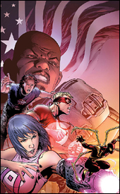 Avengers: The Initiative Annual #1
Writers: Dan Slott and Christos Gage
Artists: Salvador Larroca, Clayton Henry, Paul Neary, Steve Uy, Tom Feister, Carmine Di Giandomenico, Patrick Scherberger and David Meikis
Colorists: Stephane Peru, Daniele Rudoni, Jose Villarrubia and Wil Quintana
Letterer: VC's Joe Caramagna
Cover: Jim Cheung
Review: drqshadow
In the same vein as Marvel Comics Presents, this annual is actually a set of short stories, grouped together under the guise of a larger book. It's a chance to get to know some of the members of the Initiative without granting them their own title... or, really, even their own issue. Dan Slott and Christos Gage share the writing chores throughout, but each chapter is handled by its own team of artists.
Salvador Larroca's artwork leads off with "Second Best," a tale focusing on Gauntlet's origins in the US Army. As the first short story in the issue, it's a great example of just how brief the narratives are going to have to be to fill the allotted space within this issue. Things are really just starting to get good when everything is jarringly drawn to a conclusion. Larroca's contribution is par for the course as far as he's concerned. If you've seen some of his previous work and enjoyed it, as I have, then you'll continue to be impressed here. If his restrained, clean style didn't float your boat in the past, well, he isn't going to change your mind with this issue.
In "Reason for Being," Clayton Henry illustrates Armory's awakening, of sorts. His work is a strong contrast to Larroca's, only slightly more detailed but distinctly different. His efforts are much more cinematic, especially with the angles and page layouts he uses in this story. The second and third pages of this chapter are just tremendous, showcasing the artist's knack for dynamic storytelling and detailed backdrops above all else. While Armory's origin is shaky at best, he treats them with respect, and that heightens the impact of the story just by association.
Steve Uy is in charge of the artwork for "Be All That You Can Be," Hardball's chance to shine. Uy's work is heavily influenced by manga, which means his linework is very limited, allowing the book's colors to handle nearly all of his shading. His style has its merits, but he's also lacking in some fundamentals and his characters don't have a lot of personality to them. While he seems to be striving for simplicity, he often overworks an area of the page that doesn't really need the attention, while leaving more deserving sections unattended. That's a shame, too, because while his artwork is probably the weakest of the issue, the story is among the best.
MVP is the subject for "Born to Serve," illustrated by Tom Feister and Carmine Di Giandomenico. While their style has some very rough edges, it also has moments of true inspiration. They seem to struggle with the more pedestrian, conversational moments, which unfortunately fill the majority of their story, but really shine in the single page of action they're granted. I fear they've allowed the odd, offbeat tone of MVP's story to cloud their own efforts, because outside of that single panel, their work is very difficult to come to terms with.
Finally, in "State of Readiness," Patrick Scherberger is tasked with visualizing a day in the life of the Liberteens. His artwork is beautiful, a nice blend of J.Scott Campbell and Chris Bachalo, and he gives the characters an air of originality and electricity that helps the reader to overlook their horrible names and ridiculous attitudes. Outside of the artwork, which is lighthearted but gorgeous, and the surprise ending, this story is worthless.
The stories all have their little consistencies, which gives the issue an underlying thread of connection and helps bring the six mini-stories together under a single umbrella. Obviously, the real goal here was to showcase a handful of the myriad of names and faces associated with the Initiative, and at that it succeeds. Borrow this from a friend. If you see a story or two that looks appealing, or a character you want to know more about, snap it up � at the very least, it's a large book that doesn't demand you read it in a single sitting.
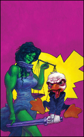 Howard the Duck #3
Writer: Ty Templeton
Penciler: Juan Bobillo
Inker: Marcelo Sosa
Colorist: Nestor Pereyra
Letterer: Nate Piekos
Cover: Juan Bobillo
Review: Tim Glancy
So, during the Civil War, Howard the Duck showed up in the Choosing Sides one shot. The one shot, which I quite liked, was about different heroes and villains either choosing to register or oppose the registration, as the title would indicate. The Howard portion was fun and, I thought, really captured the spirit of the character. Howard being denied registration because of all the crap SHIELD had suffered due to his cranky antics was tremendous, and the story was a fun little 12 pages.
Unfortunately a lot of people thought it was a fun little story, and Marvel answered that call by giving Howard the Duck a miniseries. Sometimes, and this is certainly one of those times, a story that is funny for 12 pages dies in 32 � and it's even worse when the company tries to expand it into a series. Before I knew how bad this new Howard series really was, I grabbed the first issue. About six pages in, I gave up. Needless to say, I wasn't hopeful when #3 landed in my inbox.
And guess what? I was right. With supreme confidence I can tell you that Howard the Duck is close to being the worst series I have read in a long time. I say "close to being" because I also reviewed Omega: The Unknown #3 this week, a book that surpasses this one in terms of sheer awfulness. However, that's like saying that BloodRayne was better than Alone in the Dark. It might be, but that doesn't mean it's any good.
First of all, the story is asinine: AIM is trying to take over TV (or something) by using a MODOK-like character. I'm not entirely surprised that MODOK is involved, because he is the comedy villain of the moment. Ty Templeton has done comedy well in the past, but this feels extremely forced. There wasn't one moment in this book that felt genuinely funny. Seemingly, the fact that the main character is a duck finding himself in extremely human situations is funny. I mean, ducks are funny. I love ducks. I live near a lake just so I can walk and see the ducks every few days. But this is one duck that really could fly away for the winter. And the summer.
The art is what it is; they play for sight gags and don't try to really do anything different. Juan Bobillo's colorful, exaggerated style seems to fit the character well, making the material more interesting then it has any right to be. Sosa's inks and Pereyra colors compliment Bobillo's pencils, creating a fun, unique look. More than anything, I enjoyed the art as a whole, and would surely grab another book by this team.
However, Howard is still a skip. Templeton is trying to force 12 pages of comedy into four 32-page comics, and he fails. Hell, he failed six pages into the first issue.
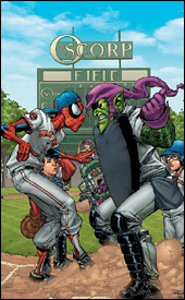 Marvel Adventures Spider-Man #34
Writer: Fred Van Lente
Artist: Cory Hamscher
Colorist: Guru eFX
Letterer: Dave Sharpe
Cover: Patrick Scherberger
Review: drqshadow
Fred Van Lente brings us this tale of Peter Parker's exploits with the town baseball squad, which reads more like an after-school special than a costumed adventure. On one hand, that's to be expected: this line is targeted to kids, ultimately hoping to interest young readers in the themes that make their greatest characters tick without bogging them down with years of continuity. On the other: kids aren't dumb, and they can tell the difference between good writing and a cluster of stereotypes. Van Lente makes a few efforts to introduce some flavor to the proceedings (Flash Thompson cursing Peter for being a nerd, then processing some simple physics before hurling a baseball at Parker's head), but for the most part it's just a cookie-cutter story crammed into a kid-friendly package.
While there's a small side story featuring Spidey and the Green Goblin, the majority of the issue focuses on Peter's exploits with the baseball team and his moral decision between using his powers for profit and retaining his secret identity. It seems like every superpowered character has faced this dilemma in the past, so it's far from fresh material, and the feel-good nature of the way it plays out is over-the-top and cheesy. Pete never seems like the bright young kid he's always been; he feels more like a weak-minded character who falls into a solution at the end of the issue that sends everyone home happy.
Cory Hamscher's artwork is suitable to the simple, cartoony nature of these titles. His clean, gestural style is a good match for the light tone of this story, and he gives each character a look and feel all their own. Peter, for instance, really looks and acts like a skinny nerd throughout the issue. That's something that a lot of artists overlook with the character, that deep down inside he's just a goofy kid with glasses and a passion for learning.
When Hamscher shines, he does so brightly � his take on the Green Goblin, who appears sporadically throughout the issue, is outstanding. He mixes in elements of other characters (Joker's smile, Captain America's chain mail) but does so inventively without losing the little touches that make the Goblin unique. But when he shows signs of laziness and loses interest, his work fades fast. Every single character in this book has an enormous, toothy grin � even when one isn't appropriate. He has no passion for the conversational scene between Harry and Normal Osborn, so the book feels incredibly disjointed when their chat is treated like an afterthought, but the Goblin's appearance further down the same page is given a wealth of attention.
Ultimately, this is what you'd expect it to be. It's not charting any new territory or revealing anything new about the characters. If anything, it's undoing a lot of the good in them by overly simplifying things to fit into a single issue. The artwork is just acceptable. The story could have written itself. And, really, it's really nothing more than a bunch of fluff meant to fill space and maybe occupy the reader for 10 minutes. Skip this, unless you need to pad your collection.
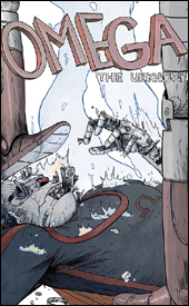 Omega: The Unknown #3
Writers: Jonathan Lethem with Karl Susnak
Artist: Farel Dalrymple
Colorist: Paul Hornschemeier
Letterer: Farel Dalrymple
Cover: Farel Dalrymple
Review: Tim Glancy
Rarely do I have trouble following a story. Though I might not like what's happening, at least I can tell you what's happening. Even the messy "Spider Clone Saga" and "Emperor Joker" storylines made some sense to me. But please do not ask me what happens in Omega: The Unknown #3.
I have read this book, cover to cover, five times now, and I still don't know what it's about. Is it about a kid in high school? A superhero? A bum? A guy driving a taco truck? I have never been more confused by a comic in my life.
Perhaps it's because I'm jumping in midstream, and there is no effort made to catch the reader up. Perhaps it's because this book drops you into a high school with a lot of people talking. With all of the word balloons cluttering up the pages, it's amazing there was room for art. I'm all about dialog � after all, I am a Brian Michael Bendis fan � but this is a new extreme. There is no action in this comic. It's just people walking around, talking, going about their normal lives. There is nothing interesting happening in this book � at all.
Hell, there is so little happening that I went to Wikipedia and looked up Omega to see if this was some sort of gag I was missing. From what I can tell, this book is exactly like its predecessor, only with no action. At least the last Omega fought supervillains, no matter how lame. Apparently this one works in a taco truck. Seriously. I hope that doesn't break the spoiler-free rule, but he works in a taco truck. And that's all you see of the hero. Him in a truck. Honestly, there is so little happening in this book, I'm having trouble reviewing it. People talk. They walk around and talk. And sell food, and go to the doctor, and talk. So I take that back. There is a lot happening, it's just that it's all rather boring.
Sure, the dialog is strong and can be very funny, but there is really no reason to give a rat's ass about anything. I'm amazed that it took two people to write this book, because that means it took two people to not tell a story. However, at least it looks good. There's a definite "indy" tone to the art, reminding me of Mike Allred's Madman and books of that ilk. The simple colors really hearken back to the older days of comic books � they're different yet bright, with not a lot of grit. All told, it's a fun throwback. In terms of look, Omega will not be for everyone, but seeing the Marvel banner on a book with this artistic style is a welcome treat. Despite the unique look, this book is better left skipped.
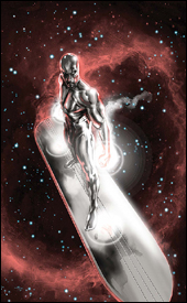 Silver Surfer: In Thy Name #2
Writer: Simon Spurrier
Artist: Tan Eng Huat
Colorist: Jose Villarubia
Letterer: VC's Cory Petit
Cover: Gabriele Dell'Otto
Review: drqshadow
Of all of Marvel's heroes, the Silver Surfer leads perhaps the most solitary, adventurous lifestyle. Since his expulsion as heir to Galactus, he's aimlessly wandered the galaxy. Unsure of his ultimate goal, he's frequently stumbled into stories involving the other characters in Marvel's 616 universe, but never seemed to have a single, defining purpose. With In Thy Name, he may have finally found that direction, even if it's come too late. Randomly discovering a utopian federation of planets and beings during his travels (dubbed the Ama Collective), he's taken it upon himself to aid one of the less-prosperous planets within the alliance. Brekknis, a downtrodden industrial planet, has been suffering at the hands of an enormous monster, and the Surfer aims to rid them of the beast.
Simon Spurrier spins a complicated tale of religion eclipsed by civilization, then assimilated in the name of liberty. His story throws more than a few subtle jabs at the present political climate, but never comes off as heavy-handed, never seems to be pushing too much of an agenda. The reader is free to enjoy the story as a purely fictional adventure through alien lands, or a clever parallel to more localized issues � it works in either context.
The writer also showcases a real knack for characterization. Although I've only known of these characters for a scant 20-ish pages, I already have a firm grasp of what makes them tick, of how they would react in a certain situation. Naturally, the Surfer himself is the real star of the show, and his loneliness and anger about the rest of the galaxy's civilization is easy to understand. He truly comes across as a lonely, weary traveler � always willing to give the benefit of the doubt, but utterly fed up with being so frequently let down. Ever watched the news and shaken your head because humanity is so sickeningly predictable and close-minded? You'll identify with this take on the Surfer.
Artist Tan Eng Huat is certainly up to the task of rendering a variety of visually unrealized alien creatures. His creativity seems boundless, although his take on the Surfer's more humanoid anatomy is a little tough to grasp. His compositions are strong, with tiny accents and details thrown in almost poetically around the page. Where most artists would highlight the powerful force and destructive power of an explosion, Huat's fireballs are much more organic, naturally flowing and almost beautiful. His grasp of a thriving, exquisite alien culture is also something to behold.
His major sin, however, is in completely and inarguably over-detailing his work. His artwork is so complicated and busy that it will often stand in the way of simple legibility. While the Surfer battles that strange alien monster within the issue's opening pages, it's a dreadfully slow experience, the pages are stuffed so full of excessive detail and ridiculous linework. To be certain, Huat clearly spent an incredible amount of time and effort in getting these pages just right. This nigh-psychotic precision and focus is generally something to be savored and enjoyed, but when your readers are spending minutes at a time simply trying to figure out what's going on, that's time they aren't spending appreciating the artwork. Huat has tremendous potential, especially within a story like this one where his imagination can flow forth uninhibited, but he needs to pull back a bit. There are times when the artwork should be king, and times when the storytelling should come first.
This is a beautiful series, and it's a shame that it hasn't received more attention than it has. Simon Spurrier does a tremendous job of dropping the Surfer into a rich alien culture, wrought with political upheaval. It's a great blend of fierce action, rich drama and intelligent observation. On the other hand, Tan Eng Huat's brilliant character designs and amazing anatomical renderings are tempered by a tendency to overcomplicate things. This is worth buying, even if you've never been much for the character himself. With a few different artistic choices, it could've been even better than it already is.
Is It Wednesday Yet?: Leftovers from 28 November 2007
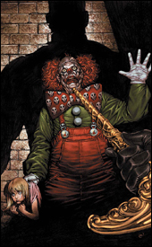 Foolkiller #2
Writer: Greg Hurwitz
Artist: Lan Medina
Colorist: June Chung
Letterer: VC's Joe Caramagna
Covers: Lan Medina
Review: Tim Glancy
Whether I like or loathe a comic book is usually more than evident by the time I reach the last page. Such is the case when I'm reading comics for please, and such is the case with most of my reviews here on Earth-2.net. But Foolkiller #2 is going to be the exception to the rule.
Foolkiller is one of the more unique and interesting books I have read in a while. I think most comic book fans have at least heard of the "classic" Foolkiller character. For those not familiar, Foolkiller was basically a vigilante with a laser gun who shot people who he determined to be "fools." Thankfully, this new Marvel MAX version of the character has ditched the blaster and garish costume � keeping only the fool killing gimmick.
To make sure those three Foolkiller fans aren't confusing this incarnation with the old one, this second issue is used to tell the tale of this new Foolkiller. Who is he? Why did he become the Foolkiller? The origin story is quite interesting, and that is a tremendous feat. In one issue, the man behind the gimmick is given a compelling story that actually eclipses a lot of Marvel's iconic origins. In one issue, I am more interested in Foolkiller then I will ever be in Penance or Justice. Hell, Foolkiller is more interesting than a lot of the mutants running around nowadays.
So writer Greg Hurwitz does a great job of telling the story of the character, but he does not do anywhere near as well with the dialog. If this were a Bruce Lee-era kung fu movie, there would be nothing to complain about. But it's not; it's a modern comic book. From panel to panel, each line gets worse than the one before it. By the time you reach the end of the book you're begging the characters to shut up. It's sad too, because the story is so good! When the dialog is this corny, you can't help but be pulled out of the story.
Lan Medina and June Chung handle the art, and they do a good job of conveying the violence and sadness that this book commands. Dark comic book vigilantes are often drawn very similarly to their more lighthearted, costumed brethren, creating a tone that doesn't fit the book / story. Marvel is guilty of this, especially in the 1990s with books like Wolverine and the three monthly Punisher comics. Thankfully, the art team nails it here, creating a dark atmosphere. The focus is on what dwells in the shadows, not what shines in the light. And though the colors aren't quite my taste, they compliment the pencils and story, so it works.
A lot of people are comparing Foolkiller to Frank Castle, and while they're both intimidating vigilantes with MAX comic books, the similarities stop there. There's plenty of room for two black-hearted killers in Marvel's adult imprint, and I hope Marvel keeps this series beyond the mini it's slated for. That said, if Marvel does spin this into an ongoing, they really need to hire a co-writer to handle the dialog. If they don't, Foolkiller will remain a borrow.


