Is It Wednesday Yet?
20 November 2007
20 November 2007 � Here we are again with another installment of your favorite comic book review series. As always the comics you're about to read about won't be released until tomorrow (21 November 2007), so these reviews are free of spoilers and should help inform your purchases on new comic book day.
Our grading scale is simple:
Buy: An excellent comic book.
Borrow: A good comic, but save yourself some money by reading a friend's copy.
Flip Through: Give it a once-over at the comic shop.
Skip: This doesn't need to be explained.
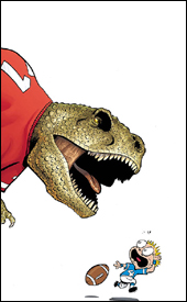 Franklin Richards: Fall Football Fiasco!
Writers: Mark Sumerak and Chris Eliopoulos
Artist: Chris Eliopoulos
Colorist: Brad Anderson
Letterer: Chris Eliopoulos
Cover: Chris Eliopoulos
Review: Tim Glancy
The assault on my adulthood continues this week, as I am reviewing the latest book from the Franklin Richards series. For those unaware, every quarter Marvel puts out a topical book starring Franklin Richards. This time, with fall being known historically as football month, the main story here deals with Franklin and a game of football that can only take place in this book. We are also "treated" to stories featuring Lockjaw, a trip to space, a future Franklin coming to visit and the Super Adaptoid.
If these stories sound interesting to you, trust me, they are not. Without trying to spoil too much, every story begins with an idea, continues with the idea going sour and ends with a lesson being learned. The first story is cute and the second one is fine, but after reading the other three stories you're going to rip your eyeballs out. The most irritating factor of all is that this is a book I wanted to love. Some of the most fun books are the ones aimed at children. DC nails this every month with their Johnny DC line, which includes Justice League Unlimited and Teen Titans Go!. Those books feature one exciting story per issue, yet they're still fun and silly enough to appeal to kids. In the Franklin Richards books Marvel seems to want to go the silly route, but they forget to add the fun and exciting parts. It's frustrating to see, because they obviously know how to appeal to young audiences through their Marvel Adventures line.
The majority of the blame falls squarely on the shoulders of Mark Sumerak and Chris Eliopoulos. Aside from the fact that it took two people to write this book, there is nothing that stands out about this book at all. The dialog is average, and the action is nonexistent. And while some of the story ideas are unique, no real effort is put into expanding them � they just stumble through the motions.
The art is fun for what it is � the colors are bright, the characters are cute and the visual gags are all on point � but there's nothing groundbreaking here. It's everything you'd expect to see before opening the book, but not in a good way.
Please skip this one. Purchasing it will make Marvel think more issues should be produced. If more issues are made, Sims will surely force me to review them. And then I would be cranky and mean to my kids. You don't want to upset my kids, do you?
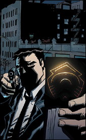
 Heroes for Hire #15
Writer: Zeb Wells
Pencilers: Alvin Lee, Leonard Kirk, Ale Garza and James Cordeiro
Inker: Terry Pallot
Colorist: Brad Anderson
Letterer: VC's Joe Caramagna
Cover: Francis Tsai
Review: Tim Glancy
When Civil War started, Heroes for Hire tied into it quite nicely. It was a good street-level book with a lot of intrigue (RE: Skrull organs). Fast forward a year or so to World War Hulk, and you are seeing a tie-in at its worst. There is really no reason for characters like Misty Knight or Shang Chi to be interacting with any of these characters, and they shouldn't be involved in something like a planetary invasion in the first place. It was bad enough when they were in the Savage Land chasing after Moon Boy and Devil Dinosaur (don't ask), and it really got away from what you would expect from a Heroes for Hire story. Now they are in the middle of a planetary crisis they have no stake in. I know there was something involving SHIELD and a big reward, but I really can't understand why these heroes would be involved. The book's not called Heroes to Fight Monsters for Free.
I believe a lot of the trouble stems from the change in creative team. Jimmy Palmiotti and Justin Gray handled the initial arc, and they really seemed to understand the character dynamics. Zeb Wells doesn't seem to get the characters, instead he wants to drop them into the silliest situations � never mind how far it takes them from where they're supposed to be as characters and a team. Much of the sassy attitude was lost when Wells took over, too. Though the book was serious, it was very antiauthority and street smart. Under Wells it's quite bland � compared to what it was, that is.
While the writing doesn't fit the characters, the art is tremendous. The characters are supposed to be beautiful yet rugged. The pencils capture this: they're detailed and fluid. Thanks to the inks and colors, the pencils pop � for it I'm almost willing to look past the writing.
Go ahead and flip through this at the store, but don't worry about reading it. Look at the art � enjoy the visual aspect of the medium � but ignore the words.
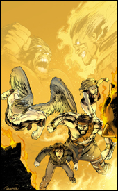 The Incredible Hulk #111
Writers: Greg Pak and Jeff Parker
Artist: Leonard Kirk
Colorist: Chris Sotomayor
Letterer: VC's Cory Petit
Cover: Carlo Pagulayan
Review: drqshadow
You've probably got a pretty good idea of what the Hulk's up to these days, what with the gigantic World War Hulk crossover finally wrapping up last week. Well, if you've already finished the final issue of that series, prepare to take a step back because Incredible Hulk #111 takes place between the fourth and fifth issues of World War Hulk.
Not that this story is much more than an addendum to that larger picture. The Hulk himself only appears fleetingly throughout the issue, with the focus squarely on the ragtag team of Namora, Angel, Hercules and Amadeus Cho. They're basically on cleanup duty, wrapping up the loose ends from the Hulk's fight with Dr. Strange. Evidently, when Strange's demon-possessed body was defeated in World War Hulk #4, Zom (the demon in question) was freed to search for a new host. Naturally, we can't have a mace-fisted monster roaming the streets of New York City, so the four renegades set about containing him before he can wreck too much more of the city's infrastructure.
Although the storytelling directly relates to his adventures, it's a tough sell for an issue of The Incredible Hulk to be so completely barren of the Hulk himself. Granted, when Brian Bendis wrote a recent issue of Ultimate Spider-Man in a similar fashion, focusing exclusively on the Green Goblin and only spending a courteous page and a half on Spidey, I loved it. There's a difference here: in that issue of USM, the story established and enhanced an obvious future collision. No matter what, you knew that at the end of the day that story would make the eventual clash of the two characters that much more important.
But in this instance, the Hulk has already dispatched of the enemy. The story expands on a battle that took place a while ago, and that's just not as exciting to read. It's a somewhat interesting aside, set against the backdrop of the Hulk's assault on New York, but it would've been better relegated to a miniseries like World War Hulk: Front Line. I'd expect Incredible Hulk to be right at the heart of the war zone, not on the sidelines cleaning up the spillage.
Leonard Kirk's artwork is just mediocre. Where Zom was a menacing behemoth in the hands of John Romita, Jr., he's fairly pass� here, like a heavier, spikier Ghost Rider without his bike. To his credit, he tells a very aggressive, detailed story with limited fuss. There's a lot happening on every page of this issue, but his work never seems overly complicated or hard to read. It's clean and professional, if not particularly exciting.
If you've found yourself completely absorbed by the WWH saga, this is a nice expansion upon that main storyline. It serves to reinforce just how big a deal it was for the Hulk to take out Dr. Strange's possessed form, and by that merit alone works as a nice extra source of information within the grand scheme. As its own standalone title, though, it's really nothing worth getting excited over. Fans unfamiliar with the giant crossover will have a lot of reading to do before this issue makes any sense, and even those who are up to speed on the proceedings may deem these events to be needlessly extraneous. Flip through this in the store, it's not garbage but it's also nothing exceptional.
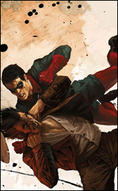
 Penance: Relentless #3
Writer: Paul Jenkins
Artist: Paul Gulacy
Colorist: Rain Bedero
Letterer: VC's Joe Caramagna
Cover: Paul Gulacy
Review: Tim Glancy
I miss Speedball.
In my tween years, The New Warriors was one of my favorite books. However, that is not where my Speedball love began. One of the earliest comics I ever purchased was an issue of Captain America where, for some reason or another, tryouts were being held for the Avengers. There were a lot of C-level heroes, including fellow future New Warrior Marvel Boy. But Speedball was the star of this part of the issue. I was fascinated with a character that, really, only had the power to bump into people at a high rate of speed. Maybe it was the color of his costume or the little energy trails that would always follow him, but for some reason that image of this character stuck in my mind. So when I was in The Comic Zone in New Bedford, MA and saw a book on the shelf with, among others, Speedball and Nova (who I also was interested in at the time), I had to pick it up.
Fast forward a decade and a half and I am left with a character that I no longer recognize. After Civil War Speedball was reborn as Penance, and he joined the new look Thunderbolts. To say I wasn't thrilled with the rebirth of Robbie Baldwin is putting it mildly. One of the things I loved about the character was the lightheartedness he brought to any book he was in. It was nice to have a character who wasn't a dark, moody tough guy. Well, now that's exactly what he is, and this series is the perfect example of that.
In truth, however, the book is put together well. Paul Jenkins has a history of wrapping great stories around mysterious characters. He did it with the Sentry and he's doing it here with Penance in this tale of vengeance and guilt. What exactly will a man will do when pushed to the brink? That's what Jenkins is examining.
Art wise, this book is very similar to the style used in Thunderbolts, which really works for the character and helps readers pick up a familiar vibe. The attention to detail is tremendous; it's easy to tell characters apart and read their thoughts at a glance. Paul Gulacy does a splendid job here, more so because this isn't normally a style I appreciate. That he was able to pull me in makes me appreciate at it that much more. Rain Bedero's colors, on the other hand, are too plain � which hurts the overall look of the book.
If I'm digging the writing and art, why do I hate this book? Penance; this character is, essentially, every character from the 1990s rolled into one. Remember when the Avengers were all wearing brown leather jackets and the Fantastic Four had big lasers? Yeah, that is what Penance feels like. Typically I'm not against characters like this; I simply skip their books. However, when it comes at the expense of a character I loved, a character I grew up with, that's when I take issue.
Here's where I'm conflicted. Personally I'm skipping this series; I don't want to read this Robbie Baldwin. But all personal bitching aside, it's a fun book worth picking up. So unless you're a huge Speedball fan, buy this.
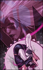
 Powers #27
Writer: Brian Michael Bendis
Artist: Michael Avon Oeming
Colorist: Nick Filardi
Letterer: Chris Eliopoulos
Cover: Michael Avon Oeming
Review: drqshadow
While his production has skyrocketed since the first issue of Powers hit the shelves three quarters of a decade ago, this series is most definitely writer Brian Michael Bendis's baby. He's poured so much of himself into this cast that they've become about as close as a fictional being can be to the real thing. Even secondary characters, such as the chief of police, are so carefully defined and developed that they could easily be the focus of their own series. When he speaks, you can almost hear his voice reading his lines in the back of your mind.
Now, with such a solid foundation of characters at his disposal, one might think that Bendis would hesitate to take risks, to change things up, to throw caution to the wind once in a while � in actuality nothing could be further from the truth. Since day one, readers have been shown that nothing is out of bounds, and this storyline has been no exception. Sometimes these risks pay off, as in the "Who Killed Retro Girl" arc, sometimes they don't (the infamous "humping monkeys" issue). The current story arc is more of the former, less of the latter.
I wasn't crazy about the intergalactic theme of the last storyline, because it was such a wild change of perspective from what I was used to in this book. Thus far, this arc has addressed my qualms and returned the narrative to a smaller, more approachable scale. Maybe it's personal preference, but I'm much more inclined to become emotionally invested in a story that deals with true detective work than a wide, universe-spanning epic saga, overflowing with alien beings and mystical disembodied voices. At the end of the day, what brought Bendis to the dance in the first place was his work on detail-rich crime noir stories, and this issue is just further proof that he can still rock and roll in that genre whenever he feels like it.
After 64 consecutive issues and a pair of specials, Mike Oeming's visuals are the beginning and the end of these characters. While his work has seen its share of peaks and valleys over the years (particularly when the book's running behind schedule), his style has largely remained the same since day one. He's the definition of gesture and simplicity, often refusing additional linework even if the layout seemingly needs it to survive. His dark, shadowy tendencies have constantly given Powers a distinctly grimy, downtrodden look and feel, but he's delivered the goods in lighter, happier moments as well.
With the recent change to a larger monthly page count and a more regular (fingers crossed) shipping schedule, Oeming's work has taken a mild turn for the worse. His artwork still carries a lot of weight and atmosphere, so it doesn't feel like I'm reading a different book, but his style was never this rough and rushed before. Mike is still just one solid issue away from reaffirming himself in my eyes, but at the moment the quality of his work is beginning to slide.
Oeming's artwork is perfectly matched by Nick Filardi's colors, page for page, issue for issue. The colors of Powers have long been one of the book's greatest successes, and though the job has been passed between a small handful of colorists, the strength of their work has never wavered. These hues are treated as almost a character unto themselves, they're so frequently and effectively introduced. Most comics never seem to grasp the kind of magnitude that colors can carry, where Powers is constant living proof. They're used so effortlessly to set a scene � like the deep reds, purples and maroons do for a strip club midway through this issue � that it's hard to imagine the series working nearly as well without them.
Reading this book has become something of a treat. There really is nothing else like it on the market today, both in terms of subject matter and execution. Bendis and Oeming have been working together so long that it's hard to imagine one without the other within these pages. They've got, arguably, the best cast of characters in comics and they aren't afraid to use them, hurt them, evolve them or kill them if it'll help further the storyline. Buy this, add it to your pull list and catch up on any issues you may have missed along the way.
 Thunderbolts: Breaking Point
Writer: Christos Gage
Artist: Brian Denham
Colorist: Guru eFX
Letterer: RS & Comicraft's Albert Deschesne
Cover: Marko Djurdjevic
Review: Tim Glancy
I had a breaking point with Thunderbolts about four issues into the rebirth of the team. I believe I actually reviewed an issue here in IIWY? a few months ago, and admitted that it was a great book I didn't like. I still look through it every time I am in the comic shop, and I frankly still don't get the appeal. I like the idea, but I dislike the direction the book has taken. It's gotten too dark � which isn't surprising with Warren Ellis writing it � but there was always what seemed to be an underlying desire for the villains in the book to do good. Now, thanks to the direction this book as taken, the villains are still villains, they just get paid by the government to hunt down heroes. That took a lot of what I liked out of this book, because there's not really any redeeming factors to any of the main characters. Songbird and Radioactive Man are still around, and do serve as the moral compass at times, but a majority of the face time goes to Venom, Penance, Bullseye, Moonstone and Norman Osborn. None of those characters are trying to become better people, they are simply out to kick superhero ass � within the law, of course.
When I started reading this story, I was worried this was simply more of the same. After the battle, however, when the character started talking, this book had a different feel. Instead of focusing on the evil and going from one wicked plot to another, things were slowed down and we were allowed to see why the characters act the way they do. Why does Moonstone need to be the alpha female? What drives Songbird to do better? Where does Swordsman fall in this? These are all questions that have been raised in the main book, but little time has been dedicated to answering them � until now, making Breaking Point a very good place to start.
After reading, I went back to see who wrote this. I read comics like this so I can go in with little to no preconceived expectations. To my surprise � although with how well the characters were written it shouldn't have been � Christos Gage wrote this book. It seems that I write words of praise for Gage every week, and I hope that these words are starting to sink in. Once again Gage tells a story that is heavy on character and drama while maintaining action. There doesn't seem to be a book that this guy writes that I don't dig. Action, dialog, characters � Gage just does everything well.
Brian Denham, who illustrated Iron Man: Hypervelocity, does a serviceable job here. Some of his details and faces are lacking, but his action sequences are fun and his body language conveys the characters. It's similar enough to what you see in the monthly Thunderbolts comic, but not quite as strong.
Go ahead and borrow this one. It's a good way to give the Thunderbolts a look, but overall the art keeps it from being a buy.
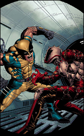
 Wolverine: Origins #19
Writer: Daniel Way
Artist: Steve Dillon
Colorist: Avalon's Matt Milla
Letterer: VC's Cory Petit
Cover: Marko Djurdjevic
Review: drqshadow
Since the death of Captain America, Wolverine has been doing a lot of thinking about his interactions with the icon. The two actually have a lot in common: a magnetism to battle, a strong sense of justice and feelings of displacement in modern civilization. And, having crossed paths more than once in the past, there's a lot to reminisce about. The current story arc in Origins focuses on Logan's memories of one such run-in.
Daniel Way's take on that chance meeting between Cap and the Canucklehead is a nice nostalgia trip. He drops both characters, seemingly at random, into the midst of an early assembly from the then-fledgling HYDRA organization. Through Logan's memories, he actually builds the group up significantly � he's pointing out the organization's similarities to the Nazi party, praising their leadership and strategy and presenting them as a real force for the first time in ages.
Even more appealingly, he's doing so with a minimum of words. Way seems to have a knack for this; throughout his run on this series, he's never overwhelmed the reader with needless explanation or description. He sticks to dialog, both internal and external, and leaves the particulars to the artist. He really understands the medium in this sense, and his work is a breeze to read and enjoy.
Steve Dillon's artwork is kind of an acquired taste. I know I wasn't crazy about it when I was first introduced to it in the pages of Preacher, but after only a few issues I couldn't imagine that series succeeding in anyone else's hands. He brings a wealth of personality to each character he illustrates, no matter how faceless or unimportant they might be. Take the horde of HYDRA underlings in this issue, for instance � for all intents and purposes, they're a bunch of clones, only there to blindly serve their master. But in Dillon's hands, we see that they're each unique underneath those masks. One soldier's eyes even betray a sense of fear and uncertainty. The artist has a tremendous knack for establishing and maintaining that individuality, whether he's working with a central character or an underling.
One thing he's never been great with, though, is superheroes. He can put together a fist fight that'll knock your socks off, but if there's a guy there in spandex, something looks weird. In his most high-profile gigs, he's been fortunate to avoid these situations; Preacher and Hellblazer didn't feature many non-civilian characters, and even Logan is running in street clothes throughout this issue. Cap, on the other hand, is in full red, white and blue regalia, and as a result something's off. It's not enough to cripple Dillon's effort (in all honesty, it's largely some of his most consistent stuff), but it is distracting and that's a shame.
Origins is in a unique position at the moment, in that it's revealing untold details about a period in Marvel history that's never been fully explored. Not only that, but the stories it's telling have a real relevance to the present, not just with Wolverine and Captain America, but also Bucky / the Winter Soldier. The series has had its ups and downs already, I'd written it off after a sharp decline in the storytelling about 10 months ago, but it's currently on an upswing. Borrow this from a friend and see if you can get into the mood and style of the story it's working to deliver. Chances are good you'll be back for another shot next month.
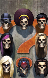
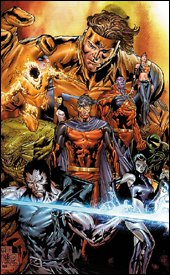 X-Men: Emperor Vulcan #3
Writer: Christopher Yost
Penciler: Paco Diaz Luque
Inker: Vincente Cifuentes
Colorists: Brian Reber and Raul Trevino
Letterer: VC's Joe Caramagna
Review: drqshadow
As the current emperor of the Shi'Ar, former Xavier student Vulcan (brother to Cyclops and Havok) is overseeing a particularly troublesome time for his people. His reign, already unpopular among the masses, falls right in the middle of a cultural war. A new race of aliens, known as the Scy'Ar Tal, is moving against his empire. They've unleashed a "doomsday device," destroying an entire planet and the billions living there, and are now threatening the very existence of all reality. Facing overwhelming odds, Vulcan has swallowed his pride and called on Havok for help.
The X-Men's fascination with the politics, warfare and civilization of alien races is something I've never been able to really enjoy. When the subject has been used properly, as in the legendary (but over-referenced) "Dark Phoenix Saga," that fixation has yielded tremendous results. When it's been misused, it's produced nothing but exotic skin colors and overcomplicated, dull stories. Emperor Vulcan is, unsurprisingly, much more of the latter than the former.
This story is filled to the brim with hyperbole, dialog that only serves to keep its characters relevant. Where the book highlights almost two-dozen characters, no more than three or four are integral to the issue's plot. The rest merely hang around and produce rambling, unnecessary contributions to the conversation and, supposedly, give the story additional depth. I think Christopher Yost expected that, by increasing the head count, he could give this story that sense of intergalactic necessity and scale. It doesn't work.
I never felt the galaxy was in any kind of peril, even if the Scy'Ar Tal were threatening to destroy the planet holding the almighty M'Kraan Crystal. I'd never even heard of the thing before this issue's introduction, and I'm sure I'm not in the minority there. If you're catering to a niche audience (X-Men fans) and only a fraction of that audience has a clue about the impetus behind this story, then you're targeting a niche within that niche. It's elaboration into a corner of the X-universe that I think would've been better off left untouched.
Paco Dia Luque's pencils continue that theme. They provide the reader with detail on top of detail, but lack the personal touch and excitement that's crucial to any comic's success. When he sketches Havok's team, sitting around a table to discuss Vulcan's proposed truce, they're just sitting around a table. There's no life to the proceedings, nothing to entertain the reader while these characters ramble on and on about the benefits and pitfalls of such an alliance. Even when the team charges into action, powers flaring, it's not an exciting read. If anything, it's even more humdrum. It's awful work, but I guess I should be glad that it's relegated to an awful book, rather than muddying the efforts of a better writer.
This is a miserable series, dealing with characters who weren't interesting enough to land a regular spot on one of the main X-books. The story is confusing and unrewarding, and the artwork is second-rate and dry. Ultimately the only thing that drove me to finish the issue was a commitment to finish this review honestly. Skip this, for all that's holy. Don't give Marvel a reason to produce a sequel.


