Is It Wednesday Yet?
06 November 2007
06 November 2007 — Here we are again with another installment of your favorite comic book review series. As always the comics you're about to read about won't be released until tomorrow (07 November 2007), so these reviews are free of spoilers and should help inform your purchases on new comic book day.
Our grading scale is simple:
Buy: An excellent comic book.
Borrow: A good comic, but save yourself some money by reading a friend's copy.
Flip Through: Give it a once-over at the comic shop.
Skip: This doesn't need to be explained.
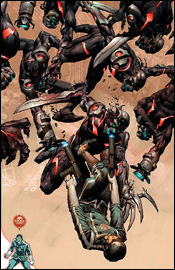 Annihilation: Conquest - Starlord #4
Writer: Keith Giffen
Penciler: Timothy Green II
Inker: Victor Olazaba
Colorist: Nathan Fairbairn
Letterer: VC's Rus Wooton
Cover: Nic Klein
Review: drqshadow
The Kree and the Phalanx, a pair of extraterrestrial races, are having one hell of a knockdown, drag-out. Actually, it's more of a slaughter: the techno-organic Phalanx have decimated the Kree, virtually conquering their entire population in record time and barricading them off from the rest of the civilized universe. As a last-ditch effort to overcome these stacked odds, the Kree have recruited a former galactic civil servant, the Star Lord, and a small group of adventurers to overthrow the opposition with a suicide mission. So far, it's worked wonderfully: one member of the team lies dead, while the others have already surrendered to the enemy.
If that sounds complicated, that's because it is. There's so much going on at any given moment in this book that I constantly found myself trying to comprehend what happened on the previous page, while the story barrels headfirst into the next meticulous proceeding. This is a much bigger problem in the first half of the issue than the second, where the characters finally quit talking and do, but it sets a bad initial tone that carries through those more action-heavy later pages.
My biggest problem was identifying with the members of Star Lord's attack squad, who admittedly didn't get much of a chance to distinguish themselves in this issue. Where the majority of this month's focus was on Mantis and Captain Universe, an analytical being with a zero on the personality-meter and a dull intergalactic superhero, respectively, the fleeting moments we got with Rocket Raccoon, Bug and the Star Lord himself were enough to tell me who the real driving personalities behind the issue should've been. There's room for growth here, if Giffen chooses to take notice.
Timothy Green II's artwork is inconsistent and tough to put a label on. When the getting's good, his stuff is downright breathtaking. He channels Travis Charest and Leinil Francis Yu at the same time, texturing backdrops and environments in the style of Yu and detailing characters' expressions and body language like Charest. While he frequently displays a mastery of these styles, he just as regularly throws his abilities into question by dropping an awful panel or page from out of nowhere.
He routinely struggles with posturing, wasting a beautiful rendering of Captain Universe early in the book with a dull, emotionless pose. His textured shading style has the potential to be incredible, but hasn't been refined to the point that it's really clicking yet. It's maddening, really, to look at the third page of this issue, which is just amazing, and then the fourth and fifth — both atrocious. If he could really hunker down and deliver 22 pages of consistent artwork (he's good for about a dozen here), Green could be a major force. Until then, he may be best relegated to covers or background assignments.
Ultimately, this is an above average book — inconsistencies, excessive details and all. Despite their subdued personalities, the team actually has a fairly interesting rapport with one another, especially in the middle of a firefight. Keith Giffen still knows how to write a nicely paced action scene, and the issue's parting shot hints at similar adventures for the team in the very near future. Borrow this from a friend if you've got the chance, it's not a long read after you've made it through the first six or seven pages, and once it starts moving, the plot provides for good entertainment.
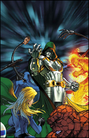 Fantastic Four #551
Writer: Dwayne McDuffie
Penciler: Paul Pelletier
Inker: Rick Magyar
Colorist: Wil Quintana
Letterer: VC's Rus Wooton
Cover: Michael Turner
Review: Tim Glancy
Sales are more important than great stories.
That is really the only conclusion I can come to when I wonder why Marvel is taking this creative team away from this book and replacing them with a superstar creative team. A creative team with deadline issues, but a team of superstars that will probably propel this book back to the top of the Diamond charts.
This issue kicks off what I believe is Dwayne McDuffie and Co.'s last arc on the book. Over the last nine issues, McDuffie has crafted a story that feels more like the Fantastic Four of old than a lot of the more recent runs, especially that of J. Michael Straczynski. Unlike some, I don't mind most of Straczynski's work, but I really disliked his Fantastic Four run for a reason I can't really put my finger on. It just felt less like a "family" and more like a collection of heroes. McDuffie, on the other hand, has managed to capture that family dynamic.
With Sue and Reed, he took the struggles that married couples face and put them on a somewhat larger scale. Sure, all married couples fight and disagree, but what happens when a couple argues over the fate of the world? The reconciliation of Reed and Sue was handled tremendously and is easy for anyone in a committed relationship to relate to. The scope is different, because while my wife and I go to Monterrey to get away, the Richards go to one of the moons of Mars, but a reconciliation trip is the same no matter where you go.
The remainder of the Four, Johnny and Ben, were shown in a new light here as well. Oftentimes, since they are used to being around family, they are shown as the jovial, almost junior members of the team. However, when paired with Storm and Black Panther, a more mature pair shows up in battle, and it's nice to see. Sure, there are still the moments where they try to get on one another, and the verbal jousting between Ben and Black Panther was some of the best moments in years, but you really felt that Ben and Johnny needed to prove themselves to Storm and Panther, and wanted to earn their respect.
Anyone worried about this team mailing it in is worrying for no reason. This arc, ominously titled "Epilogue," kicks off with a bang and does not let up, even on the last page. McDuffie even makes reference to the old school feeling of his run thus far in the first few panels in a great discussion between Torch and Thing. McDuffie once again does a tremendous job of writing these characters as a family and making sure that familiar bond is there between all four, but he also does an excellent job of turning the story on a dime by introducing the big kick in the story. The middle drag a little, thanks to some of the dialog, but it's not terribly unbearable. However, it's a small complaint in a story that is seemingly going to end up being pretty big, and if the last page is any indication, have some surprises ahead.
The art, especially the pencils, are very solid and do a good job of helping the story along. Some of the scenes are a little too dark and that does get annoying, but as a whole everything is detailed well and doesn't take away from the story at all. Another concern I had was with the colors: there's a lack of consistency between the backgrounds and costumes. The blue in the Fantastic Four's costumes changed a few times, and the same with the backgrounds.
By itself, this issue is very good, but there are a few flaws. Normally this would warrant a borrow, but I'll let them slide because it's the first issue in a storyline. Some of the slower moments are clearly there to build towards something down the line. So I'll give this a buy, but only if you grab the entire arc. Otherwise, heed my borrow.
 Howard the Duck #2
Writer: Ty Templeton
Penciler: Juan Bobillo
Inker: Marcelo Sosa
Colorist: Nestor Pereyra
Letterer: Nate Piekos
Cover: Juan Bobillo
Review: drqshadow
Howard the Duck is back in Marvel's regular rotation with a new miniseries. Last month, the feathered title character had a run-in with a pair of struggling scientists in the backseat of his cab, a disagreement that escalated into an all-out brawl with various foreign objects randomly thrown into the mix. This issue follows Howard and his longtime lady friend (and MeTube costar) Beverly Switzler's 15 minutes of fame, as a video of the aforementioned beating becomes a viral hit.
The premise is a little thin, but the book's really in its element when it's playing around with oddball humor and random situations. The way these characters float through life, oblivious to the strange shit that's going on around them, is actually a lot of fun in the same vein as Flaming Carrot. The driving force behind this comic has always been social and political satire, and on that front it doesn't shirk.
When the title character first appeared in the early 70s, the climate was perfect for that style of humor. Pop culture was in a sad state and it was fashionable to hate on the political scene. When the 80s and 90s rolled around, a lot of things changed (including the way the character was written) and Howard lost his relevance. The mindset of today's world bears a striking similarity to that of the 1970s, though, and writer Ty Templeton has noted and reacted to those social changes by returning the character to his jaded, sarcastic roots.
I realize that's probably a lot more elaboration than is necessary for what's ultimately a cartoon about a humanoid duck and his overly buxom partner, but those underlying themes are ultimately what keeps the book moving. When the duo make an appearance on a faux- Bill Maher late night panel discussion, for instance, the satire kicks into overdrive and the issue finds its groove. Templeton has a firm grasp of what makes this character relevant, and he's venting most of the public's shared disdain for the current state of things by presenting a parody of pop culture that's shockingly similar to the real thing.
Juan Bobillo's artwork does a fine job of masking the issue's venomously sarcastic mood with a bright, colorful façade. He brings a lot of flair to the proceedings, and the no-rules nature of the story allows him a lot of creative liberty that would be lacking in a more structured, serious book. In those situations, where the plot couldn't have contained more than a simple instruction like "Howard climbs aboard the wooden train with a Taser in his hand," Bobillo takes control of the story and grants it a personality all its own. He's giving us wild, tilted camera angles, great silhouettes, stylized backdrops and surprisingly developed characters, which somehow match the mood of the story perfectly and bring it to life.
This isn't tearing down any walls or anything, it's not a landmark achievement in the art of comics, but it's still an entertaining read. If you're as fed up with the current state of society as I am, whether it's the 24-hour Paris Hilton watches on CNN or the talking heads on Fox News who press their own agendas ahead of the facts, Ty Templeton shares your pain. Don't be ashamed to ask a buddy if you can borrow this; it's lots of fun wrapped inside of a genuinely relevant package.
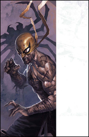 Immortal Iron Fist #8
Writers: Ed Brubaker and Matt Fraction
Artist: David Aja and Kano
Colorist: Matt Hollingsworth, David Aja and Kano
Letterer: Dave Lanphear
Cover: Jelena Kevic-Djurdjevic
Review: Tim Glancy
Every so often a critically acclaimed series will be released, yet I completely miss the boat. It's not that I overlooked the first few issues of Iron Fist. I actually own them, and even read the hardcover upon its release. I simply don't get the series.
So when Mike sent me my comics this week and I saw that Fist was one of them, I was actually pretty pleased list. I figured it was a great opportunity to see if I was crazy or if this book just really isn't for me.
Turns out I'm not crazy.
Ed Brubaker, should he ever be searching the Internet for seedy material and stumbles upon my reviews, is going to think I hate him. Ed, I loved the issue of Daredevil I reviewed. It was awesome. Your Captain America stuff is awesome as well. You write mystery and espionage and intrigue better than anyone else writing comics right now. However, I don't think martial arts are your strong point.
The action in this issue centers around a martial arts tournament held in a mythical city. Besides one really good fight, it's quite hard to follow. I think this issue suffers from the same thing that his X-Men books suffer from: he's better at suspense than action.
The book also tries too hard to tell stories in multiple times and locations, resulting in a muddled story. Is this fight in the current tournament, with the current Iron Fist, or in the past? Is Iron Fist in the tournament or looking elsewhere for whatever he's searching for? And what exactly is he looking for? And who are all these people? Maybe it's my fault for not keeping track of the story to this point, but for the life of me I could not get sucked into this book. I tried. I even printed this instead of viewing it in my PDF viewer, and I still couldn't do it. I could not make heads or tails of this writing.
The art is serviceable, but I had some issues here as well. A lot of times, I had no idea who was who. Part of that falls on the writing team, but the artist was not doing a great job of making these characters standout from one another. The best example of this is Luke Cage. Cage is a character who is pretty unique in comics, and if not for the beanie and bad attitude, I would have had no idea who he was. And Misty Knight is apparently a white woman. I have a Heroes for Hire trade paperback right here at my desk telling me otherwise, but sure enough in here she is white. Or some other nationality, but certainly not African-American. The fight scenes, however, are beautiful and really well done. Even though the writers gave me little reason to care about the characters, when I knew who they were, the artist drew some beautiful fights. I really take my hat off to them.
Once again, I am left bewildered as to why Iron Fist is a critical smash. Maybe everyone else is right, and I am just too negative. Personally, however, I think it's just different strokes for different folks. I love big, sweeping action comics with a fast pace. This wasn't that. So, personally, this is a skip. Now I just need to keep running away from Ed Brubaker.
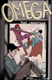 Omega: The Unknown #2
Writers: Jonathan Lethem with Karl Susnak
Artist: Farel Dalrymple
Colorist: Paul Hornschemeier
Letterer: Farel Dalrymple
Cover: Farel Dalrymple
Review: drqshadow
Without a "previously in" blurb, this book assumes that you've read the first issue (I haven't) and that you'll be able to hit the ground running alongside the story (I couldn't). The primary characters have a strained relationship to say the least, and the majority of this issue is spent establishing how awkward they are around each other and their ineptitude at the most basic forms of conversation. Meanwhile, in the background of most of these scenes, there's a superhero fight in the streets.
It says a lot that the non-powered characters don't even deem this to be worthy of closer examination (or even surprise), and that opens up a few interesting possibilities for future storylines (a world where superpowers are the norm, so run-of-the-mill that two guys throwing each other into buildings is as everyday as a traffic accident). Unfortunately, because that possibility isn't really explored in this issue, it only serves to cast a deadening tone over the book. If the everyman characters don't see anything worth getting excited over during a quick battle between superhumans, why should the readers?
Farel Delrymple's artwork is very loose, to the point that it seems quite hurried. It reminds me a lot of the style common to DC's early Vertigo books in the first half of the 1990s: very straightforward, very old school and more than a little outdated. His paneling style is straight out of a textbook, adhering to a strict grid, and while he grants his characters a fair amount of individuality and personality, there's no emotion in what he brings to the page. I don't think this issue could've taken him more than a day or two to layout, and it shows. I think he was aiming for a quaint, simplistic style that would help him standout from the pack, but instead it feels more like a loose series of proposed layouts than a finished book.
Delrymple doubles as the issue's letterer, which works as both a positive and a negative. On one hand, this association ties the style of the lettering directly to the light, airy style of the artwork, giving the book a single, unified look and feel. On the other, that look and feel really isn't anything to get excited about. The artist's lettering is far from professional grade, especially compared to his computer-aided modern contemporaries. It's too thick, tougher to read than most of the books on the shelves today, but I can't say it lacks personality.
That's something I could say for this book as a whole. It's trying so hard to have a unique take on an overanalyzed concept that it loses sight of simply telling an interesting story. The artwork wants so badly to be noticed among its more dynamic peers that it goes too far in the opposite direction and comes off as unfinished and unrefined. There's still room for growth here, and the slow-paced story is laying the groundwork for a few longstanding plot threads. Still, it's a long way from fruition and I'm not entirely sure the series is doing itself any favors by taking such a slow moving approach one issue into its existence. Flip through this on the store shelves and see if it's your cup of tea. I remain ambivalent.
 The Order #4
Writer: Matt Fraction
Penciler: Barry Kitson
Inkers: Mark Morales and Jon Sibal
Colorist: Dean White
Letterer: Artmonkeys Studios
Cover: Barry Kitson
Review: drqshadow
As California's representative of the Initiative, Tony Stark's dream of housing a government-trained superhero team in every state of the union, The Order is an important squad. As government-appointed guardians of one of the most populous states in the union, they're the closest thing to a public face the Initiative has, and as such are under tremendous public scrutiny every time they make a move. Recently, that's been more of a curse than a blessing, as the team caught hell for unwinding after a battle by holding a drunken party and various members have begun to crack under the pressure inherent in such a high-profile gig.
The big problem with this story, and with the ongoing story of the Initiative as a whole, is in the sheer number of previously undeveloped characters involved. Before this issue, what was Anthem doing with his life? Had anybody even heard of the Supernaut? What about Calamity? It's a collection of new faces and also-rans, and it's tough to empathize with them when I've never heard of them before. Writer Matt Fraction is a guy I've been a big fan of thus far into his career, but he isn't given a whole lot to work with as far as star power is concerned.
Fraction takes an approach to his characterization that's very similar to Marvel contemporary Brian Michael Bendis. He takes these larger than life action heroes with superpowers and gives them a decidedly human slant, giving them lengthy opportunities to introduce themselves to their readers and distinguish their personalities from the pack. The first two pages are a frank discussion with Veda, a former Hollywood starlet-turned superheroine, and provide tremendous insight into her motivations. Unfortunately, Fraction can't exactly fill the book with these "getting to know you" segments, and when the focus shifts back to the battlefield we're left with one recognizable face and six nobodies.
Barry Kitson's artwork is solid throughout this issue, never something I'd call spectacular but always impressive. His treatment of the women of this issue frequently reminds me of the work of Frank Cho. Where the trend in the past was to illustrate superpowered ladies as tits, ass, legs and muscles, Cho and Kitson share a softer, more realistic approach. The T&A is still there, for better or worse, but much more attention is paid to the characters' faces and surrounding physique. Rather than inhuman androids with off-center nipples and blank facial expressions, these women are confident and intelligent. Their musculature doesn't look out of place; they just look like they hit the gym a lot.
This is a book that could really do something with a more identifiable cast. I'm not even talking about upper-tier characters here. Even a former West Coast Avenger castoff would be enough. The story just needs one or two faces with some visibility. Matt Fraction is slowly building a good story here, but that lack of star power is really holding it back. The one page in which Tony Stark appears is probably the most successful of the book, for that very reason. He brings a recognizable personality to the proceedings, and when that bounces off of one of the team's unknown characters, good things happen. Without that kind of presence, the book feels wishy-washy and kind of dull. Flip through this, think it over and maybe give it another look in the event of a shakeup in the cast.
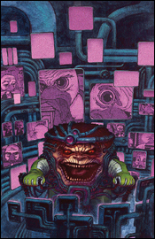
 Super-Villain Team Up / MODOK's 11 #5
Writer: Fred Van Lente
Penciler: Francis Portela
Inker:Terry Pallor
ColoristGuru-EFX - E
Letterer: Nate Piekos
Cover: Marko Djurdjevic
Review: Tim Glancy
A few months ago, I reviewed an issue of this miniseries and wasn't exactly kind. While I thought that the writing and art were serviceable, I saw little reason for the miniseries to exist. Though the idea was novel, the execution was lackluster. In fact, I would guess Marvel was attempting to capitalize on the "let's put an obscure character with a cult following in a miniseries" trend. Some of these work, but most are terrible. Both companies are guilty of this, but at least DC is tying these miniseries into a larger event — thus giving them some purpose.
Going into this issue, I was understandably underwhelmed. I thought that the ending would be fairly mundane — pedestrian even — with no lasting impact at all. We have seen it for years: comic books companies pumping minis out for no reason other than to make a quick buck. In recent years, it feels as though you could read six or seven books in the Marvel Universe and know what was going on, so why bother reading a miniseries featuring some random X-Men? Sure, you might get the occasional fun mini, but for the most part they are mundane — at best.
It seems like Super-Villain Team-Up might be bucking that trend.
It was refreshing to read an ending that could very well spill over into the main Marvel Universe. It's also nice to read a series ender that ties every hanging plot thread together. Fred Van Lente crafted a story from issue one that was full of twists and turns, and each of those twists are explained here as the plan is revealed. Van Lente also manages to take a group of terrible people — seeing as these are all villains — and separates the truly evil from those who are strictly bad by circumstance, and does an admirable job of making that very clear. Dialog wise, Van Lente can be a little heavy-handed and just all around hokey. It was almost like reading the script to a 90s action movie. And not a good action movie, but the kind with a bunch of hot chicks shooting guns and getting naked.
Artistically, the characters are handled well, but other details are lacking. Some of the issues I previously had with the book have been corrected, but not everything is perfect; some panels are still odd, but they're fewer in number. This time around the art held my interest; last time it pulled me away, so that's something of an improvement.
Like last time, I am going to recommend that you borrow this bad boy. The book has improved, but not enough to warrant a purchase.


