Is It Wednesday Yet?
16 October 2007
16 October 2007 � Here we are again with another installment of your favorite comic book review series. As always the comics you're about to read about won't be released until tomorrow (17 October 2007), so these reviews are free of spoilers and should help inform your purchases on new comic book day.
Our grading scale is simple:
Buy: An excellent comic book.
Borrow: A good comic, but save yourself some money by reading a friend's copy.
Flip Through: Give it a once-over at the comic shop.
Skip: This doesn't need to be explained.
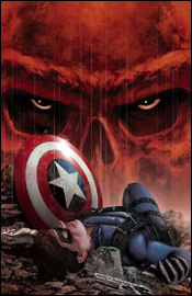 Captain America #31
Writer: Ed Brubaker
Artist: Steve Epting
Colorist: Frank D'Armata
Letterer: VC's Chris Eliopoulos
Cover: Steve Epting
Review: drqshadow
Ed Brubaker and Steve Epting's recent run on Captain America has been a roller coaster. Not only have they removed the title character from the proceedings, killing him off in issue 25, but they kept the book fresh and arguably improved it. With Marvel's recent announcement that the star-spangled Avenger will be making a glorious return to his own title in three short issues, we can expect a few wheels to begin turning on that front starting this month.
One of my biggest gripes about the last issue of Captain America I reviewed was that too much was going on at one time. Ed Brubaker's writing was great, but there was so much jumping around, so many different plotlines intertwining with one another in just 22 pages, that I found myself overwhelmed and lost. This issue confronts those flaws and erases them, focusing on one particular story (the Winter Soldier's captivity and attempted brainwashing) with a few interspersed asides. The end result is a format that's much friendlier to new eyes, a story that I could sit down and enjoy without struggling through a six paragraph "previously in..." blurb.
The slower pace allowed me to appreciate the strength of these characters more than I did when the story was more spread out. This issue is primarily a reactionary tale, with the Falcon and Tony Stark discussing Sharon Carter's betrayal, the Red Skull introducing himself to a new army of followers and the Winter Soldier struggling with his past. With a thinner supporting cast, this issue may not have been possible, but this is when all of the work Ed Brubaker's done in the build-up really starts to pay off. Although very little of consequence actually happens in this issue, especially compared to the last few months, it's still an outstanding read. The characters have begun to fend for themselves, now all Brubaker needs to do is drop them into a situation and allow them to react.
Steve Epting's artwork is something of a paradox: it's exceptional in the all-too-brief warped flashbacks that frequent this issue, but a step or two below when the dialog returns to the present. The way he treats Cap and Bucky during World War II is downright gorgeous � the skies a dark grey haze of smoke and dirt, the fallen soldiers and shell-shocked vehicles he's left abandoned on the cold city streets, the American icon's silhouette in the background as Bucky leads the charge into a foxhole. His love of this era is blatantly obvious, so much that it detracts from the panels that follow, as they can't hope to meet the lofty expectations he set for himself from the outset � which is fine, because in its current format, this book doesn't really need flash and flair. It needs substance, atmosphere and legibility, which Epting doesn't hesitate to deliver. His work is technically sound, his characters identifiable, his storytelling classical. He's a nice match for this book, and while I occasionally wished for a little more excitement to match the situation, what he delivered in its stead was perfectly acceptable.
This is a damn good book, and surprisingly one of the publisher's most understated. With everything seemingly in place for the big event in just a couple short months, the next few issues could prove to be "can't miss" books. I'd recommend you buy this one � it's addressed the problems I previously had with it as a reader and seems to be on the verge of greatness.
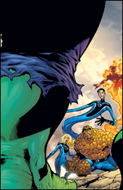 Marvel Adventures Fantastic Four #29
Writer: Steve Niles
Penciler: Leonard Kirk
Inker: Kris Justice
Colorist: Lee Loughridge
Letterer: Blambot's Nate Piekos
Cover: Leonard Kirk
Review: drqshadow
As the most accessible book in the Fantastic Four line, Marvel Adventures Fantastic Four focuses on out-of-continuity stories of the team, generally of a historical perspective. In this issue, for instance, Steve Niles tells us about an early confrontation between the team, the Hulk and General "Thunderbolt" Ross. There's no need for an elaborate backstory, since the characters are already familiar to so many potential readers, so the writer can focus less on wordy explanations and more on delivering a simple, exciting tale.
Niles has a firm grasp of the lighter moments the four frequently share. Ben Grimm is distracted mid-sentence by a nearby dishful of candy. Sue warns the team to avert their eyes while Reed is "doing the eye thing," presumably bugging his eyeballs out to inspect a bit of hardware in greater detail. It's the little things that make his story such an entertaining throwback of a read, that give the reader a sense of familiarity and association with these heroes.
I'm not sure how long the Thing's word balloons have been treated with jagged edges or if this is a recent development, but it's really distracting and unnecessary here. I was constantly mistaking his lines for thought balloons throughout this issue, which in turn took me out of the story while I tried to figure out which dialogs were internal and which were Ben's. The cardinal rule of a good letterer is to play their role nearly invisibly, so thumbs down to Nate Piekos for breaking that law here.
Fortunately, Leonard Kirk's artwork generally atones for most of the letterer's sins. His style is subdued and legible at some moments, dynamic and explosive at others, depending on the mood chosen by the storytelling. While he occasionally gets a bit too playful for his own good (how much time can Reed possibly save by stretching his neck out 40 feet in front of the Fantasticar, greeting a guard at the gate before the team arrives?), these indulgences are par for the course as far as the Fantastic Four is concerned. I'm not crazy about his rendition of the Thing, who comes off a bit too gorilla-like for my taste, but he's at least got the right texture and the rest of the team looks great.
Kirk is at his best during a fast-paced action segment, as evidenced by his illustrations of the team diffusing a skyscraper fire in this issue's opening pages. As a reader, I can sense the urgency of the moment through his light, shadow-focused linework in these situations. He doesn't weigh things down with a bevy of unnecessary details � he just delivers the pertinent information, fills the panel with motion (usually Johnny's fire-tail while he's in flight) and lets the characters do the rest of the talking. There's a lot about his style that reminds me of Andy and Adam Kubert, particularly the simple, energetic way he'll render characters at a distance. The brothers are masters at delivering a signature pose or tiny bit of body language in this kind of small, afterthought of a panel, and he follows their lead perfectly in that regard. I wouldn't be surprised at all to discover he's a graduate of their dad's school.
There's not a lot of weight to this issue, but that's all right because they can't all be multi-issue epics. There's a time for giant events and it's not every month � that's something that a lot of books have lost sight of lately, and something that Marvel Adventures Fantastic Four only shines a brighter light upon. Not all that long ago, this kind of a short, simple, entertaining read was the norm. Today it's the exception, and I'm not sure if I'm all that happy about the situation. That's not the fault of this book, though, as it achieves exactly what it sets out to do. It's a no-strings-attached joyride through a simple chapter of the Marvel story. I was pleasantly surprised by Leonard Kirk's artwork, found Steve Niles's story entertaining and closed the issue with a smile on my face. It gets a bit hokey at times and the tone of the tale won't be for everyone, so I'm recommending you borrow this issue and see if it's down your alley.
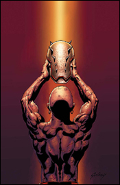 Penance: Relentless #2
Writer: Paul Jenkins
Artist: Paul Gulacy
Colorist: Rain Beredo
Letterer: VC's Joe Caramagna
Cover: Paul Gulacy
Review: drqshadow
Formerly known as Speedball of the New Warriors, Robbie Baldwin became Penance during the superhero Civil War and basically flip-flopped his personality in the process. Stricken with guilt over the Stamford incident, Penance punishes himself by wearing a wardrobe that's spiked both on the exterior and the interior. Personally, I really didn't care all that much for this character when he was the goofy guy with the power to create colored spheres � but from what I read of it during Civil War: Front Line, I'm not sold on his new personality, either.
This story has a few bright points � Paul Jenkins works beautifully with Norman Osborn, Baldwin's supervisor with the Thunderbolts. The former Green Goblin, now subservient to Tony Stark, constantly battles his urge to tear into his superior at the first sign of a perceived disrespect. The nanites running through his bloodstream prevent him from acting on these impulses, and the effect it has on his personality makes for some interesting reading. Jenkins also treats Robbie's "suiting up" rather well � the scene is short, only a single page long, but both uncomfortable and borderline painful to read.
Jenkins's main ongoing plot just wasn't all that interesting, though. Penance isn't deep or interesting enough to carry a story by his lonesome, at least not yet. The writer compounds this problem by dropping Baldwin into a situation where he's hunting and confronting a character who's even less important than he is: the Robot Master. Tony Stark's inclusion in this issue and his frequent confrontations with Norman Osborn are really the only threads of any interest here, and they're treated almost as afterthoughts. I guess you can't really call the book Stark and Osborn Illustrated, but if you remove them from the picture there's literally nothing of value here.
Paul Gulacy's artwork wasn't really my cup of tea. His work is a bit too pedestrian and realistic for my taste, giving Iron Man a strange, out-of-place appearance with his bright red and yellow suit of armor (sans helmet) alongside a dozen businessmen in suits and ties. He treats Osborn beautifully, detailing every war-worn detail, blemish and wrinkle of the mastermind's face, but that's perhaps his only true success. On the large, I found his style drab and dull, and that what praise he's due for the personality he delivers to each character is quickly countered by his work during the issue's action scenes. When Penance is facing off against a dozen robots midway through this issue, Gulacy's contributions are downright awful. To his credit, though, the artist has a great understanding of the title character's new wardrobe. He really makes it work for a few pages in the darkness near the end of the issue, allowing the brief spots of light to play with both the reflective surfaces of his armor and the warm, fleshy leather that surrounds it, but from my perspective that was a case of too little, too late.
I wasn't expecting all that much from this title, and with a few fleeting exceptions it met those expectations. Paul Jenkins tries to make something of this despite a boring title character, but only serves to temporarily distract the reader from that fatal flaw. Couple this with a wholly mediocre artistic contribution, and I think you can safely skip this release.


