Is It Wednesday Yet?
07 August 2007
07 August 2007 — Here we are again with another installment of your favorite comic book review series. As always the comics you're about to read about won't be released until tomorrow (08 August 2007), so these reviews are free of spoilers and should help inform your purchases on new comic book day.
Our grading scale is simple:
Buy: An excellent comic book.
Borrow: A good comic, but save yourself some money by reading a friend's copy.
Flip Through: Give it a once-over at the comic shop.
Skip: This doesn't need to be explained.
 Amazing Spider-Girl #11
Writer: Tom DeFalco
Penciler: Ron Frenz
Inker: Sal Buschema
Colorist: Gotham
Letterer: Dave Sharpe
Production: Irene Lee
Cover: Ron Frenz and Paul Mounts
Review: Christopher Brosnahan
Spider-Girl is the "possible future" version of the Parker family. In said future, Peter and MJ have a daughter, May, who becomes Spider-Girl. The big event happening recently is that Carnage has returned, with an unknown host, and has kidnapped May's father and baby brother.
The Amazing Spider-Girl is aimed towards younger readers than the main Marvel line, and as a result is far more straightforward than the mainstream titles. It has a far more classic feel than some of the more mainstream titles as well, as a result, however, it feels a lot more dated.
On one level, going back and reading a comic in which the captions describe exactly what you're looking at on the page is a blast of nostalgia, comics haven't been written like this for a long time. Unfortunately, on the other level, there's a reason comics haven't been written like this for a long time. It's superficial. Comics can be aimed at younger readers and still be smart. Look at Runaways, for example, which aims towards the same audience, but in such a way that an older audience can easily appreciate it.
For such a light title, Spider-Girl is surprisingly harsh; Carnage tortures somebody by slowly slicing their throat (in a threatening, rather than damaging manner). And the ending is the kind of thing that is bound to disturb some younger readers. As a result, it doesn't feel like it's aimed towards kids; it feels like reading a Spider-Man title from the early 90s. And the early 90s certainly weren't a benchmark time for Spidey.
The art is workman, but there are a couple of strange points. An unfortunate decision to dress Mary Jane in a headscarf means that she looks like a Shi'ar empress. Especially with the disturbing eyebrows and somewhat manly jaw. It's "comic book" art, which is almost strange to see nowadays. And I'd swear a panel in which Peter manages to free himself from his shackles could have been traced from the sequence where Wolverine was held captive by Omega Red... and freed himself from his shackles.
It's not actively bad by any means. The characters are broad strokes, but they're generally likeable. And I can see kids liking Mayday herself. However, it feels misjudged. Just because something is aimed towards younger readers doesn't mean it needs to read like comics from another era.
Skip it, and go read Runaways instead. It's aimed at you, and it's better.
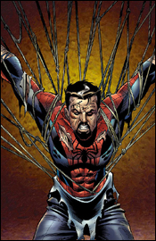
 Annihilation: Conquest - Wraith #2
Writer: Javier Grillo-Marxuach
Artist: Kyle Hotz
Colorist: Gina Going-Raney
Letterer: VC's Cory Petit
Cover: Clint Langley
Review: Tim Glancy
Every few years, I try to get into space comics. Last year was my latest attempt, and I did so with the original Annihilation story — a huge crossover that encompassed a majority of Marvels space-faring characters. The reason I wanted to check this out, honestly, was the inclusion of Nova, a character I have enjoyed since New Warriors in the 90s. I thought that his part of the saga was handled well, as was the inclusion of another fave, Ronan, but overall it felt overblown and complicated. This is often the problem I have with space books in general. Yet there is something about these books that keep drawing me back. This time, with Wraith. From what I gather, the Phalanx, who were last seen in a mid-90s X-Men crossover, have reformed and are looking to once again takeover the universe. They plan on doing so by, well, I guess, turning things into machines. How Wraith fits into this is not quite known yet, because little is known about the character. He was created to take part in this crossover and this is the second appearance of the character ever. In the first issue we learned that he had some sort of way of countering the Phalanx, and he had a weapon that could take many forms. At the end of issue number one he was captured by the Phalanx, and that is where we are now.
I was surprised by how much I enjoyed the first issue, and I think a lot of that has to do with there being no pretentious backstory to the character. There's no overbearing background to deal with and none of the other typical nonsense you get with most cosmic character. Instead we get a pretty kick ass adventure book that happens to take place in space, almost akin to the old Killraven book. Javier Grillo-Marxuach is a writer who, honestly, I had never read or even heard of before this, but I like the way he handles the character. He is crafting a mysterious character while not making him so mysterious that he becomes confusing. I also like the way he handles the inclusion of the Super-Skrull and Ronan, who were two important figures in the original Annihilation. Javier nails Ronan better than anyone I have seen in a while, and that I appreciate, because Ronan is a tremendous character when handled properly. The origin here is tremendous, and some of my favorite writing in a long while.
The art compliments the story. This is a dark tale about an equally dark hero, and the art and colors reflect that tone. The origin sequence is the perfect example, because it is a horrific story that is made all the more powerful by the art and colors. You feel Wraith's pain as he became the man we see today. The whole issue is handled well, and the attention to detail is stunning — bringing to life all of the techno characters in the book.
But the real winner here is the writing. This is a wonderfully written story that fits into the overall Conquest event, but would feel right at home if read on its own. The art is a tremendous compliment to the tale, and everyone who works on this book should be extremely proud of what they accomplished here — especially with an unknown character. For years to come, Wraith will be a major part of the Marvel Universe. And with any luck, he'll find his way into an ongoing series after Conquest is over.
This book is a very strong buy along with issue one. Get in on the ground floor, because I really think this is a creation with legs. Wraith is one of my favorite new characters in years, and so far this is among the best stories of the year.
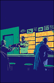 Criminal #8
Writer: Ed Brubaker
Artist: Sean Phillips
Colorist: Val Staples
Cover: Sean Phillips
Review: drqshadow
Ed Brubaker and Sean Phillips, known for collaborating on DC / Wildstorm's Sleeper, are working together again on Criminal, which delivers issue eight to the shelves this week. For Brubaker, who's been making a name for himself on superhero books of late, the series marks a triumphant return to crime-focused subject matter. But really, both creators have a great handle on telling these kinds of stories, lending a sort of authenticity and gritty realism to them without overdoing it.
In the vein of Sin City, each arc of Criminal features a different cast of characters. They inhabit the same world, share the same haunts and interact with the same people, so there's that overlying sense of unity to tie the whole thing together. This particular issue focuses on Tracy and Mallory, a sort of reverse odd couple. Tracy, the introspective, emotional type, is the muscle of the operation, while Mallory is more collected, intelligent and spontaneous. They're related strictly through their work, which happens to involve the relocation of a large amount of cash from a nearby ATM, although the relationship quickly moves forward from there.
Brubaker knows how to flesh out these characters; by the end of the issue, I felt like I'd known Tracy and Mallory for years. His finest gift is an excellent capacity for basing things in the real world. There's no master plan for the theft that provides the initial spark for this story, just a fair amount of common sense, a little brawn and a plenty of personality. The characters don't talk to each other like a pair of cardboard cutouts with prerecorded monologues, they chat like regular folks. Their moods shift, they misunderstand each other, they make fun — anything to take their minds off of the risky business at hand.
If you're worried about jumping in midway through a story arc and losing all sense of direction, erase that thought from your mind. Although this issue is the third in a five-part storyline, it functions wonderfully as a standalone tale in its own right. There's enough going on in the background to pique your curiosity about what's come before, though it's never a big enough part of the tapestry to overshadow the main storyline.
The artwork of Sean Phillips provides an excellent counterpart to Brubaker's script. In true crime noir fashion, much of the rendering is done by the shadows. Even surrounded by a glistening coat of fresh snow this city looks grimy, foreboding and intimidating. He lends each character a look and feel all their own, provides a nice variety of angles and visuals, works wonders with the concrete jungles in the backdrop and doesn't jump up and down screaming for your attention when he doesn't need to. His work with Tracy is particularly great, as he'll carry an entirely innocent expression in one panel, then shoot a glare like a pitbull backed up against the wall just a few pages later. Outstanding range, good grasp of the characters' personalities — good stuff.
This is a great little crime book. It provides excellent pacing, strong characters, solid artwork that fits the mood and a good balance between gunfire and conversation. It's got some adult content, so you're going to want to keep it out of the kids' hands, but it's never gratuitous. Either buy this right now and savor the wait between issues or hold off for the collected edition and enjoy it all at once on a lazy Sunday afternoon. Just don't forget about it, because books like this one deserve the attention.
 Daredevil #99
Writer: Ed Brubaker
Artists: Michael Lark and Stefano Gaudiano
Colorist: Matt Hollingsworth
Letterer: Chris Eliopoulos
Cover: Marko Djurdjevic
Review: Christopher Brosnahan
In the fifth and final part of the "To the Devil, His Due" storyline, Matt finds out who has been behind the Gladiator's recent personality change, and it's not what he expected. The return of a past figure puts those close to Matt in far more danger than anyone could predict.
This has been a superb storyline, which makes possibly the longest unbroken run of excellent storylines I can remember a single title ever having. Seriously, since Brian Michael Bendis took over, I can't remember a down point in this series. Some might have expected a hiccup when the creative team changed 18 issues ago, but Ed Brubaker's transition has been so seamless. It's astonishing.
This storyline in particular has followed one of my favourite storyline structures, which may well be why I'm quite so enthusiastic about this. The protagonist finds himself in a small situation, which leads to him finding out more about a larger plot, building to a climax where he realizes that he is entirely out of his depth. Mix this with the "dawning realization" on the reader of just what is going on, and it's as satisfying a comic book as I've read in a long time.
One of my favourite storyline points in the past 15 years was the dawning realization during the build up to the Onslaught saga. The protracted breakdown of Xavier, with the huge storyline twist of Onslaught being his repressed darker side, was done in such a way that the reader realized what was going on a few pages before it was explicitly said. The effect is the rising excitement in the reader as they make their way through the book. For me, this is so much more effective than the usual random encounters that lead to fights.
Daredevil #99 does this better. Not necessarily as spectacularly, but having read this yesterday and given time to think about it, I like this one better. While the build up to #100 didn't start off in such a way that it was going to be a huge event, now it's just become the top of my "must-reads" for the next month.
The art is also consistently gorgeous, not least because it never tries to impress. It tells the story, and it does so economically. But it does so in such a way that doesn't try to push itself over the writing. They complement each other in a way that few titles do.
If you read comics, and you're not reading Daredevil, you're missing out on the single most consistently strong comic on the shelves today. It may not be as flashy as some other comics and it may not tie as strongly into events as other titles, but if this was a TV show, Daredevil would be the one that everyone keeps talking about — and you feel left out of the conversations because you've not watched it yet. So sit down to take the time to read it. In other words, definitely buy it.
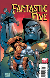 Fantastic Five #3
Writer: Tom DeFalco
Penciler: Ron Lim
Inker: Scott Koblish
Colorist: Rob Ro
Letterer: Dave Sharpe
Cover: Clayton Henry
Review: Tim Glancy
Sometimes, no matter what, there is no way to improve on an original. Two weeks ago, when reviewing Ultimate Fantastic Four, I professed my love for the original Fantastic Four stories and the series in general. I think that if you go back and read the Fantastic Four from the early years through today you'll see a book that is fun, packed with action and is one of the most influential comic books ever created. So why Marvel is always trying to muck with the formula and re-imagine these characters and stories is so far beyond me it's almost coming back around.
What we have with the Fantastic Five is a story set in the same possible future as Amazing Spider-Girl. Apparently Doctor Doom has escaped from Atlantis, where Namor was holding him captive, and he has regained the Power Cosmic. This of course leads to the traditional Doom vs. Fantastic Fo... Five battle. Tom DeFalco is handling story chores, and it reads like a lot of the writer's others stories from the last 15 years. That's not to say it's bad, but you know that you aren't going to be breaking any new ground here. There's going to be some fights and a twist or two along the way, but everything will be pretty much back to normal by the end of the series. He handles the characters well enough, but you would think that over the last couple of decades the characters would have changed a little bit. Instead, we still see Ben trying to solve his problems by clobbering, Mr. Fantastic making decisions for what he thinks is the best without consulting anyone... and so on. Every character is virtually unchanged from their current, in-continuity counterparts. The other problem I have is that Doom spends so long posturing and fighting Ben that there is little in the way of plot development and story progression. DeFalco does a great job with explaining how Doom is using the power he has and what he wants to do with it, but we don't see any of that until the last few panels, where we also see a sudden decision made by Richards. By the third issue in a five-issue story, we should be further along than this. The dialogue also feels very heavy-handed, as if it jumped right out of Fantastic Four #389 — or any FF comic from that era.
Ron Lim's artwork adds to the throwback feeling. Lim is a talented artist, and his style fits this book very well. He handles the characters well and helps maintain a lighthearted feel to the story, but his backgrounds and attention to detail are pretty average. And they vary from panel to panel. Sometimes he pays a tremendous amount of attention to details, including items in the background — especially in an early panel in Reed's armory. Other times he just seems to throw a solid color up in the background. The colors are good throughout the book, to Rob Ro's credit, and they feel as though they fit with the rest of the book. However, the inks are a bit heavy and distracting in places. There were some panels where I thought that the characters were wearing some sort of force shield that was supposed to be demonstrated by a thick black outline. The inks also make the characters stand out from the background, giving off a 1950s blue screen vibe.
What we are left with is a story that is not very good and art that is really hindered by the inker. I understand what they were going for here, and I think there could be mileage in these characters. But for it to work a more modern creative team is needed, especially on the writing side. This really just feels like a mid-90s Fantastic Four story cloaked in a Fantastic Five banner. Flip through this one, because towards the end there is a pretty cool two-page splash, but don't read it — it will be time out of your future you won't get back.
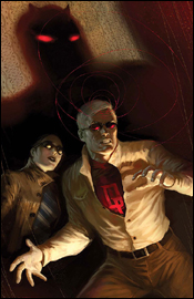
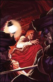 Marvel Illustrated: The Man in the Iron Mask #2
Writer: Roy Thomas (adapted from the novel by Alexandre Dumas)
Penciler: Hugo Petrus
Inker: Tom Palmer
Colorist: June Chung
Letterer: Joe Caramagna
Cover: Marko Djurdjevic
Review: Christopher Brosnahan
When I grew up, two of my favourite comics that I owned were outsized issues of Classics Illustrated. One of Frankenstein and one of War of the Worlds. The adaptations were skillfully done, and the art was rendered in a totally different style to the majority of comic book fare.
Reading one as an adult is a fun nostalgic experience.
Here too, the adaptation has been done skillfully. The story is told simply, without embellishment, and yet manages not to skim too much on what actually happens. Obviously, with a novel that has a higher rate of action than, say, a James Joyce novel, this is far easier to do. (And now, I want them to try and adapt something totally unsuitable, just for my amusement.)
The art is gorgeous. Not in a "Wow" way, but in the way that the characters are all easily distinguishable, and tells the story simply. For a Classics Illustrated-like comic, it doesn't need to be visually stunning — it needs to be about characters and storytelling, and it pulls this off superbly.
It's not imposing either, something that I would be wary of with aiming classic stories towards a younger audience. But while there is far more dialogue than most comics, it's clear, it's uncluttered and it's easy to read.
I'm not going to criticize the story, because that's difficult to do with this kind of comic. If you liked The Three Musketeers, you'll probably like this. If you like intrigue, you'll probably like this. If you only like comics with lots of explosions, you may find it slow and heavy going.
More than any other book, sadly, the adverts feel incongruous. Nothing takes you out of a character's early life in the village of Noisy-Le-Sec than a big blue and red picture of Spider-Man, a bunch of people on a rollercoaster and a caption that reads, "The only place where you can live the adventure!" It's slightly distracting.
As a result, don't buy it. Flip through it. If you like the story, it's worth buying — but wait for the trade, so the adverts aren't there. Hopefully, the trades will do good business, because it's fantastic to see Marvel doing these.
 New Avengers #33
Writer: Brian Michael Bendis
Artist: Leinil Francis Yu
Colorist: Dave McCaig
Letterer: RS & Comicraft's Albert Deschesne
Cover: Leinil Francis Yu
Review: drqshadow
Brian Michael Bendis and Leinil Yu are in town this month to continue their second story arc together on New Avengers, "The Trust." I've been onboard with this series since the very beginning, and I don't think I've been nearly as excited about it as I am right now. After stumbling through a few early story arcs, the conclusion of Civil War has delivered a great shared identity to the members of this team, which has opened up a lot of storyline possibilities that just weren't there before.
The beauty of Yu's work is in the details. He'll throw in little unscripted touches like a good actor will ad-lib a few lines. When Echo signs the tab for a room service order, she does so on the delivery boy's back. Before the food has even arrived, Wolverine has somehow produced a bottle of alcohol. Most people won't even notice these things, but they work subliminally to paint a better picture. They explore little bits and pieces of the heroes' personalities, and create a more realistic environment. Not that he'd need the help, since his background work is breathtaking. When he's asked to set the mood in a seedy bar, your fingers feel dirty leafing through the pages.
Yu's also mastered facial expression and body language virtually across the board (although Jessica Jones does look entirely too skinny throughout the issue — is that a clue?), which really helps to clear the page of unnecessary word balloons. Why clutter things with too much dialog when you can tell the story through expression? His work is equally at home with civilians and superheroes, and they don't look awkward interacting with one another.
One of the biggest advantages of the two ongoing Avengers books sharing a writer is how effortlessly the two can reference one another. Bendis delivers a brief mention of the happenings in the latest issue of Mighty Avengers midway through this issue that's amazingly insightful, interesting and downright cool — and it takes a grand total of five panels, start to finish. It's barely half a page, but it's enough to remind you that there's always something going on in the greater Marvel Universe, that the two teams are aware of one another and that these guys really do exist in the same plane of existence even when they aren't face to face.
That's something that used to be so unique about the mighty Marvel line in its heyday; even if you bought an issue of Spider-Man, there was a good chance you'd see another character making a guest shot or at least getting some sort of mention. The heroes were always conscious of each other's activities, which made the whole world feel much smaller and more interesting. The practice was lost for quite a while as the stories' themes grew more complex and mature, but Bendis has reminded us of it perfectly here. Not only that, but he's proven that it can work even within the guidelines of a smart, intricate story.
This issue is almost entirely character-driven. Having blown through the last few chapters with ninjas, superhuman duels and the threat of open interplanetary warfare, it was nice to settle down and just get to know these characters a bit better. The team bickers like a room full of school children, as many adults are prone to do in high-pressure situations, and it keeps the book on its toes. It's boring to watch a team that gets along like a happy family, and New Avengers has never been better.
Of course, it's not all chatter with no fireworks. An old, forgotten B-level hero from the 90s makes a return to the funny pages in this issue, and Leinil Yu illustrates him better than I've ever seen before. A new pair of villains are introduced as well, and make an immediate impact on the proceedings. If the last panel is any indication, this issue was merely the eye of the storm and the action should escalate once again in New Avengers #34.
This series is really starting to kick some ass right now, and remains one of my favorite monthly reads. Brian Michael Bendis somehow manages to get every member of the team involved in the dialog without forcing anything, introduces tiny new plot threads for the public to paw at, acknowledges the activities of the pro-reg Avengers team and wraps it all up in just 22 pages. There's enough meat here to satisfy my appetite, but enough clean air to keep the book from feeling too weighty and dialog-ridden. You should be tripping over your own two feet to buy this. It's outstanding work.
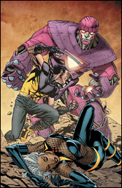
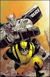 New Avengers / Transformers #2
Writer: Stuart Moore
Penciler: Tyler Kirkham
Inker: Sal Regla
Colorists: Annette Kwok and Blond
Letterer: Todd Klein
Cover: Jason Pearson
Review: drqshadow
Stuart Moore and Tyler Kirkham are in with the second of four planned issues in Marvel's New Avengers / Transformers gathering. The membership of both teams is a little goofy here, with the Avengers appearing in a modified pre-Civil War incarnation (Sentry is MIA, however, replaced by Ms. Marvel and Falcon) and the Transformers themselves arriving in very limited numbers. The entire face-off occurs over the backdrop of a Latverian / Symkarian war, which means Dr. Doom is in on the fun, too.
I'm not entirely sure why this crossover was necessary. Granted, the Transformers motion picture is in theaters as we speak, so I suppose any opportunity to take advantage of that momentum is reason enough, but I can't really grasp the logic here. It's a very by-the-books meeting: random circumstances bring the two teams together, a misunderstanding forces them into battle, cooler heads prevail and they reunite to battle a common foe. I don't think that plotline was very interesting the first time I read it — about 15 years ago.
As a whole, the story and artwork are both quite unremarkable. Much of the issue reads like filler, there to needlessly complicate and elongate the storyline, and when I finished the book I wasn't really sure what had been accomplished. I don't think Stuart Moore has more than a passing knowledge of either team's longstanding mythos, as evidenced by the heroes' words and actions. The Avengers don't work together as a unit or put their individual strengths to good use, they sail into battle with a bloodlust. Optimus Prime reminds his crew to avoid fatally wounding the humans at all costs, then immediately fires at Cap's head. There's no personality, no characterization, no familiarity, just two teams of empty shells wearing familiar wardrobe. The Decepticons' master plan is flimsy at best, and leads the reader to wonder why they'd travel such a great distance to see it through to completion. Surely there must be easier, less risky methods of acquiring energy?
Tyler Kirkham's art would feel more at home in the mid-90s, but feels dated and unwelcome alongside the more stylized work that's on the shelves today. His paneling is confusing and weighty, often distracting from what's actually going on. His work on the Transformers themselves lands somewhere between strict realism and cartoony exaggeration, when it would be better suited sticking with one extreme or the other. Instead of compassionate living beings, the Autobots have never felt colder, more metallic than they do here. Granted, he didn't get much to work with as the vast majority of the issue is centered on talking heads, but a good artist knows how to get around such difficulties. Kirkham merely passes the buck.
The Autobots spend most of the issue in their vehicular form, which is strange because they don't really do anything outside of the first three or four pages. They're just kind of parked there, speaking through their holographic human "drivers" as the story slowly drags itself toward the finish line. It's a missed opportunity to deliver a few impressive visuals — Captain America standing tall next to Optimus Prime or Iron Man chatting it up with Wheeljack — and if the goal of this series isn't to take advantage of those opportunities, I'm at a loss as to its true intentions.
Bottom line, unless you're an absolutely masochistic Cybertronian completist, you're going to want to skip this one. It's cool to see a lot of these guys sharing a panel here and there, but not nearly as cool as it was when the Transformers met up with GI Joe a couple of years ago. It's lacking in just about everything but star power, which makes its ultimate failure even more disappointing.
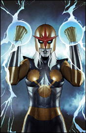 Nova #5
Writers: Dan Abnett and Andy Lanning
Artists: Sean Chen, Scott Hanna and Brian Denham
Colorist: Guru eFX
Letterer: VC's Cory Petit
Cover: Adi Granov
Review: drqshadow
Marvel has almost always placed an unusual emphasis on the activities of its alien species, with the business of the Kree, Shi'ar and Skrull species of particular interest to humanity at large (not to mention the activities of Galactus, his heralds or the Watchers). With that in mind, the powers that be have recently taken the initiative of relaunching Nova, telling the otherworldly adventures of the golden-helmed adventurer.
The last time we saw the title character, he was in rough shape. Flying full-force into an impenetrable Phalanx force field generally has that kind of effect on a guy. So, to give the man some time to gather his thoughts and reassemble his body, the Worldmind computer (the source of Nova's power) has gone to the trouble of choosing a temporary assistant: a Kree medic named Ko-Rel. She's the public face of this issue, and wields the same powers and apparel as Nova himself.
Dan Abnett and Andy Lanning have brought a surprisingly shrewd, entertaining story to the table in this issue. They do a nice job of developing the temporary supporting cast to accommodate the new lead, take the reader on a roller coaster ride that keeps them guessing and finish things off with a final page that had me legitimately interested in the follow-up. Never underestimate the value of a good cliffhanger.
Although the entire cast of this issue is alien, they each have a unique look and feel to them. Where the common cliché would be to give every alien creature a similar physique, outlook and uniform, here they're treated intelligently. They're given outfits that suit their occupation, natural personalities — in short, they're given the same dignity that human characters are afforded. I probably shouldn't have been as surprised about that as I am, especially considering Nova focuses so exclusively on extraterrestrial affairs. Still it's something that was nice to see anyway, even if some other stumbling blocks aren't as carefully avoided. It's especially distracting that these guys speak fluent English (save the curse words), for which they have their own odd pronunciations. If the story takes two steps forward with its handling of the alien culture and the similarities to our own, it takes one back for including a line like, "Oh fark, what the das't is that?"
Sean Chen and Scott Hanna deliver safe, solid visuals in the vein of Greg Land. Chen's visual style is picturesque, almost to a fault. The characters look too realistic, in that they never seem overly dramatic or stylized. I prefer an artist who takes a little more creative liberty with their work, but he's good at what he does and I can respect that — even if it's not to my taste.
Chen does get a bit crazy with the speed-lines from time to time, but it's never so bad as to spoil the composition. It's the use of silhouettes that seems to be his real interest, and also his greatest strength. He introduces them to imply depth, to further emphasize the power of a bright light and to simply deliver a cool visual, but they're never overdone or forced into a situation.
Brian Denham fills in for five or six pages throughout the book, and provides close enough a replica of the other style that I didn't even notice the change. That's good, too, because I really can't stand the disruption of a drastic artistic shift in the middle of a book. It completely pulls me out of the immersion.
Having finished this issue, I'll actually be keeping my eyes peeled for the next, where before I never would've given it the time of day. Do yourself a favor, borrow this one from a friend. If you can hang with the artist's style and the prospect of an almost exclusively blue-skinned lead cast, you might lose yourself in the quality sci-fi storytelling.
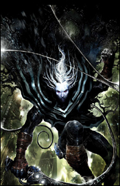
 Ultimate X-Men #85
Writer: Robert Kirkman
Penciler: Yaniuck Paquette
Inker: Serge LaPointe
Colorist: Stephane Peru
Letterer: Joe Caramagna
Cover: Yaniuck Paquette
Review: Tim Glancy
To me, Ultimate X-Men, at times, represents both the best and worst of the way mutants have been handled in the mainstream Marvel Universe. At the best of times, it's a book that deals with people struggling to fit in with society and using their powers to help a world that hates them. At worst it's a huge action book with the X-Men always saving the world and entirely too many mutants with totally crazy powers running around helping / hurting them. While the comic was seemingly going that way, it recently turned a corner and is really heading in an exciting direction. It seems like the end of the "Cablerine" story signaled a change of direction for the comic. Once focusing on the big action, the book is now about the characters and their relationships — while still having plenty of action.
At the helm of this turnaround is Robert Kirkman. What I have enjoyed about the issues since the Cable thing ended is the individual details and stories that we have seen for characters like Storm, Nightcrawler, Bishop and Toad. After the apparent death of Xavier, we saw the characters deal with the pain and grief in their own ways. Another writer would have sent the team straight into another fight, but not Kirkman. Because of it, the characters were allowed to grow. However, the fact that Kirkman has chosen to use the events surrounding Xavier's death to create a whole new team of X-Men is probably my favorite wrinkle of all. Over the past few issues we have seen the team of Bishop, Wolverine, Pyro, Storm, Angel, Dazzler and Psylocke form, and in this issue we see them in their first battle as "The All New, Mostly Different X-Men." The thing that amazes me about the writing is that in a book that needs to work on establishing a new lead team, we are still seeing little personal moments building the individuals as well. What's with Storm and the Shadow King? What is Beast doing with Shield? Why does Jean talk to gremlins? These are just some of the little running stories that Kirkman manages to tell while never losing the pace or purpose of the main story being told here. I guess if I had to complain about one thing, however, it would be that some of his dialogue feels a little forced and clichéd. Not a lot of it, but there are lines in this book, especially on the last page, that are just pretty damn bad.
The art more than holds its own end of the bargain here. Attempting to give your own, unique look to characters such as Wolverine and Storm can be a daunting task, because if you try too much you'll wind up altering a lot of what makes people relate to them visually. Not enough and you could be seen as lazy. It's nice to see that Yaniuck Paquette, Serge LaPointe and Stephane Peru can keep the characters fresh without having to change the look altogether. Of course, it helps that they are working with characters that haven't really been top-rate in this book thus far, but you never get the vibe that you are looking at art by anyone but this team, and the style is unique enough to create its own impression. The fight scene at the beginning, culminating with a tremendous splash on page 13, is some of the best work on Ultimate X-Men in a long time — resulting in a truly solid performance from the art team.
So what do you get when you combine great characters, a great writer and an A+ art team? A comic that I think you should buy even if you haven't been reading the series to date.
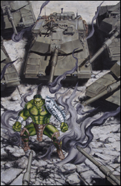 World War Hulk: Front Line #3
Writer: Paul Jenkins
Artists: Ramon Bachs and Shawn Martinbrough
Colorist: Matt Milla
Letterer: Dave Sharpe
Production: Anthony Dial
Cover: John Watson
Review: Tim Glancy
Another week, another World War Hulk tie-in. This time around, it's World War Hulk: Front Line, the one comic that captures the thrill and action of being a news reporter and of working at a newspaper in general. All kidding aside, I thought that Front Line worked very well within the confines of Civil War. However, that was mainly due to Civil War having a much more realistic (at least as far as comics are concerned) premise. A controversial law was passed, dissension arose, fights ensued. Turn your TV on and watch coverage of the Middle East and South America and you will see that this is a pretty common occurrence. Therefore it made sense to tell the reporters side of it, and especially with a reporter from each side. Following Ben Urich and Sally Floyd as they risked everything, including their journalistic integrity, to report the truth was fascinating. However, with World War Hulk there is no universal truth to report. Hulk was betrayed, his lover and child killed and now he is back to smash. Doesn't seem like there is a big conspiracy in play there. And it feels that way in this book as well. Instead of seeing the reporters try to track down leads and get to the bottom of the war, we spend time watching them run around the war zone. Not exactly the most intriguing of plots.
Paul Jenkins is once again the writer of this series, and once again he does a good job of capturing the emotions and personal struggles of the average person in a not-so-average world. The problem is, I don't want to read about someone having day-to-day problems. You know who has day-to-day problems? Me. So I really don't want to read about the problems of normal people. Unless Marvel decides to publish Two-Kid-Single-Income-Family-Man, then I might be interested. The only part of the story that was remotely interesting was Jonah railing and bitching about Ben and Sally's newspaper. It's great. Paul does, however, come through on the backup story. Basically a detective story, we see Sally's boyfriend, Danny Granville, and one of Hulk's warbound, Korg, searching for the robot pilot that brought the warbound to Earth. This feels like something you would expect to read in a comic, not boring work stuff. I would have much preferred 22 pages of Korg and Danny over 11 of Sally and Ben.
The art is good for what it is, people walking around and talking to one another. Ramon Bachs handles the first story, and you really get to see him shine in the last six or so pages, when there is actually action. I was much more impressed with Shawn's portion of the story. He brought a gritty, dark style to the hunt for a missing person. The art actually reminded me of Gotham Central, in that it was simple yet true to life.
So, looking at this book as a whole, I really can only suggest that you flip through it, although that is due to the first half getting a skip and the second getting a borrow. This really feels like two different books — it's just too bad one of them stinks.


