|
Comic Book Coloring 101
By Ross Hughes
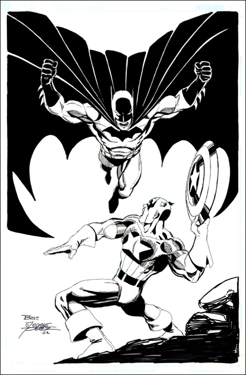
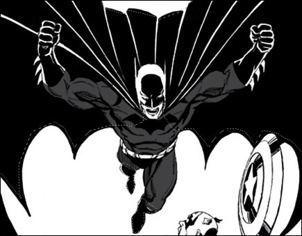
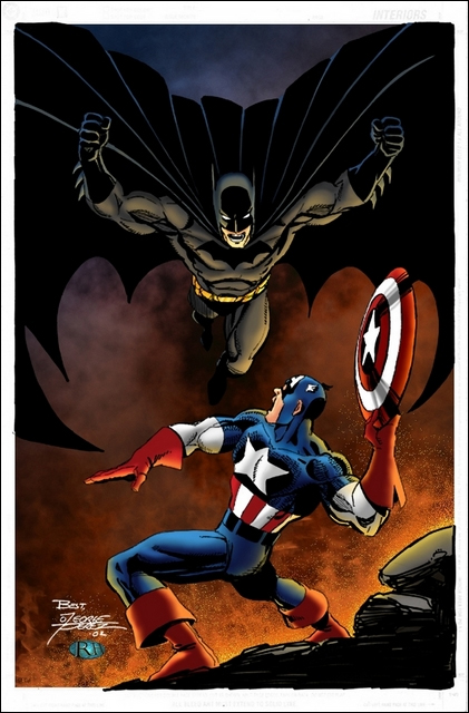
17 May 2007 — The first thing any colorist needs when working is something to color. Obviously. So I've selected this Batman / Captain America pic illustrated by George Perez. One of the best pieces of advice I can give when you're first starting out is to color artwork by someone who knows what they're doing. Coloring your friend's crappy artwork, complete with bad anatomy, isn't going to do you any favors at all. So I would strongly urge you to stick to pro-level work until you have a good grasp what you're doing.
Here is the picture that I've selected:
Getting Started
The first thing to do is to separate the black lines from the white background. I work in layers, so I'll explain how to separate the lines in that way.
01. Select the entire picture (Select > All), then go cut (Edit > Cut).
02. Make sure your Layers box is open (Windows > Show Layers), and click on the Channels tab.
03. In the Channels tab, you'll see a small square icon that looks like a piece of paper with its corner folded. This is the New Channel icon. Click that. You should see a new channel open up in the menu with the name Alpha 1 assigned to it.
04. Highlight the Alpha 1 channel, then go to Edit > Paste. This will paste the art you cut in step one into that Channel.
05. Press CTRL+I to invert your selection. Your art should now look like a film negative.
06. Return to your Layer menu by clicking on the Layers tab.
07. Click on the New Layer icon twice to create two new layers. (The same icon as in the Channels menu, only this one creates a new layer.) After doing this, you should have three layers in the Layers menu: one white, the other two empty. (Note: Layers are just that. Think of them as transparent sheets of glass laid over one another. The topmost layer will have nothing obscuring it, while lower layers could have things obscured by the layer(s) above it.)
08. Highlight your topmost layer, then go to Select > Load Selection. A box with a drop down menu will appear.
09. Click on the drop down and select your Alpha 1 channel, then click OK. This will load the white space from your Alpha 1 channel as a selection (called "marching ants" by many, because they look like ants walking in a circle around your selection).
10. Click on your Paint Bucket tool, and select a color to fill your line art with. (Usually done with black, but you can go nuts if you like.)
11. Click anywhere on your page, and the Paint Bucket tool will fill your selection with your chosen color. You've now separated your black line art from the white on your page and placed it on its own layer. Deselect and you're ready to start flatting!
Flatting
What in the blue hell is flatting? Flatting is a term used to describe filling the page with color to separate different areas of the picture from one another. Huh? I guess to get a handle on why someone would flat a page it would help to know a little bit about this helpful little tool.
 This is the Magic Wand tool. It selects the entire area of whatever color you click on. So, if you fill an area with red, white and blue (like we'll be doing with this piece), but only want to work with your blue color, you can use the Magic Wand to select your blue area by clicking anywhere in the blue color. The Magic Wand will wrap the blue area in a selection (those wonderful marching ants), and your tools will only work in that area. This is the Magic Wand tool. It selects the entire area of whatever color you click on. So, if you fill an area with red, white and blue (like we'll be doing with this piece), but only want to work with your blue color, you can use the Magic Wand to select your blue area by clicking anywhere in the blue color. The Magic Wand will wrap the blue area in a selection (those wonderful marching ants), and your tools will only work in that area.
How does that apply to flatting? A lot of colorists find it easier to work with one color at a time. There are a bunch that just jump right in there and start painting digitally, but I work by making selections and working that area before moving on to my next selection. So, flatting my picture will separate the different elements of the picture and allow me to use my Magic Wand to select just the area I want to work in. This saves me time over using the Polygonal Lasso (we'll get to that one) to choose my selections.
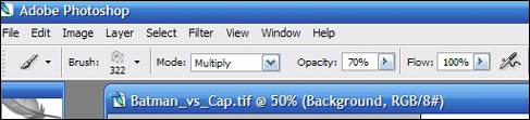
So, how do I flat? First and foremost, when the Magic Wand is selected, you'll see a little check box at the top of the screen — in the menu bar. Uncheck the box labeled Anti-alias. Having the box checked would cause your colors to blend wherever the meet, and would nullify the use of the Magic Wand. (If the colors blend, the tool won't be able to distinguish between where one ends and the other begins.)
Now you're ready to go. There are a couple different methods to flatting. If you're looking to flat for another colorist, then you're going to be just as concerned with speed as you are with color separation. A lot of colorists don't care what color a picture is flatted with. Their main concern is that the elements are separated. So when you're flatting, you don't always have to be concerned with getting the "right" color as much as you do getting a different color than the one next to it. (Meaning, you could flat Captain America to be pink, green and orange, just so long as you remain consistent.)
 One method to flatting that is used is to fill your entire picture with one color and then start separating elements from there. This will speed things up, because you only need to separate the colors. The method I prefer (which is probably why it takes me ages to flat a complex page) is to choose your elements with the Polygonal Lasso tool (seen above) and fill the area(s) with a base color. It's a lot slower, but I've found that it works for me. It gives me a better idea of what I want to do on the. As you get the knack for this, you'll find the method which works best for you. One method to flatting that is used is to fill your entire picture with one color and then start separating elements from there. This will speed things up, because you only need to separate the colors. The method I prefer (which is probably why it takes me ages to flat a complex page) is to choose your elements with the Polygonal Lasso tool (seen above) and fill the area(s) with a base color. It's a lot slower, but I've found that it works for me. It gives me a better idea of what I want to do on the. As you get the knack for this, you'll find the method which works best for you.
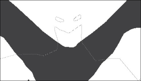
Start off by selecting the empty layer underneath your line art layer. This will put all of your flat colors underneath the black lines. Select the Polygonal Lasso tool, click a starting point for your selection and begin to work your way around the area. The Polygonal Lasso will allow you to create waypoints along the path by clicking wherever you want the path to go, unlike the regular Lasso tool, which works much like drawing a shape around an object and closes itself off after you've released the mouse button.
In the image below you'll see that I've selected the gray portion of Batman's costume. (Note: You can select multiple areas by pressing the shift button while you set the first waypoint of the next selection. A small plus sign will appear next to the Lasso tool. Incidentally, pressing the CTRL button will give you a minus sign, causing the Lasso tool to deselect an area.)
After you've made your selections, you're ready to fill the area with color. You can either use the Paint Bucket tool or the Pencil tool to accomplish this. The Pencil tool works the same way the Brush tool works, but the Pencil is aliased whereas the Brush is not. And, remember, for flatting aliased equals good. I use the Paint Bucket tool though, because it's much faster than trying to color it in by hand with the Pencil. One click and I'm done.
Here is the area after filling my selections with my chosen color:
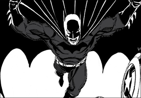
By hiding the layer with the line art in it (by clicking on the little eyeball in the Layer menu) you can see that the color is there and that it has a hard edge to it.
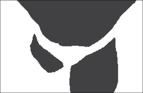
Now we move on to the next color. Here I've selected the blue areas in Batman's costume:
But wait! You've got your selections running into your gray color! Won't that put the blue color over the gray color?
So I have! This is where the biggest advantage to flatting with the Paint Bucket tool comes in. Using the Pencil tool, I would have to be careful not to overlap my new color too much with my old color, or I'd have to take the time to deselect the gray areas that I didn't want to turn blue. (Which isn't all that hard when using CTRL+Magic Wand to deselect a color, but you get the point.) This way a single click of the Paint Bucket tool will only paint on top of the color or area that the pointer is on.
By clicking in the empty area of my selection the Paint Bucket will only fill the empty area with my color. And with the aliased edge of my gray color matching up with my aliased edge of my blue color, I'll get a nice crisp area to be able to select with my Magic Wand later on.
It's just lather, rinse, repeat at this point until you've filled in everything that you want to have flatted. Generally, I fill in the background on a separate layer, like I've shown here. This allows me to play around with the background without having to worry about pulling any of my other colors into the background. It's especially handy to do it that way when working with different effects. Blurring and smudging, amongst other filters can affect the surrounding colors as well as the areas selected, so be aware when you're using those functions.
 I highlight my background layer in the Layer menu and then use the Rectangular Marquee tool (above) to select an area. From there I use the Paint Bucket tool to color in my background layer like so (below, left). I've hidden the layer with my flat colors to show that it does indeed cover the entire area. I highlight my background layer in the Layer menu and then use the Rectangular Marquee tool (above) to select an area. From there I use the Paint Bucket tool to color in my background layer like so (below, left). I've hidden the layer with my flat colors to show that it does indeed cover the entire area.
Once I've finished my flats, I'm left with the image above (right). This is just what the name would suggest. Flat colors underneath my black line art. No rendering has been done to give it any depth or definition. And I've given myself some selectable areas to use my Magic Wand tool on when I'm ready to do the final rendering.
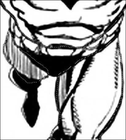
Below is a close-up to illustrate the different areas. Notice that Cap's glove is a different color red than the part of his shield that he is touching. That's because I've set my Magic Wand's tolerance level to 0, so it will only select the specific color that it is clicked on. If I were to set it at a higher level, it might select both of these colors because it figures they're similar enough. I don't want that though, so I keep it at 0 pretty much all the time.

Rendering
Alright, you've got your flats laid down and you're ready to get into the good stuff. The rendering! This is where you'll (hopefully) give your picture depth and definition. There are so many factors to consider when you're approaching a picture that I can't possibly name them all. Some of the major ones are lighting, atmosphere, mood, depth, texture and how one object affects another.
I generally like to start with the background first to help set the mood and lighting, then I work to the front. Let's say you've rendered your characters and foreground first, and you've given everything a yellow highlight. Well, what if you decide that a blue background suits the environment better? You'd have to go back and do all of that work over again — just to render it under a blue highlight. The way I've suggested helps you avoid that mistake.
Photoshop has a bunch of filters that are designed to give images different textures and lighting. The problem is that they are not always the best thing to use for coloring, and usually stick out like a sore thumb. This is why the majority of colorists will work with custom brushes that they've either created themselves or found on the Internet. Take the time to find or create some brushes that suit your style. It will be worth every second you spend on it. Anything from clouds to fur to rust and fabric can be created convincingly with the right brush, the right color and the right settings.
Back to the tutorial: First I created some cloud cover to place behind the characters using several different cloud brushes. I started with a base color and then adjusted the way my brushes worked by choosing different options in the brush drop down menu and adjusting the opacity.
After a little playing around, this is what I've come up with (below, left):
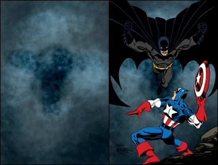
Above (right) you'll see what the clouds look like with my flat layer laid over them. It's important to make sure what you're doing in the background isn't going to take the focus off of the characters or the story. Remember, the buyer didn't pay to see your pretty colors. They paid to read a good story and see quality art. Overpowering the line art with your colors is possible, but it's not recommended — and probably won't be well received.
This is the reason why I work the background first. I had originally intended to have Batman and Cap in a dark setting with a glow coming up from behind the rock formation to serve as a light source. While I was playing around with getting the look right, I stumbled onto the Dissolve setting to my brush and it created an interesting effect that made me thing of burning embers, so I thought, "Why not a volcano or something like that?"
Blue clouds don't exactly fit a burning volcano setting, so I went to Image > Adjustments. From there I clicked on Hue / Saturation. This allowed me to play around with the Hue and Saturation levels (Duh!) without actually affecting the rendering that was done with my cloud brush. All it did was change the color for me (below, left).
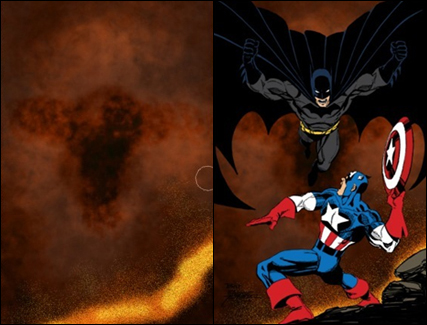
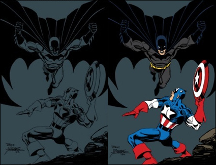
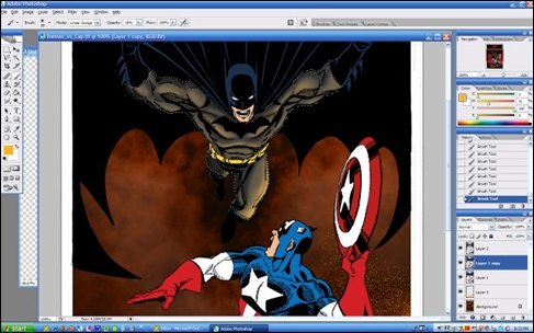
With the line art and flats visible (above, right), you can see that it gives the impression that they're in the middle of some kind of burning area. With the background of this one being quick and easy, it's time to render the foreground. I like to create a copy of my flats layer so that I can always go back to it later. This allows me to use the Magic Wand if I decide what I've rendered needs more work. You can do that by right-clicking in the layer you want to duplicate and choosing Duplicate Layer. Or you drag that layer to the New Layer icon. Just be careful you don't dump it into the trash.
Here is a sample of my rendering in a selected area. There are many different ways to render your picture. Play around and figure out what your style is. For this I've taken a sample of the local color from the background to apply my highlights. This helps to tie the character into the surrounding environment. Remember, the environment affects how the character or object will look.
Work your way through the entire picture and voila! You're done. Post it online and ask for critiques — then bend over and take them. I kid! (But not really.) Just keep in mind that there is a difference between style and right and wrong. Take the advice that people give you and try to either apply it to this picture or your next one. That and a lot of practice will help you improve your style.
Take a break from your picture once you're done, then go back to it and give it a critical eye. Be honest with yourself. I usually go ahead and post mine for feedback prior to taking a second look, just so I can get as much info as possible before tweaking things here and there. But it's up to you.
Here is the "final" version. Of course, as I'm taking a second look I'm already seeing things that I want to go in and play around with. Fixing things can be great, but another thing you've got to learn how to do is let go. There comes a time when you just have to move on to the next picture.
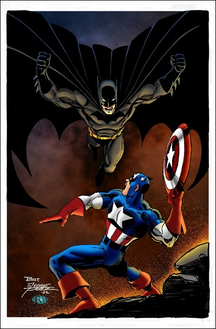
And just before I published this article, I realized the image above wasn't the final version (hence the quotes). This is my real final version. I wasn't happy with the saturation levels in the blue on Cap's costume and I wanted to punch up the embers a little.
Well, there you go. I hope that will help some of you. I've barely scratched the surface, so if anyone has any questions, let me know and I'll do what I can to answer them.

.: about :: donate :: contact :.
© 2004-2026 its respective owners. All rights reserved.
|


